Comics go to the movies: Close Encounters, 1978
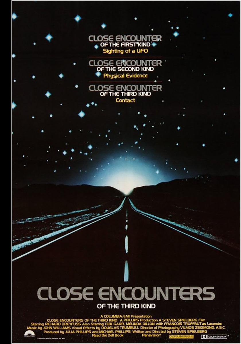
It’s long after the game for me to make this observation, but Marvel Comics and Close Encounters seems like kind of a mismatch. There’s no denying the movie is a masterpiece with spectacular, engaging visuals, but it takes a while to get where it’s going and a lot of it doesn’t feel like a good fit for comics.
Much of the movie is deliberately paced for contemplation, and most of the characters are deliberately ordinary, prompting the famous line, “ordinary people under extraordinary circumstances.” Comics are good at depicting extraordinary circumstances, but ordinary people in comics have to do extraordinary things to keep them interesting.
There’s a lot of dialogue in the film, but the biggest and most important moments are dialogue-light with a boatload of suspense. Comics are less good at depicting that for reasons I explained in my review of The Abyss. Suspense scenes are murder in a comic book where you need to tell a story rapidly. Slow reveals require a lot of square inches that most comics simply can’t afford. Plus, there are usually busier scenes right across the page acting as distractors. This sort of storytelling was antithetical to the tone of Marvel comics in the 70s, but Close Encounters was built on it.
So what made this comic happen in the first place? Most likely, it was the Spielberg effect. He’d already established himself with Jaws, and everyone knew ahead of time that a Spielberg UFO movie was going to be another big one, especially in the year of Star Wars fever. Close Encounters would premiere November 16, 1977, and Marvel was going to be on that bandwagon.
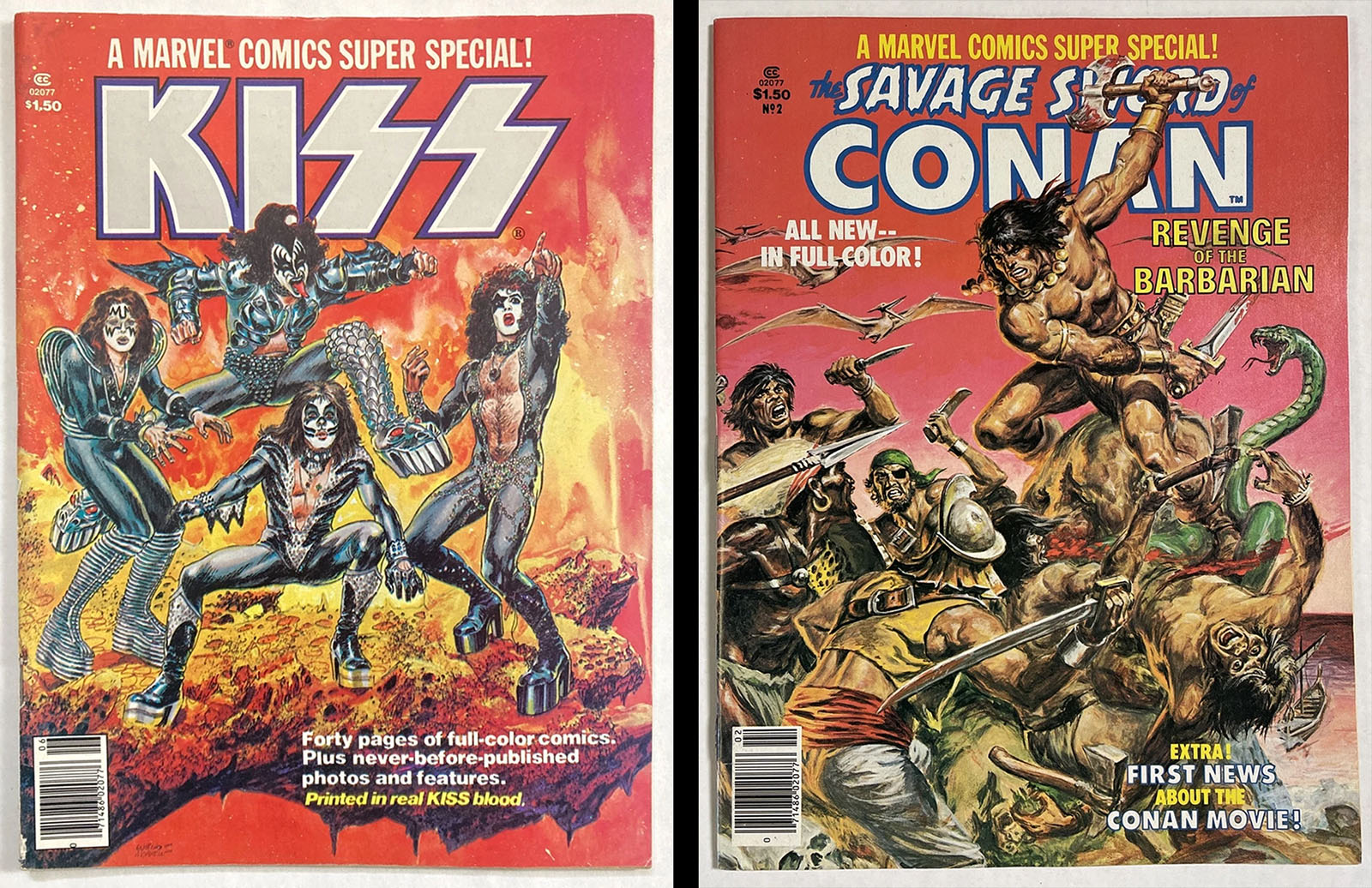
Marvel Super Special was a “prestige” magazine-format series for big-name projects that had started in 1977 with KISS in the debut issue (a monster seller), followed by Savage Sword of Conan in issue 2. The Close Encounters adaptation filled issue 3, published in early 1978, making the Super Special into a vehicle for high-profile film tie-ins (see a complete list here).
So how do you handle a movie that isn’t a very good fit for comics? You give it to people who are really good at making comics. In this case, writer/editor Archie Goodwin, penciler/storyteller Walt Simonson, and inker Klaus Janson. They were each masters of their individual craft, and made for an absolute dream team when combined.
Archie was especially good at filling silence with thoughtful prose, Walt was highly accomplished at dynamic composition, and Klaus was an expert at fluid, organic brush inking. He was also a pioneer in using screen tones to keep shapes together and increase the vocabulary of texture in comic art. From a storytelling and artistic standpoint, this was as solid a comic as you could ask for. (And it should not escape notice that Archie and Walt would go on to create the greatest movie adaptation of them all the following year.)
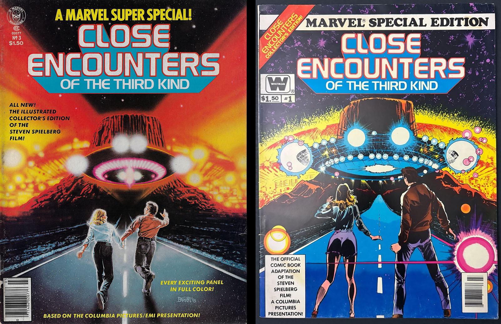
Left: Super Special cover. Right: large-format Treasury edition cover.
From a technical standpoint, though, this project was a creature of its time. Color was the big handicap, completely incapable of capturing the depth and range of the film’s imagery (which won an Oscar for its director of photography). The standard Marvel comics of the time only had access to a palette of about 70-ish colors and weren’t capable of even simple gradations. Painted art would have been a much better way to capture the film (and live up to the “prestige” format), but that’s not how it went. Limited time and budget were the usual culprits, so let’s just assume that was the case here.
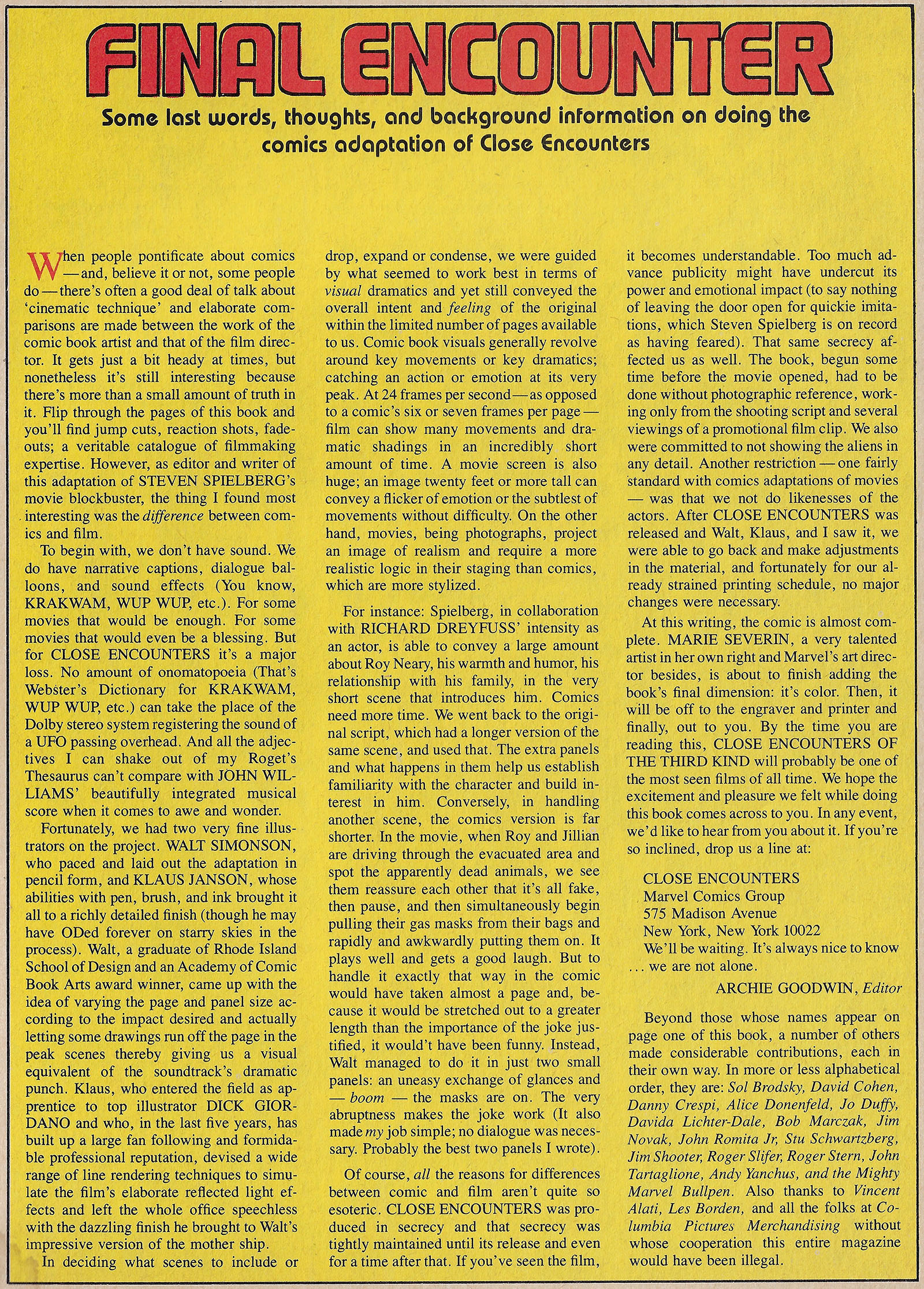
According to Archie Goodwin’s editorial (read it at the end of this page), they were given very little in the way of visual reference, but they did have an early draft of the script that provided extra dialogue to work with and a few scenes that didn’t end up in the movie. This was always a good way to bring added value to a comic.
Whereas many subsequent Super Specials arrived in stores before their respective films, Close Encounters was one of the first “controlled” releases where information was intentionally withheld to preserve surprises. This meant the comic would come out after the premiere (being published in early 1978), which gave everyone time to spruce it up a bit after actually seeing what they were adapting.
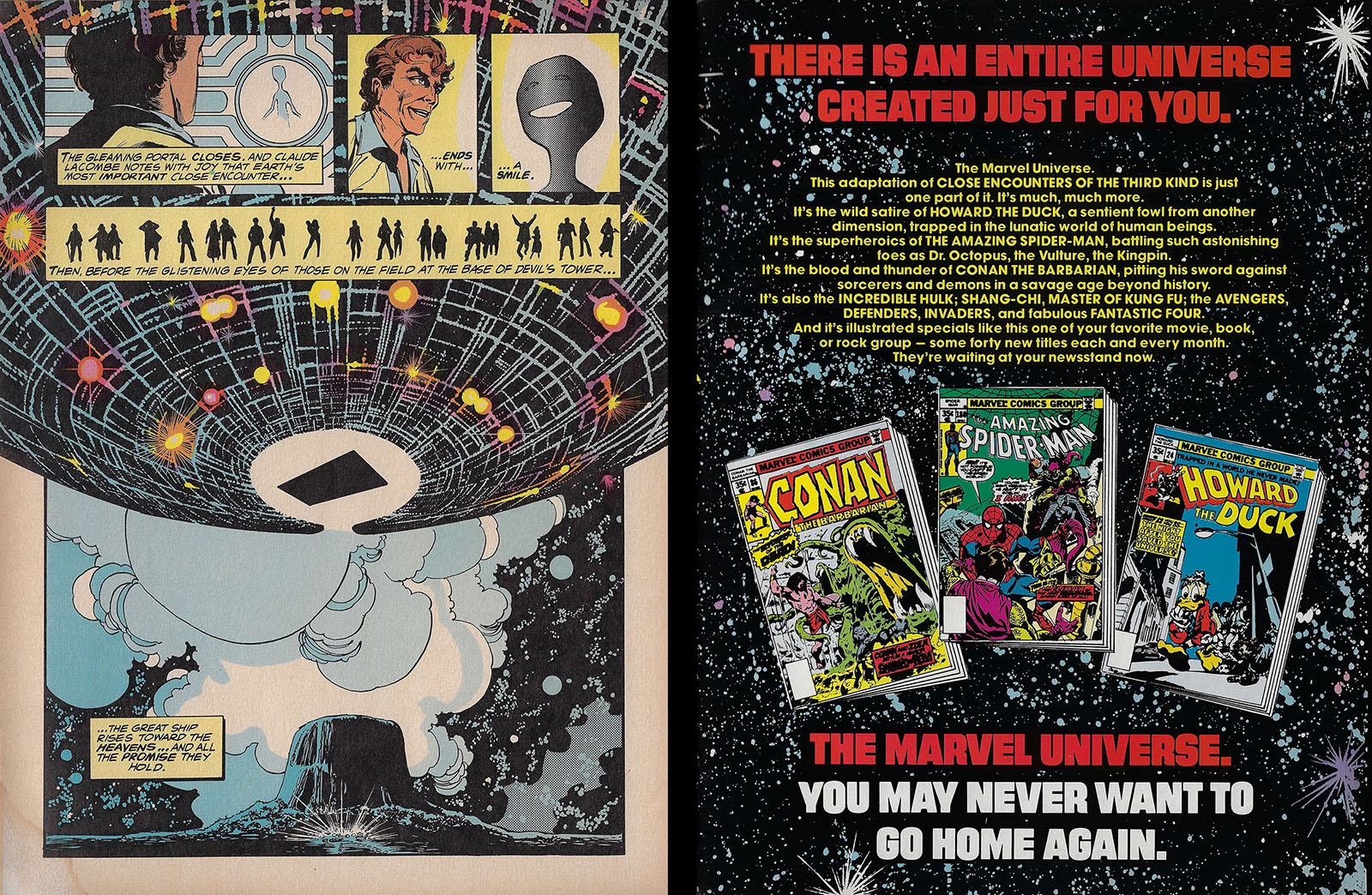
Likeness rights were not secured for the actors, which probably made the characters easier to draw, and the aliens were intentionally kept vague in the closing panels. Regardless, Marvel must have thought the comic would attract people who weren’t necessarily Marvel fans, because they closed with a big ad that invited new readers into the fold. They had space for three titles to lure people in, and the choices demonstrated their range: one super-hero (Spider-Man), one literary character (Conan the Barbarian), and one oddball (Howard the Duck). That lineup seemed to have something to offer for everyone.
Click here for a PDF of the entire Close Encounters Super Special from cover to cover
Highlight Scenes
Here’s a collection of moments that stood out to me while reading the comic for the first time since I originally bought it…
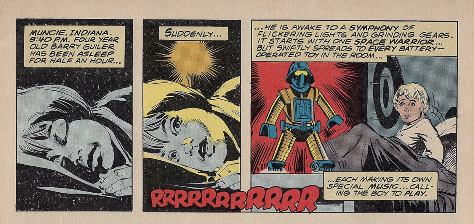
Here’s a great example of how Goodwin and Simonson adapted a long, wordless sequence. First Goodwin combined exposition (basic story info) with impression (his own interpretation of the scene). It’s as if you’re sitting next to him while he explains the movie to you. Simonson, meanwhile, compressed the entire sequence into as few panels as possible to save room for bigger things.
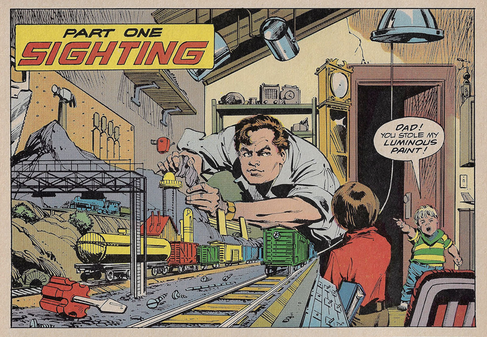
That’s Roy Neary in the center, but it’s definitely not Richard Dreyfuss playing a flabby schlub from Indiana. The comic book version of Roy is built more like a comic book character. The “luminous paint” reference comes straight out of the script draft they were adapting.
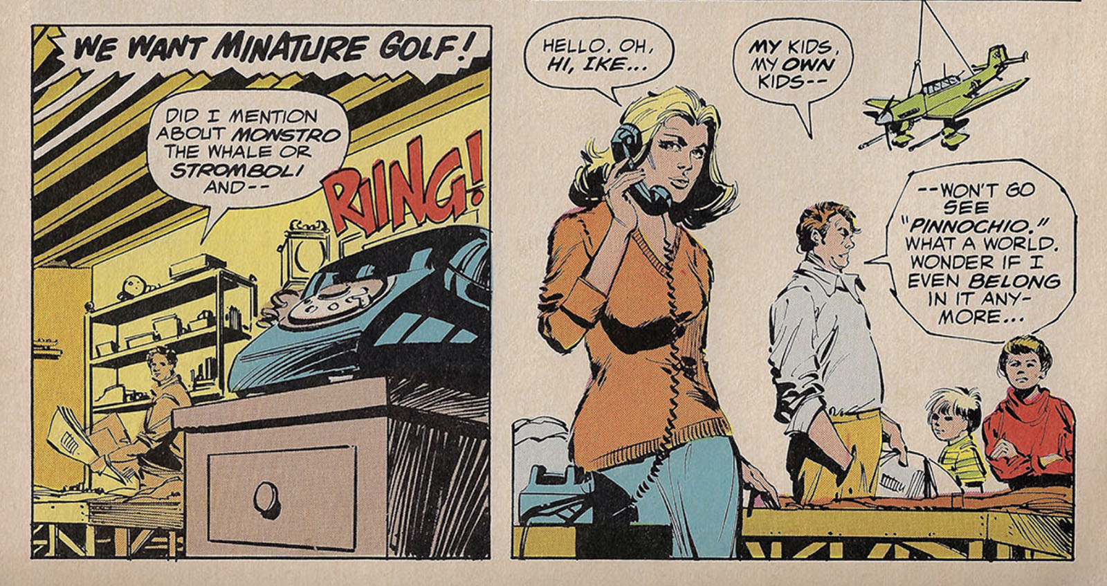
The Pinnochio reference is more pointed in this draft, setting up Roy as a man losing connection.
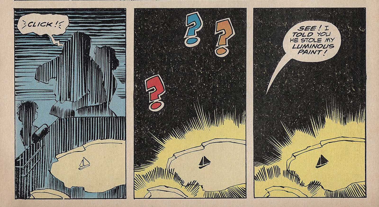
Here’s where the paint line pays off. Maybe it was too hard to film?
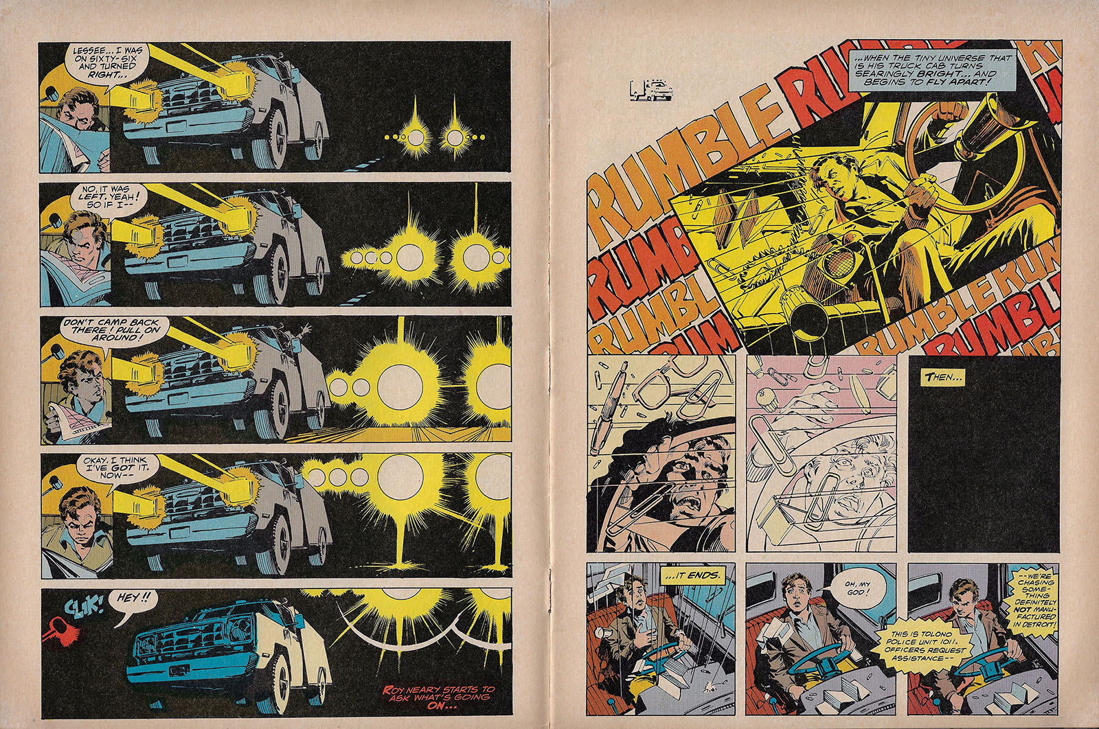
Walter Simonson truly shines in this scene, one of the most important moments of the film and worth spending some page area on. Usually, a single shot like the one at left would rate only a single panel, but the progression is so vital Simonson devoted a whole page to it. But there’s still economy at work here; if you removed any single panel from this spread, it wouldn’t work as well.
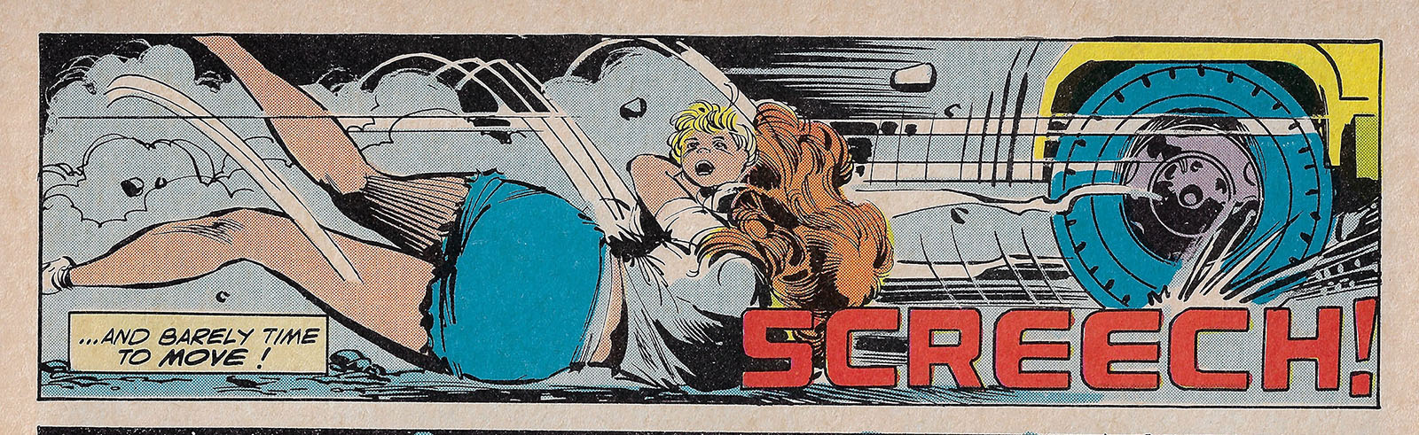
Like Roy, Jillian was drawn in an obvious comic book style. Shapely enough to jump into a super suit.
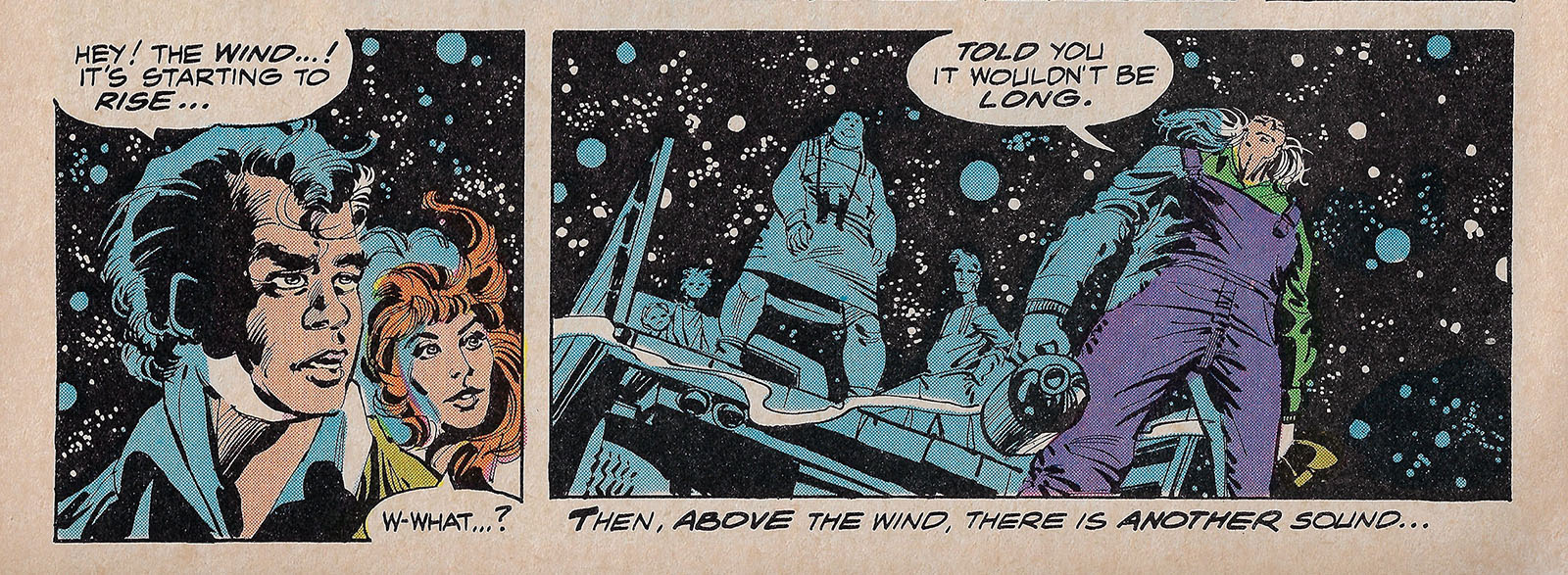
Even as a kid, it always bugged me when night skies in comics were drawn like this. That’s not what a night sky looks like!
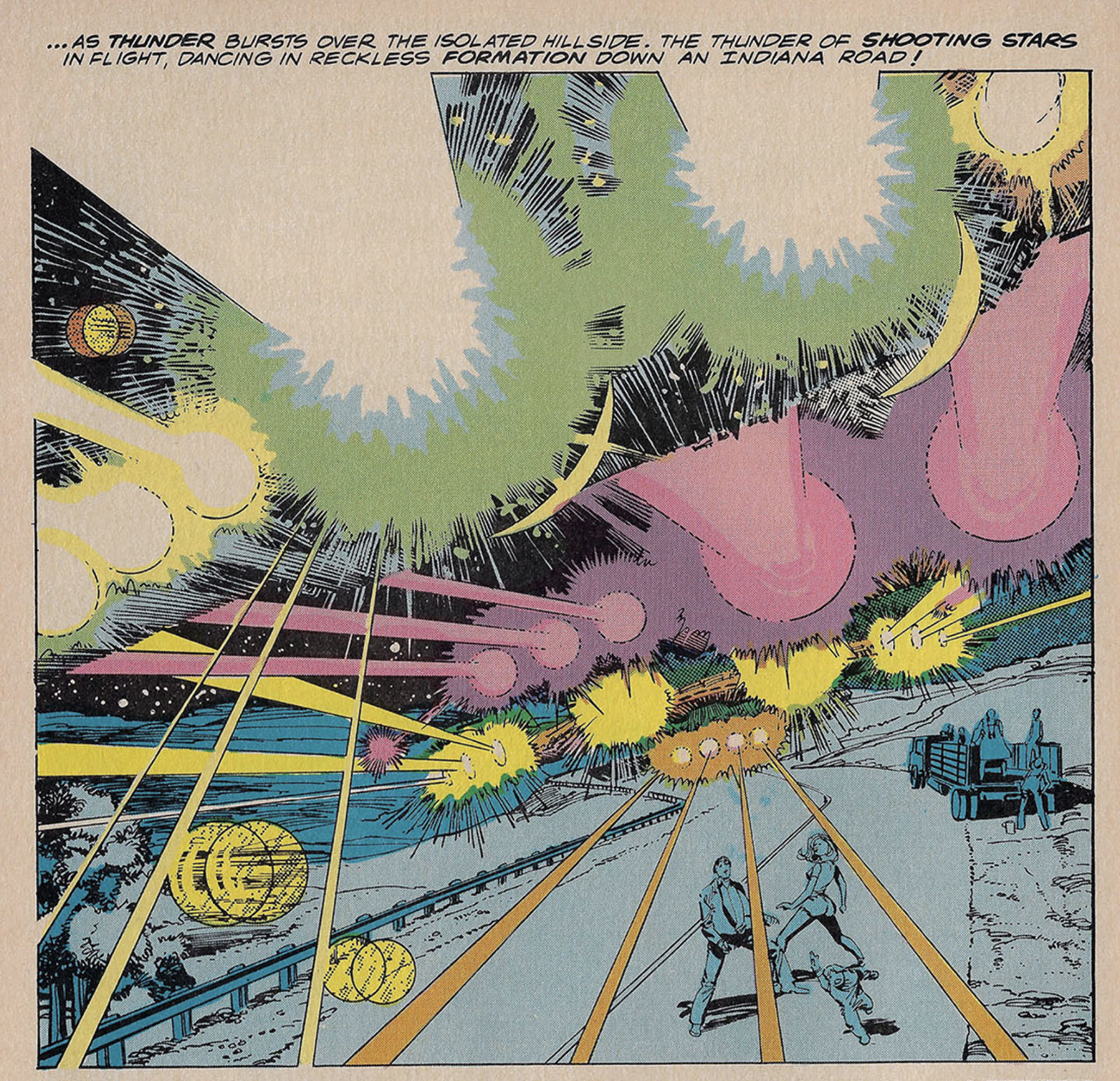
This is where you can see how the 1970s color technique really isn’t up to the task of reproducing this film’s lighting effects. Simonson left plenty of spaces open (and the page probably looked much better in black & white), but the colorist filled them up with tones. My number 1 coloring rule is that lights should always be the brightest thing on a page, but here some of them are darker than the ground. It also doesn’t help that the underlying newsprint casts everything yellow to begin with.
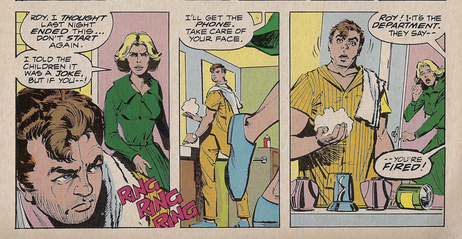
Here’s a straight up coloring error: Roy’s face is supposed to be half sunburnt, and Walt even drew a line down the middle to define it, but there’s no followup.
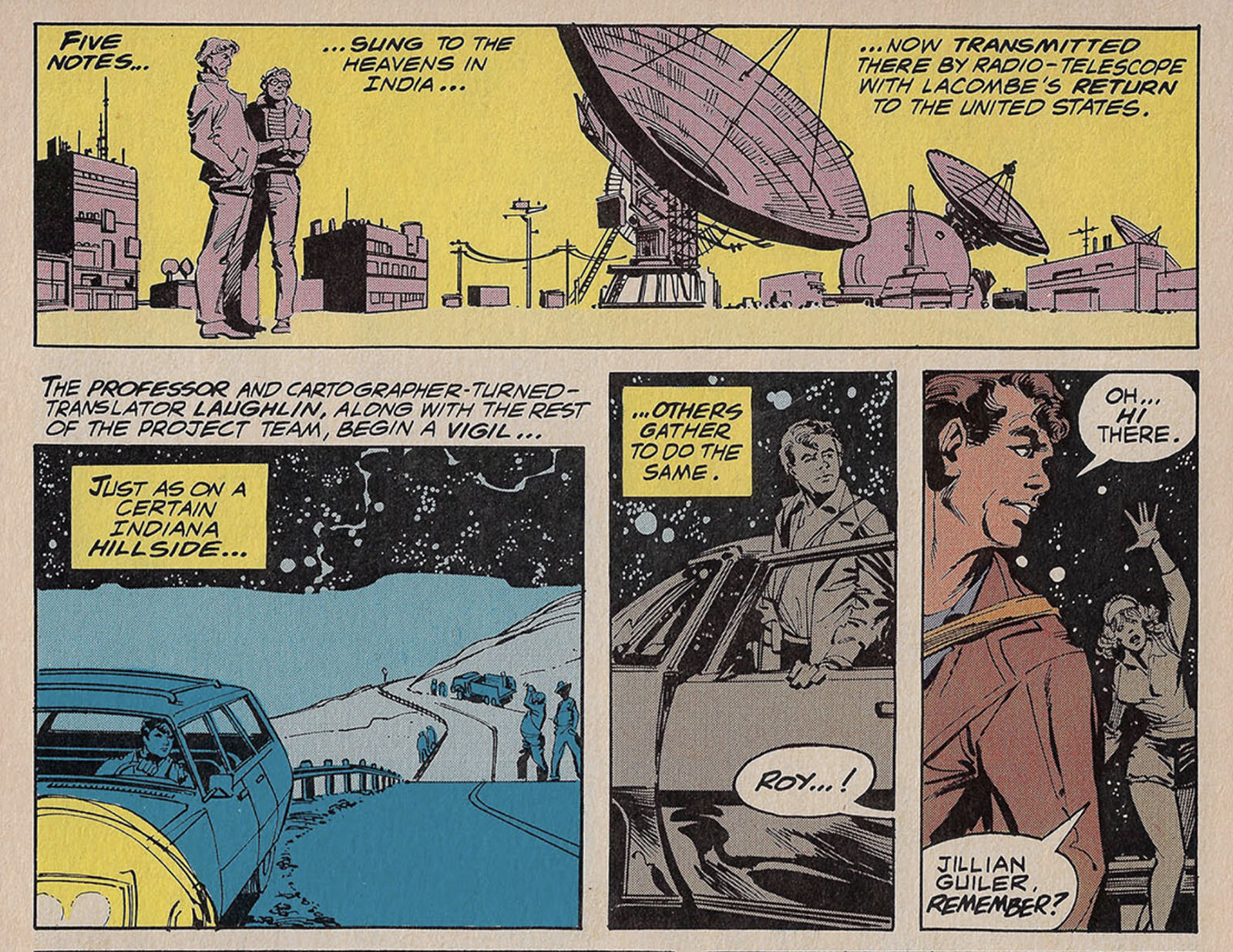
If you’re wondering how they handled the musical notes in the comic, the best Goodwin could do was describe them as “five notes” and leave it at that. It’s funny to me that Laughlin (Bob Balaban’s character) is mentioned by name, but he doesn’t actually say anything until we get halfway through the book.
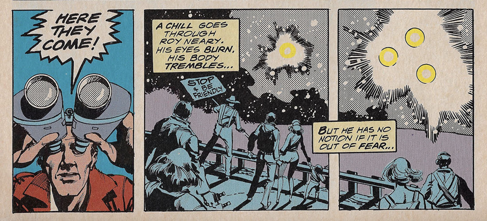
Another lighting mistake here. Walt left the focal point of the light source open and Klaus Janson applied screen tone around it as a buffer, but yellow was dropped on top of white. Yellow is not brighter than white. The color is working against the art.
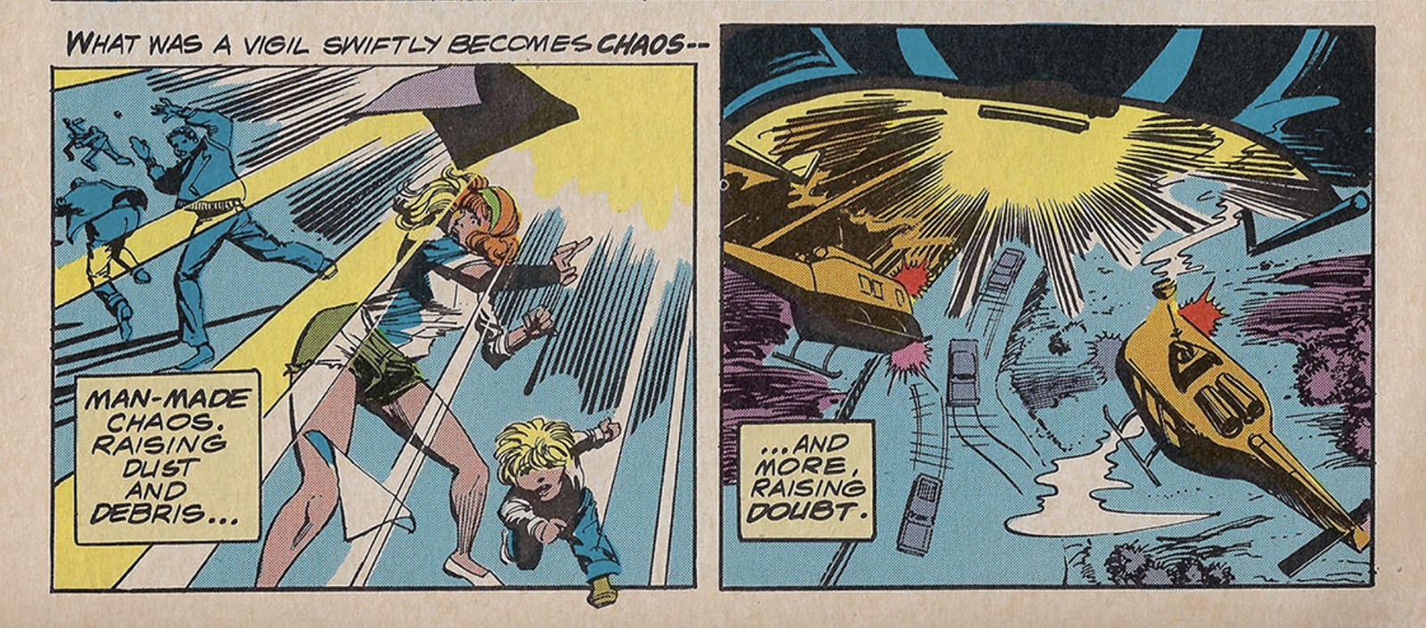
Great wordsmithing by Archie Goodwin, another killer combo of exposition and impression. He was SO good at that.
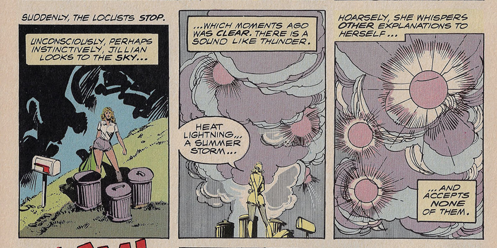
What’s that rule again? The lights should be the brightest thing on the page. These lights are not.
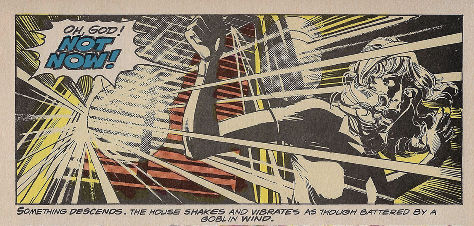
On the other hand, here the color and art work together exactly right. See the difference?
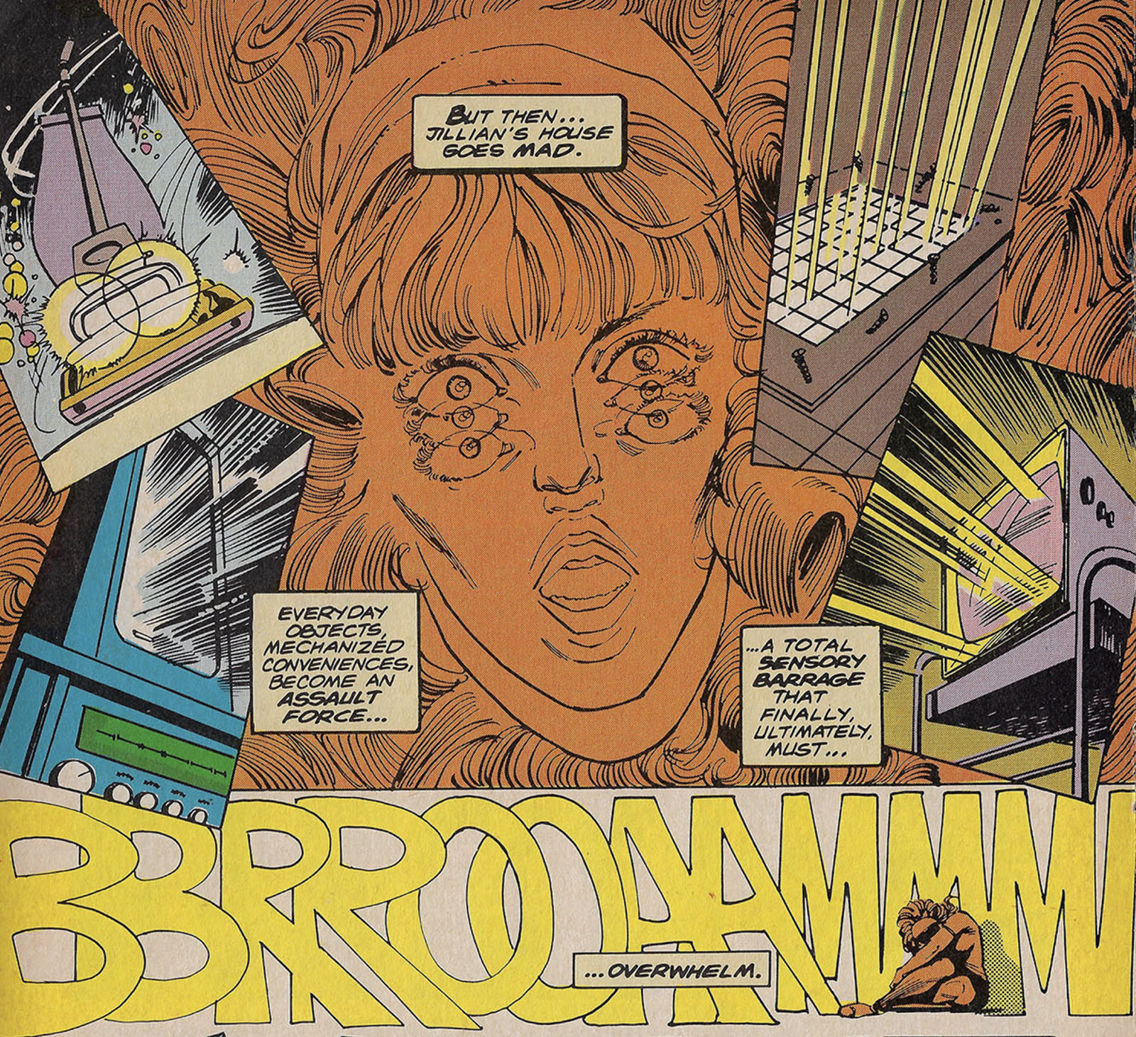
Walt Simonson brilliantly condenses a several-minute sequence with lots of shots and terror into a montage that gives us a perfect impression in less than a full page.
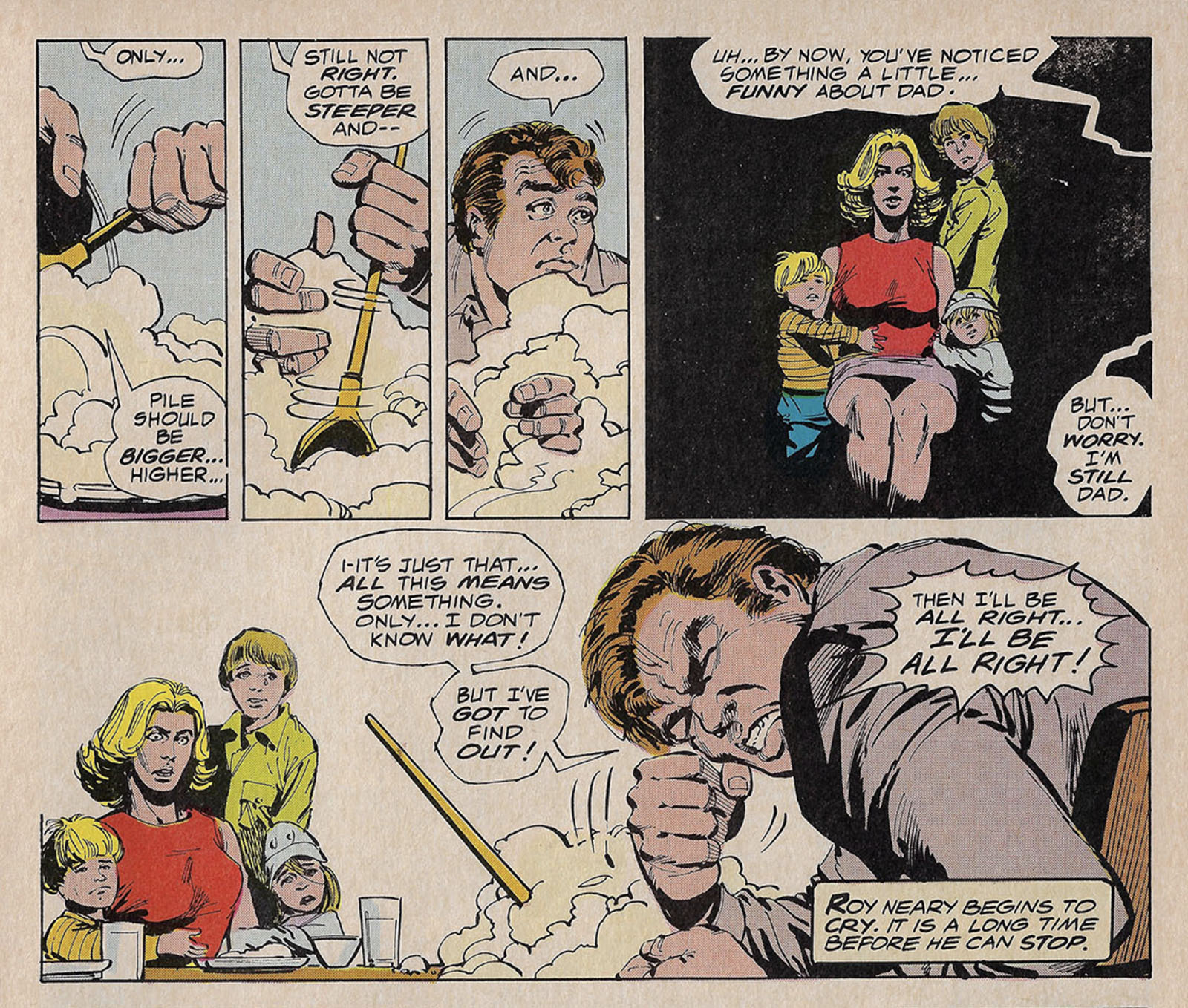
The slow-burn mashed potato scene at the family dinner table was practically silent in the film with visuals telling the whole story. Goodwin had no choice but to fill it with words and intensify the acting. If this is how the scene were staged in the film, it would be overkill. Here, it works.
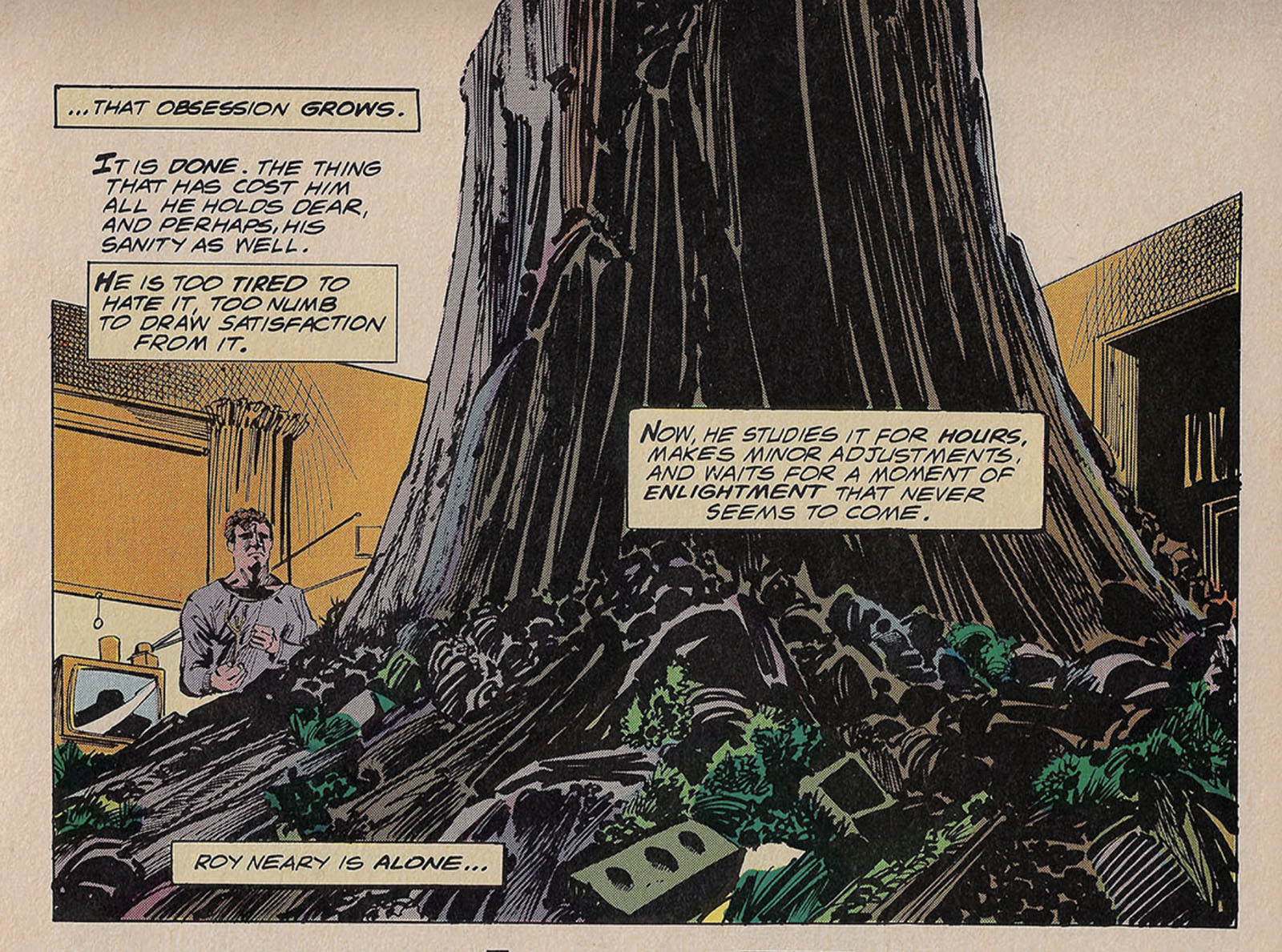
Another pivotal scene, perfectly composed and deftly described. This is the precise halfway point between a movie and a novel.
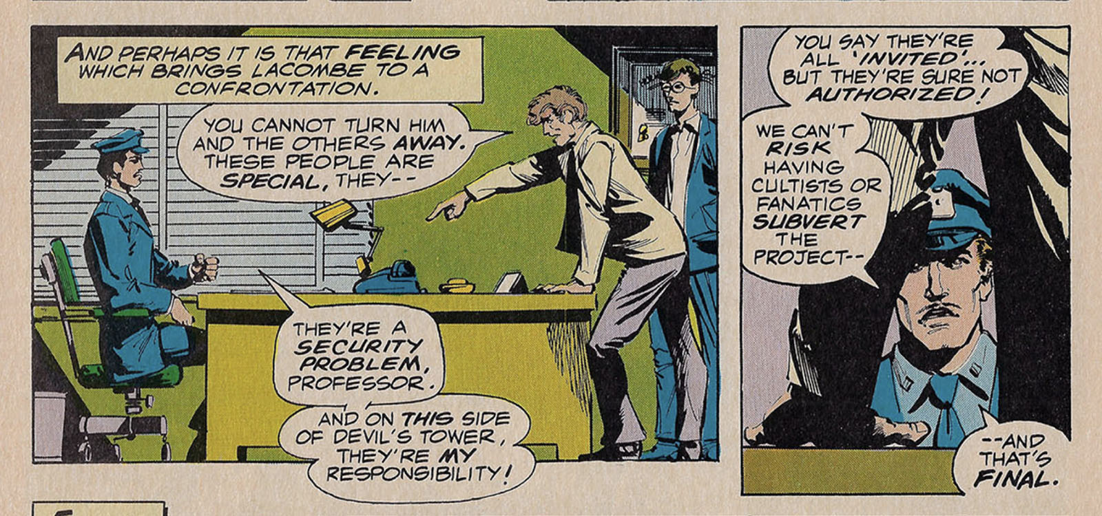
The confrontation between Major Walsh and Claude Lacombe is pure Marvel, played for visual drama. Stubborn military types like Walsh were VERY common in 70s comics.
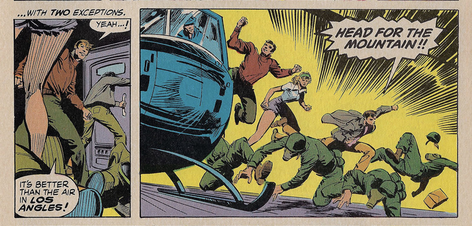
Another “Marvel moment” happens when our heroes burst out of the helicopter. In the movie they snuck away, but here they might as well be Avengers.
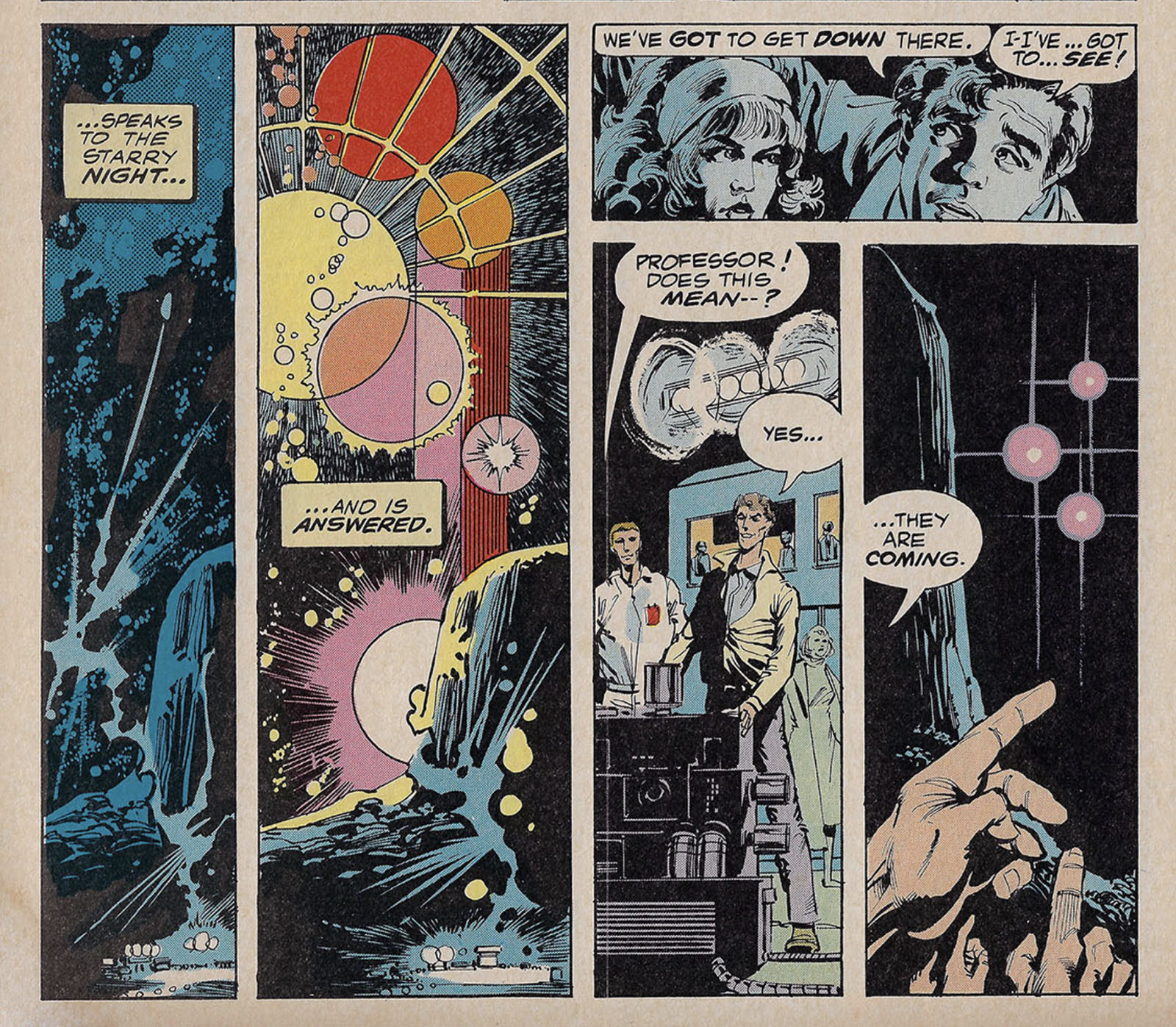
Almost to the end, and that lighting color problem is back. Say it with me: “Lights should always be the brightest thing on the page.” The color is doing everything to defeat this logic.
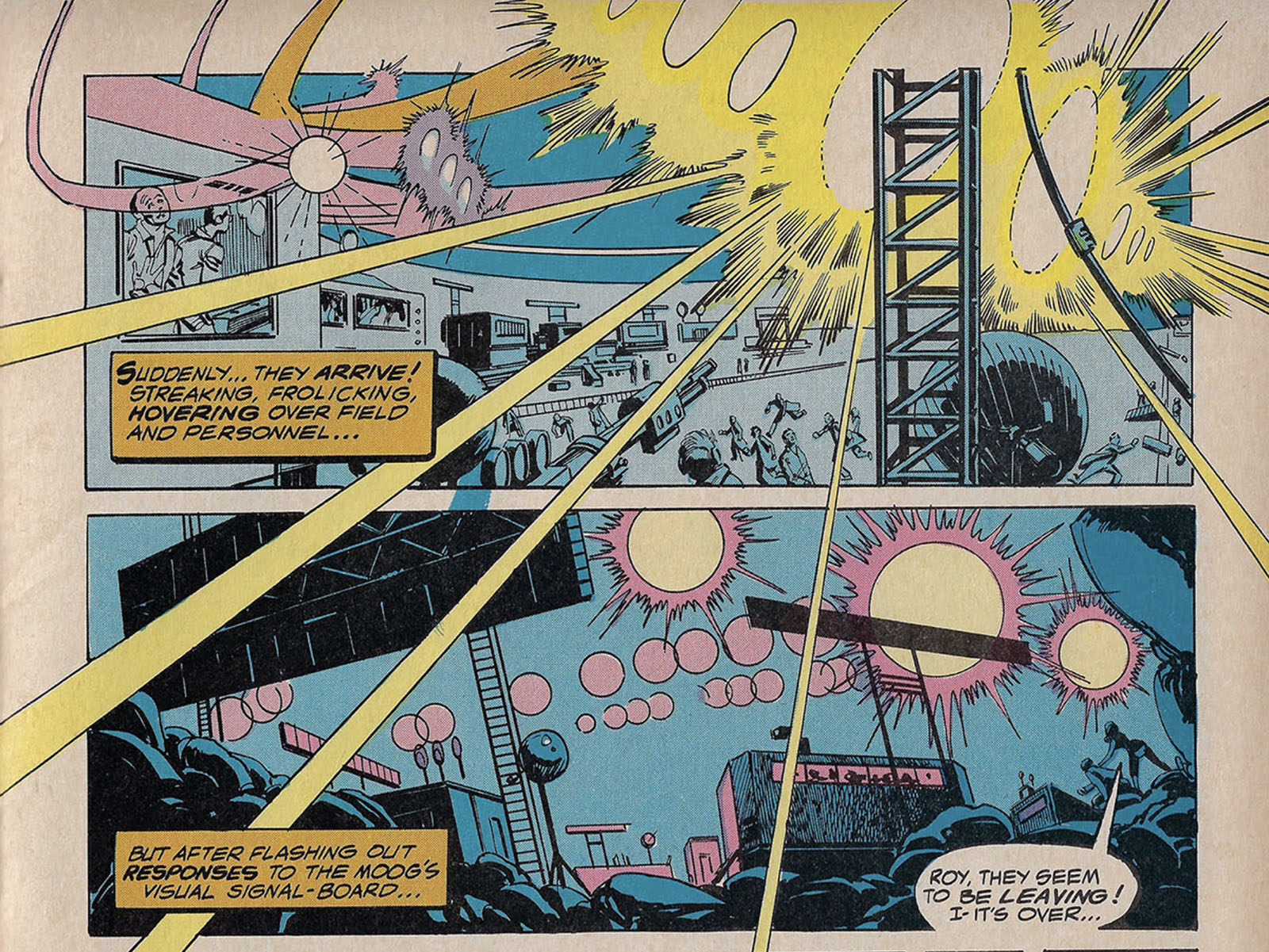
It looks better here, but there isn’t enough contrast in the background colors to make it sing. BTW, this represents the entire “field buzzing” sequence where the UFOs are zooming over and around the base. It occupies only these two panels, which is a shame. But it wouldn’t be efficient to spend more time on it, especially considering what comes next.
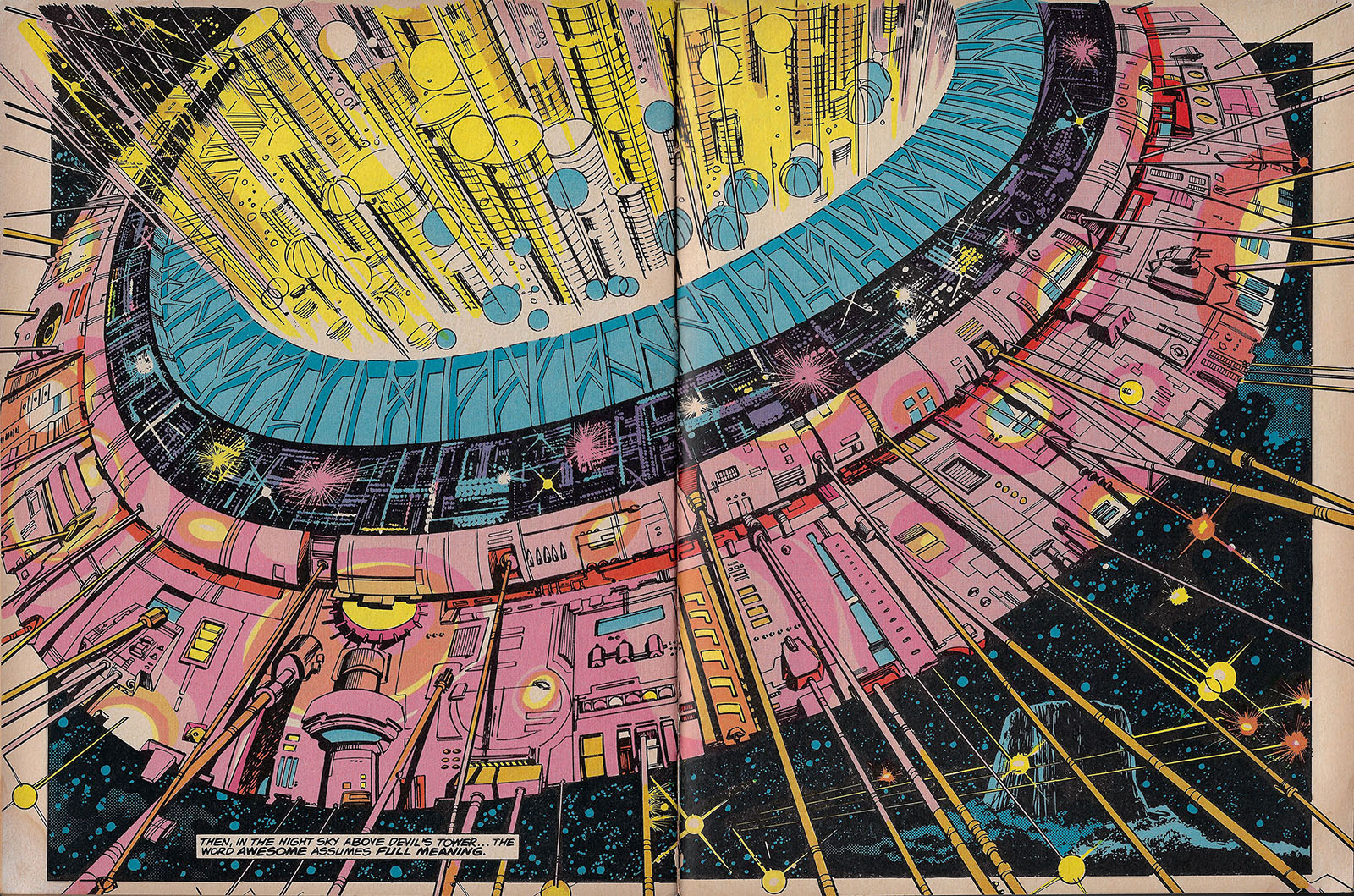
Simonson was wise to budget everything leading up to this moment. The rest of the story is so compressed, it makes this double-page spread (the only one in the comic) seem even bigger than it actually is. The lighting color works pretty well, but I’d love to see what a more focused approach with carefully-sculpted digital color could do with it now.
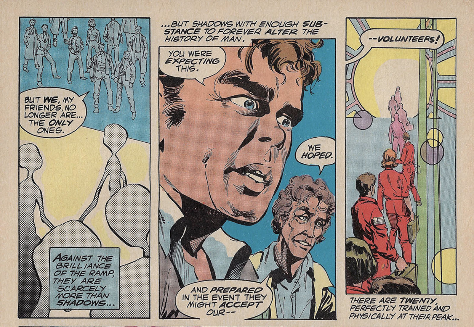
There at the left is the best look we get at the aliens, which were kept secret to such a degree that Columbia apparently didn’t want to risk even a drawing leaking out from Marvel.
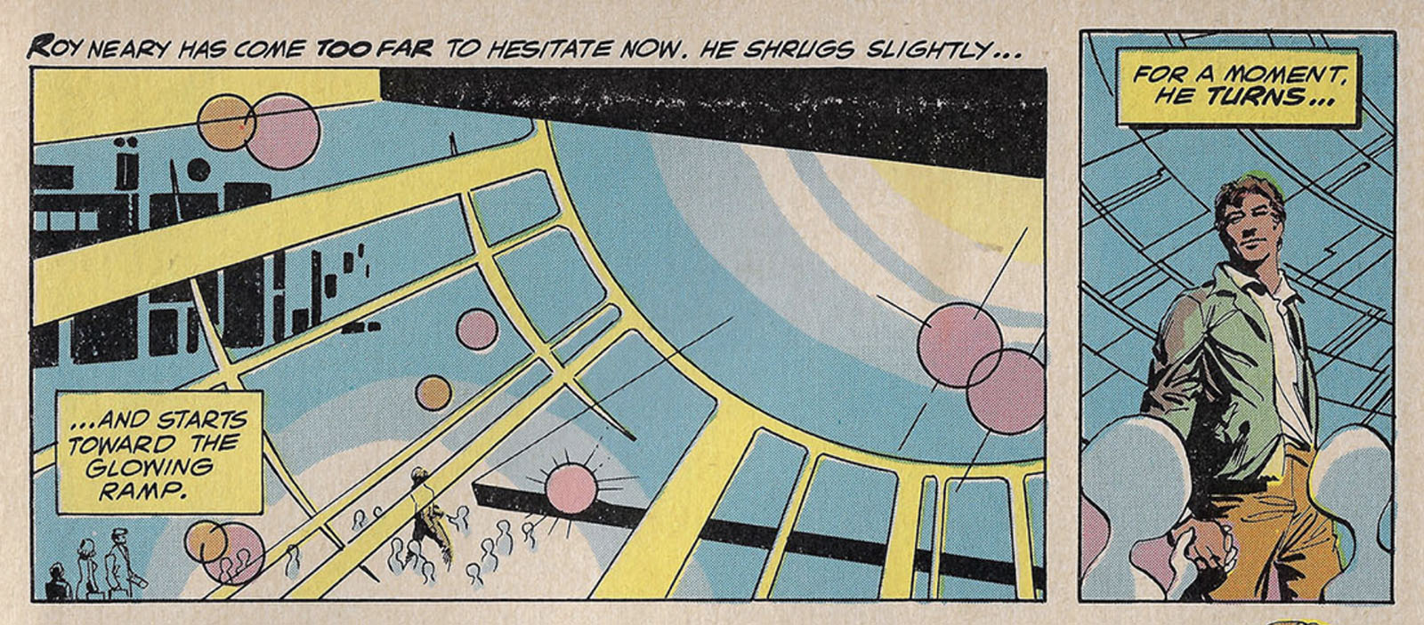
I don’t think I need to repeat my lighting rule again, do I?
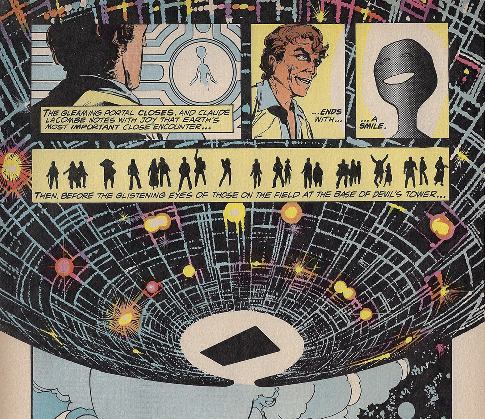
Well, okay, that’s better. But now the story’s over, so…….
Related Media
1977/78 was still the pre-home video age where big movies were capturing people’s imaginations but you had no way to see them outside a theater. Thus, print media came to the rescue and gave us plenty of time capsules to look back upon.
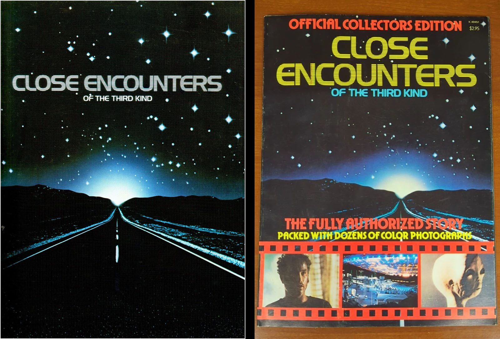
Movie program book
See some interior pages here
Official Collector’s Edition magazine
See some interior pages here
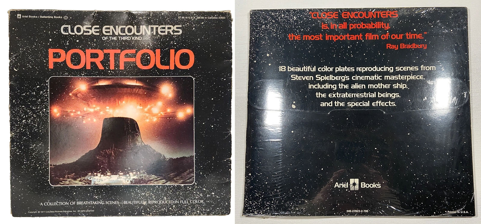
Close Encounters Portfolio
Ariel Books/Ballantine Books, 18 sheets
See some interior pages here
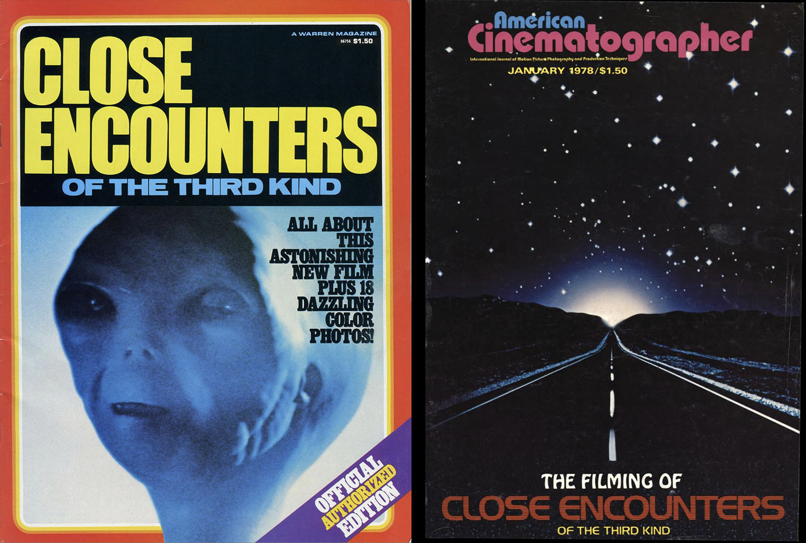
Close Encounters
Warren publishing
Read it here
American Cinematographer
January 1978 issue
Read it here
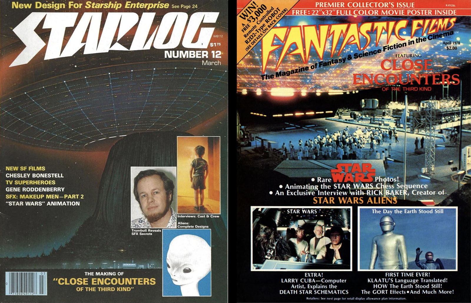
Starlog magazine
No. 12, March 1978 issue
Read it here
Fantastic Films magazine
April 1978 issue
Read it here
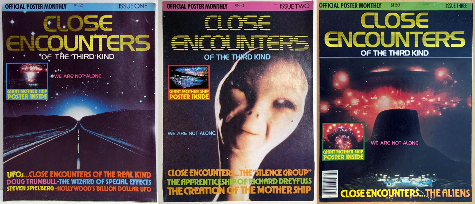
Close Encounters poster monthlies
Paradise Press, three issues
See some interior pages here
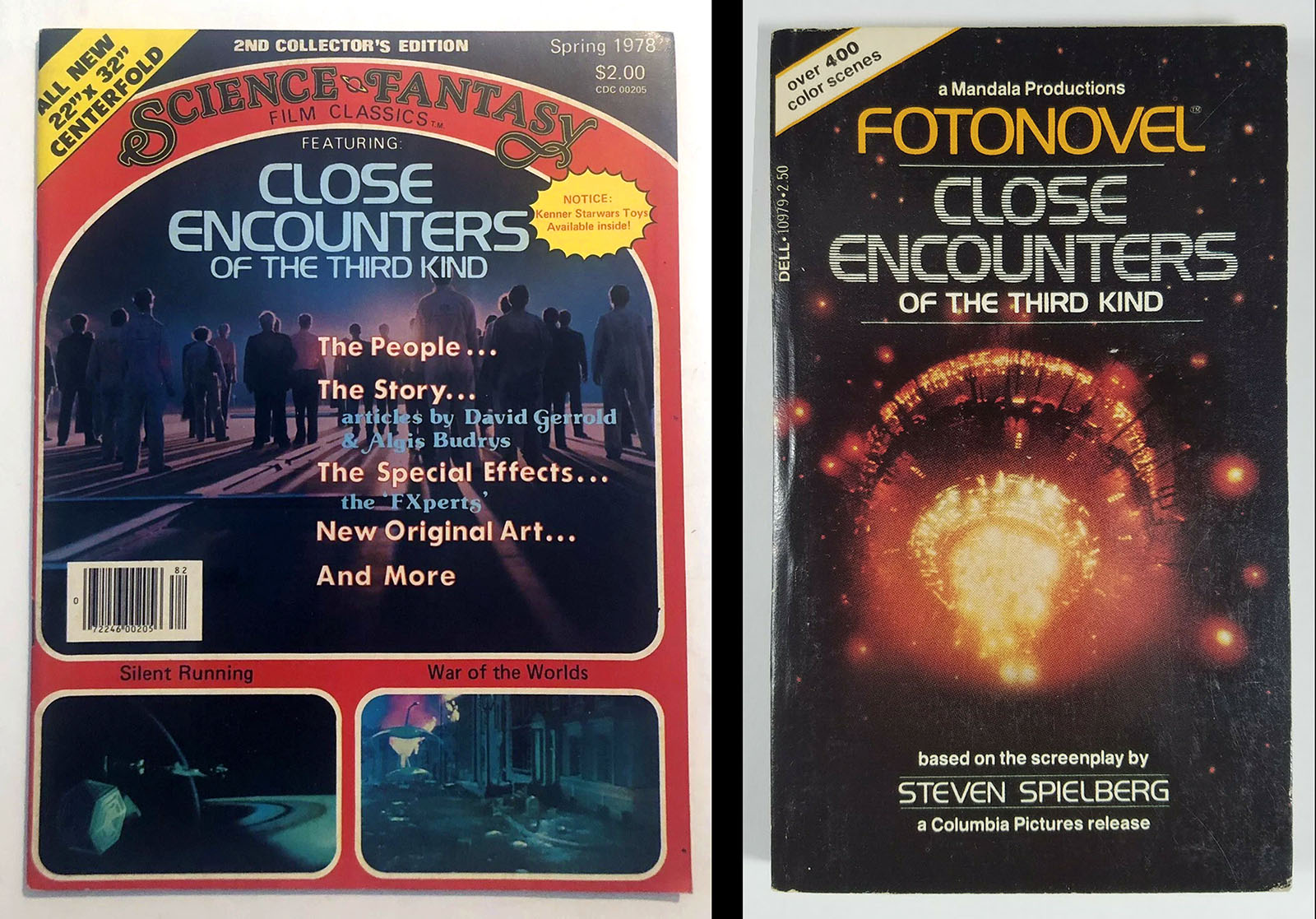
Science Fantasy Film Classics
Spring 1978
Close Encounters Fotonovel
Dell publishing
See some interior pages here
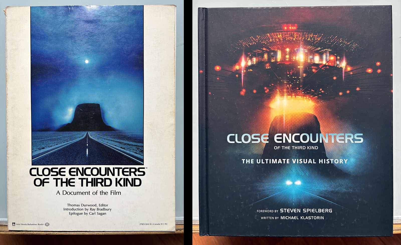
Close Encounters
A Document of the Film
Ariel Books/Ballantine Books, 1978
Close Encounters
The Ultimate Visual History
Harper Collins, 2017
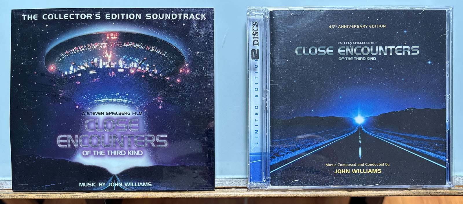
20th Anniversary Edition Soundtrack
Contains 26 tracks on 1 disc
Play it on Youtube here
45th Anniversary Edition Soundtrack
Contains 54 tracks on 2 discs