
The webcomic future: Pitsberg (part 3)
In the final part of this series, I’ll talk about the remaining experiments I undertook in the making of my SF webcomic, still the most complex and ambitious story I’ve ever created. I hope this gives you a greater appreciation for the typhoon of ideas that flowed into me from who-knows-where, and also gives you inspiration to take chances with your own work. This is what can happen when you don’t wait around for permission.
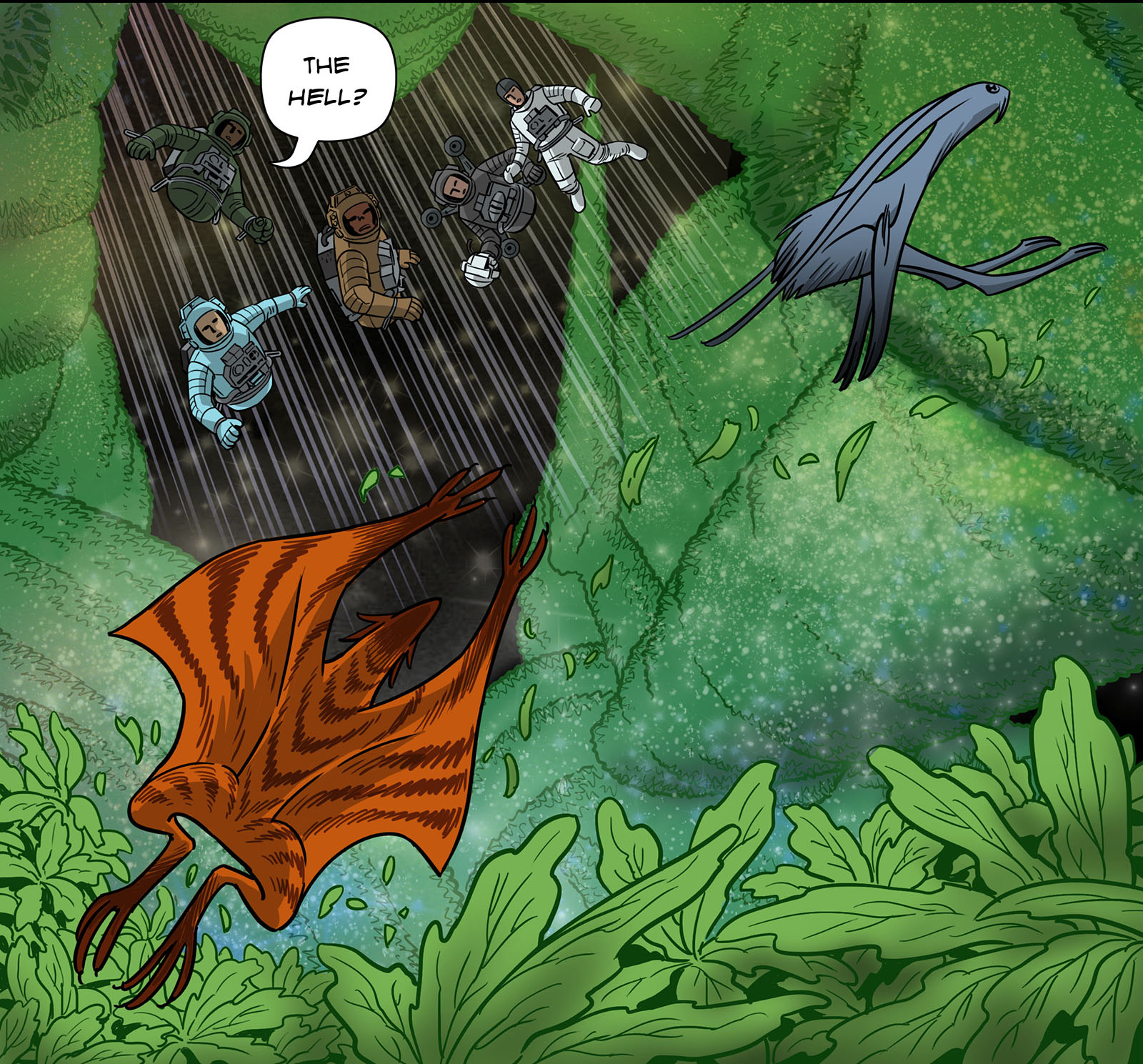
This right here was the dream image that started the whole thing. (From Chapter 9)
Experiment 11: The soundtrack
I was just sitting at the office one day in 2015, minding my duty station, when I got a message from my longtime friend Johnny Ceravolo. He asked me if I could make a movie and hire him to write the soundtrack. He’s a musician, and he was just itching to write a score for something. I answered that I could if he had a few million bucks to hand over, but in the meantime maybe he could write music for this webcomic I was developing.
And just like that, Pitsberg went multimedia. Johnny’s text gave me the idea instantly. The comic would be published electronically, so there were no barriers to adding a soundtrack. As I pondered how it could be structured, I thought the music could be built to loop since everyone would read at their own pace. That is, write a melody to fit the mood of a scene, play it through, and then have it repeat. That seemed like the easiest approach.
We started out that way, and Johnny knocked it out of the park in Chapter 1. I can’t tell you how much time I’ve spent listening to his “Greenhouse” theme, which never stops being elegant and beautiful. An enhanced version comes up again later at the start of Chapter 6 where the greenhouse meets its “fate,” which was like an elegant and beautiful punch in the gut.
Over time, we moved away from the “looping” idea when I thought it would be better to mold the music like a score to hit specific moments. The only way to do that was to read the comic at what I thought would be an average pace and create a list of timing cues for Johnny to hit. Writing and creating music is still a form of magic to me, so I can’t even begin to describe what happened when Johnny hid himself away in his sound cave. All I knew was a few days or weeks later, I’d get tracks from him that were all far beyond anything I could anticipate. He created a voice for the story that I couldn’t have imagined before I got his text.
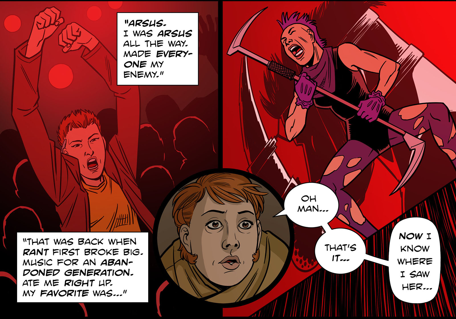
Then it dialed up a notch when I got the idea to weave a song into the story. An actual song with lyrics and singing. When I asked Johnny what he thought could be done, he introduced me to his friend Shikhee D’iordna, who performs very progressive music under the name Android Lust. The concept of adding a song was not arbitrary; I wanted one of the main characters (Brae Baeza) to be a former singer in a rant band, which was this world’s version of punk rock. In the chapter where this is revealed, I wanted to create the comic version of a music video with her performing. For this, I needed a song. When I heard Shikhee’s music, it was a great fit. But what were the chances that she, an established musician, would be willing to contribute a song to my little story?
As it turned out, she was intrigued. Johnny sent her a link to the Pitsberg website after we’d gotten underway. She read the early chapters and saw their value. She understood and appreciated what they had to say about the fate of human beings ground up and chopped to pieces by capitalism. We had one meeting in person where we discussed the idea, and that turned out to be enough. The lyrics would be the words of someone who never felt more alive than at the moment before death. That became the title: Never More Alive.
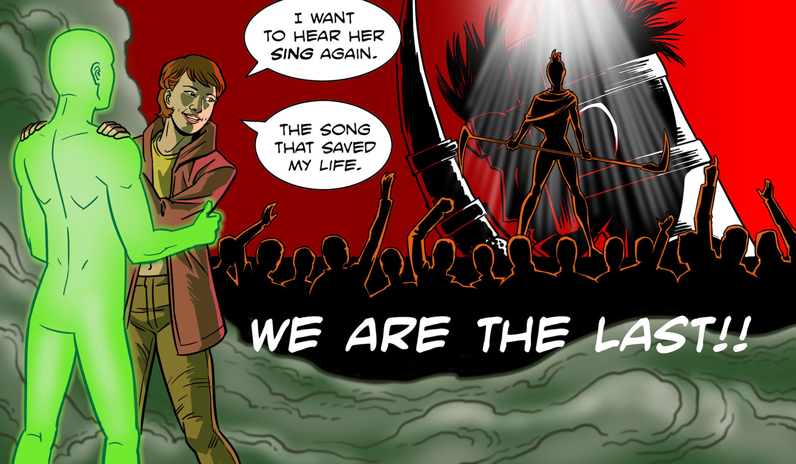
When she delivered the track, it was so strong and felt so important I reshaped the story to fit around it. It gets quoted several times (most significantly in Chapter 6), and I even found another place to play it in Chapter 7. Never More Alive was, both literally and conceptually, a gift from Shikhee that I can never repay. I didn’t ask for any exclusivity, and she didn’t charge me a dime.
Before this experience, I could only wish that such generosity existed. Then both Johnny and Shikhee granted that wish. Pitsberg became many times better thanks to them.
Meet Johnny here
Meet Shikhee here
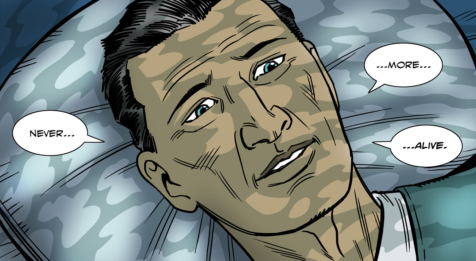
Sidebar: Making the Music
by Johnny Ceravolo
It is difficult to put into words what working on Pitsberg did to my relationship with music. I had never done something like that before. With every chapter I found myself descending deeper and deeper into the natures of existing and new characters, a realm, different environments, sociological and political themes, and existential questions that all point to the ultimate question facing metacognitive existence: How do we survive ourselves?
There are always those who exploit and those who are exploited. How do the exploited respond to their assailants? At what point do the exploited explode and revolt? What shape does that revolt take on? Is it possible to take power from those who have taken power? How do the oppressed and exploited topple tyranny?
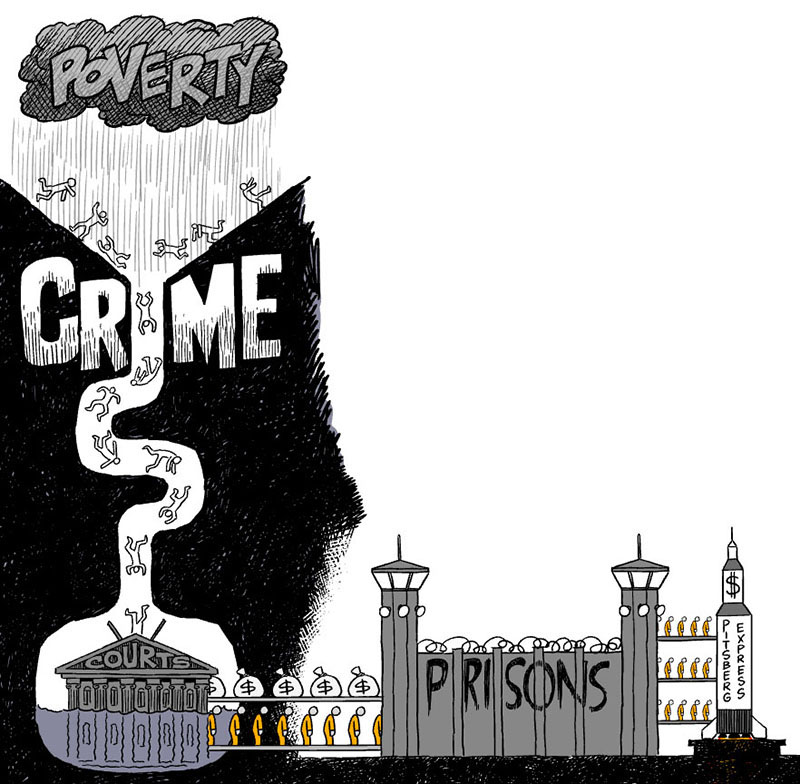
As I moved through the chapters I felt myself getting more and more depressed and angry. It got to the point where working on the chapters began to darken me in ways I had not expected. This was especially so in Video Chapter 5 where Tim projects into the future and imagines outcomes dark and troubling. It was in this particular moment that I felt something inside me snap. The image of humans being funneled into prisons and sent off to work camps in space revealed to me how dark and corrupt the billionaire class was willing to become. This image of oppression has proven quite prescient. It is no longer hyperbolic or inconceivable to see Tim’s cautionary imagining of the future coming true. It almost seems inevitable now.
After crossing this line, it was no longer about trying to serve a scene or underscore narration or create a perceived musical environment. It was war. It was revolution. It was a resolute understanding that something more important than art was happening. Art was the weapon, but it wasn’t the war.

Throughout the series, I employed a lot of strings and piano. I avoided complexity, especially harmonic complexity. I think any harmonic inference in the pieces throughout was deliberately limited to two tone chords or arpeggiated chords. This was done to create a sense of isolation and separateness. Where the characters all felt like individual notes, marooned from one another while still inextricably linked.
Under tyranny, individuals become convinced they are only one person who can’t make a difference. They have been convinced by their oppressors they don’t have the numbers or the force of numbers to topple the regime. It is the first and most important lie tyrants weaponize to inculcate the minds of the masses. “I’m only one person. What can I do?” The challenge with this approach was to create rich harmony that united all of the oppressed individuals, though unbeknownst to them.
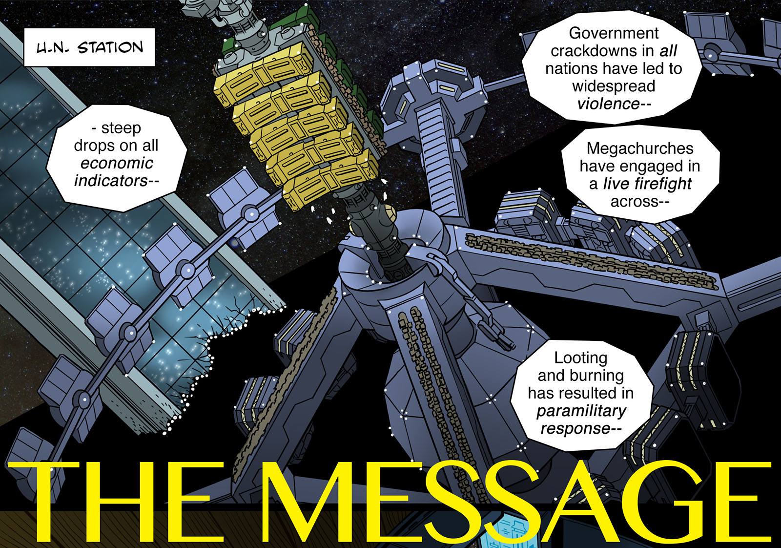
I felt like this was best achieved in Webcomic Chapter 10. It didn’t feel like I really landed the intention of this approach until the very end. I had been trying to get there and didn’t really feel like I hit the mark until the very end. The irony is that this frustrating experience of fighting to get the output to match the intention, and never feeling like I got there, created an unintentional longing and tension throughout that I think served the work in total. In the end, the failures were unforeseen successes.
That tracks with the experience of making this music over the course of several years. There were so many 3am moments where I had been working for 16-plus hours to no avail, and then suddenly some weird accident or misstep would point me in the direction that would lead to discovery. I never felt inspired in this. I felt compelled and led. I felt a complete absence of mirth. It broke me over and over again and I couldn’t stop. I remember at one point staring at a blank session and hating that this was reality. That oppression and tyranny were massive, real, repeated throughout history, predictable, worsening, redundant, and ubiquitous. Terrible was everywhere and extending from past into the future.
The piece I am most proud of is the final Video Chapter 8. It is one of my most satisfying compositions. And I feel like it punctuates Tim’s final closing thoughts elegantly. About halfway through the project, Tim gave me a sense of where things were going to end up and I immediately picked up my acoustic guitar and played what would become the final piece of music in this work. I played it over and over as I moved through the chapters. It became a salve that kept my soul pieces barely stitched together, so the work could continue. I especially love the choice to not resolve at the end.
“The human race came alive and got to witness the universe. When you get a gift that rare, you don’t throw it away. Is this a happy ending? No. There are no endings. Only change.”
Experiment 12: Collaborations
Johnny turned out to be only the first in a team of collaborators, all of whom were extremely talented and supportive. It was the first time in many years that I turned over some of the reigns to others on a comic project, but it was 100% the right way to go.
One thing I figured out early on was that I should hire a colorist. I was perfectly capable of doing it myself, but if I added that to my other tasks it would take me MUCH longer to finish a chapter. I had sufficient income at the time (directing Avengers cartoons for Marvel Animation Studio), so I could afford the going rate of $50 a page for someone to take that labor off my hands.
I’d been out of the comic book biz for about 20 years at that point, so I consulted with a friend of mine from the Malibu days, Dave Lanphear. He’d been running his own lettering and graphic arts studio for a while, and had a network. From that network came Betsy Golden, who I hired as soon as I saw what she could do. She’d been involved in various projects for Image and had major chops. Regrettably, I only got five chapters out of her before she received an offer from DC that required exclusivity. But in the short time we worked together, she set a high bar. I remember looking through Chapter 1 for the first time and thinking, “Man, this looks like stills from a really good animated film.” Which is exactly what I’d hoped for.
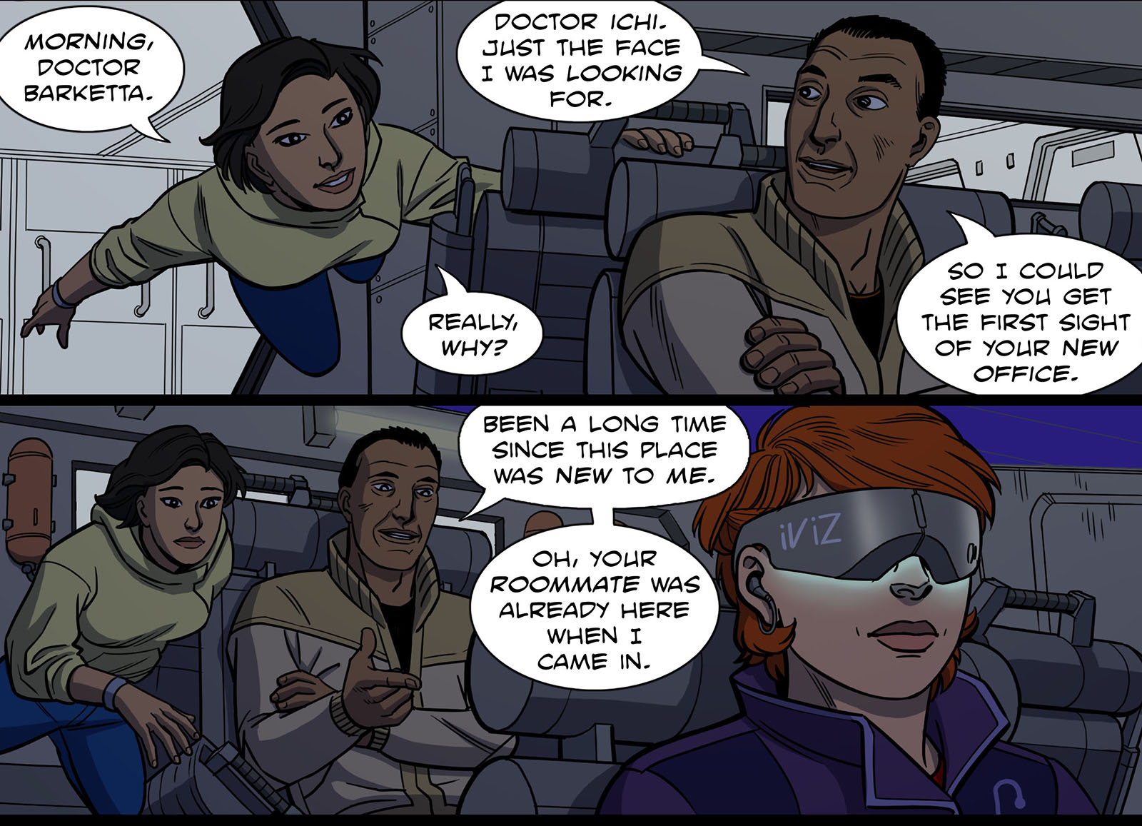
Betsy colors from Chapter 1
Betsy recommended a fill-in colorist named Chris Northrop who kept me on track for the next two chapters, and then I found Aaron Johnson, who became my right-hand guy for the rest of the run. Aaron was up for any challenge, willing to follow me down every crazy road and give me everything I asked for while gaining valuable experience and developing his craft. I couldn’t have asked for a better partner. We both came out of it richer for working together, and he’s traveled many more roads since then.
However, the first color you actually saw (in Chapter 1) came from a beginner named Alessia Matera. She was a production assistant at Marvel (on Avengers Assemble) while developing digital painting skills on the side. Incidentally, you may have noticed that she has the same name as my main character. Not a coincidence; when I was looking for a name, hers seemed just right. (I asked for her permission, of course.) I wanted the dream sequences to have a watercolor look, and Alessia was honored to be asked. It became her first professionally published work of any kind.
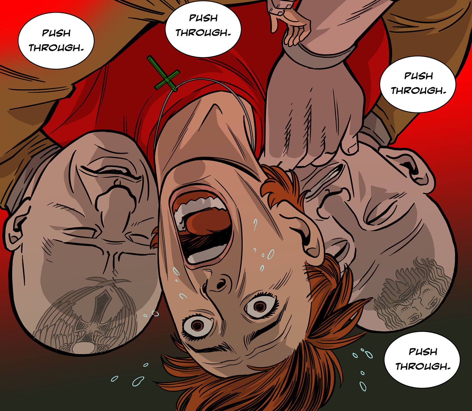
I may never create a moment this traumatic again. But I’ll try.
True to my expectations, the process went a lot faster thanks to these collaborations. What I didn’t expect was that it helped me to understand the work better. Every time I handed out a chapter for coloring, I had to explain why I made certain choices, and how color would reinforce them. I’d learned plenty about color theory, but this time it was a fundamental part of the storytelling in whole new ways. Every choice was deliberate, and having to articulate it to a colorist made me accountable to those choices.
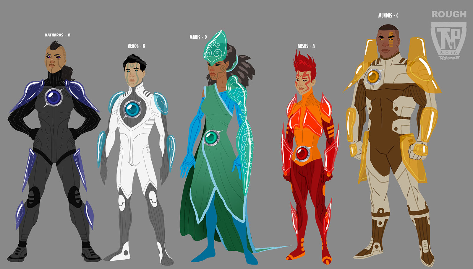
Another motivation to collaborate came directly from the Fallen Heroes chapters.
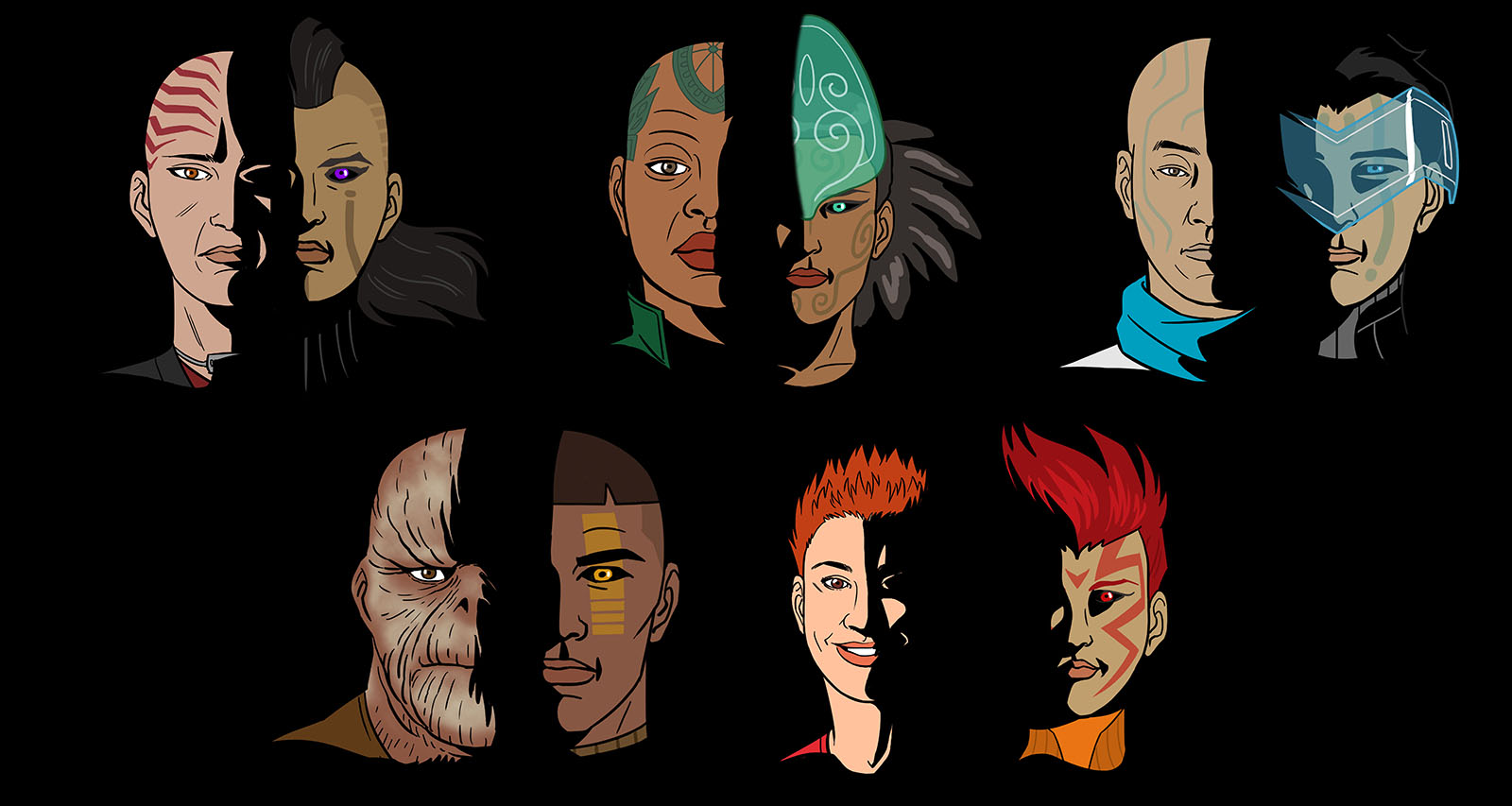
From the start, I wanted them have a different look from the main story. If I drew them, I knew that I’d sink back into my natural drawing style no matter how hard I tried to vary it. Instead of struggling with that, I went looking for someone else. This began with character design. I wanted the Heroes to look like something I didn’t invent myself. So I went to one of my best friends in the character design business, Thomas Perkins. He and I met at the start of our animation careers (on Extreme Ghostbusters) and have landed in the same cartoon crew more than once. And no wonder; he’s one of the most gifted designers I’ve ever met.
We got together for lunch, I explained the concept, and he was mightily intrigued; enough to lend his efforts in exchange for some future favor (still here, Thom). In just a couple rounds, he delivered top-notch designs that I adapted into the story. I did a few followup illustrations myself, but for the actual comic art I had someone else in mind.
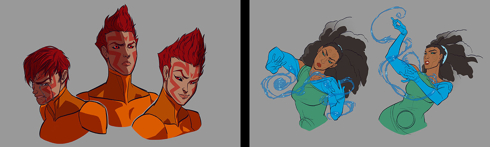
That was Jess Cuffe, who was on my Avengers storyboard team. I knew she could bring an imagination and energy to Fallen Heroes that would match my own, and her art looked just different enough to give Fallen Heroes its own identity. Our arrangement was that I would write the scripts and design the pages, and she would create the finished character art. I then went in to draw backgrounds, going for a more organic style than in the main chapters.
In a dream world, I would have hired Moebius to draw Fallen Heroes. It always felt like a Moebius story to me. All I could hope was that all of us together could add up to his level of genius. You’ll have to be the judge of that.
Experiment 13: Color theory
Whenever I colored my own comics prior to this, their color theory was “inherited.” When I did adaptations of anime (Star Blazers, Votoms, Cyber City) the palette was pre-determined by the filmmakers. When I colored my first few Grease Monkey stories, I had an actual comic book colorist (my friend Albert Deschesne) do Episode 1 and I followed his lead. Thus, Pitsberg became the first project where I originated the color choices from the ground up.
My earliest thought about this was to make the backgrounds monochrome in order to “push” the characters forward. This idea went by the wayside when I realized that the backgrounds needed full color to achieve the realism I was after. So much for saving time and labor.
My color choices for the characters themselves were partly decided by the environment they were in and partly by the clothing they had to wear, but I wove in something more sneaky, and I wonder if anyone picked up on it. Each of the space miners we meet has a counterpart in Fallen Heroes. They not only have the same ethnicity, their outfits have the same color palette. Alessia starts with variations, but finds her way there as her true self emerges.
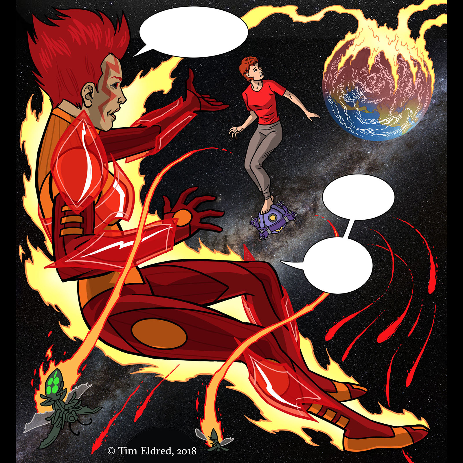
Then there’s “the green,” which might just be the most abstract plot point I’ve ever come up with, but it gets reinforced all over the place when you know what to look for. I love coming up with stuff that you probably won’t catch on your first reading. Anyone who goes back in for seconds gets rewarded for their time.
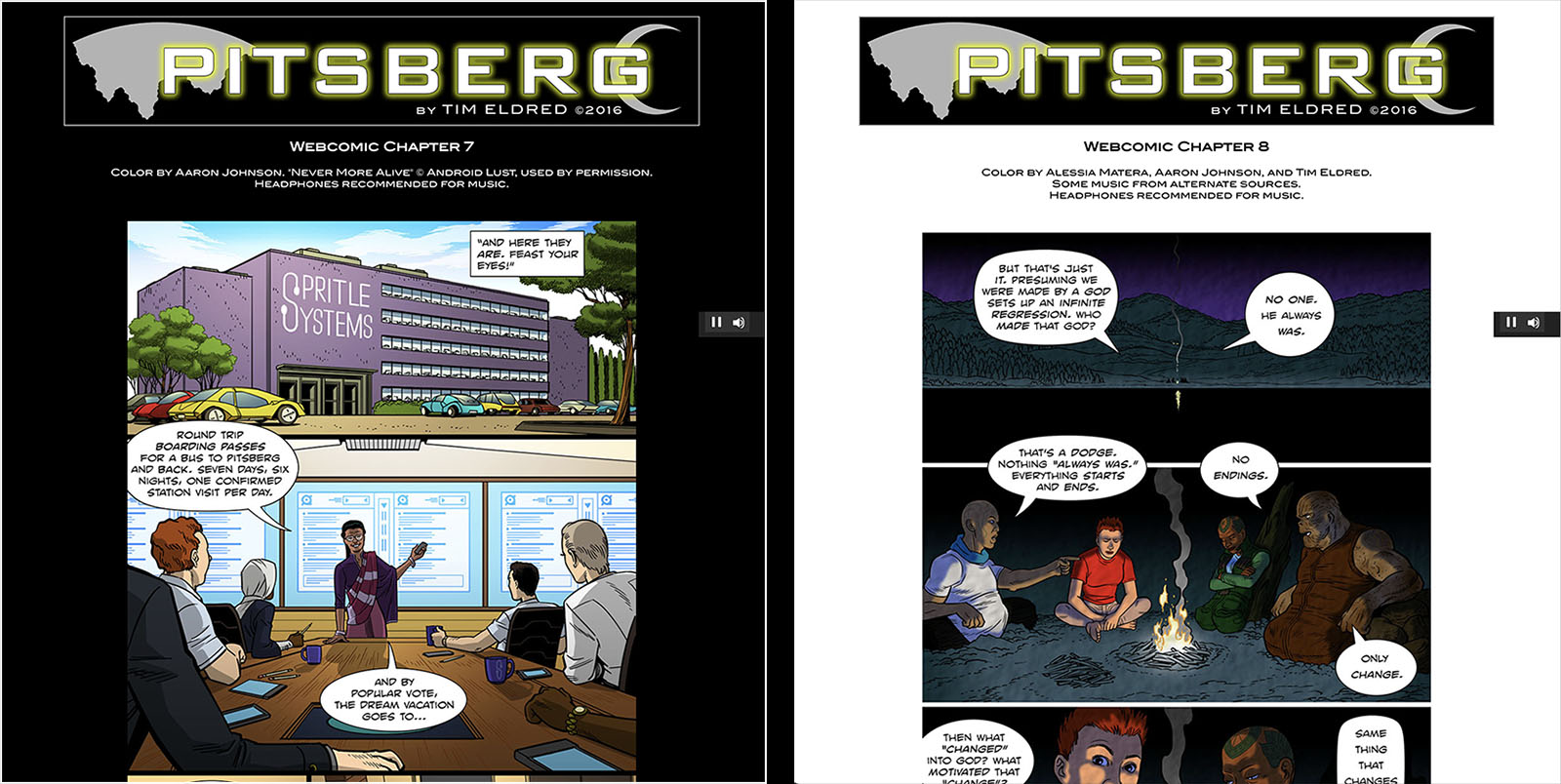
Finally, the “master color” is built into the website itself, representing the night side of the Pitsberg asteroid itself. It’s the blackest possible black, a complete absence of color that hangs over everything. I first used the “black canvas” technique on Captain Harlock, and wanted to make it the load-bearing foundation of Pitsberg.
But there’s one exception: in Chapter 8, the canvas flips to white. That’s when we go to the day side of Pitsberg, which is drenched in so much reflective sunlight that it blinds you. It took years to reach the payoff of that chapter, and I couldn’t believe how beautiful it looked.
Experiment 14: Dedicated website
Coordinating what I described above was part of the negotiation process for creating the website. I say “negotiation,” because I didn’t know if it was going to be possible until I started talking with my web designer.
Creating a site to contain Pitsberg was the most important part of the project. Grease Monkey had its own website, and my Star Blazers comics had a home at Cosmo DNA, so it seemed natural that Pitsberg would need one as well.
The overall design was one of the first things I had to solve, and since the focal point was going to be a chapter index, I had to determine the flow and content of each chapter in order to design a “map” to follow. I thought it would be cool to have a new part of that map “light up” each time a new chapter was added, a “bookmark” to make it clear where you were in the story. I’ve always wanted my sites to look unlike anything else out there, so I brought it up in the very first meeting with my web designer, Tom Hakim. He built the Grease Monkey site to my specs, so I knew he was up for a challenge.
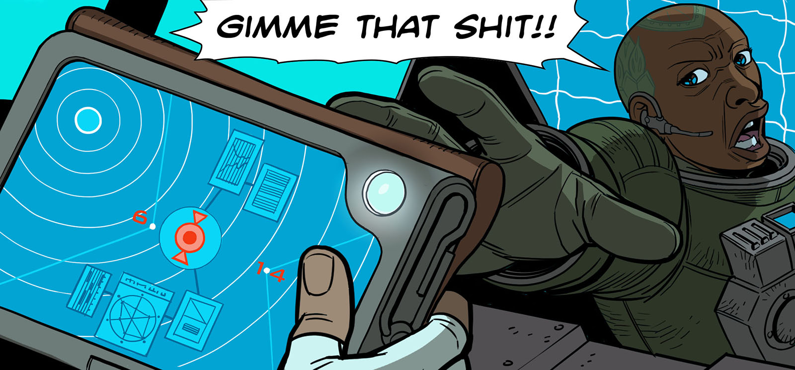
Pitsberg pushed the parameters beyond Tom’s experience, so he brought in his MVP, Kim Fox. Her interest in the fringes of web technology found a solution to every wonky thing I asked for. She turned the chapter index into something I could update on my own, worked out the mechanics of syncing Johnny’s music with specific images as they scrolled by, programmed the Fallen Heroes chapters to scroll horizontally, and gave me complete control over every element that needed periodic updating. It was a dream come true to see all those dreams come true.
Naturally, when it came time to create ArtValt, I returned to Tom and Kim. When I got The Last Blue Eagle ready for its debut, they were right there to make the digital magic happen again.
In the time since then, I’ve come to understand that a highly customized site is sort of like a high-performance hot rod. What I considered a common-sense platform to present my work to the world now seems rare enough to impress people all by itself. A site that doesn’t feel like social media, doesn’t look like a news aggregator, and isn’t packed full of obnoxious advertising feels like luxury. A coffee table book amidst a swirl of magazines, maybe.
With such an animal comes limitations; my sites are not exactly mobile-friendly. I warn people going in, you won’t like reading it on a phone. I work for the big screen. A tablet at the very least. As soon as they see it, they get it. Does that leave a lot of people out? Does it put me into self-imposed exile? Maybe. But I like the idea that as the internet gets more and more overrun with noise, I can offer an alternative.
Experiment 15: Lucky accidents
An accident stretches the definition of “experiment” since you need some measure of control over things to conduct an experiment. But it could also be said that keeping yourself open to accidental discoveries is an experimental state of mind. It certainly served me well. Occasionally I realized after the fact that something had worked in my favor without forethought, and other times an idea suddenly occurred to me just as it became important to the story (usually when I was out on a run or cleaning up in the shower afterward). There were many such accidents, but here are the ones that stand out in my memory.
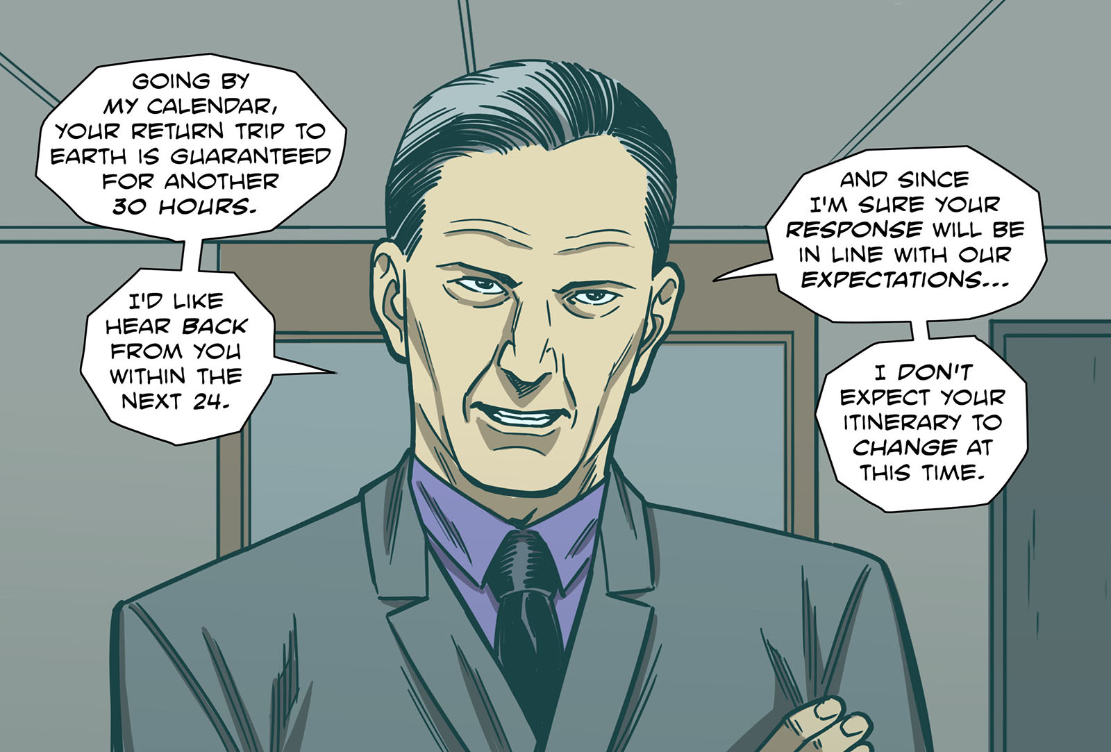
Lessi is a detective trying to dig up info on Culton Ferris, but at the beginning I didn’t think too hard about who she was working for. Her company Spritle, of course, but why would her company be after this info? Was someone else bankrolling the effort? Just before I started writing Chapter 7 it hit me out of nowhere: Arnold Jacek. This was a background guy who got mentioned once or twice before, and then he vanished from the plot. But he was the ONLY one with the motivation to get the plot going, so it had to be him. I repeat, this thought did not occur to me until shortly before he had to step onto the stage and reveal himself. As if he pulled the same trick on me that he pulled on Lessi. And this is why I usually feel like I discover stories rather than create them.
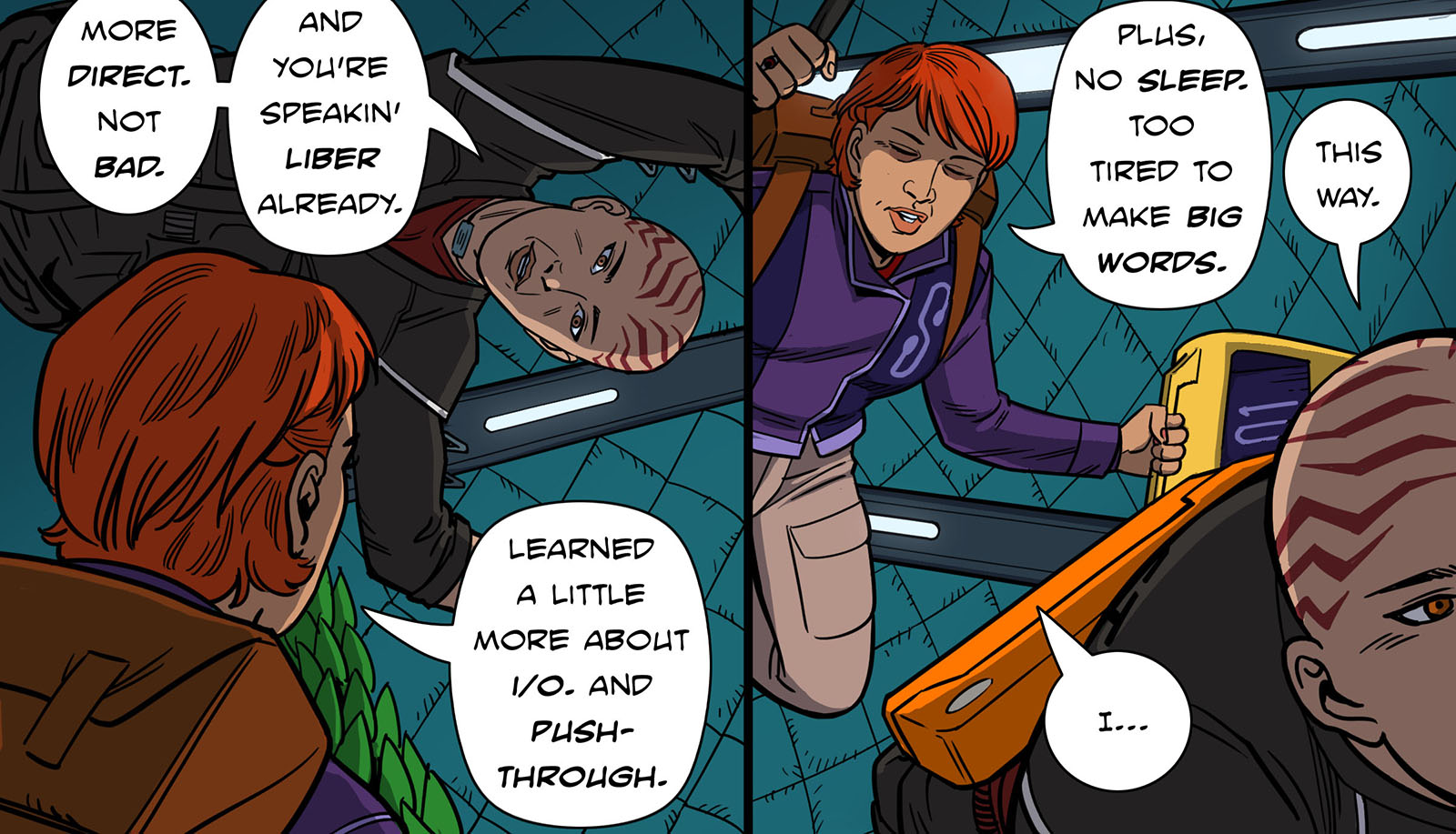
“Liber speak” was something I decided upon to (1) differentiate the Pitsberg miners from Earth people and (2) grapple with communication problems. The idea was for them to speak slowly, in as few words as possible, to get around the constant static emerging from the Pitsberg “soup.” Strangely enough, that turned their speech into a form of ebonics, which had its roots in slavery. And what are the Libers, if not corporate slaves? Figuring out how to express their speech visually was a new challenge. Their word balloons became vertical with stacked words, and I tried very hard to keep all the words under three syllables. Definitely something I’d never dealt with before. It taught me a lot about how dialogue placement controls your reading pace.
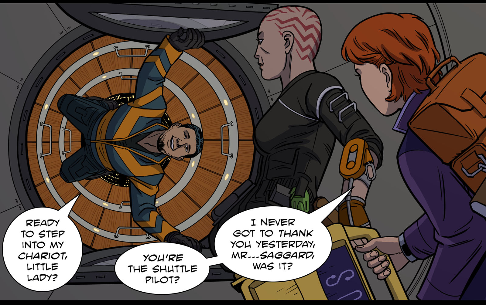
Back to the topic of color theory, since Lessi was tied to the Fallen Heroes character Arsus, the signature color for both of them was red. Every time something important happens to Lessi, there’s an element of red in the scene. When we see her dream self, she’s red. And by a complete coincidence – honest – her chauffeur through this story is a guy named Red. Honestly, I didn’t even put that together until I was a couple chapters in. I just wanted a cowboy name for him, and Red Saggard seemed cool. But there it is.
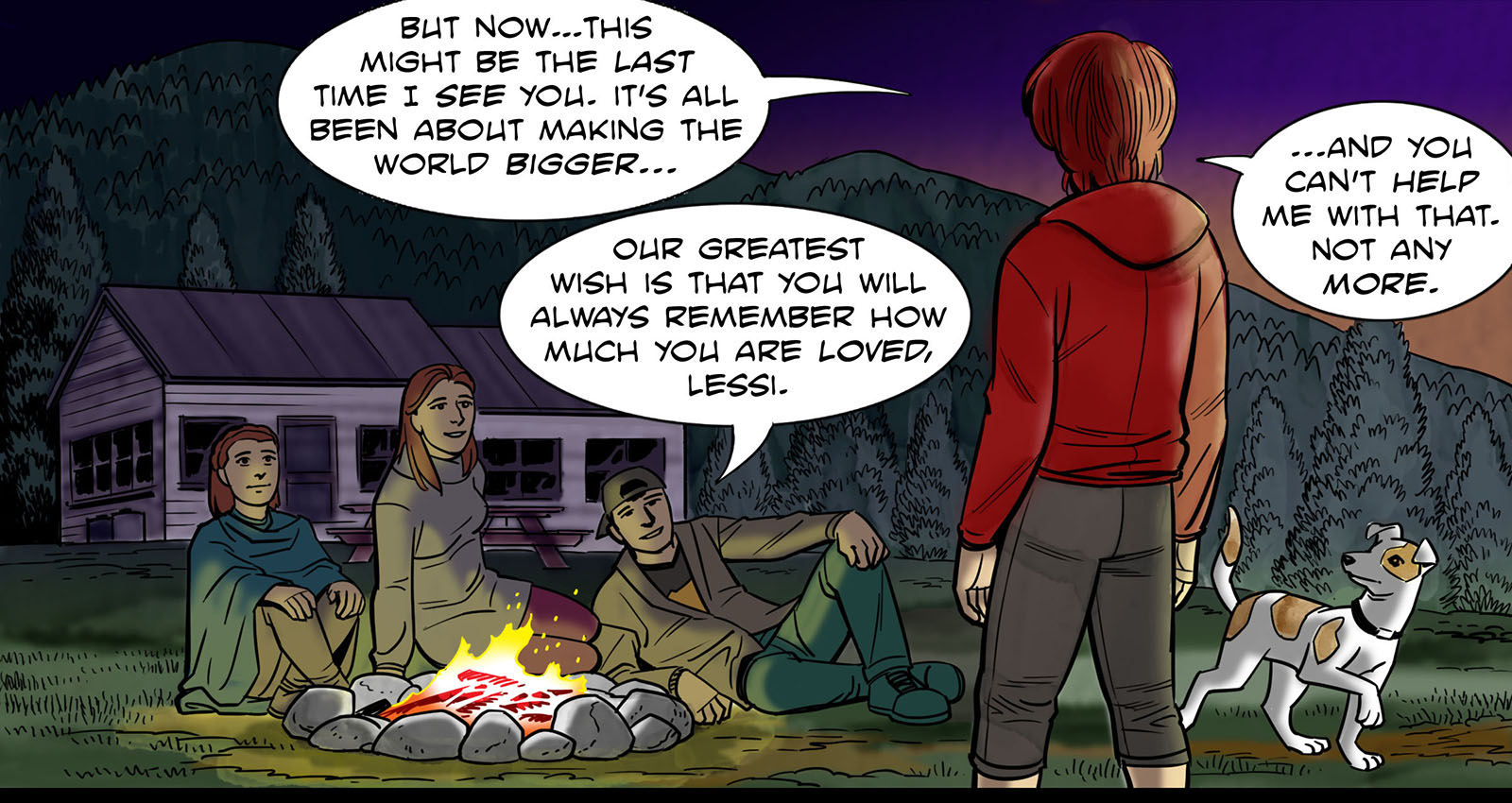
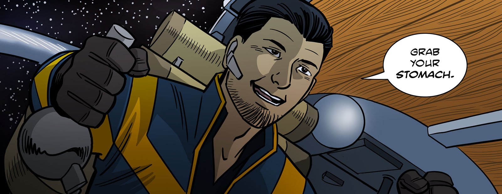
The last lucky accident I’ll mention here was my favorite one. I gave Lessi a dog, who you see in the flashbacks depicting her childhood. She named her dog Yerky, and transferred the name to her master sprite. Quite randomly, I decided Yerky was a Jack Russell Terrier, and the photo ref I used showed a white one with tan spots. This was decided in 2015. Two years later, I met a girl named Alissa. She had a Jack Russel Terrier named Luna. White with tan spots. We’re married now. Nobody could have predicted that one.
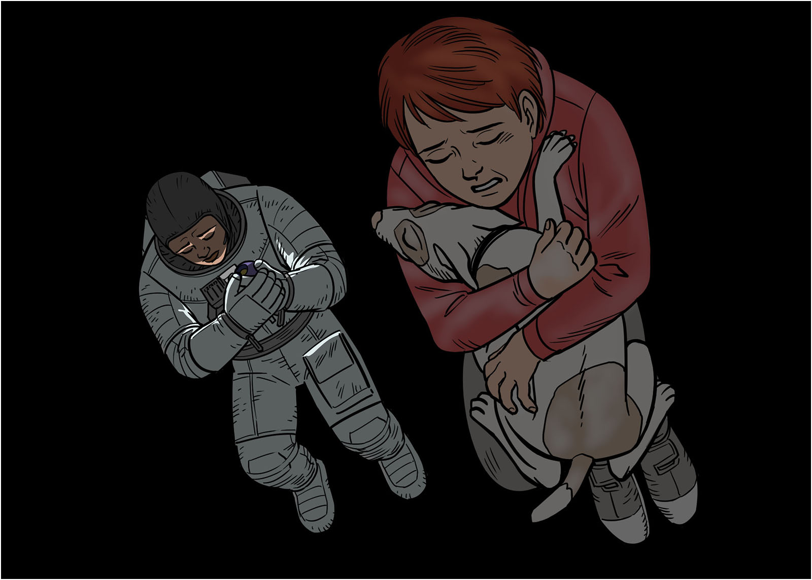
Luna posed for this shot.