Comics go to the movies: The Abyss, 1989
Hands up, who got to see The Abyss in a movie theater when it was released in August, 1989?
If your hand went up, I am jealous of you. A little over a week before it opened, I launched dual careers of being a father and drawing comic books for a living, so going out to see a movie was unthinkable. In previous years, I would have been there on opening day, but under these new conditions I didn’t even know it existed. It came and went without even pinging my radar.
Well over a year would pass before I had a chance to amend that, thanks to my cable company’s pay-per-view system. Back then, you’d call an automated service to request a film, then you’d tune into a specific channel to watch it at a specific time. Sometimes I’d set up my VCR to watch it for me.
Even on a small screen, it was one of the most intense viewing experiences I’d ever had. It helped that I was a night owl and could easily handle an 11pm start time, and the apartment was pitch black. From first frame to last, I was astonished by the quality of the writing, production design, acting, filmmaking, effects, stagecraft, music, use of color, you name it. It was a perfect step forward from Aliens and nicely captured the aesthetic of my favorite anime shows of the 80s.
In terms of wider context, The Abyss (along with Gunhed, released in Japan just a few weeks earlier) turned out to the be the last “solid state” SF action movie of the 80s (apart from the water tentacle, that is). The CG revolution was just around the corner, ready to change things for everyone. Movies that were physically challenging to make would get easier. If The Abyss were made today, for example, I doubt anyone in it would have to qualify as a professional diver.
The commitment to overcome physical challenges and actually incorporate them into the story was another of the components that made the film unforgettable. And thus, at no time while I was watching it did I think, “This would make a great comic book.”
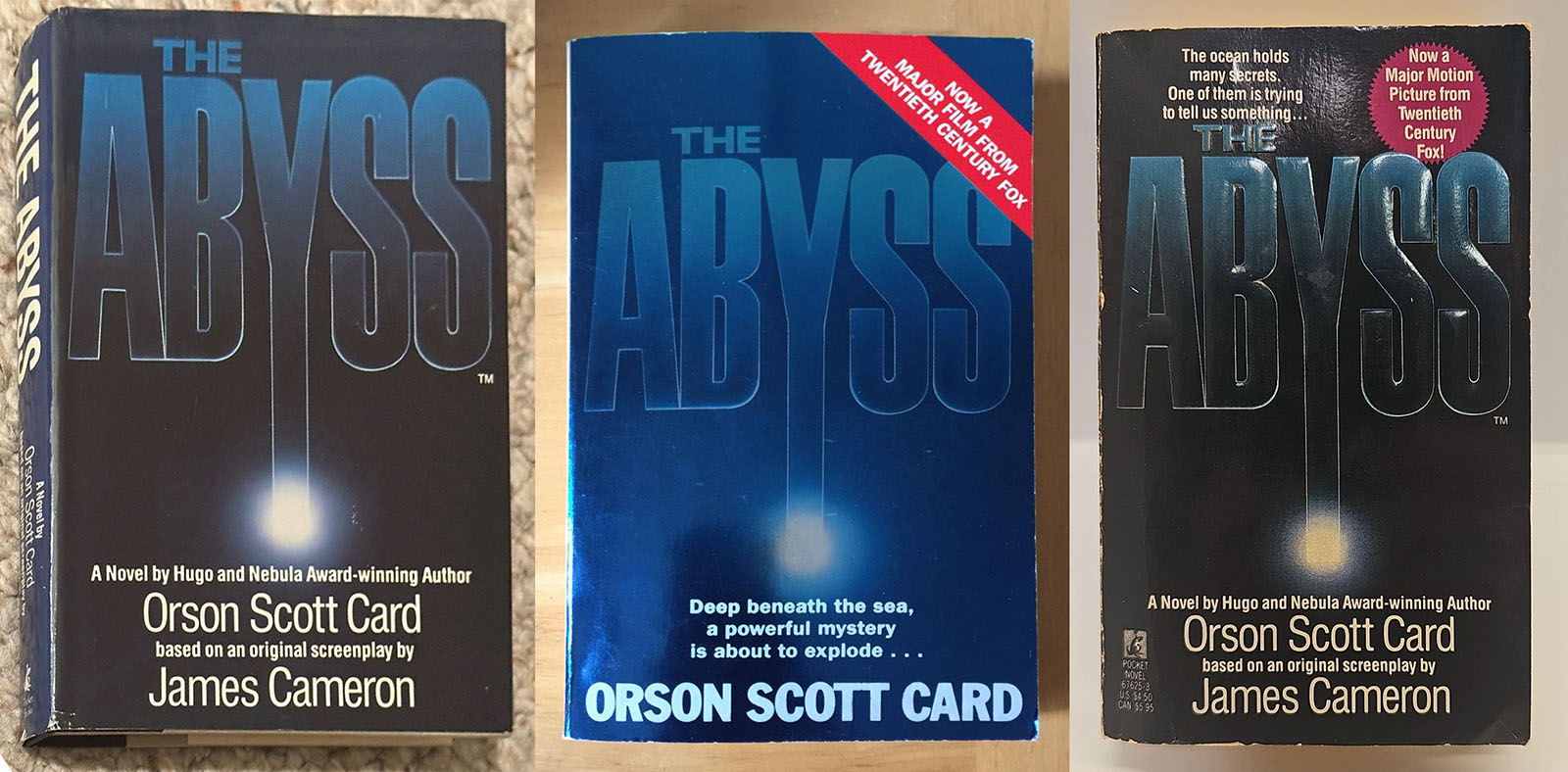
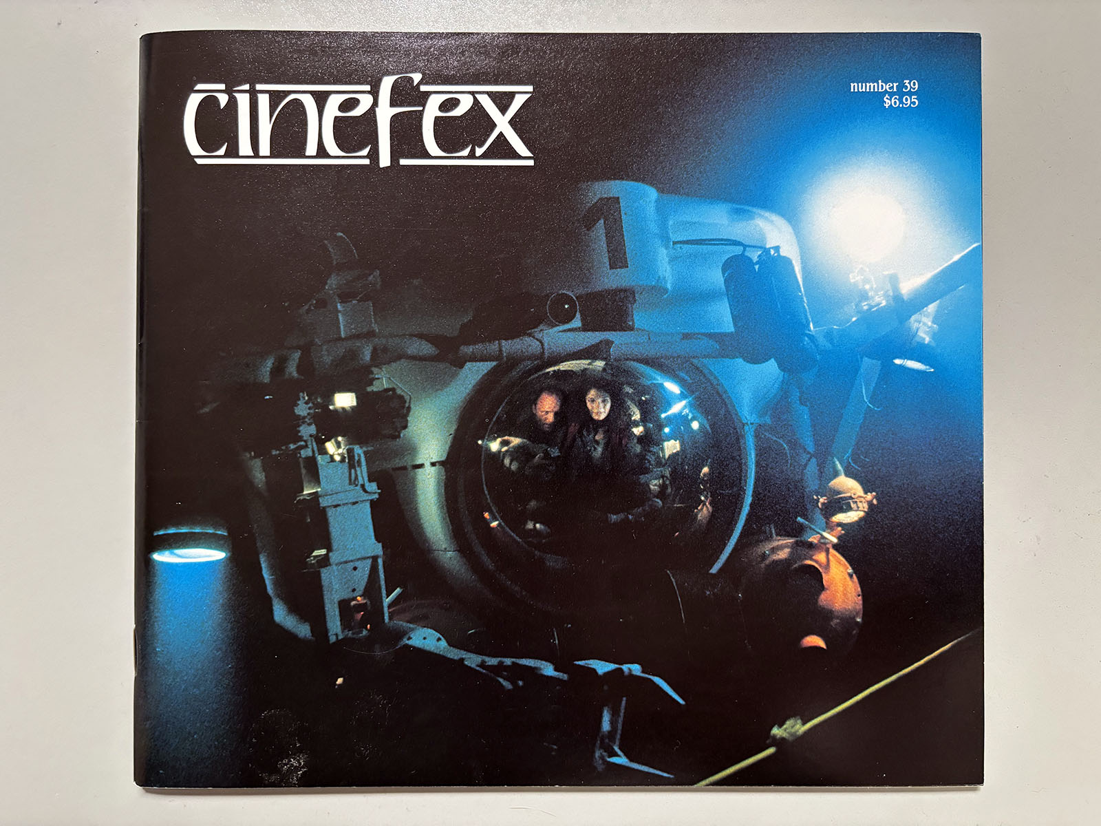
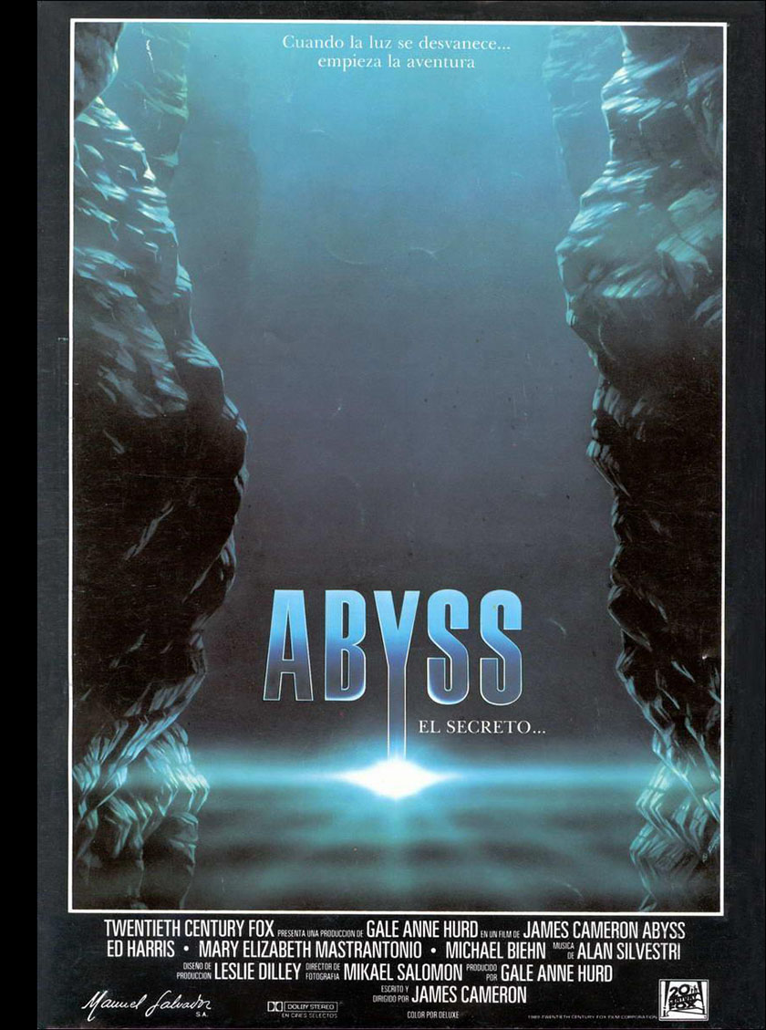
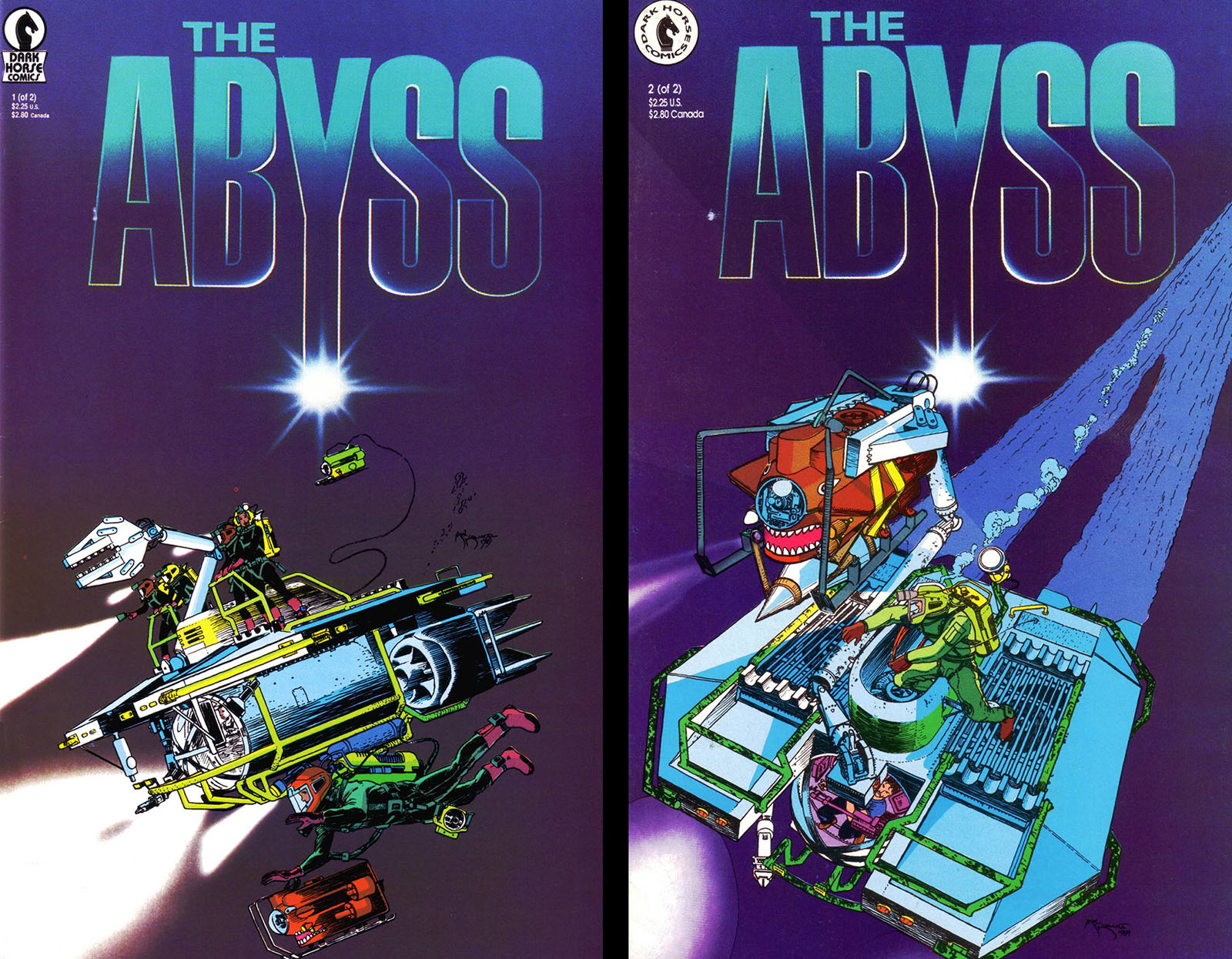
Nevertheless, there was also a comic book adaptation, published by Dark Horse. This too slipped right past me. Before deciding to write this article, all I’d seen of it was an ad in another Dark Horse title. It debuted with the film in August 1989 and took its place as one of just two print media spinoffs. The other was the novelization by Orson Scott Card, which I read a couple years later.
Since print media was always my thing, it was a disappointing to find so little for The Abyss. At the start of the 80s, every big movie was accompanied by books and magazines. They were built into the promotional strategy and did a lot to enlarge the viewing experience. If I liked a particular film, I’d buy and read the stuff, then see it again with extra insight. It taught the nuances of how storytelling functions in different media. (And it’s one of the reasons I write these articles today.)
Then home video kinda ruined it. Was it great to pick up a VHS tape or videodisc and see the movie at home? You bet it was. But over time it had a dulling effect on print media. Books became rarer. Comic book adaptations were on their way out at the end of the 80s, and “solid state” SF films would soon follow.
Since I didn’t actually take a look at Dark Horse’s version of The Abyss until this year, you can maybe tell that it wasn’t a high priority for me. It goes back to the reason I didn’t think to myself, “This would make a great comic book.” That reason was simply this: suspense.
You can do suspense in a movie. You can also do suspense in a novel. In a comic book, not so much.
Why? Because suspense is in the hands of whoever controls the experience.
When you watch a movie (especially in a theater), the filmmaker controls the experience. They decide how long to stay on a shot, the pace of editing, placement of sound and music, how the lighting directs your eye, and all the rest. When they do it right, the filmmaker takes control over all of your senses.
When you read a novel, the writer controls the experience. You can only go one page at a time, and the writer decides how much information to reveal at a deliberate pace. Sure, you could jump ahead and maybe spoil it, but who does that? You go in with a tacit understanding that the writer is in control.
But with a comic book, the reader controls the experience. As the reader, you have all the freedom to look at a whole page, or even flip through a whole comic, before absorbing a single word. Writers and artists do their best to make you resist that urge, vying for your attention with all sorts of tricks to guide you through a story one panel at a time. But we know full well that you can break off and jump ahead whenever you want to.
This is why suspense is VERY hard to pull off in a comic book. That doesn’t mean we don’t or shouldn’t try, it just means we can’t expect it to be as effective as in a movie or a novel. And that’s why a movie like The Abyss, which is entirely built on suspense, is a tough one to capture in comics.
Nevertheless, Dark Horse gave it a shot. How successful were they? Let’s find out.
The first sign of trouble was that the adaptation was only two issues (published two weeks apart). This wasn’t Dark Horse’s fault; Marvel had made it the standard by that time not to go beyond 48 pages. Why? Because a movie’s tenure in theaters was usually limited to less than 60 days. Long gone were the days when Star Wars and Empire got 6 issues apiece. Even Return of the Jedi got only 4. They were probably right to assume that a movie comic wouldn’t sustain itself up to six months after the premiere.
With some films, 48 pages worked out okay. The Dark Crystal did just fine at that length. The Abyss did not. And it comes right back to the question of how to best depict suspense in a comic book. If the panels are all crammed in tight, you don’t have room for suspense pacing. Setup and payoff could happen just a few panels apart, or across facing pages. The best you can hope for under those restrictions is to put a payoff moment behind a page turn.
High compression also makes it harder for an artist to create standout moments. On a comic page, a standout moment is usually one with scale and spectacle. Therefore, you want it to be bigger than the surrounding images. Maybe even a full splash page if you have the luxury. Without that luxury, you do the best you can to expand and compress within the boundaries of each page.
It sounds like I’m putting the weight of this on the artist, but the writer is just as responsible. The writer of a comic book is the first to decide how much content a page can hold and tries to envision how that page will be laid out. A very experienced writer becomes a master of this, but it’s usually left to the discretion of the artist who lays out the page. (As we saw on the 2010 adaptation, sometimes a layout artist can be different from the one who draws the finished art, which is a perfectly valid approach.)
Another thing about adapting a movie into a comic book is that it can’t be done mathematically. For example, if you have to squeeze a 2-hour film into 48 pages, it doesn’t mean each page has to cover 2.5 minutes of screen time. A filmmaker can pack a HUGE amount of information into 2.5 minutes that could never fit on a single comic book page. Conversely, there could be 2.5 minutes of slower scenes that wouldn’t be worth an entire comic page (especially if you’ve got denser scenes to cover). And, sometimes, a single line of narration in a comic book can replace an entire movie scene if it’s not going to add visual value.
Randy Stradley, a writer with a lot of experience, was the one who adapted the screenplay into this comic, and he closed the second issue with a very enlightening 1-page description of his technique. He also explained that adapting the shooting script rather than a workprint of the film offered some unique opportunities. Keep reading, you’ll find his page. (Incidentally, Randy was the first editor to give me a shot at making comics professionally, so my hat is permanently tipped to him.)
What about the look of the adaptation? The very best thing about it is that Mike Kaluta drew it. He entered the comic book industry in 1970, part of a generation that took influence from fine arts and classical illustration and applied it to graphic storytelling (more to the point, he didn’t limit himself to comics). He brought a craftsmanship to The Abyss rarely seen in movie adaptations. Reproducing the intricate design of the film wasn’t for the faint-hearted. With only a couple of months to get the work done, most artists would fudge the details. As one who always takes the details seriously, I can tell when someone’s phoning it in. Mike definitely did not.
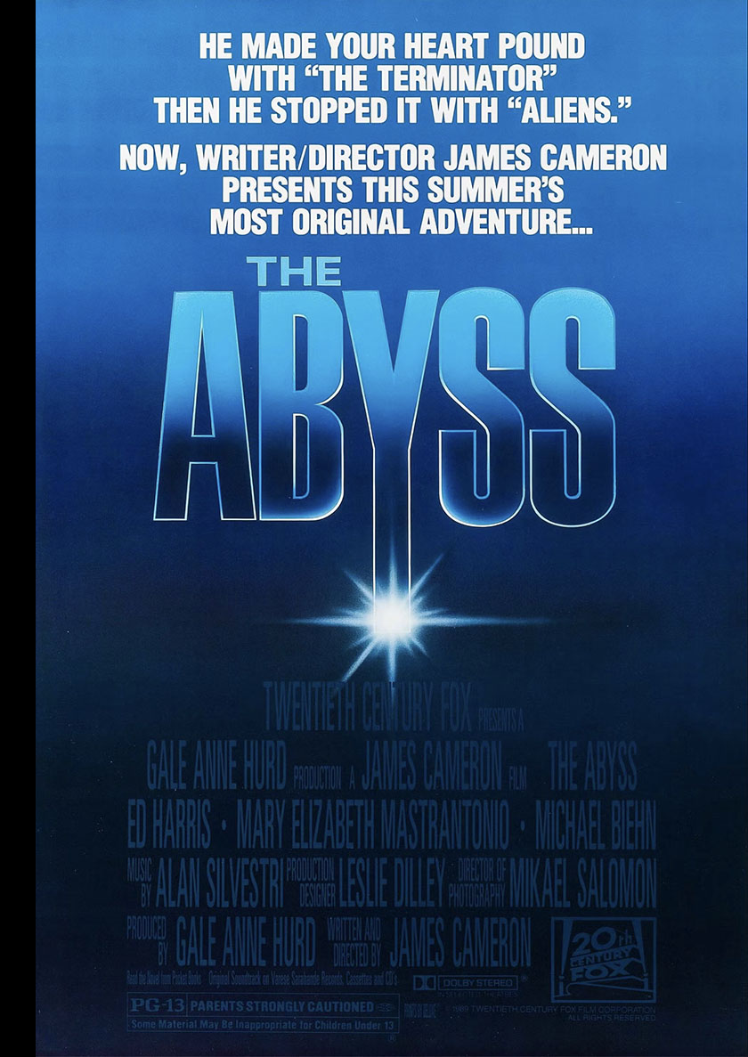
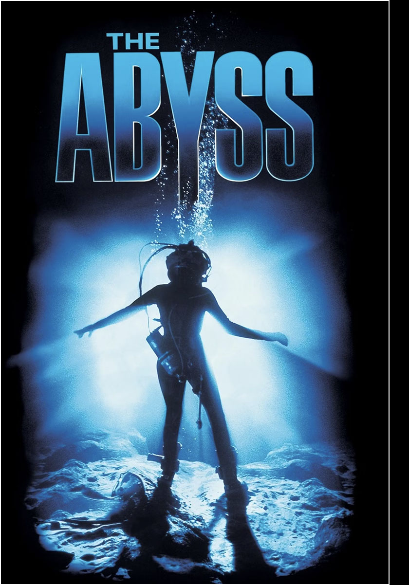
That said, I think an important opportunity was missed. To me, what really stands out in the visual presentation of The Abyss (film) is its color palette. The dense blacks and cold blues were an essential part of its visual vocabulary, as you can see in the images above. But, as you may have noticed, the canvas color for comic books is usually white. By “canvas,” I mean the area outside the panels: white margins, white gutters. Everything is built on top of that white. Sometimes, however, you can build on top of black instead.
The first time I tried that (on Captain Harlock: the Machine People), it made a huge difference. Black margins and black gutters encouraged me to do more with light and shadow and it became one of the best-looking comics I’d ever done.
I took the same approach with my webcomic Pitsberg to emphasize the heavy darkness of the environment, and I’m doing it again with The Last Blue Eagle because now I’m in love with it. It would have been very easy for the Abyss comic to take that approach, and I’m certain it would have greatly improved the presentation.
That brings me to the last, most important point I want to observe: the color.
This was, unfortunately, the deal-breaker in this adaptation. Not only did it completely ignore the color palette of the film, it did the last thing comic book color should do: distract you from the art. The pages became more confusing and more visually noisy because of the color. I could say a lot about the technical limitations of comic book color in pre-digital times, but I already did when talking about The Dark Crystal.
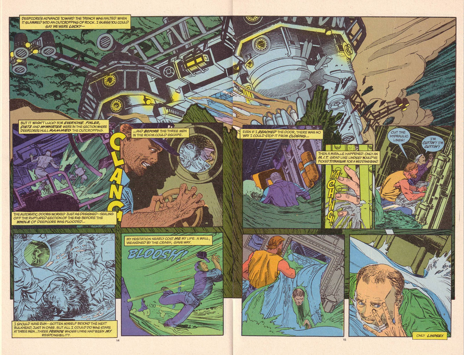
So instead, let’s just let the pictures do the talking. Here’s a 2-page spread from the first issue, as published.
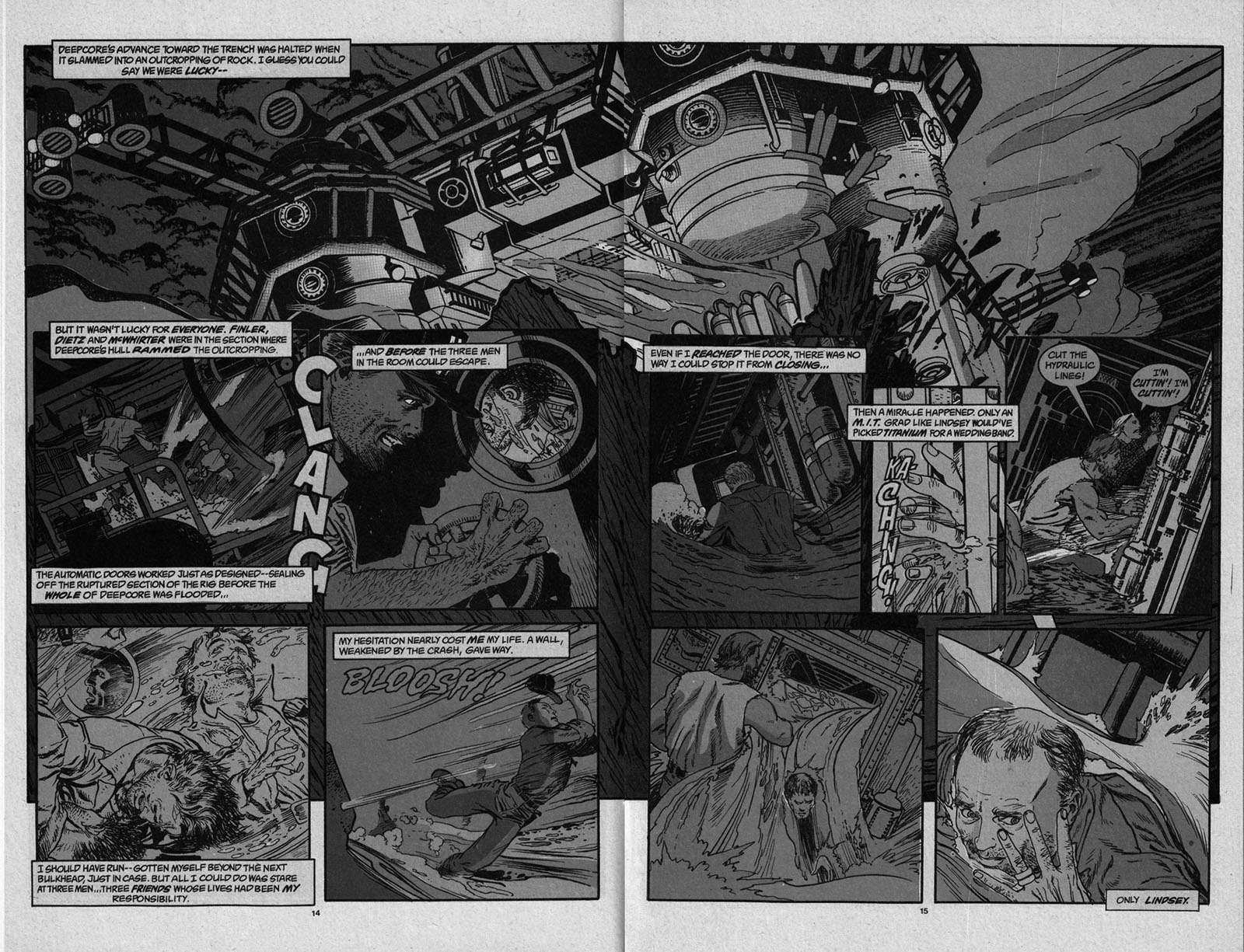
Now let’s see what happens when we convert that same page to greyscale and desaturate the color. Suddenly, it’s a lot clearer
Taking it one step further, let’s see how the page looks when we push it closer to the film’s color palette and build off a black canvas. Now we’ve got the mood.
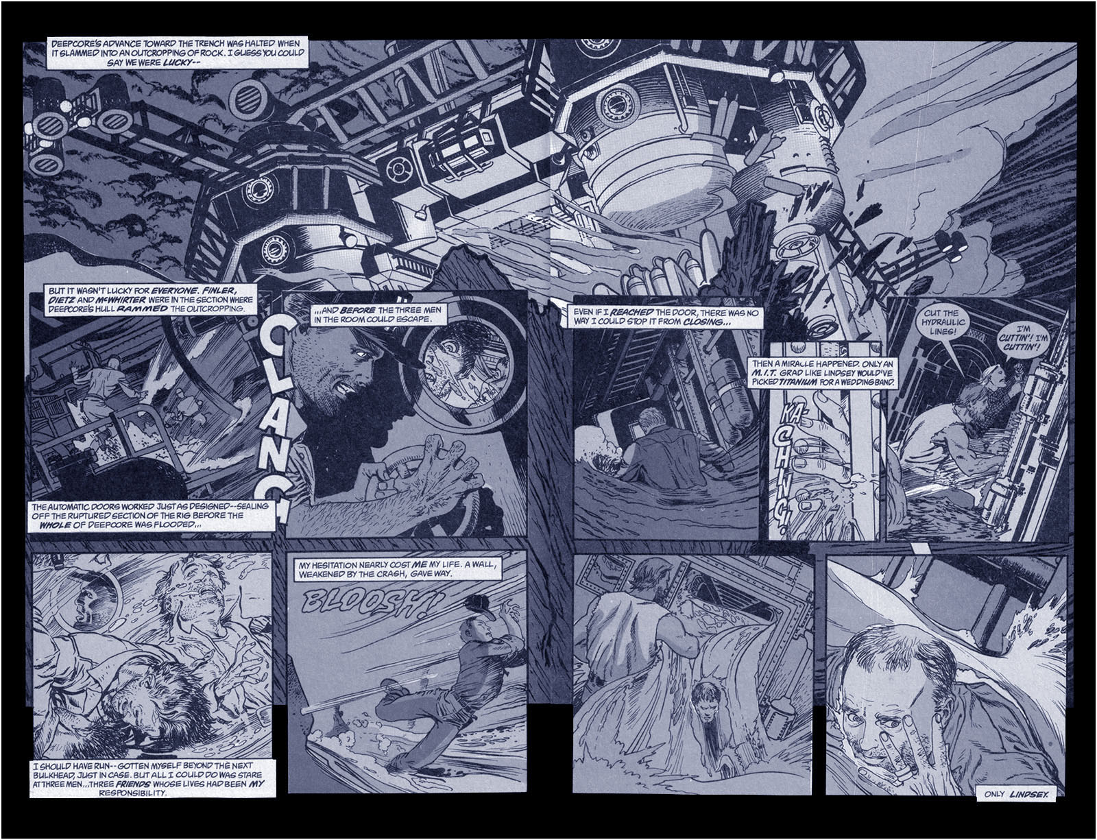
You can see for yourself what a massive difference it makes. If the whole thing looked like that, I’d have been happier.
So guess what…I made the whole thing look like that. See it below. You’re welcome.
Bonus pages
Related links
Mike Kaluta’s website | Mike Kaluta’s Wikipedia page | More about Mike Kaluta
The Abyss IMDb page | The Abyss Wikipedia page
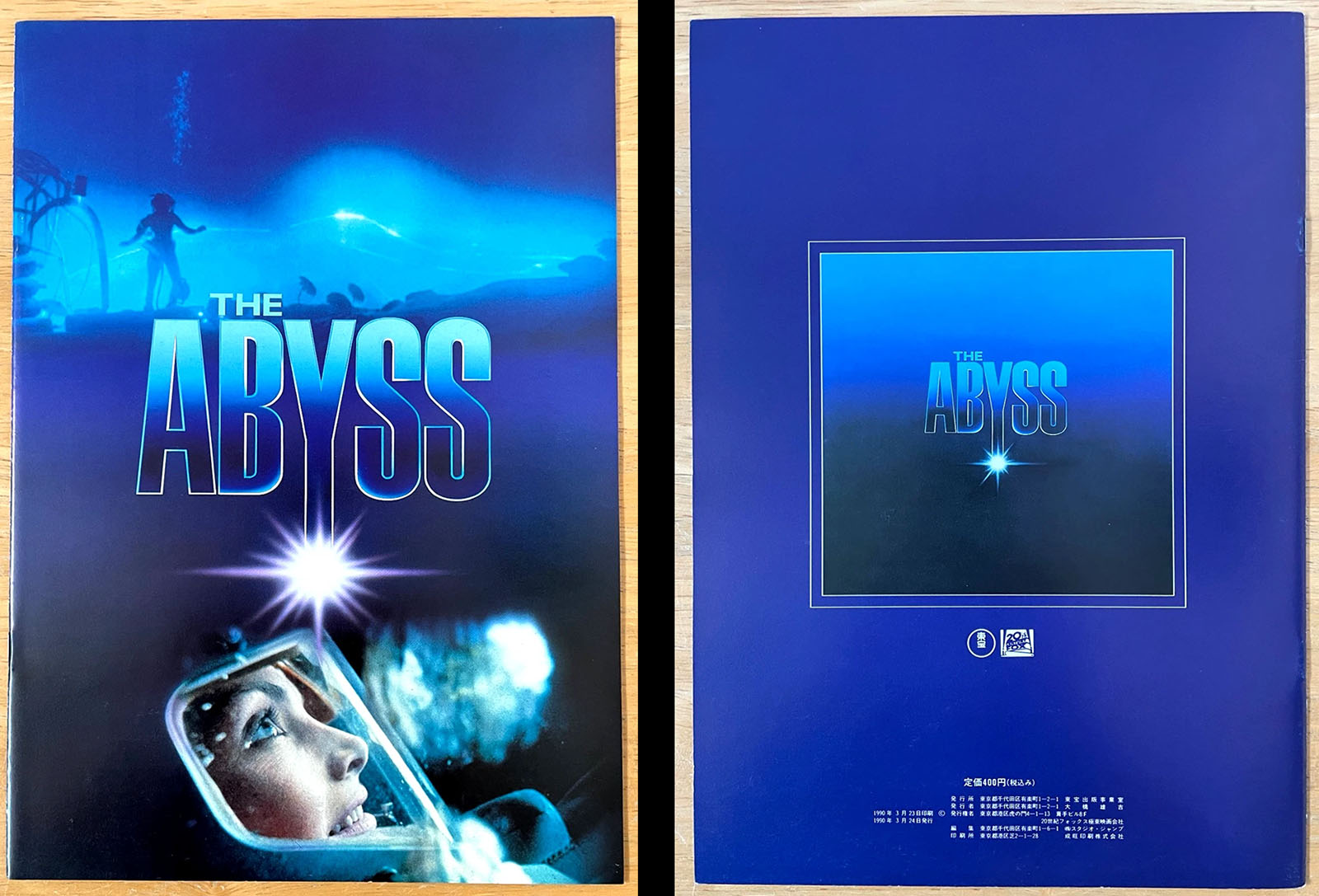
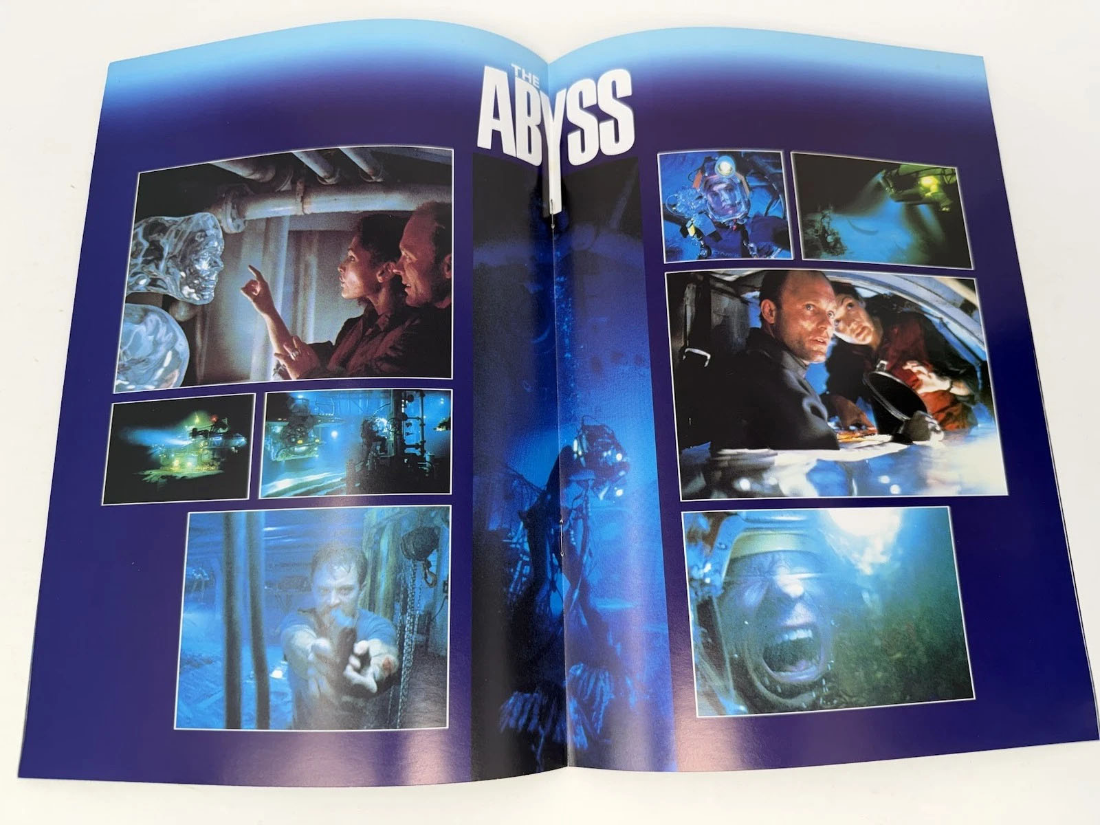
Other Abyss media
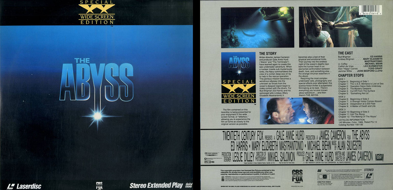
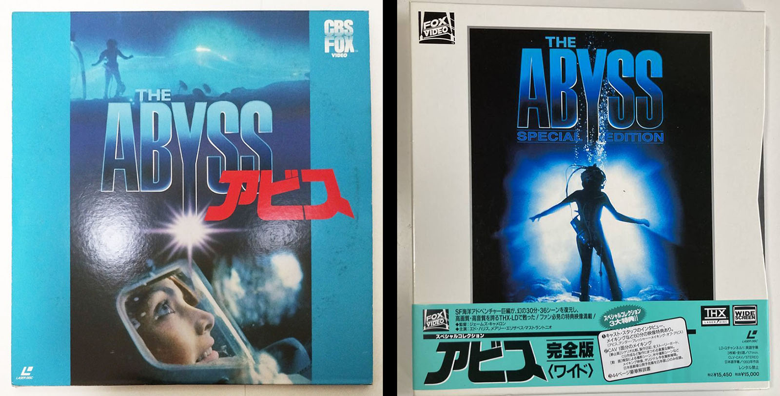
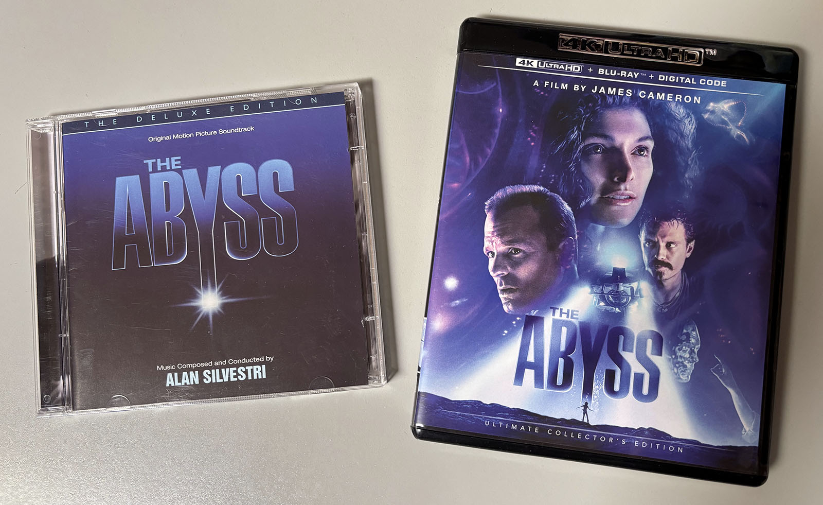
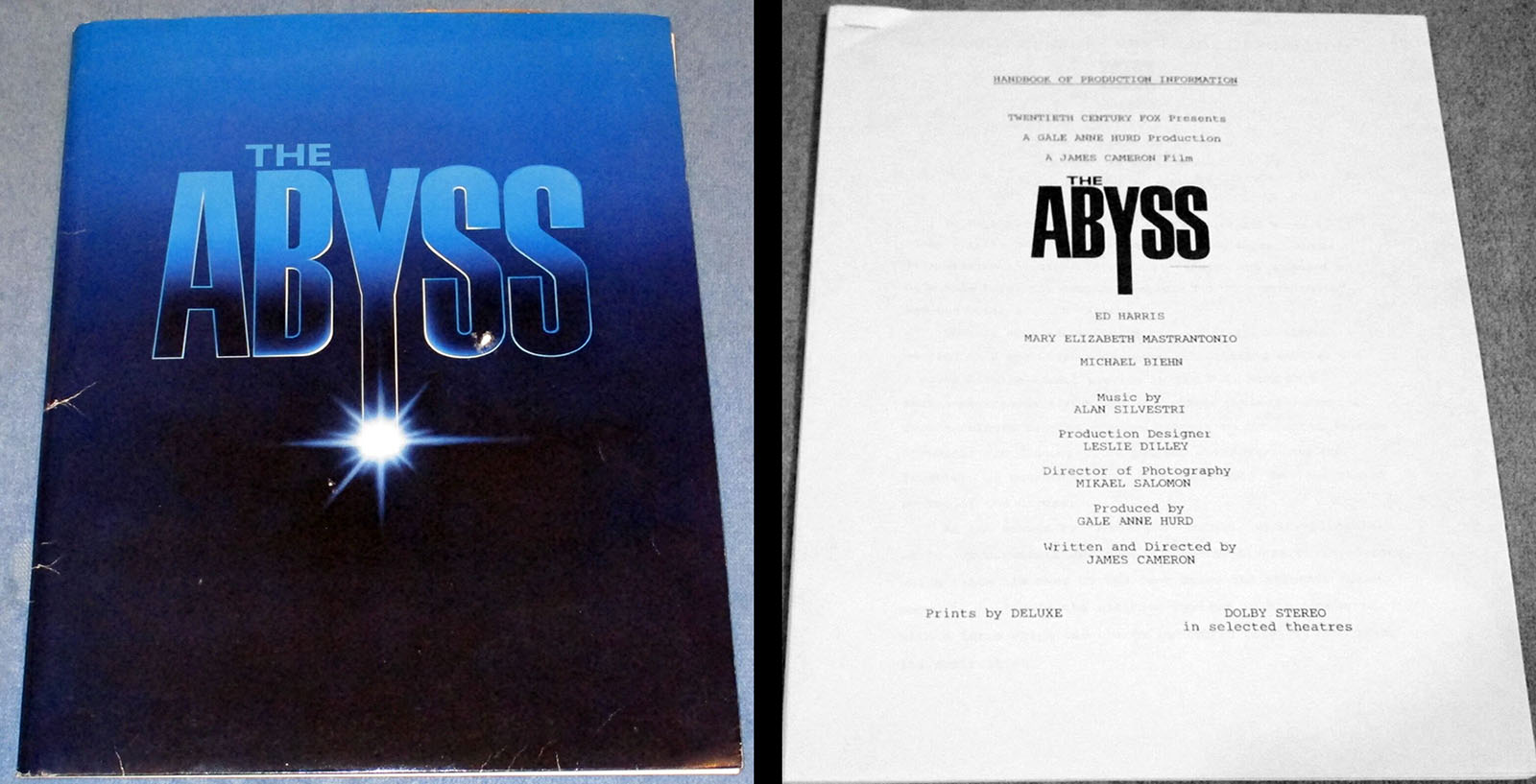
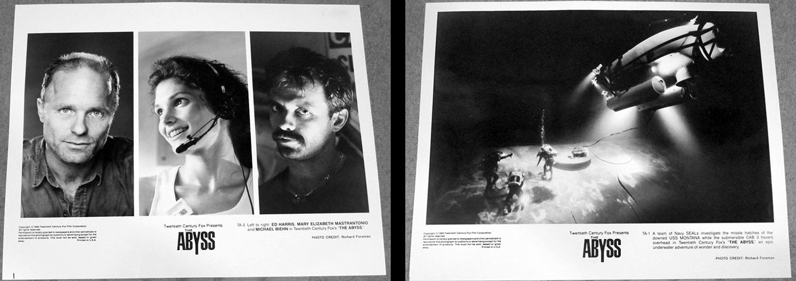
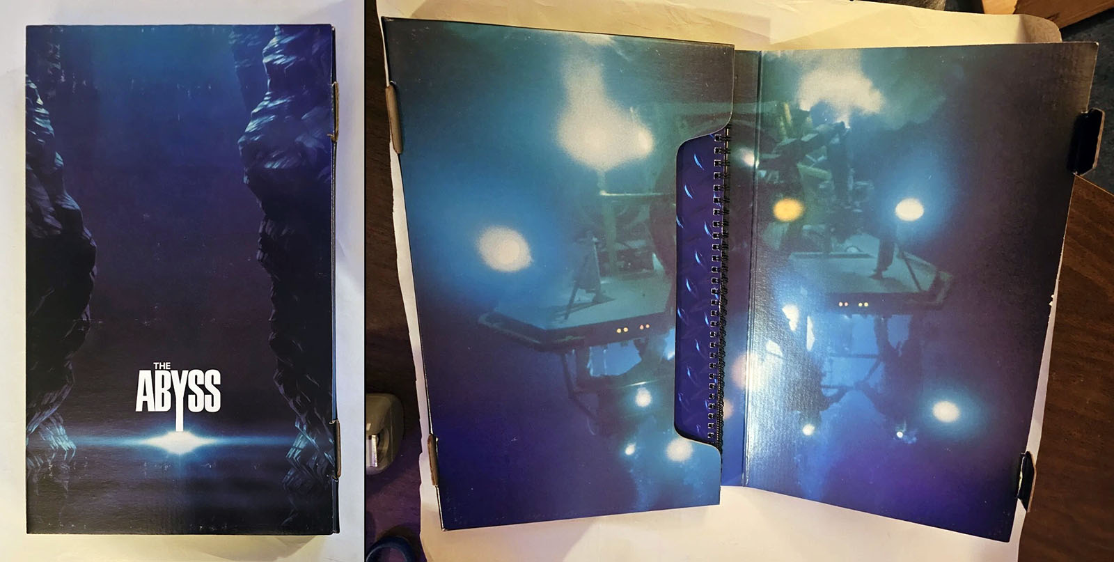
Like I said, by 1989 the era of print media spinoffs was fading away. If there was a big “art of” or “making of” book for The Abyss, I would still have it on my shelf. Instead, here’s what we do have…