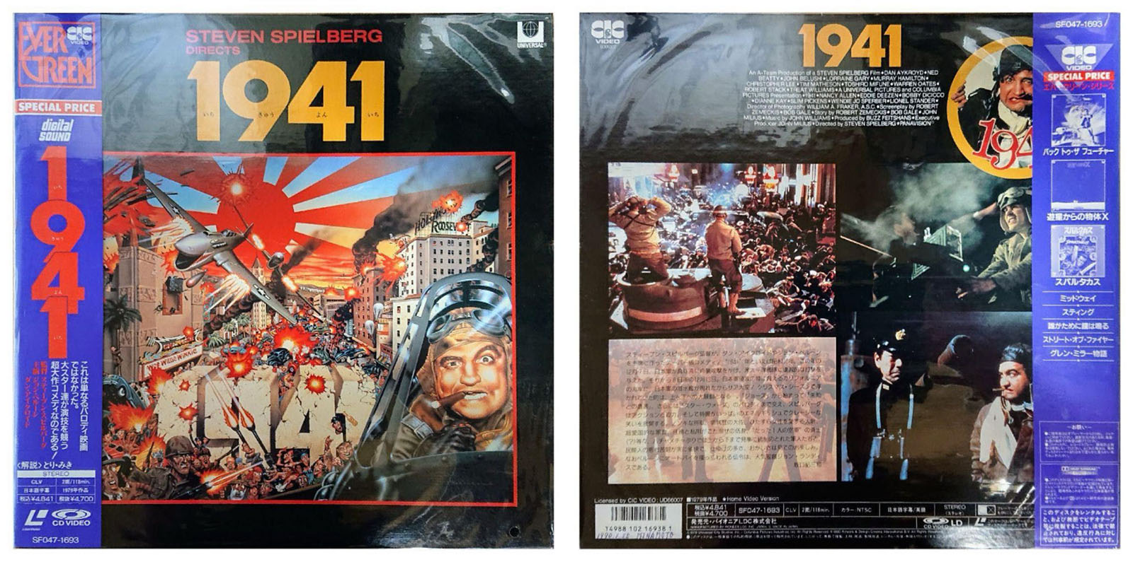
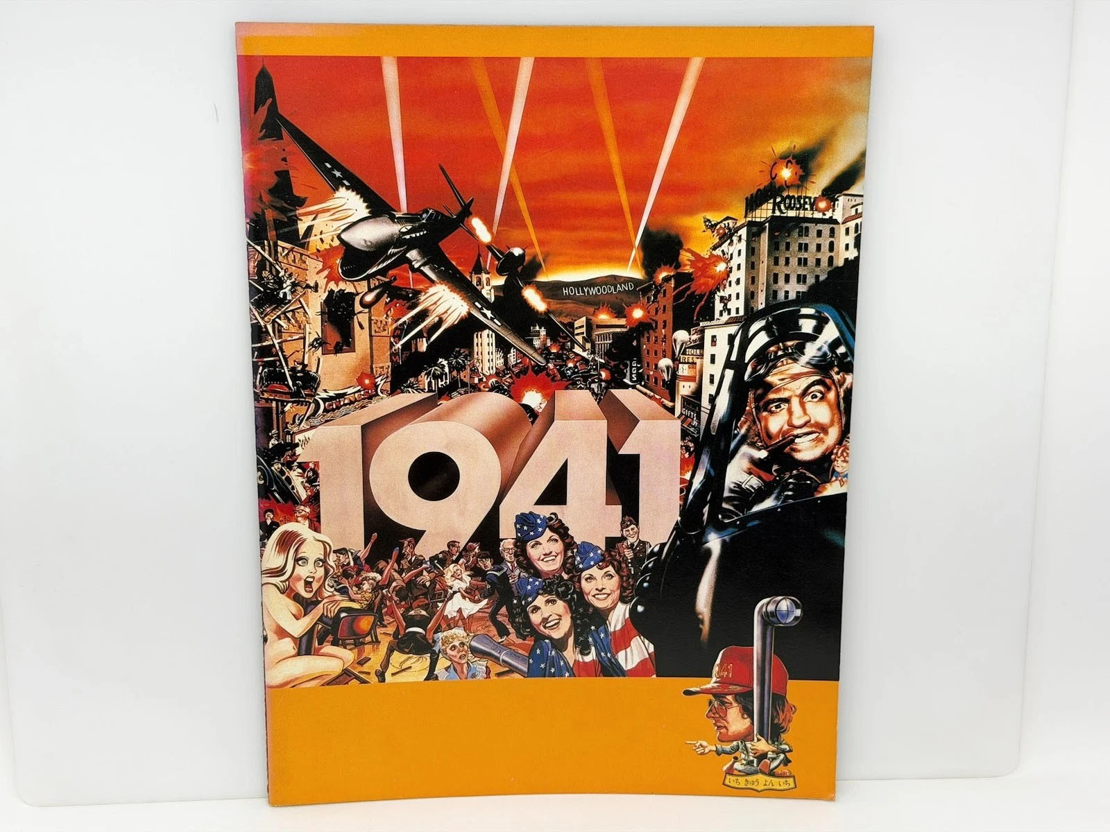
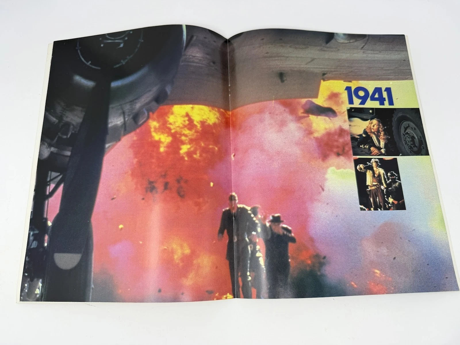
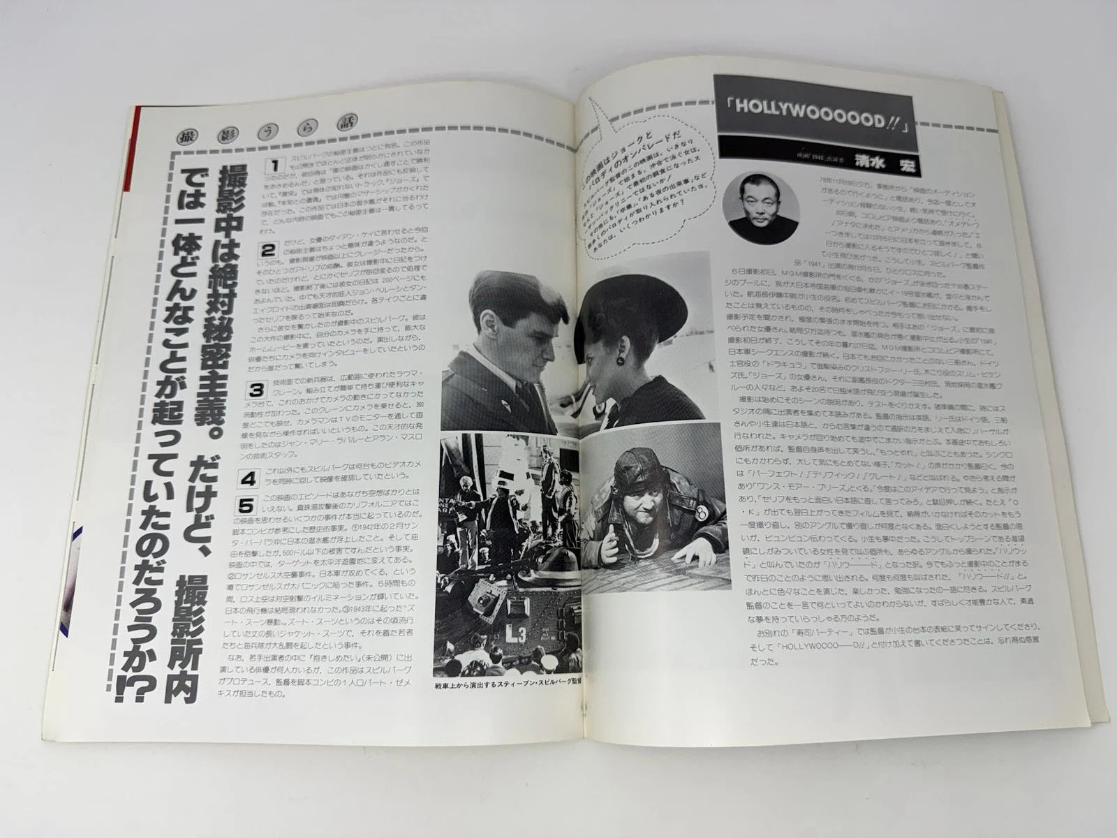
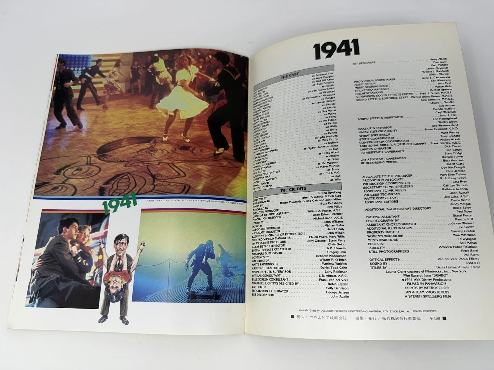
Comics go to the movies: 1941 (1979)
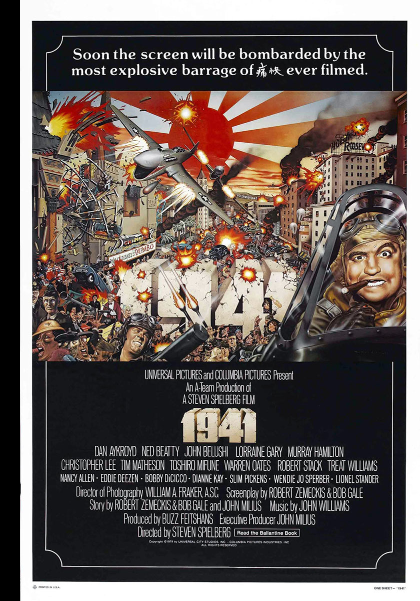
When I picked this comic adaptation to examine, I didn’t think it would result in me writing the following, but here goes…
In Steven Spielberg’s third feature film, culture slammed head-on into counter-culture in a way we hadn’t seen before. And nobody won.
Now the unpacking begins. On one side: culture. Sometimes referred to as The Greatest Generation. They saw things you people wouldn’t believe. It hardened them. It pickled some of them. It ossified many of them.
On the other side: counter-culture. Sometimes referred to as the Boomers. Growing up in the postwar decades fostered in them an appetite for satire that found its voice in popular media, pushing the boundaries of acceptability on TV, in film, in music, and in print. This is what gave us such treasures as MASH, Monty Python, National Lampoon, and Saturday Night Live.
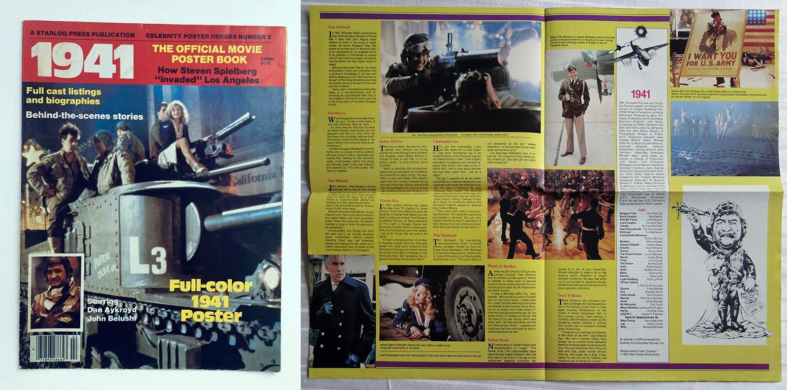
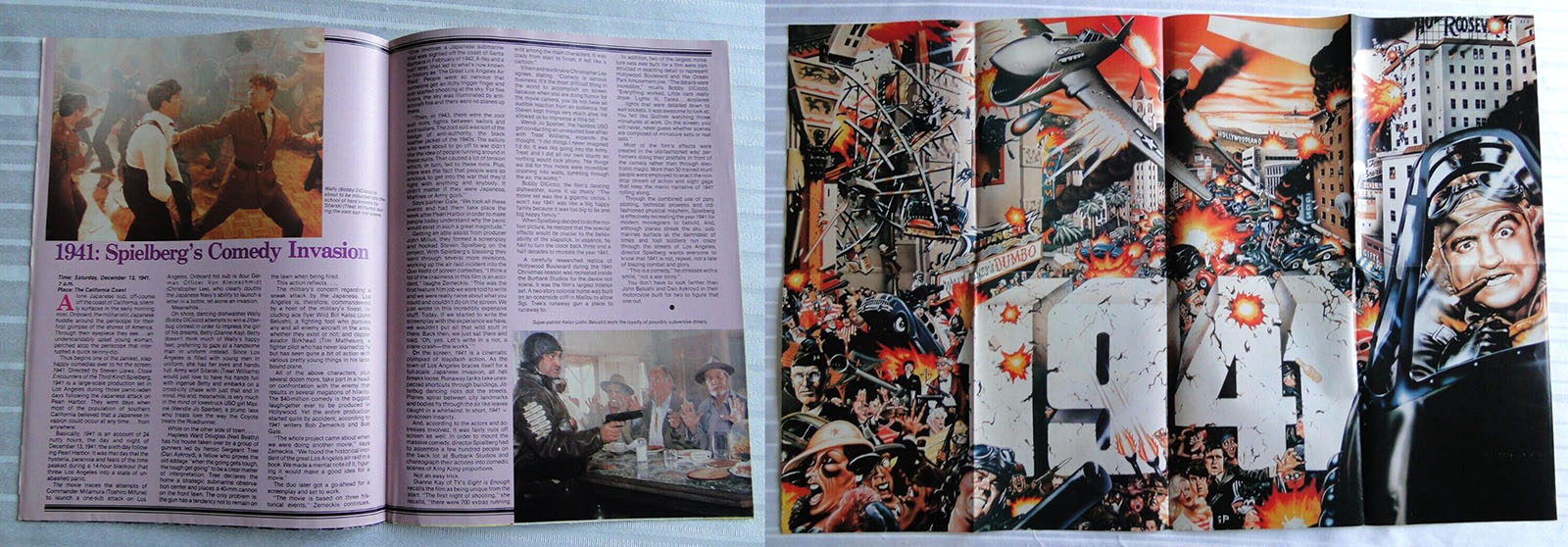
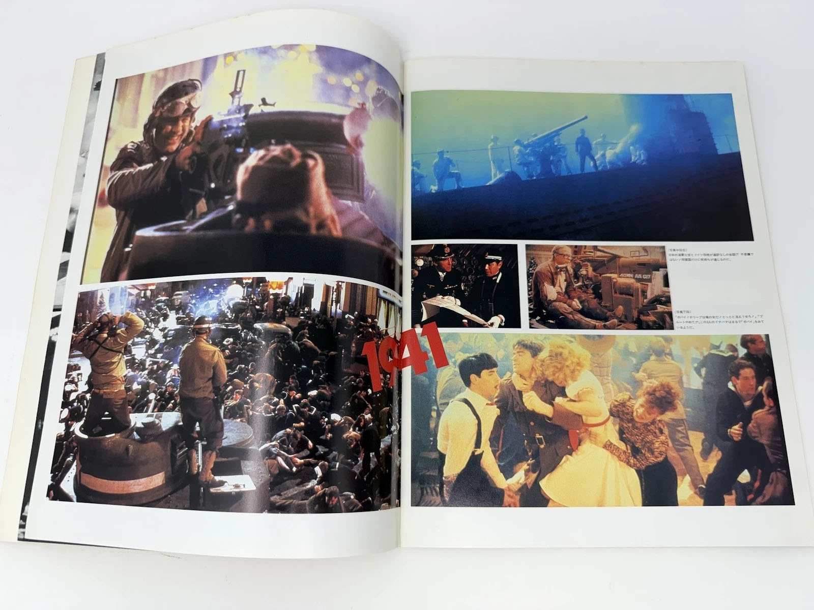
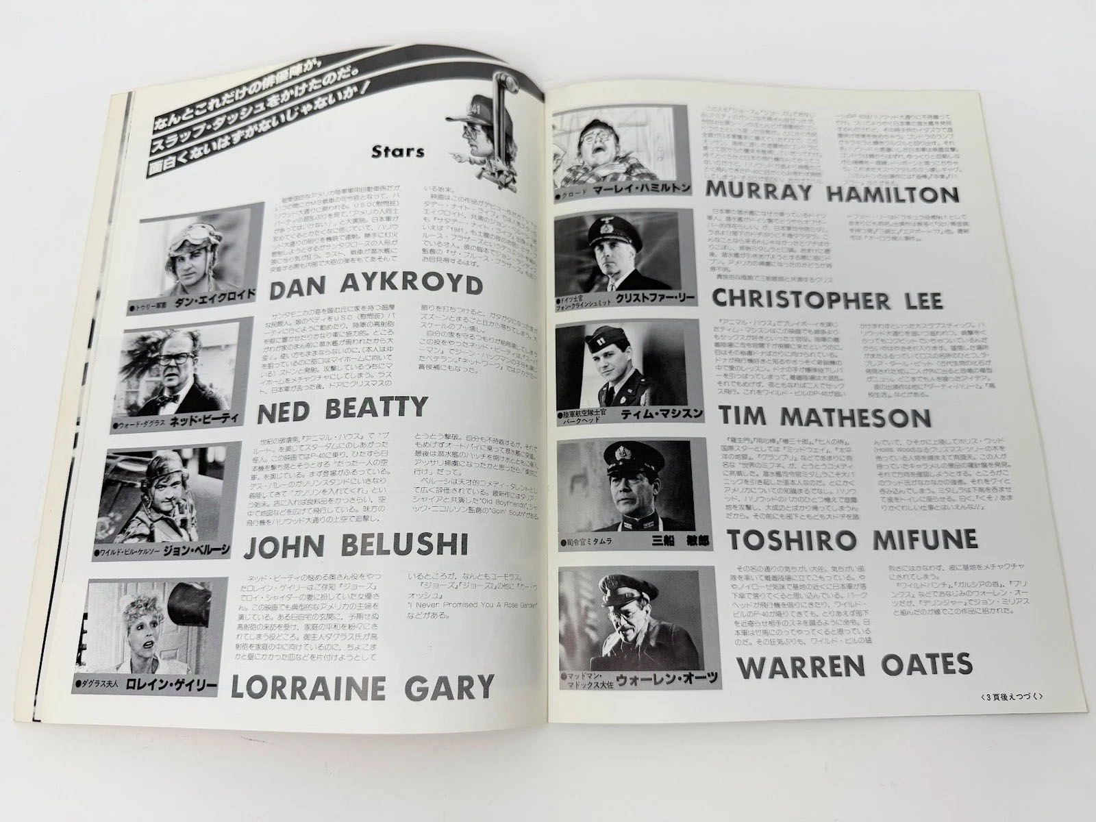
Disguised as a late 70s screwball comedy, 1941 gathered those treasures, balled them up, and hurled them directly into the wall of culture, erected by The Greatest Generation. Two of its biggest icons, John Wayne and Charlton Heston, were invited to star in the film (in an Army officer role ultimately given to Robert Stack), and both railed against the script as “anti-patriotic.” To the Boomers intent on making the film, this was undoubtedly the strongest possible incentive to proceed.
Unfortunately, the end product wasn’t as strong as it should have been. With all that star power and Steven Spielberg in the director’s chair, it should have become a cinematic benchmark. Instead, betrayed by a fatally shallow script, it paid its bills and went on to be forgotten. Spielberg returned to his proper path, the one that would lead to Schindler’s List and Private Ryan.
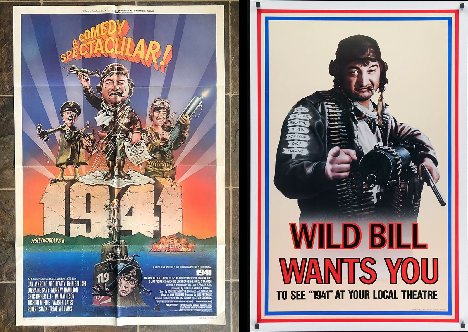
I didn’t see 1941 in a theater. It was one of those films I rented once and never watched again until I decided to write this article. I didn’t remember much about it except that, even back then, it wasn’t as funny as it tried to be. In a fresh viewing, all of its influences were still easily identifiable. They were once on the leading edge of satire, but that leading edge is now over 40 years behind us. This, I expected.
What I didn’t expect – and what explained why I didn’t watch the film more than once – were the paper-thin characters. They carried the gravity of their influences, but the script only carried the gravity of a Daffy Duck vs Bugs Bunny cartoon. Some of the set pieces were memorable. The characters were not.
The story’s satirical overview was meant to be the viral effect of xenophobia and nationalism, but Dr. Strangelove already had that covered, and 1941 had nothing to add but cartoon violence. And if you think going out on an open-air brawl is the right comedic end note after spending half of your film on another open-air brawl, you’ve lost the chance to declare a victory for counter-culture.
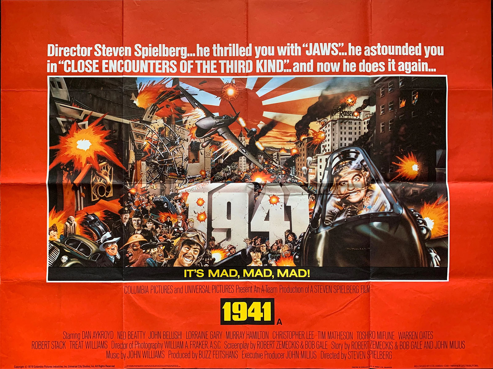
The comic book version, though…that’s a different animal.
The counter-culture treasures I listed earlier informed the film. But other treasures (which emerged from that same wave) informed the comic adaptation: underground comix and MAD magazine.
The adaptation was written by Alan Asherman and drawn by two very gifted artists: Stephen Bissette and Rick Veitch. Fresh out of the Joe Kubert School of comic art (the first graduating class in 1978), They teamed up to make 1941 their first professional assignment. They both went on to have stellar careers, continuously pushing the boundaries of what comics could accomplish. That pushing began with a vengeance on this project.
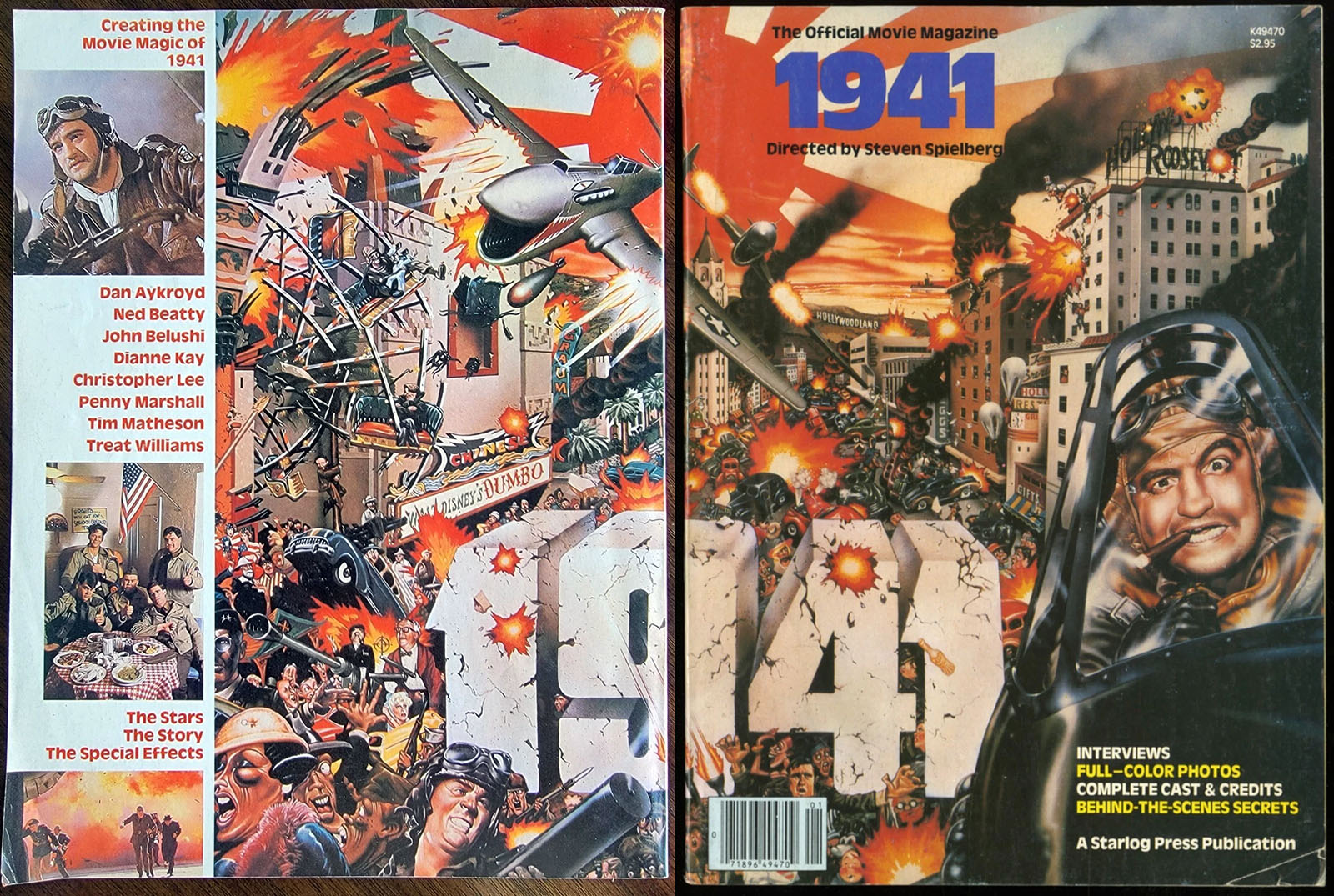
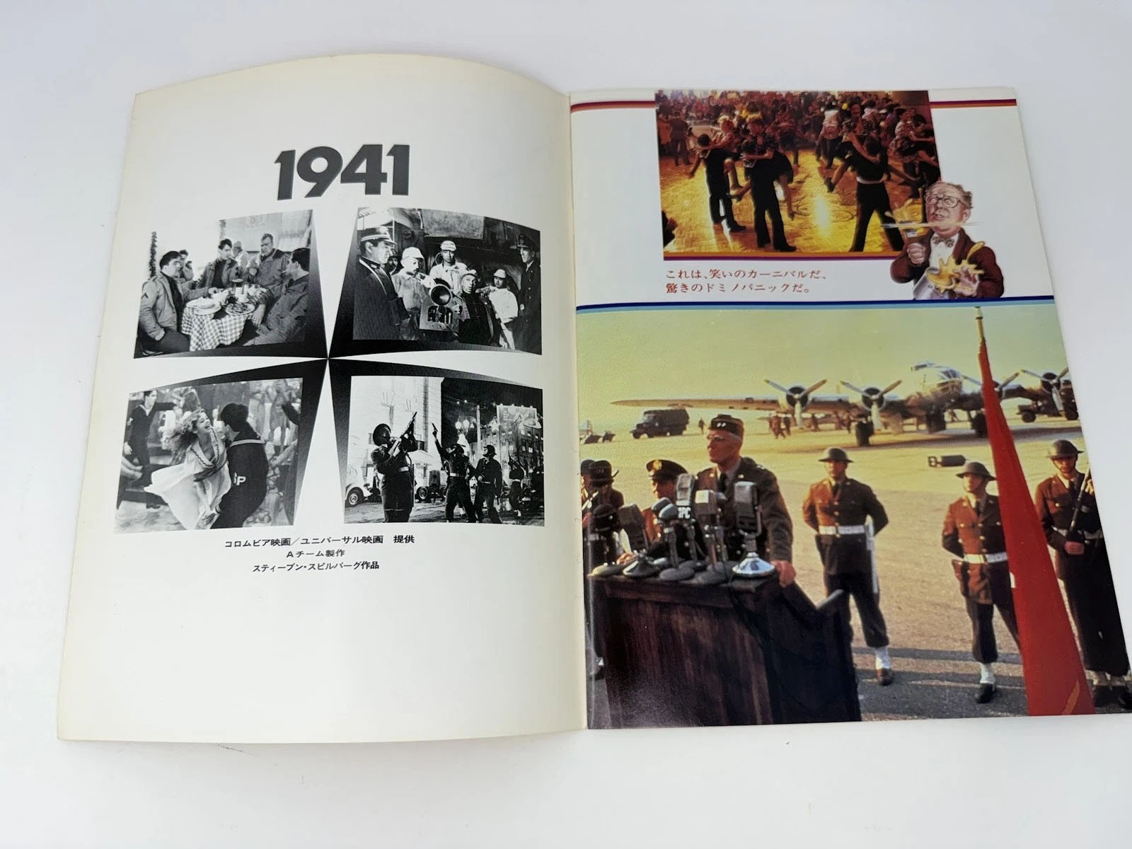
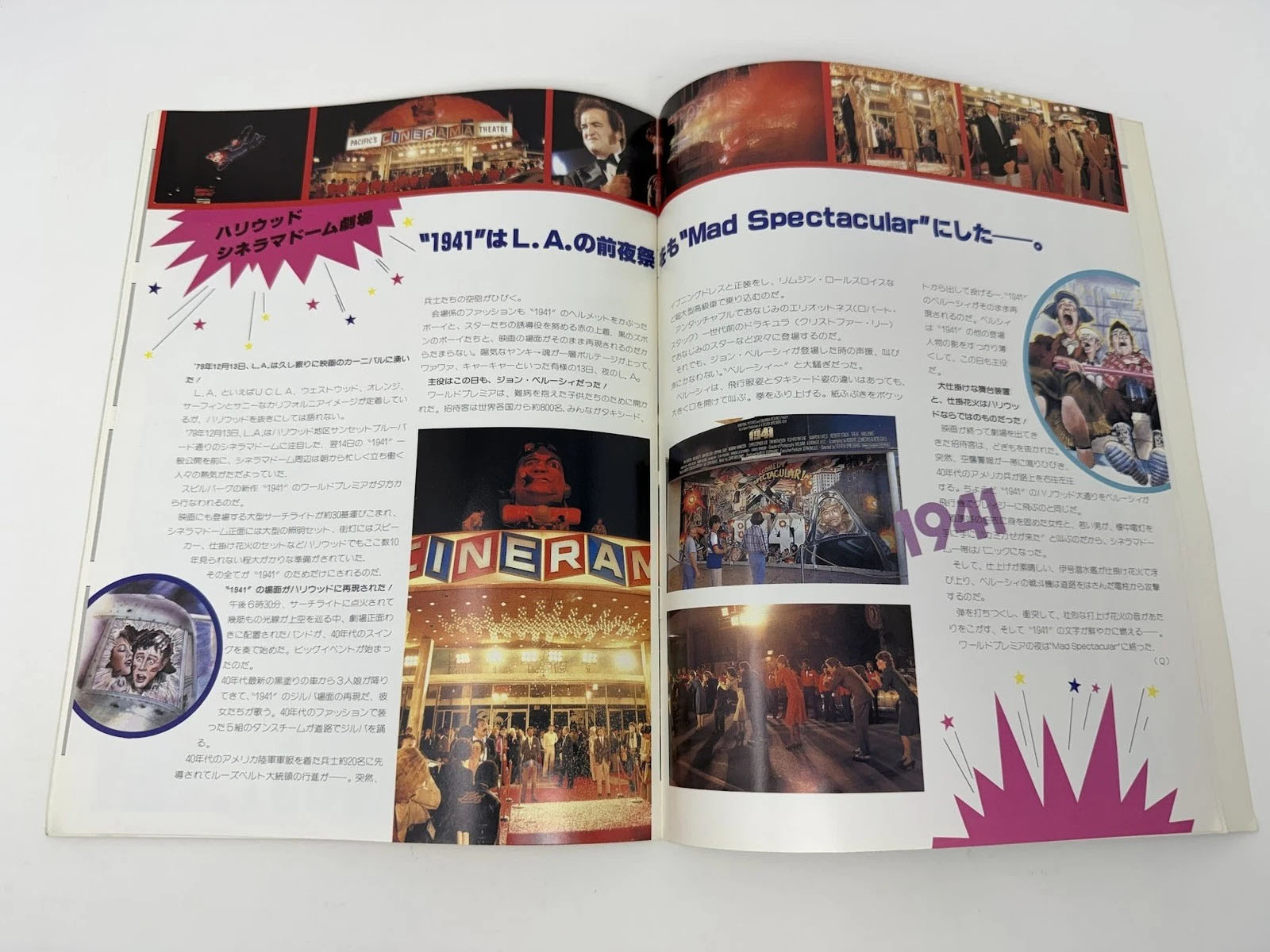
1941 The Illustrated Story was published by Heavy Metal and Pocket Books (Arrow Books in the UK) around the time the movie premiered (December 13, 1979). Rather than a straight-up adaptation, it very much took its own approach. The film script was reduced a plaything for the artists. If the movie was channeling Monty Python, then the comic was channeling Terry Gilliam, and doing a much better job of it.
Every page is a visual feast, trading away any pretense of serving the film in favor of jamming in as much imagery as possible. It’s an assault on the eyes, making the reader feel as unmoored as the characters. There was only a token attempt to land actor likenesses; Wild Bill Kelso occasionally looks like John Belushi, but the only other time you see an intentional representation of an actor, it’s a photo merged into a non-stop collage of visual noise.
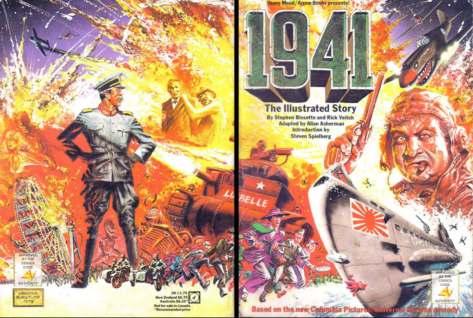
Since, as I said, I only barely remembered 1941, I decided to read the comic before watching the film again. That made it even crazier. Even fresh out of school, Bissette and Veitch were already masters of their craft. They openly rebelled not only against the rules of film adaptation, but the rules of comic book storytelling itself, leaving out such conventions as establishing shots or scene-setting. It’s not a comic for casual readers. If it made noise, it would scream at you every time you open it.
In the end, how does it qualify as an adaptation? My answer has to be, “in name only.” It goes so far out of its way NOT to adapt the film that it becomes something else entirely. In embracing a chaotic graphic approach, it avoids the trap the film set for itself with that shallow script. It observes the viral effect of xenophobia and nationalism in methods only available to a comic book, free of all the commercial tensions of putting actors on a screen and charging money to watch them. If the mission was to communicate the message, the comic was the better messenger by far.
HIGHLIGHTS
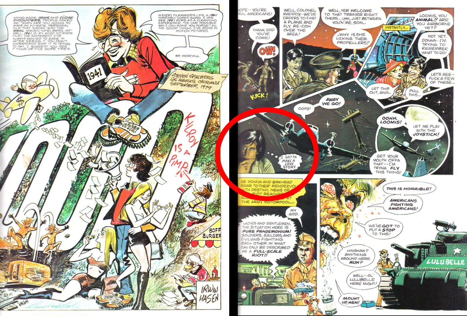
Steven Spielberg appears in a comic for the first time. He’s writ large on the introduction page with his own intro. His second appearance (at right) comes deeper in the comic, which is festooned with drop-in cameos. Easy to miss on your first reading. The intro pages were drawn by cartoonist Irwin Hasen, best known for Dondi, and an instructor at the Kubert School at the time Bissette and Veitch were students.
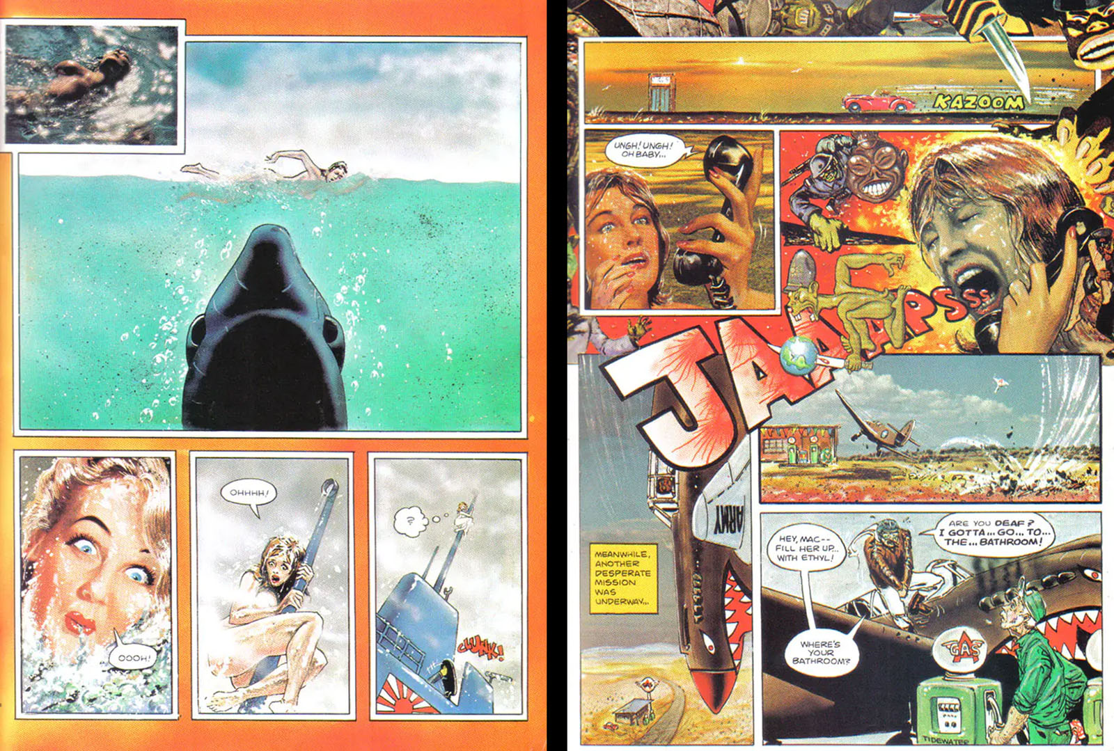
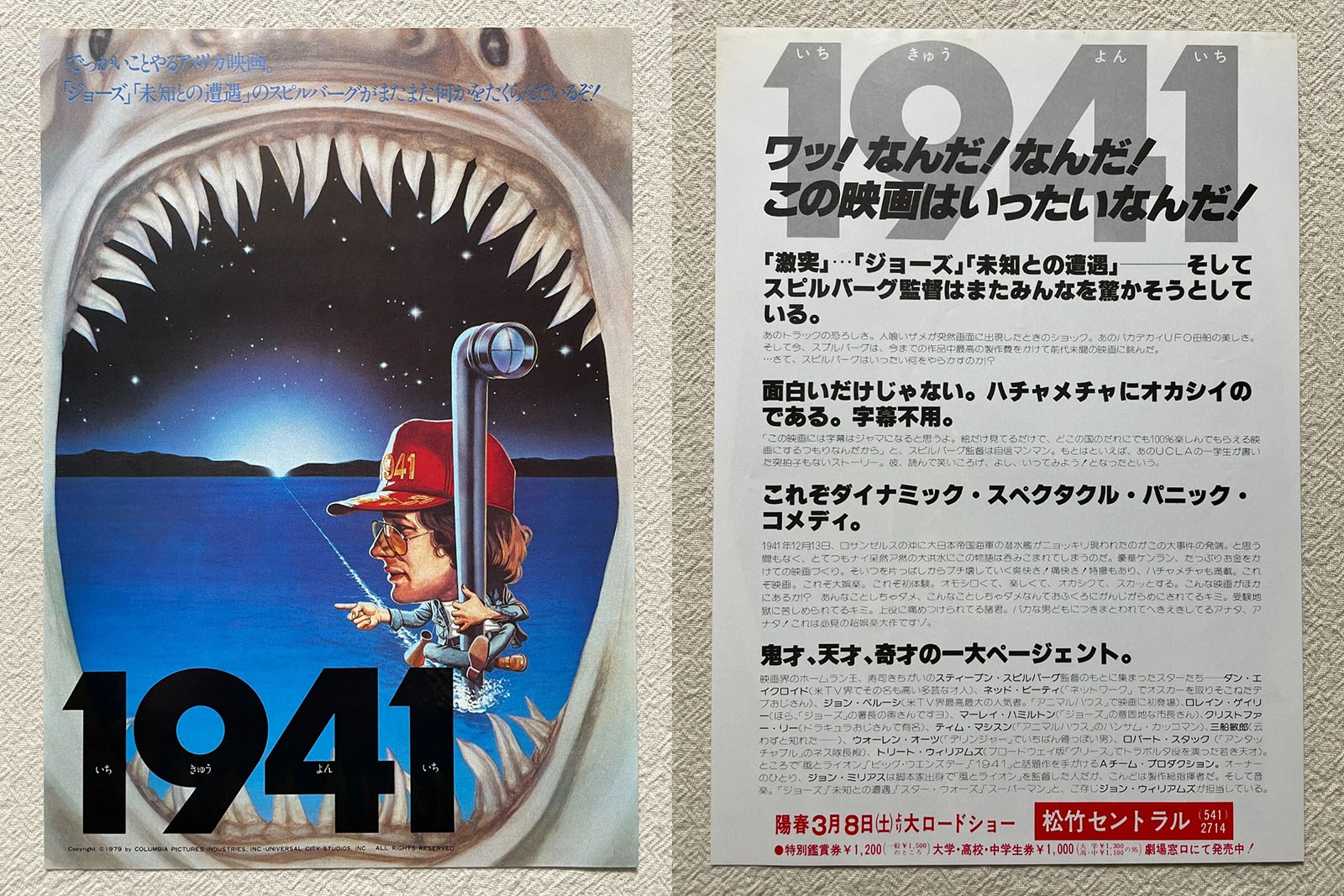
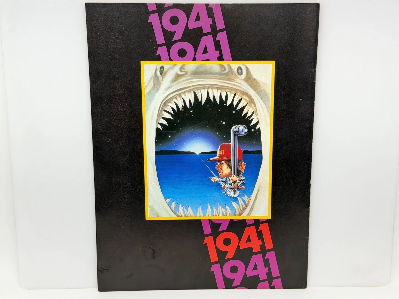
Spielberg opened the movie with a self-parody, hiring the same actor who played Chrissie Watkins to go through the same motions. Bissette and Veitch used it to parody the Jaws poster art, taking it one step farther.
At right is the book’s first example of both drop-in collage art and a satire of the rampant xenophobia seen throughout the story. The lower half of the page introduces us to Wild Bill Kelso in as few panels as possible.
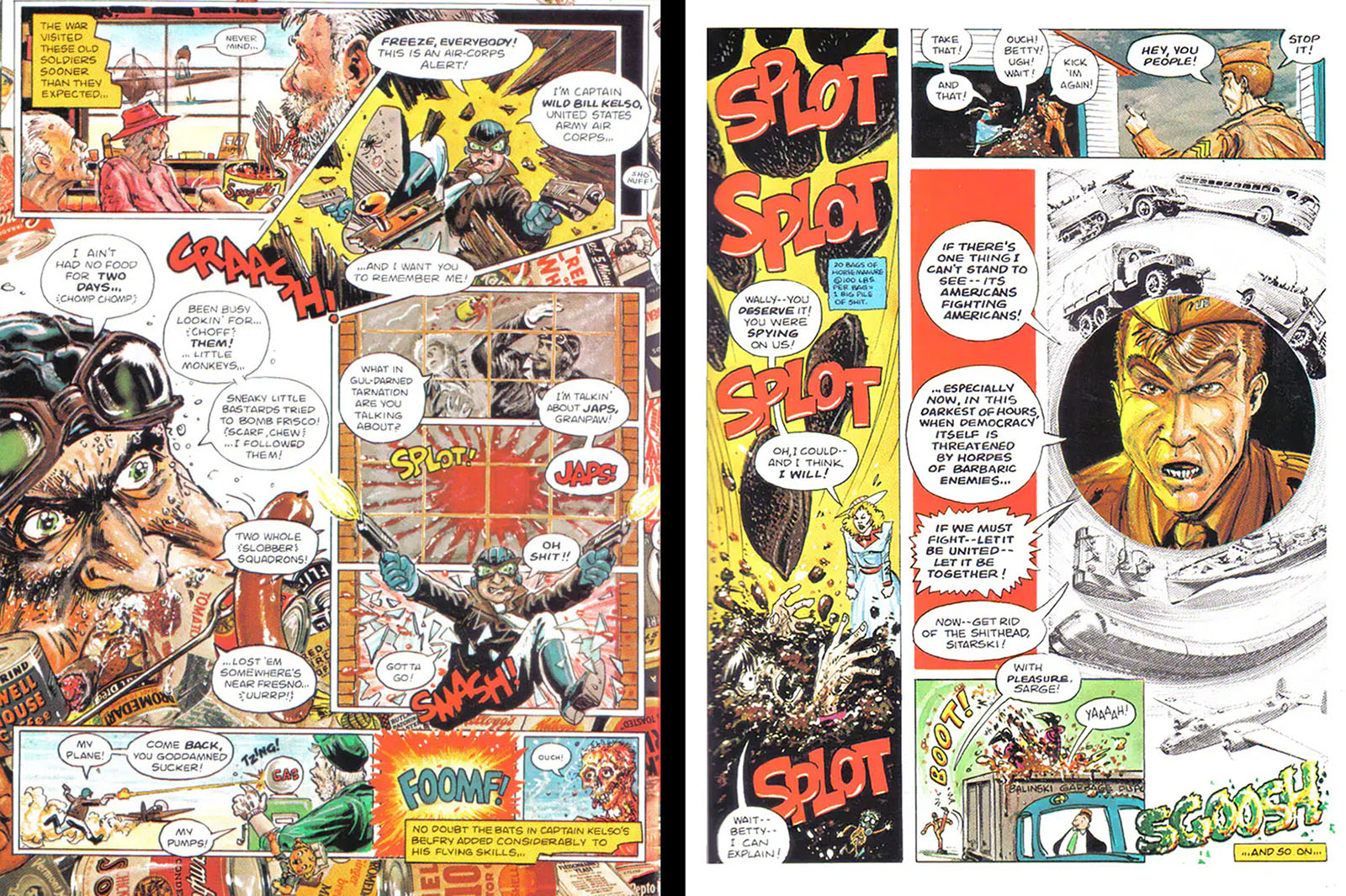
Both of these pages are examples of how dense the compositions get, and also how little concern there was about actor likenesses. The focal points here are John Belushi (left side) and Dan Aykroyd (right side), but if I didn’t tell you that you might never have guessed.
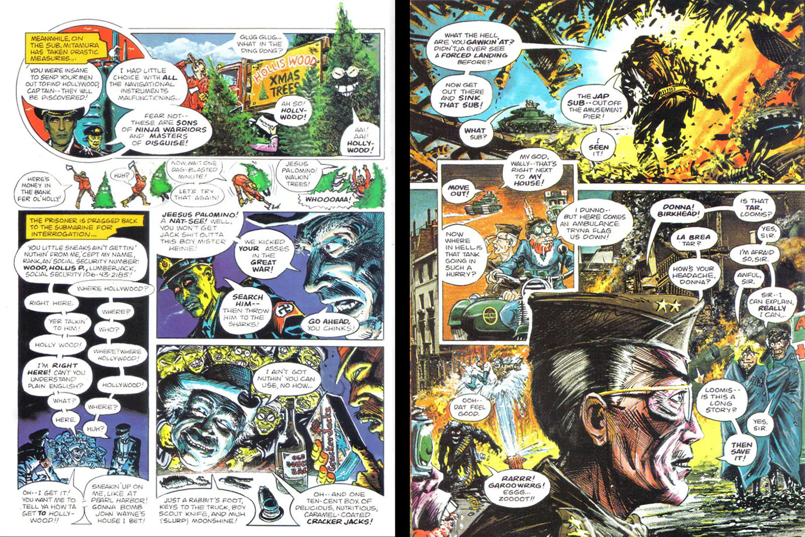
Here’s an example of comic book rule-breaking writ large. Both of these pages are jammed with far more dialogue than is comfortable, but there were many reasons to break with convention. First, it gets you through scenes with very limited visual content by compressing them to a small panel count. Second, it amplifies the comedy. The mere presence of so much text tells you this is comedy.
Incidentally, John Workman was the design director for this book, and the word balloons breaking the panel borders at lower left are his invention.
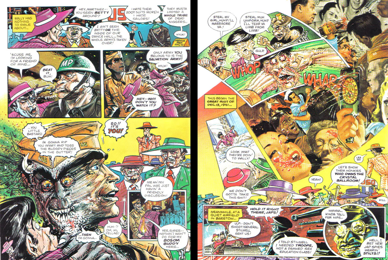
Left side: something you can do in a comic that’s usually prohibitively expensive in a film is push characters into extreme distortion. That’s what’s happening with the hyper-aggressive Treat Williams character, who is drawn as a werewolf most of the time.
At right, the page composition amplifies the chaos of a fight and drops in a heavy number of found images to command your attention. Including Dr. Strangelove himself.
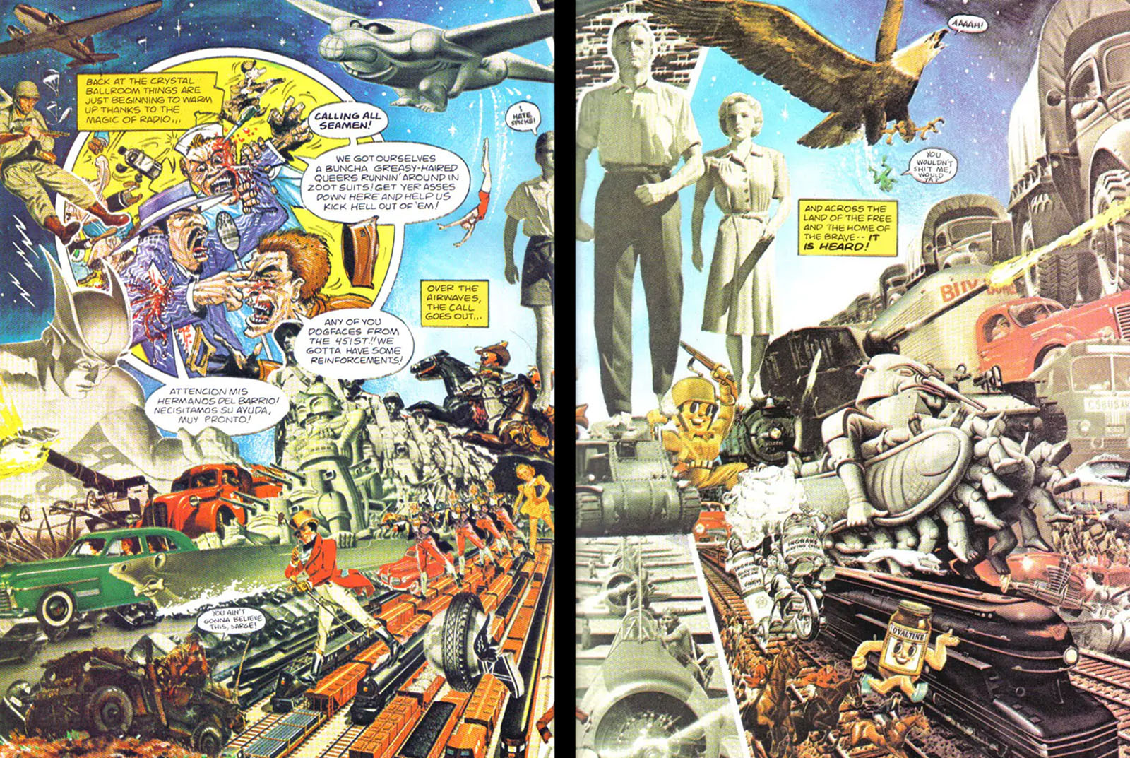
The collage approach gets dialed all the way up on this spread, departing completely from the film into a deluge of American excess. This is why I invoked Terry Gilliam earlier.
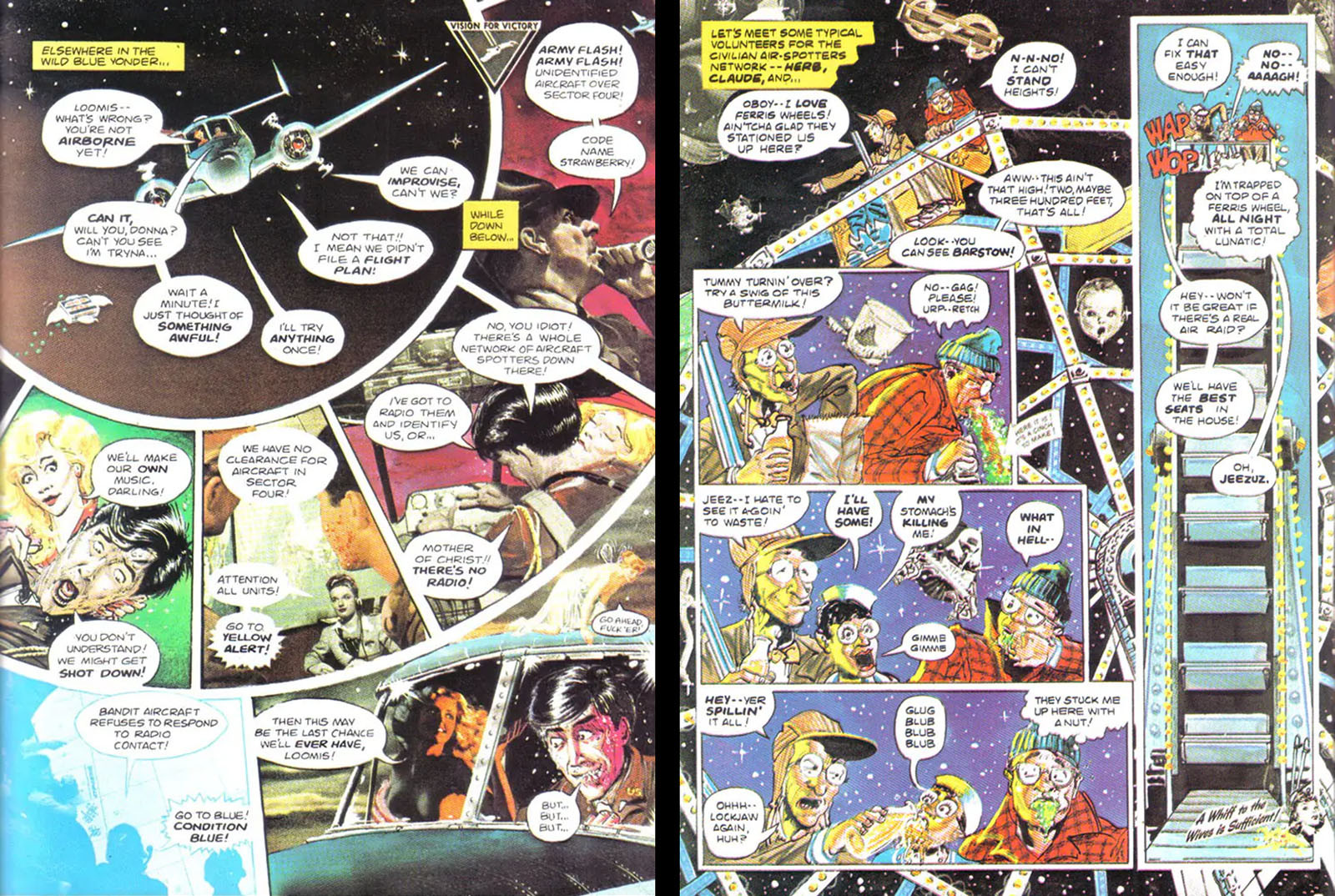
Two great page layouts here, demonstrating how individual panels can be arranged into full-page compositions. On the left side, there’s no doubt about the focal point of the scene. On the right, a tall panel perfectly framing a tall ferris wheel gives much-needed context to the other panels.
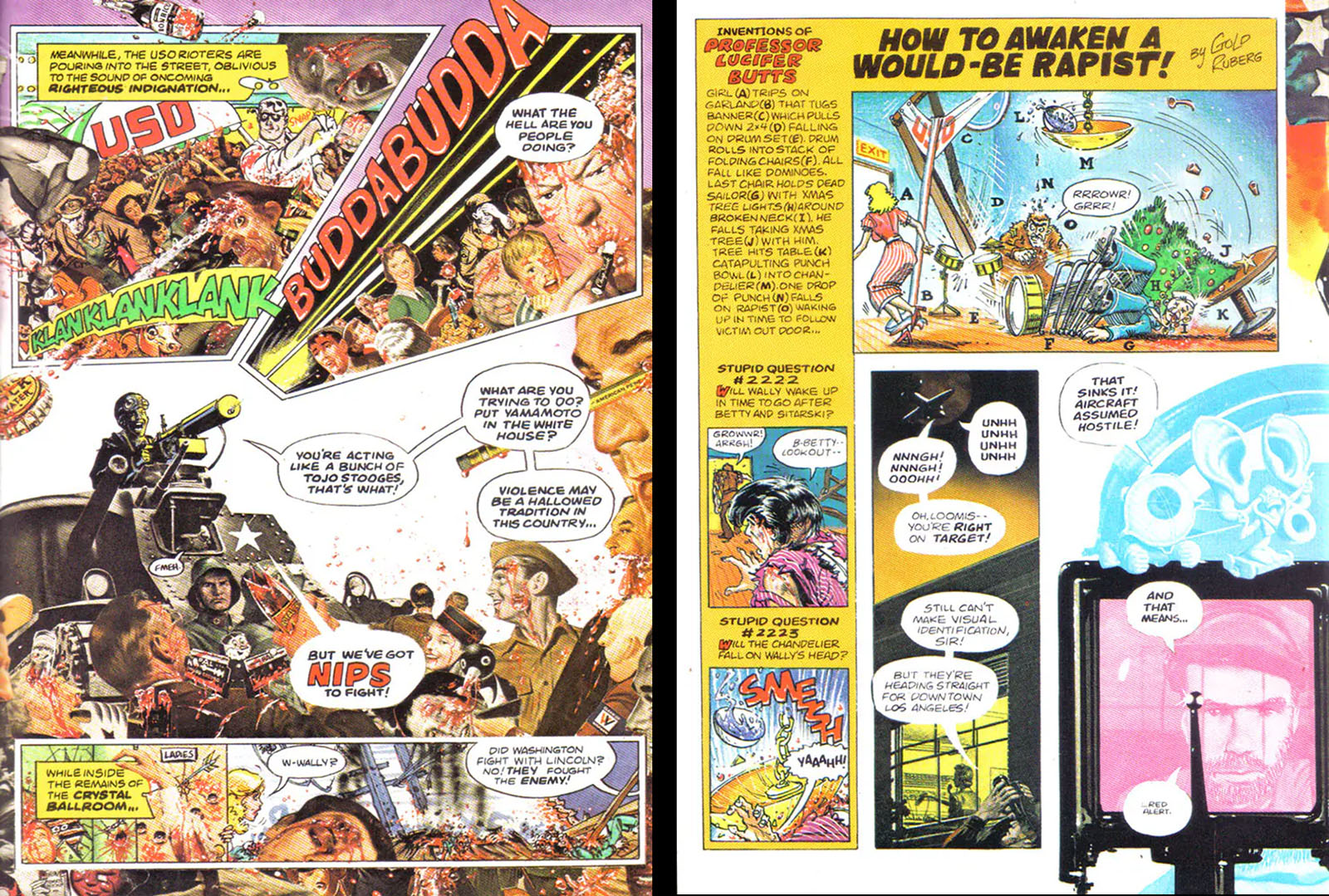
Left side: another very deliberate composition helps to balance an overwhelming mass of found images. There’s actually very little original art tucked into those collages.
Right side: at this point in the movie, there’s an extended “chain reaction” scene worthy of Rube Goldberg. It would have taken at least two pages to play out in a conventional comic, but here a MAD magazine approach gets it down to one panel.
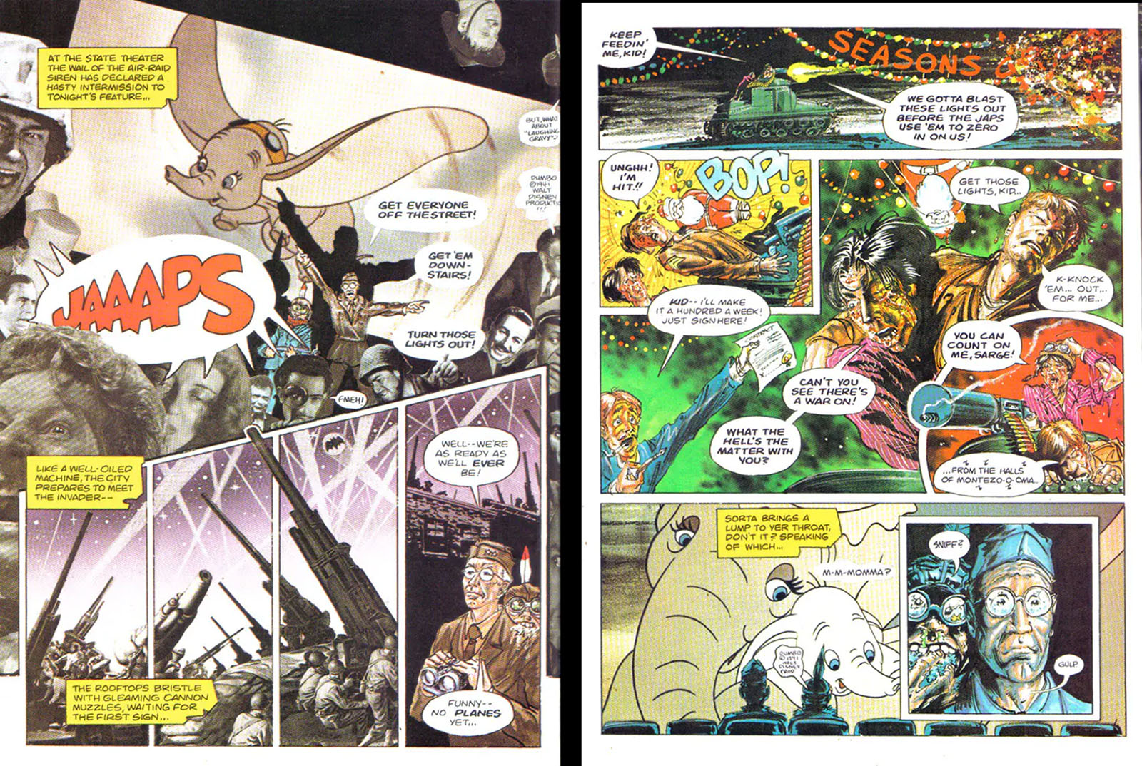
Taking a much-needed break, Robert Stack’s character goes to see Dumbo in a downtown LA movie theater. Actual Dumbo footage was licensed for the film, and the comic took the brazen step of dropping Dumbo stills right into these two pages. A copyright notice is given (though you have to search for it), but we’ll have to assume the laws of parody provided some insulation.
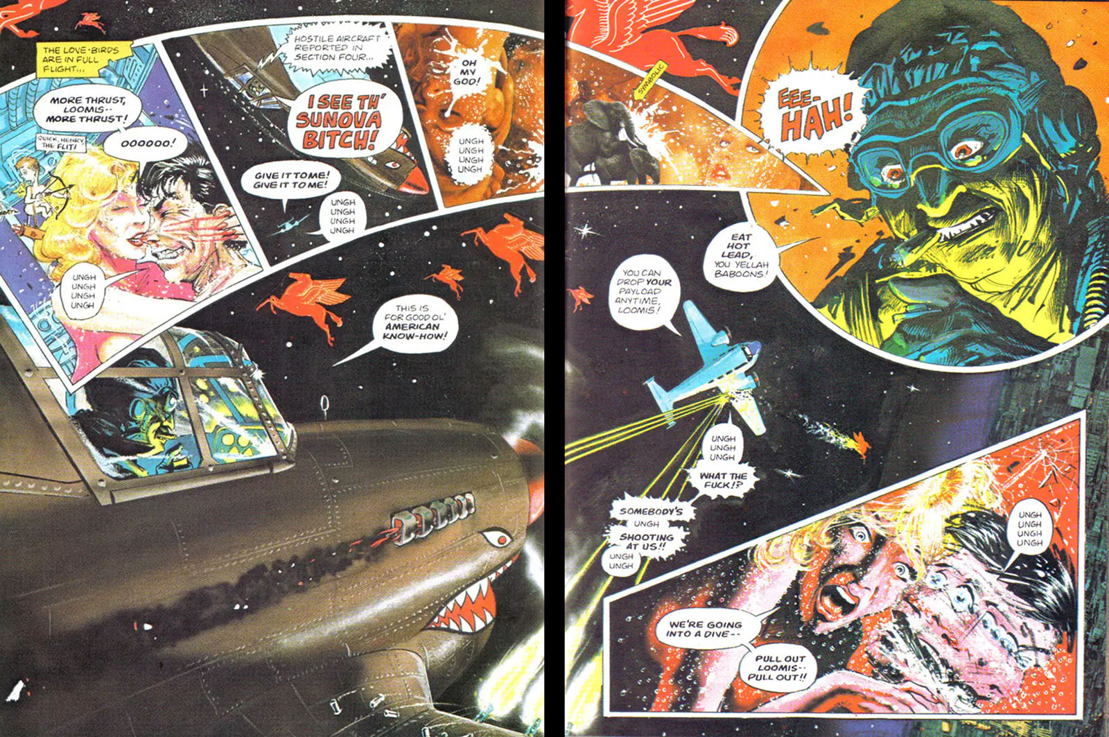
Fantastic work on this double-page spread with Wild Bill’s plane framing the left and Wild Bill himself (John Belushi) intercepting the stream of panels on the right. It’s only when your eyes go looking for relief that you see the radically-tilted horizon. This is one of those layouts that gets better the more you look at it.
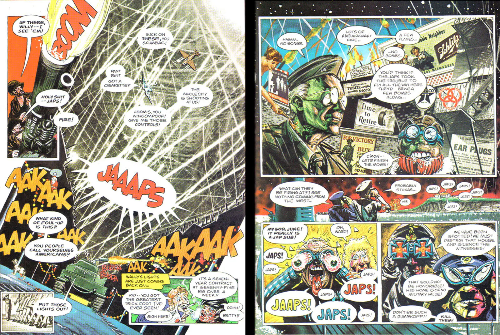
Absolute insanity, all the best things about this comic contained in two pages, using the medium to the fullest.
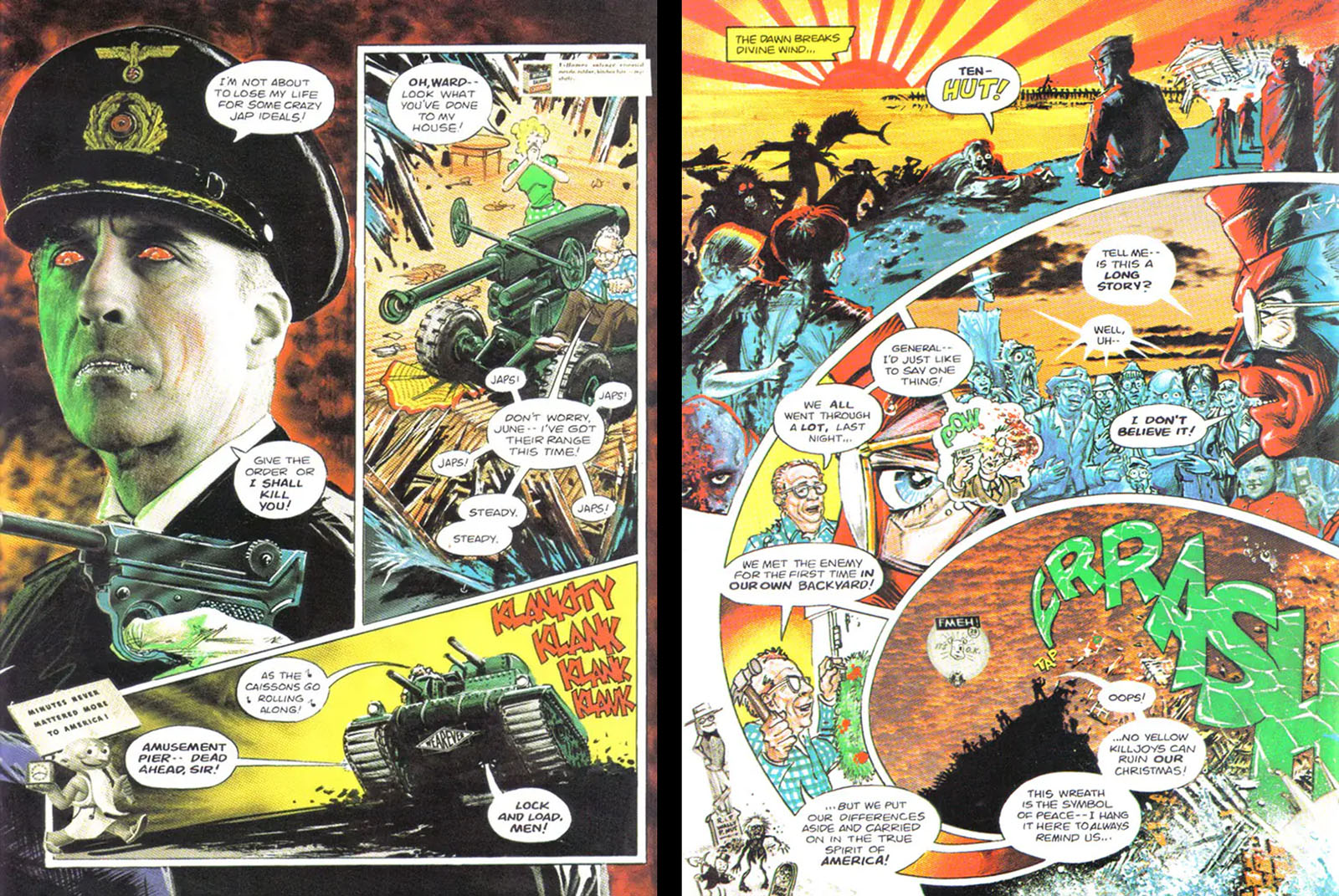
Lastly, a rare case of full actor photo drop-in on the left side (that’s Christopher Lee as a Nazi) and the comic book version of an iris-out on the right side. This is the last scene of the film, in which a helicopter shot pulls back from the closing brawl. Nothing is learned by anyone, but the comic doesn’t make it feel cheap. I especially like how the word balloons at the end continue the spiraling stream of panels with the pointer going right to the focal point. This is the kind of graphic brilliance I aspire to but seldom reach.
RELATED LINKS
RELATED MEDIA