
Comics go to the Movies: Buckaroo Banzai, 1984
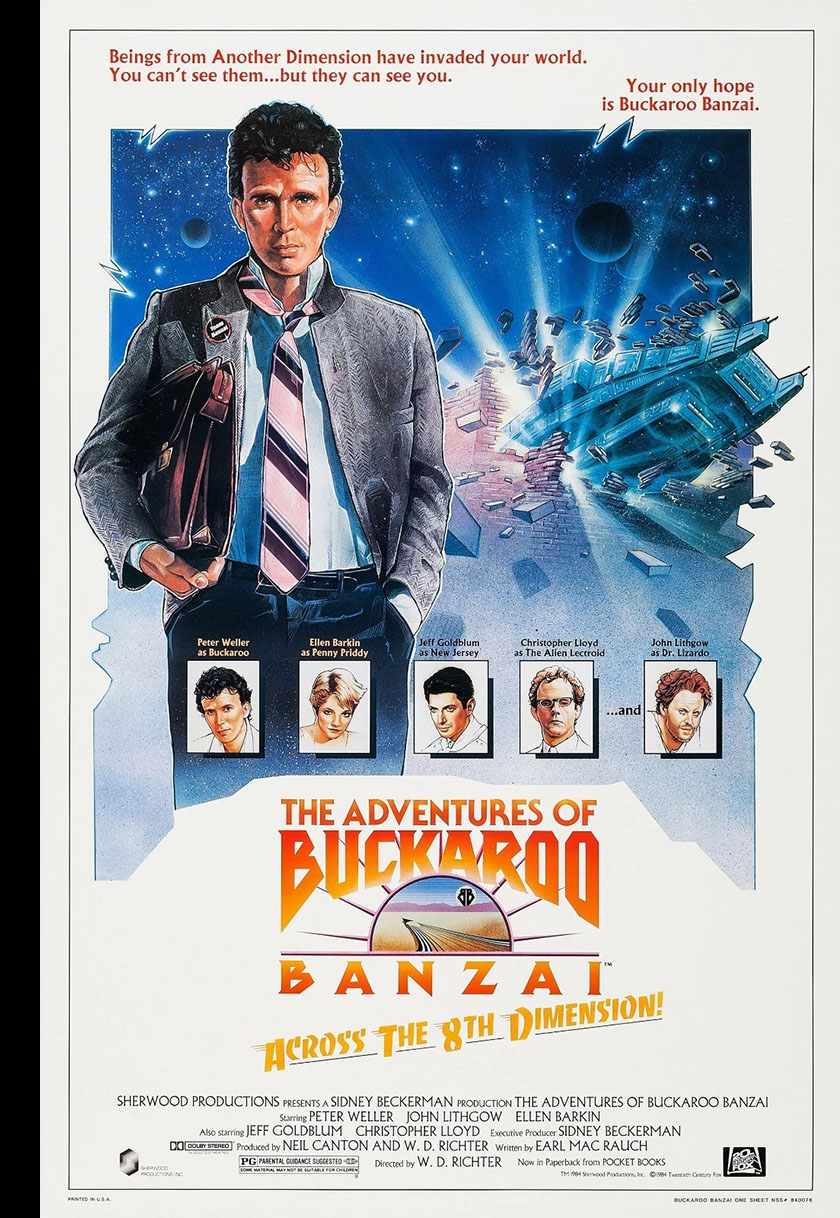
For a very brief moment, we got a look into another dimension. And I’m not referring to the Eighth one.
This was a dimension of action, adventure, charisma, science, and incredible potential. When Buckaroo Banzai Across the Eighth Dimension premiered on August 10, 1984, my geeky friends and I were there on opening night. As purveyors of every sci-fi and action movie, we’d seen the trailer and were instantly hooked. It seemed entire natural; sci-fi had its foothold in modern cinema, and genre-expansion was the next step. This film seemed just right to catch on and become a pop culture touchstone.
History (and catastrophically bad marketing) had a different plan in store, but for us the film became an instant favorite and never fell from its perch. It was at once corny and cool. It was both funny and sincere. Seeing it for the first time felt like catching a plane that was already in flight. If you were ready for it, you could grab its wing and take the ride. If not, the plane would leave you spinning in midair and keep on flying.
It was so much fun not even a crummy comic book adaptation could ruin it.
As with many films of the 80s, I got hold of the comic version first and read the whole thing in advance. Spoilers weren’t a problem for me, since the presentation style of comics and movies was so vastly different. Comics, for example, couldn’t capture sound. The good ones would make up for it with interesting, engaging artwork and become a different kind of vehicle for the story. The Buckaroo Banzai adaptation, sadly, wasn’t one of those.
The saving grace for a bad adaptation is built into the presentation style I mentioned above. Unless the story turned out to be garbage, the movie wasn’t going to be dragged down by anything in the comic.
There’s been a debate in the comics world for ages about the yin-yang of story and art. Can bad art ruin a good story? Can good art save a bad story? If you read comics long enough, you’ll see examples of both. Especially if you’re invested in a regular series (like, say, Marvel’s Star Wars) and they suddenly throw a terrible artist at you (like, say, Carmine Infantino). The writing was good enough for me to endure the art. I stuck it out until a better artist stepped in, and it was worth the wait.
But there have been other times when such changes were made and I suddenly found that I wasn’t invested enough to stay on board. It always comes down to your personal tolerance.
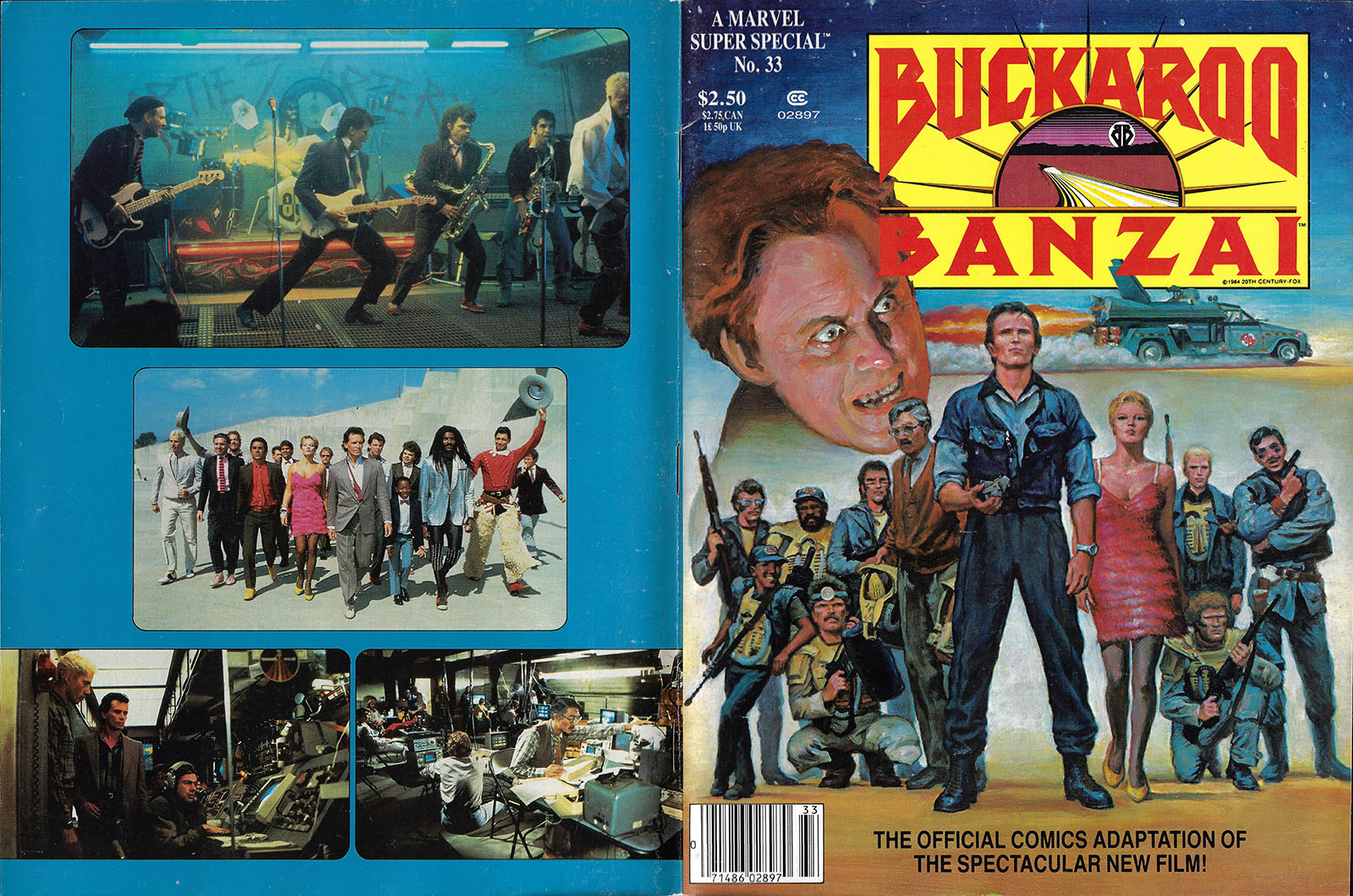
When I opened up Marvel Super Special No. 33 in advance of the movie, I could tell from first glance that I wasn’t going to like the art. But I wanted to find out what the movie had in store, so I bought it anyway and read it from front to back.
The artists were Mark Texeira (pencils) and Armando Gil (inks). Mark Texeira had also painted the cover, which I liked. But being a good painter doesn’t necessarily mean you’re a good penciler, because penciling is about much more than figure drawing.
Mark had been penciling comics for three years at this point, and was still honing his storytelling craft. He went on to a very successful career, so nothing I’ll have to say here can denigrate his later work. I’ll wager that no comic book pro (including me) looks back at their early work without some embarrassment, but we also learn a LOT when we look at it objectively. The learning is what I’m here for.
I’d previously seen Armando Gil’s inking on a Marvel series that I was VERY invested in, The Micronauts. It was another Star Wars/Infantino situation, where he and a new penciler tapped in and I disliked the art from the first page. Not enough to drop the comic, but it definitely became less fun to read. Armando’s brush style was heavy-handed and oppressive to me, and felt completely miscast on a sci-fi comic. He was a good fit for the baroque world of Conan. Micronauts and Buckaroo Banzai, not so much.
I repeat, none of this was a drag on the movie whatsoever. I loved it from the first frame and still love it today. Despite being visually rooted in the 80s, it still feels ahead of its time. If I were given the ability to revise history, re-engineering Buckaroo into an 80s film trilogy with all of its cast members intact would be on my list. But short of that, all we can do is weigh what we got and see what it tells us.
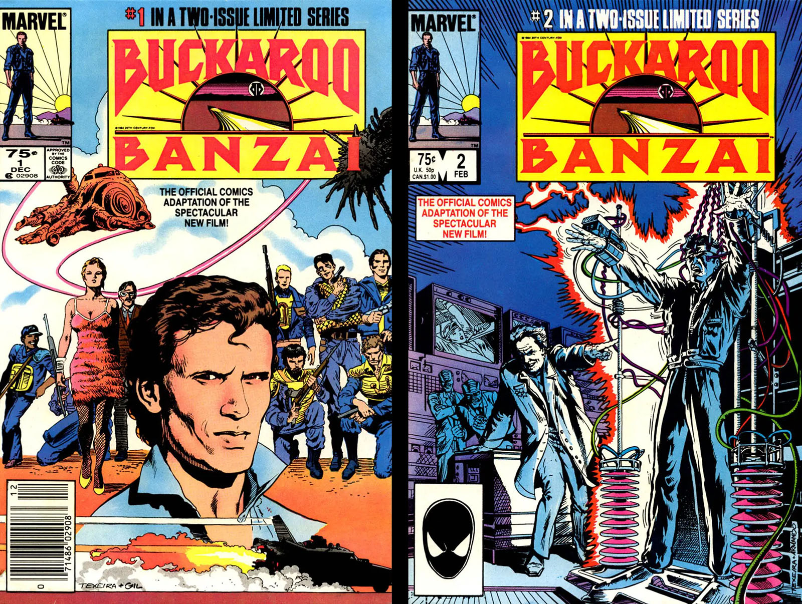
2-issue standard format version. Read both issues here.
The Comic
If there was one overall lesson to be learned from the Buckaroo Banzai adaptation, it was the importance of effective composition. This happens at both the panel level and the page level. For the most part, individual panels in this comic follow the same rudimentary format: word balloons clinging to the top and drawings rooted to the bottom. Consider that the baseline.
To make a composition interesting, you need to look for opportunities to “spike the baseline.” In other words, pick a moment to do something different. The baseline then serves a real purpose, giving you a standard to vary from. That’s how you make a story moment more important. The most accomplished pencilers base their page layouts around those spikes. How do you recognize a spike? Whatever image on a page jumps out at you is the spike. Everything else is the baseline supporting that spike. The opposite of that approach is to keep all the panels at the baseline, squared off and uniform, with no noticeable spikes. (Conversely, artists who try to spike everything just end up with that as their baseline. If it’s all spikes, then nothing is a spike.)
If you don’t have the experience or confidence to think at the page-layout level, you can still spike a baseline by varying camera angles, experimenting with light and shadow, and making the word balloons an active element rather than a passive one. (They can do more than just contain words, believe me.)
With that in mind, let’s put a spotlight on some moments in this comic (all pages from the 2-issue edition)…
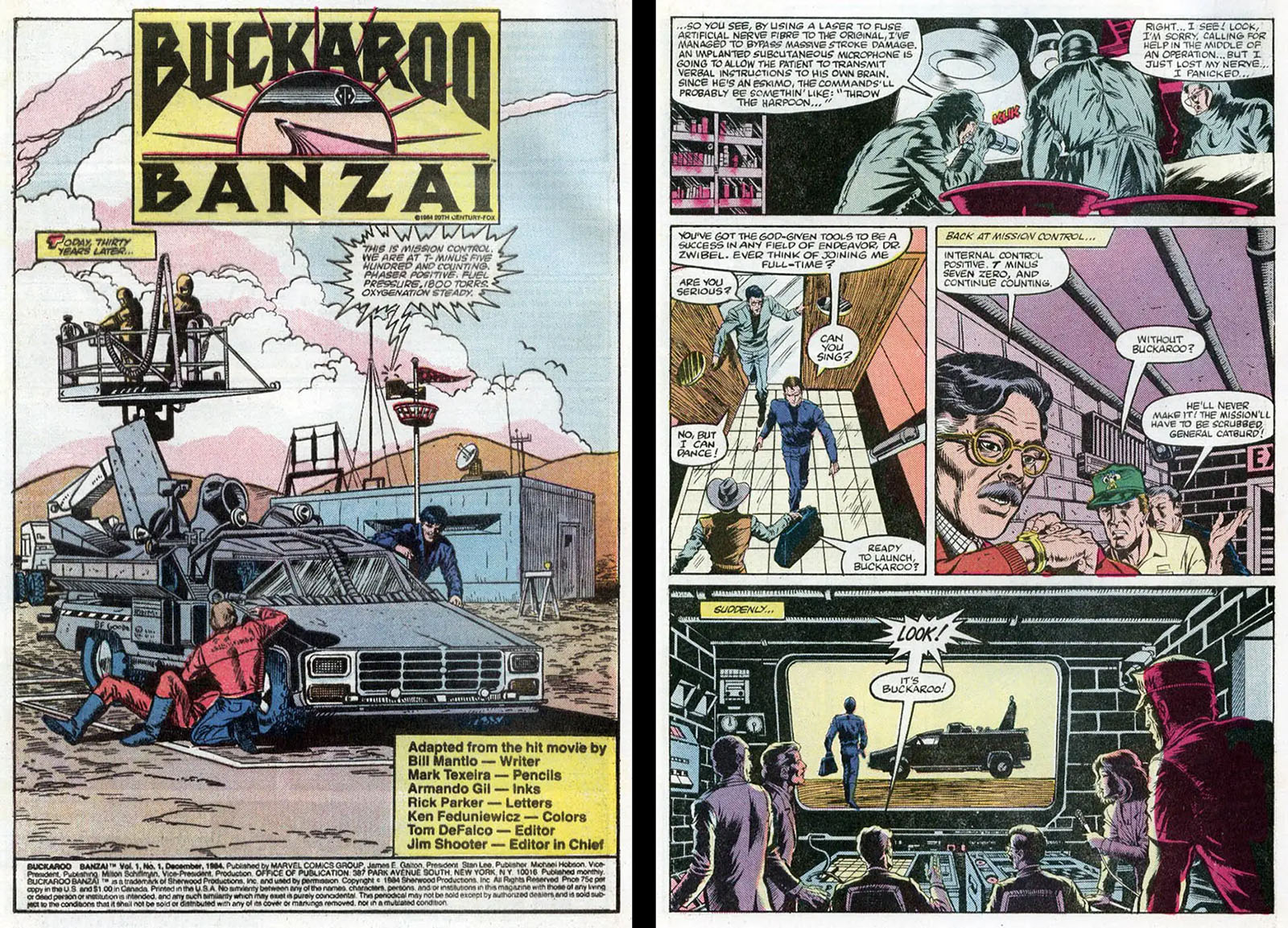
Left side: the opening splash page sets the tone right away for wasted space. All the important elements are crushed together, reducing scale and giving us no sense of the wide open desert we’re supposed to be in. There’s no reason the logo and credit boxes should have taken up so much room.
Right side: the composition of panel 1 is awful. Nobody wants to read a word balloon that dense. It should have been broken in half and stacked. The space below it contributes nothing to the composition. In panel 3, the characters are jammed into the lower half of the panel and overlapping each other while we get a useless look at the ceiling. This is the sort of thing beginners do.
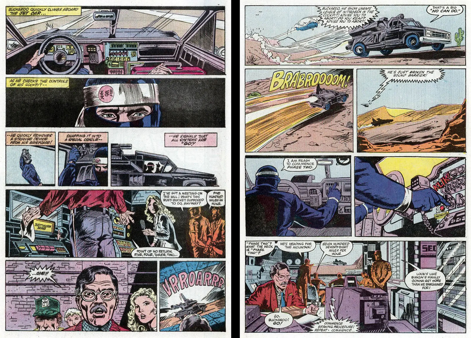
Left side: the car roars to life all the way down at the bottom of the page, crushed into a tiny panel. Just to the left is a panel with room to spare. This makes the car look like the least important thing on the page when in fact it’s the opposite.
Right side: the third row down shows Buckaroo behind the wheel, taking up two whole panels to depict the flipping of a switch. Meanwhile, the breaking of the sound barrier barely gets noticed. These two pages are a perfect example of everything being drawn at the baseline with no thought about what should be spiked.
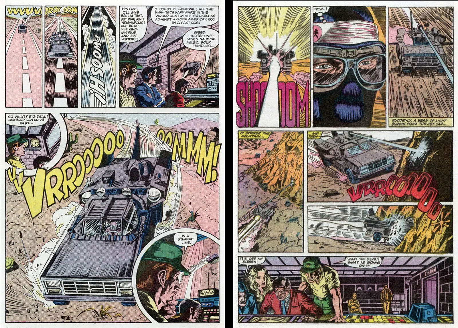
Left side: this is the only page of its kind in the entire adaptation. You have no doubt at all about what’s the most important event. It would be better if the jet car wasn’t crashing into that circular panel, but you can’t have everything.
Right side: but then something even MORE important happens when Buckaroo’s jet car phases into the mountain. The layout of this page minimizes it down to nothing. These pages don’t face each other in the comic, but the allocation of space should have been flipped to favor the second one. As it is, the drama is completely crushed. Also, what’s with that wasted space in the bottom panel? All it does is take up square inches that should have been spent on the big moment. Blah.
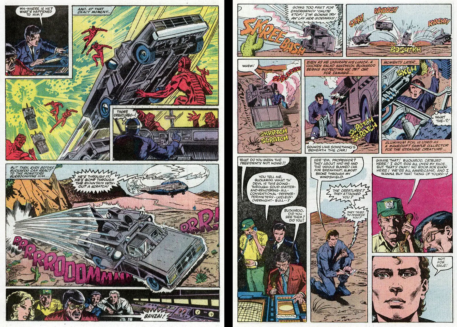
Left side: we’re doing better here, but the impact of the first panel is compromised by the inset panel where we get a lot of attention on Buckaroo’s dashboard, but not much on what’s outside. Meanwhile, the first and last panels on this page serve no purpose.
Right side: The biggest event on this page is the jet car bouncing to a stop, but again it gets almost no real estate. At the very least, the action in the first two panels should have been combined into one. Everything in the lower half has more room than it needs, so you could allocate some extra space from there.
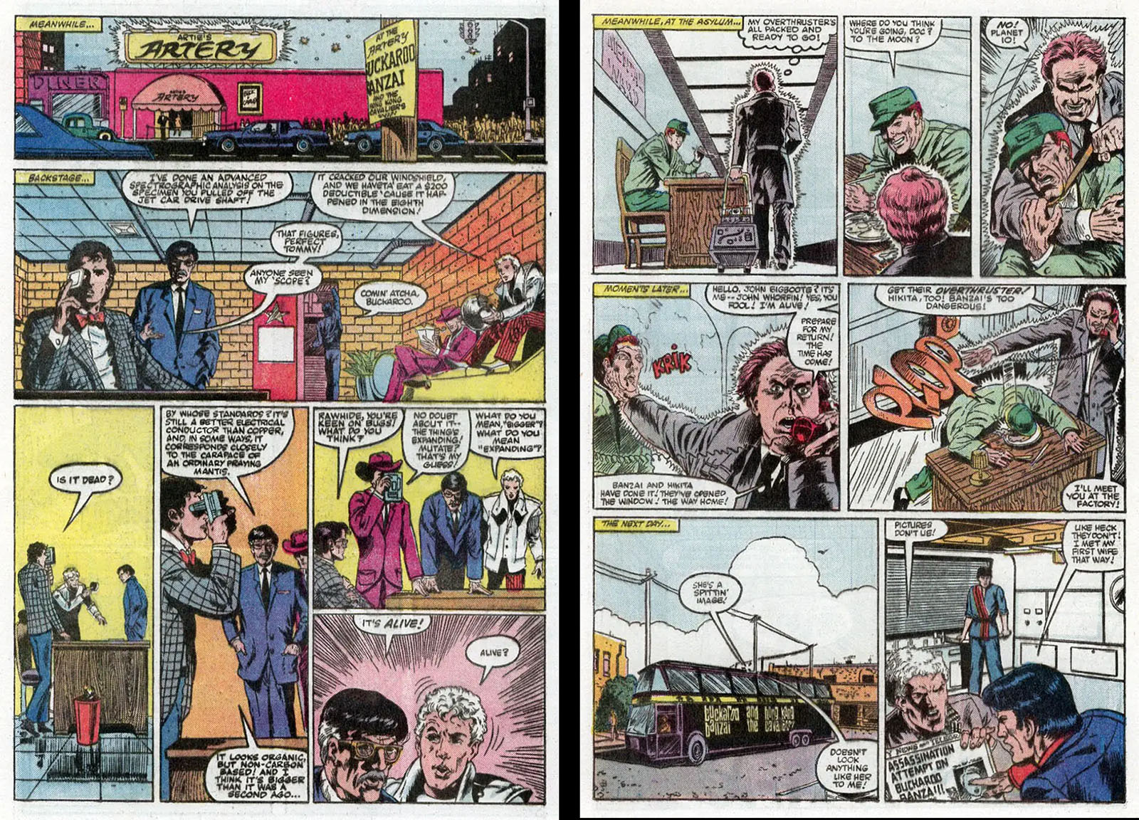
Left side: I cannot count the times I saw drawings like panel 2 in someone’s portfolio. All the labor went into drawing that room (every…damn…brick…) and the characters are just thoughtlessly placed in it like nobodies. Speaking of which, we don’t even see complete bodies. All the panels in the lower half have wasted space that serves no purpose, and the word balloon placement is amateurish at best.
Right side: we get a good likeness of John Whorfin in panel 4, and it sticks out like a sore thumb because it’s one of the few images based on a photo. Unless you’re a good enough artist to maintain that quality all the way through, it just makes the rest of your work look terrible. More wasted space in the bottom panels. (This is a running theme now, isn’t it?)
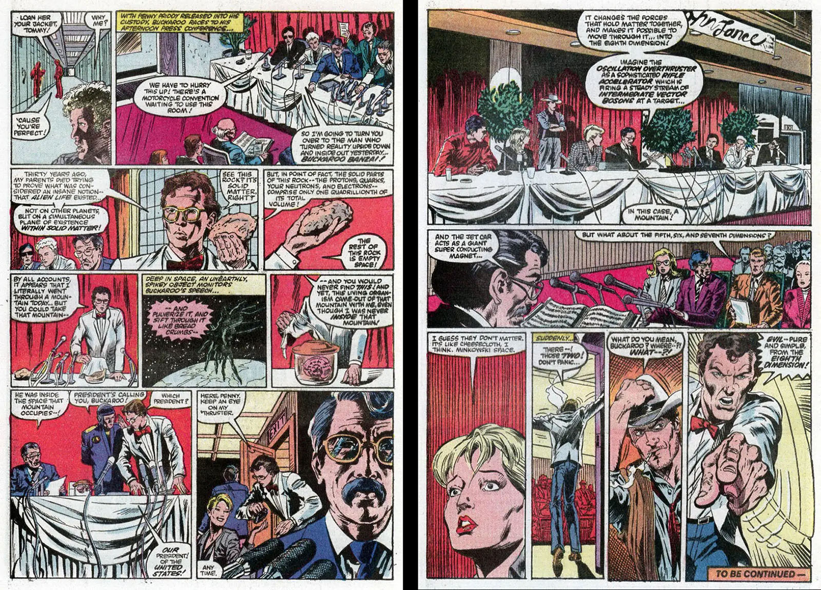
Left side: we’re getting toward the end of the issue, and a lot of compression is happening. That makes this page almost unreadable. Everything bad is happening all at once with too much dialogue, no room for an establishing shot, and wasted space all over the place.
Right side: on the last page of the first issue, we open with the establishing shot we should have seen earlier. At the bottom, Buckaroo refers to the two Lectroids in the audience and points at them, but we don’t see them. Moments like that should be spikes. As drawn, they don’t functionally even exist.
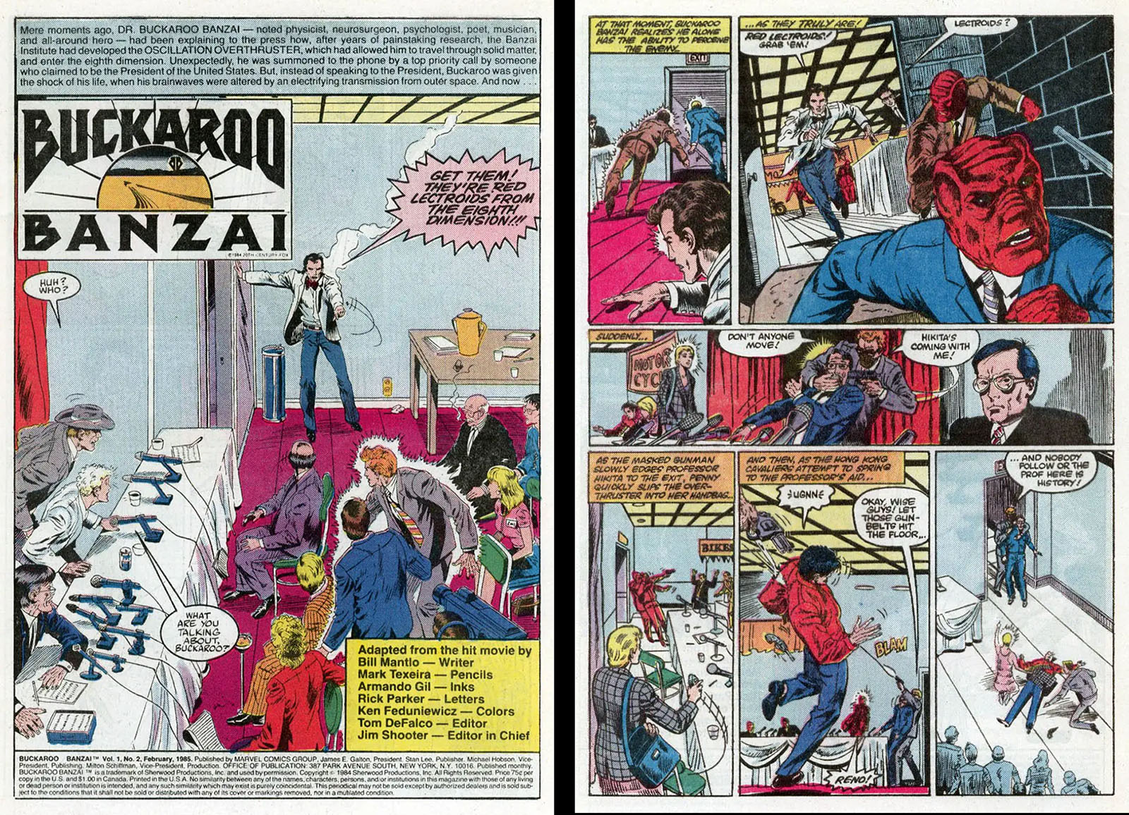
Left side: the payoff sort of comes on the first page of issue 2, but here again we have those big logo and credit blocks mucking things up. The entire upper half of the page is empty space. BTW, the logo and credit boxes were removed in the Super Special edition, making the empty space even worse.
Right side: For a very brief moment, we have a single well-crafted panel at the top of the page (upper right). Everything is nicely balanced for a change. Enjoy it, because we won’t get many more.
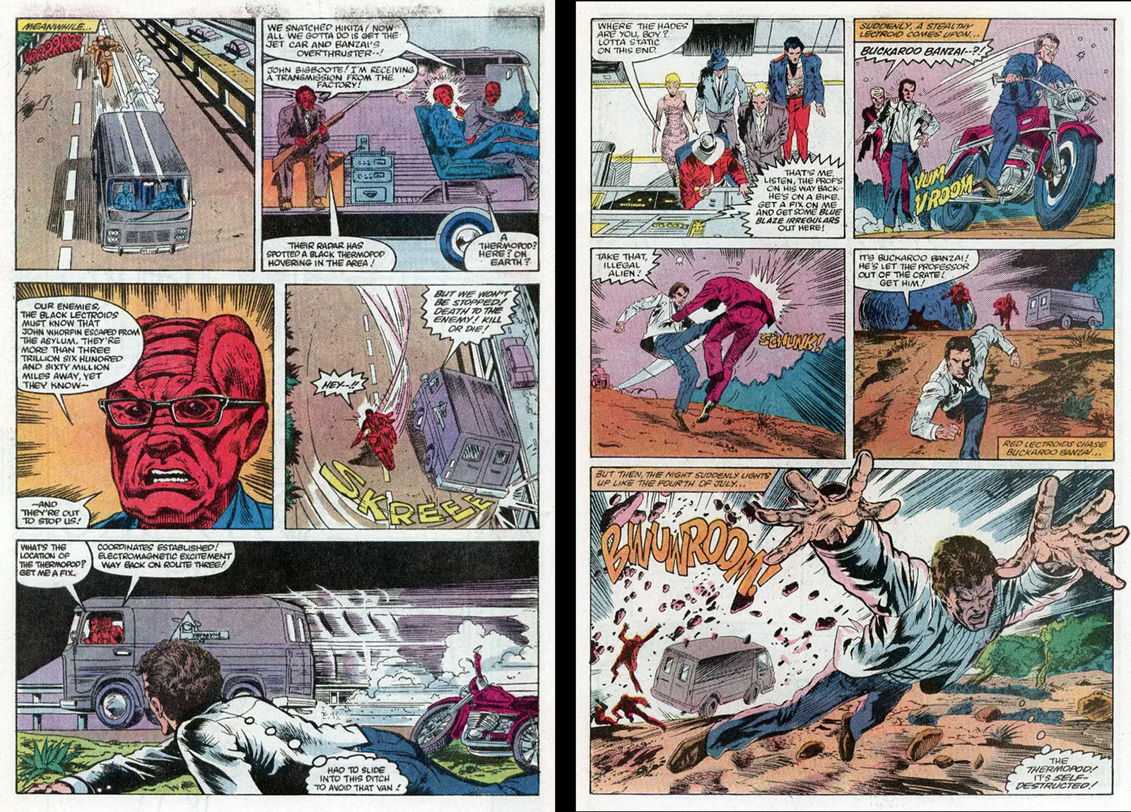
Left side: panel 2 is a ridiculous cutaway showing the inside of the Lectroids’ van. Panel 2 is a closeup of one of them, pointing in the wrong direction and being crowded by his own word balloon. If I saw this in someone’s portfolio, I’d suggest they put more time in before coming back.
Right side: here’s a rare page where you can see the “spike moment” at a glance. Unfortunately, the figure drawing and perspective are pretty awful. But it’s a step in the right direction.
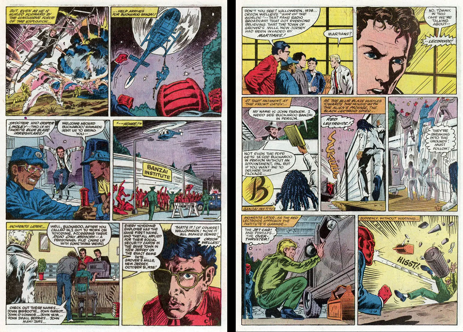
Left side: by now, you should be able to see right away where all the wasted space and badly-placed word balloons are. We’re about halfway through issue 2, and nothing is getting better.
Right side: there’s a criminal amount of wasted space in the top two panels. Also, the guys are in the lab at this point of the story, not in the…whatever this place is. Everything on these two pages is so uninspired and flat and dull, we get no sense of priority.
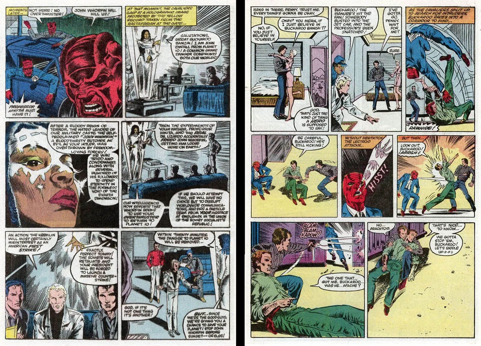
Left side: more word-crush as the entire John Emdall speech is crammed into a single page. Which panel contains the most important moment? No idea. Why are panels 2 and 4 essentially the same? No idea.
Right side: the empty space in the last panel seems intentional for a change. Rawhide just died, and we get a sense of emptiness from the composition, but we’ve seen so much emptiness already it doesn’t have the desired effect. Right above it is the panel of Rawhide actually getting struck, but it gets almost no play.
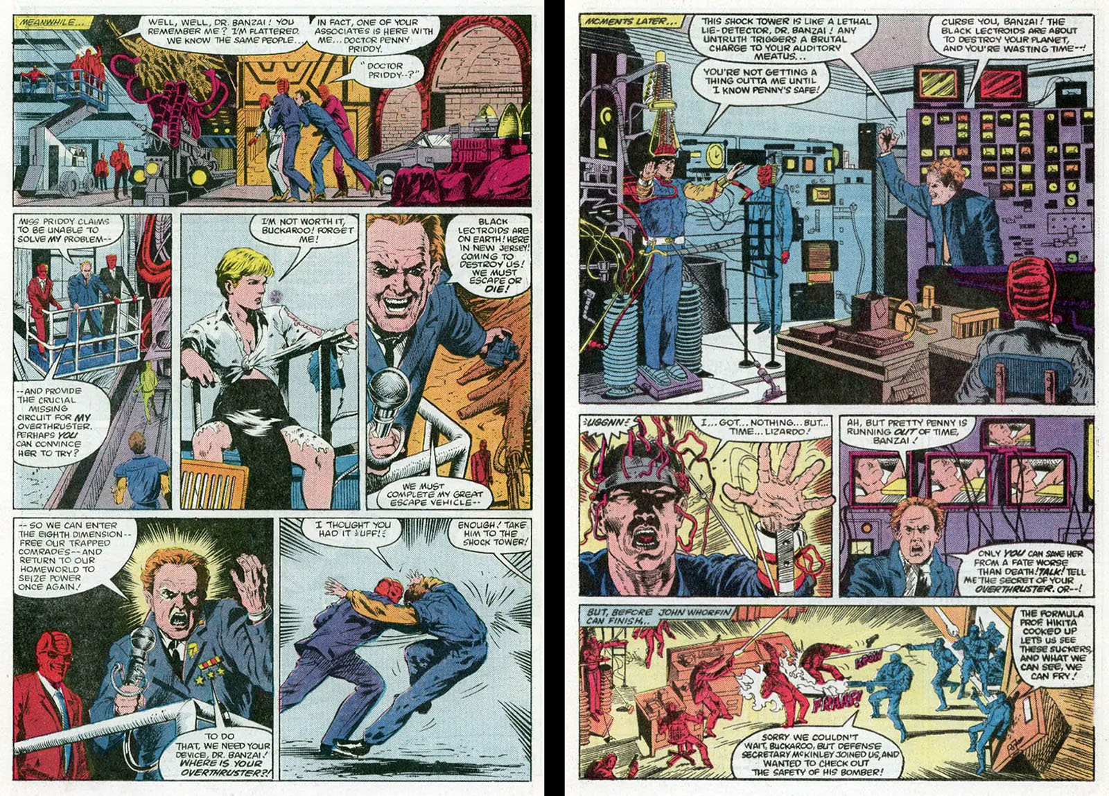
Left side: at last, Buckaroo is dragged before John Whorfin for a confrontation. Why doesn’t it look that way? Because it’s crushed into panels 1 and 2 in such a way that you have to puzzle it out for yourself. That’s not your job as the reader.
Right side: here’s a nice big establishing shot for a change. It’s essentially traced from a still, and unfortunately it’s been flopped. And then the biggest moment on the page is crushed into the bottom panel. We never get a win in this comic.
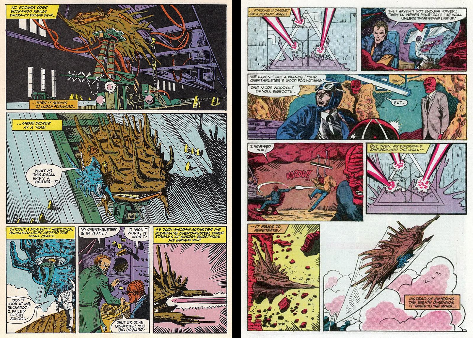
Left side: not bad here; the first panel gives us plenty of context. The second panel just shows us the same thing from above, though. Nothing has moved. These two panels could easily have been combined into one big one. Incidentally, this page was left out of the 2-issue edition I linked above. I don’t know if that was on purpose.
Right side: what’s the key moment on this page? Only one of the biggest moments in the movie, when the Lectroid ship bursts out of the Yoyodyne building. That shot was so big they put it in the trailer. You barely notice it here. Partly because it’s in a small panel, but also because it’s shown in profile, which is the WORST possible angle to convey information. Profile shots actively remove information from a scene, which is why you almost never see them in film.

Left side: wrapping it up (finally), there isn’t a lot of wasted space on this page. We’re up in open sky, and it sort of feels that way. However, panels 1 and 4 are essentially the same. One of them should have been dropped or used for something else.
Right side: The climax! Whorfin’s ship EXPLODES! But you’d never know it at a glance. There just isn’t enough information to get you there.
And that’s that. I would have LOVED to pour admiration over this comic, but it never earns it. I’m sure the artists are doing much better work now, and that this project represents a learning curve that they got paid to take. (I was on my own learning curve in my early years, and I was lucky enough to get paid for it, too.) But Marvel editors knew better. They could tell beginners from veterans. Was it simply that no veterans were available? Was the page rate too low to entice a veteran? Was Buckaroo Banzai not prestigious enough to attract more experienced talent? We may never know.
On the other hand, this is an excellent tool to prove the importance of strong composition. Sometimes you can learn more when the magic is missing.
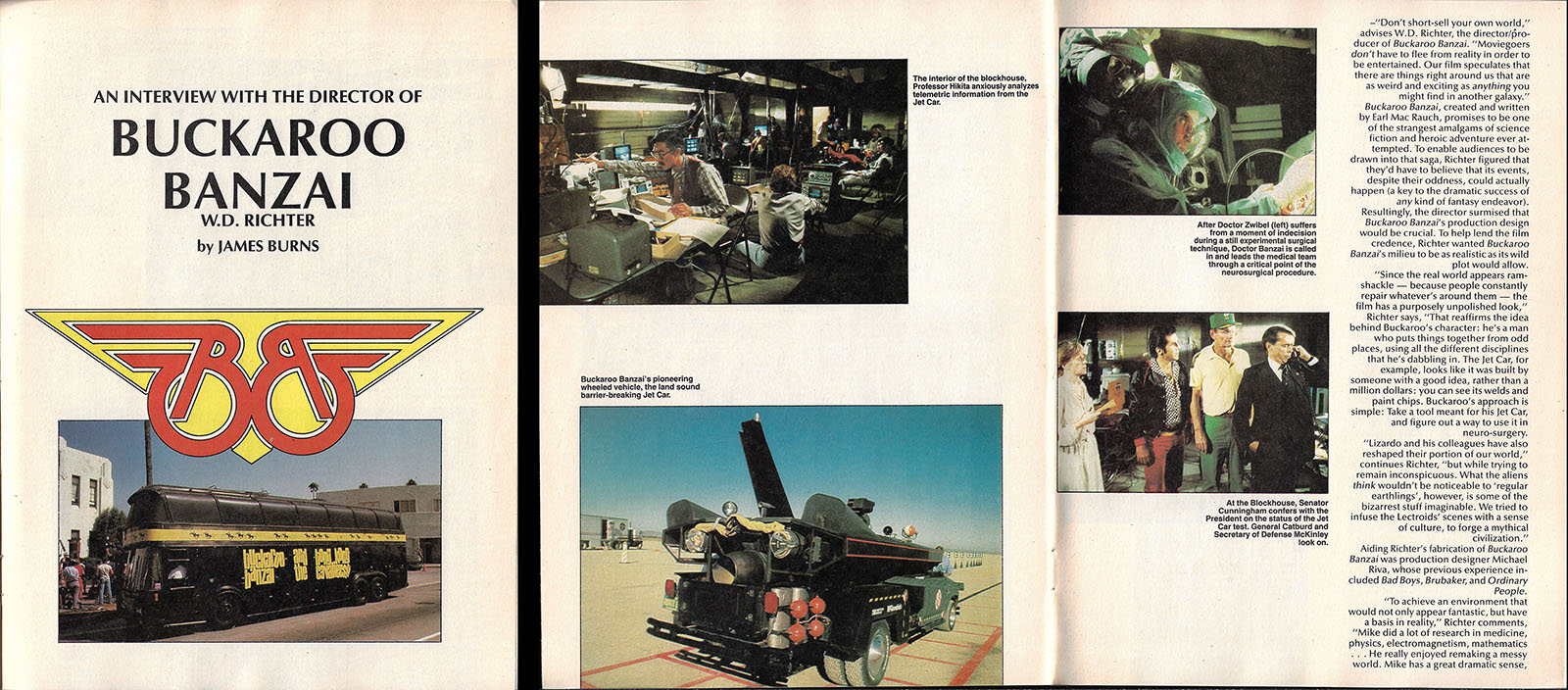
The complete adaptation covered 48 pages in the Super Special, which was broken in half for the 2-issue edition. The Super Special added a 16-page interview with Director W.D. Richter; read it in a PDF here.
Buckaroo Banzai media
We didn’t get the movie franchise we deserved, but fortunately we didn’t have to go hungry in other areas. Here’s what you might have collected over the years as a vigilant Blue Blaze Irregular…
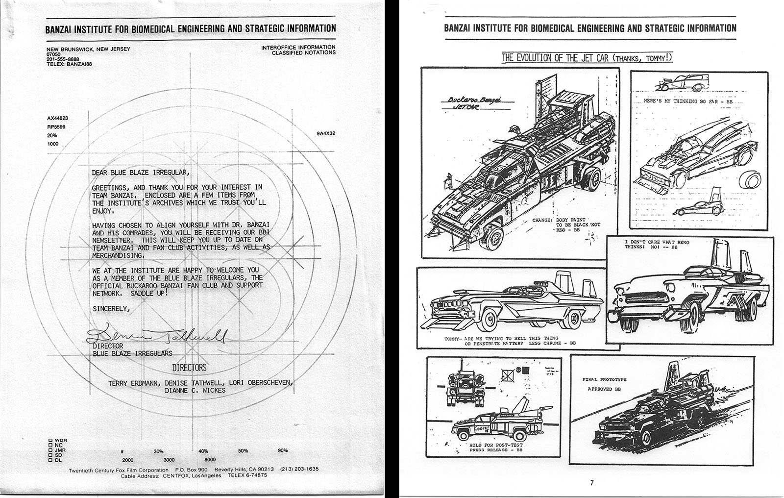
The Original Fan Club
In May 1985, I attended an SF con in Michigan where someone from showbiz turned up to run a Buckaroo Banzai panel, so you bet I sat in. This is where we got the official word that no sequel was in production, but there was a fan club within 20th Century Fox that was hoping to drum up support. They gave the address, I wrote in, and in August I received a satisfyingly thick envelope of material.
Inside was the first World Watch One newsletter, a loosely-organized collection that included a dossier of all the characters and a newsletter that rounded up a bunch of random info with fan art. Click on those words to see complete PDFs!
I heard nothing further from World Watch One, but there were additional newsletters. Someone turned it into a fanzine later. See several issues (and other eclectica) at archive.org here!
Music and Video
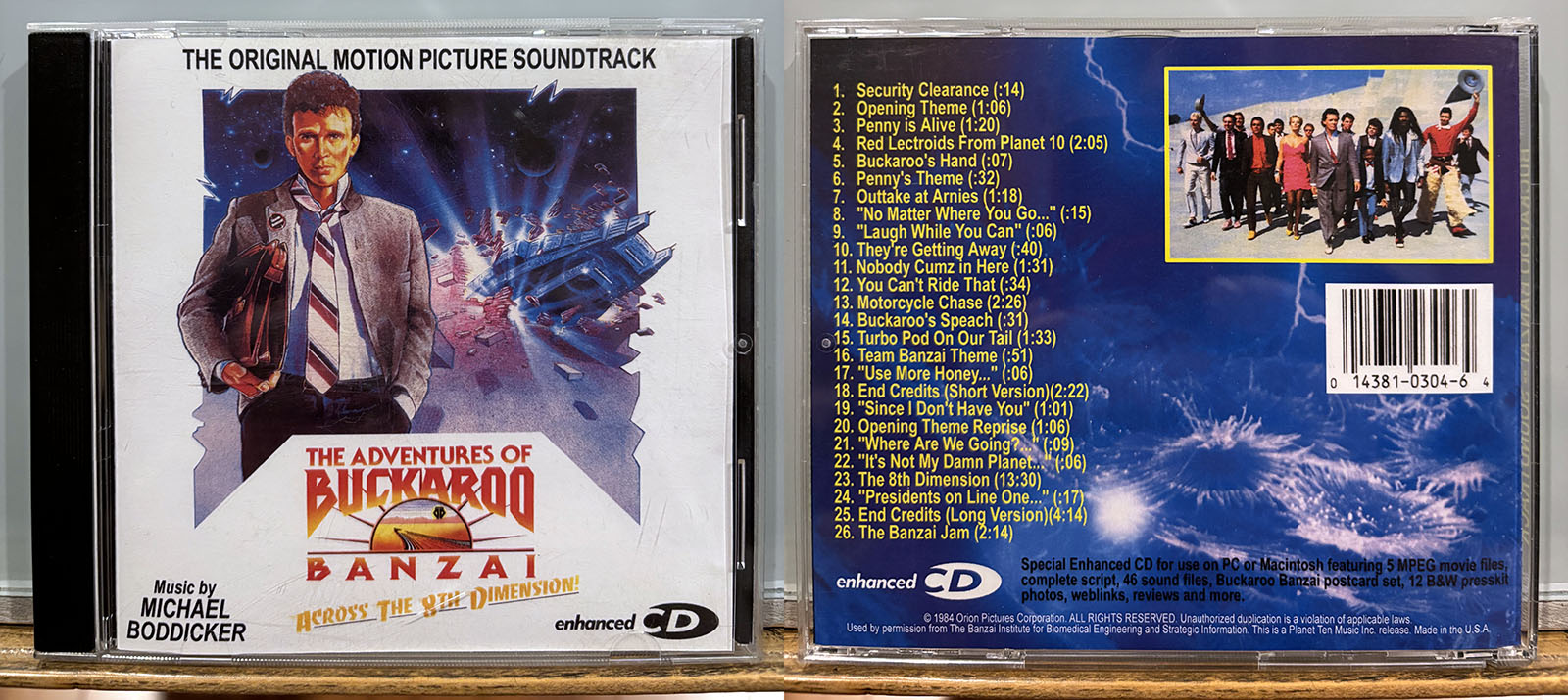
Motion Picture Soundtrack, Enhanced CD
Planet Ten Music, Inc.
I found this at a Comic Con or somewhere from a bootleg dealer, and it’s perfect for those moments when I can’t get that impossibly catchy theme song out of my head. This happens more often than you think.
Message from the makers: Why was this soundtrack created? Well, let’s just say it wasn’t all generosity, but then what is? For the most part, we’ve seen so many Blue Blaze Irregulars and other ‘fans in passing’ plunk down $100 even $200 for a single copy of the soundtrack. We couldn’t believe it. “This is ridiculous!” we thought. No one should have to pay so much for any CD. We decided then and there somebody had to make accessible copies of the soundtrack. It seems that the powers that owned the rights until recently cared little about those of us who desperately must have Buckaroo, especially the Team March!
It’s a CD-R, so it includes quicktime movies, the script, sound files, jpegs, and more. Most of the files are no longer accessible, but I rescued the lobby cards here
Listen to the CD on Youtube here
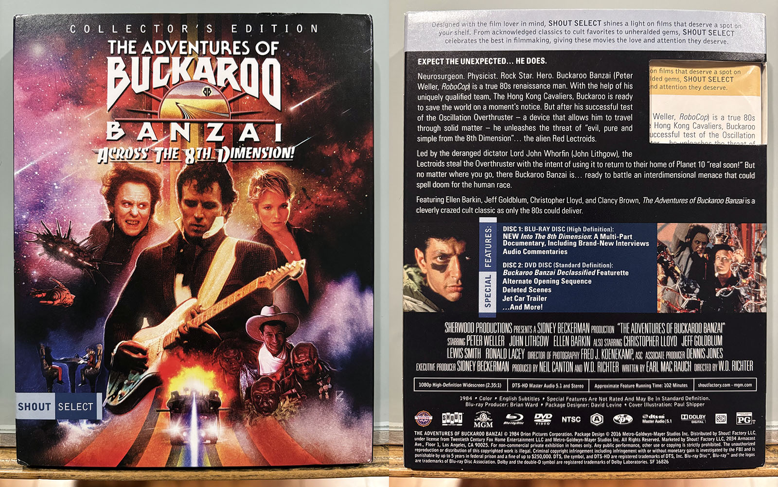
Collector’s Edition Blu-ray
Shout Factory
Two discs: a blu-ray containing the movie with extensive making-of documentary, and a DVD with multiple bonus features from a previous release. You might as well just go ahead and buy this, you know it’s inevitable.
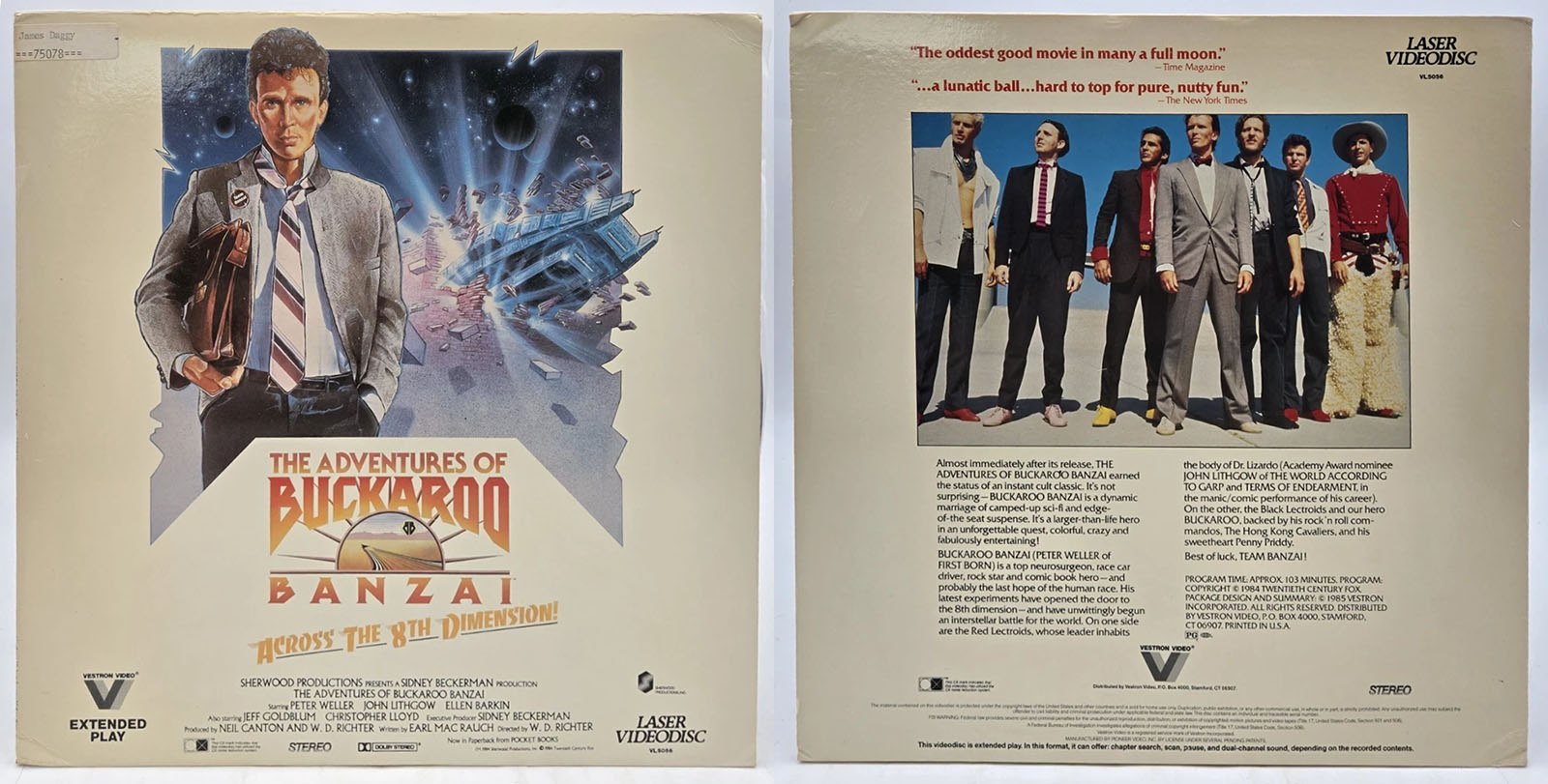
Original 1984 laserdisc
Vestron Video
Back cover text: Almost immediately after its release, The Adventures of Buckaroo Banzai earned the status of an instant cult classic. It’s not surprising — Buckaroo Banzai is a dynamic marriage of camped-up sci-fi and edge-of-the-seat suspense. It’s a larger-than-life hero in an unforgettable quest, colorful, crazy, and fabulously entertaining!
Buckaroo Banzai (Peter Weller of First Born) is a top neurosurgeon, race car driver, rock star, and comic book hereo — and probably the last hope of the human race. His latest experiments have opened the door to the 8th dimension — and have unwittingly begun an interstellar battle for the world. One one side are the Red Lectroids, whose leader inhabits the body of Dr. Lizardo (Academy Award nominee John Lithgow of The World According the Garp and Terms of Endearment, in the manic/comic performance of his career). On the other, the Black Lectroids and our hero Buckaroo, backed by his rockn’roll commandoes, The Hong Kong Cavaliers, and his sweetheart, Penny Priddy.
Best of luck, Team Banzai!
Books and magazines
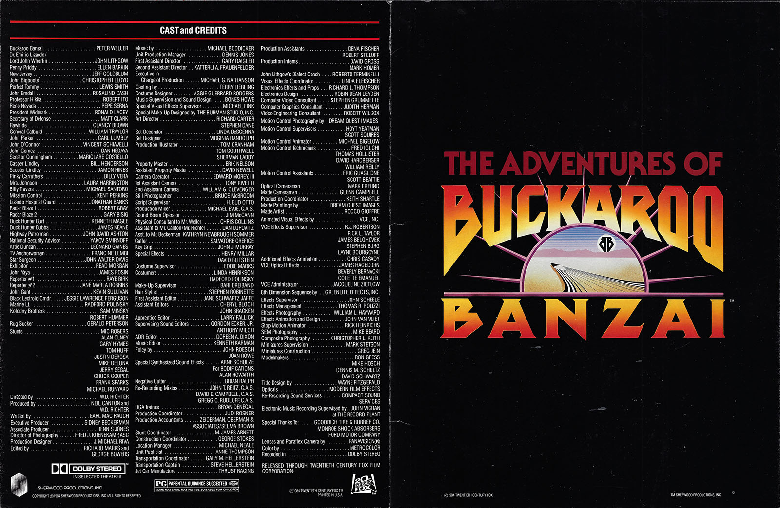
handed out in theaters
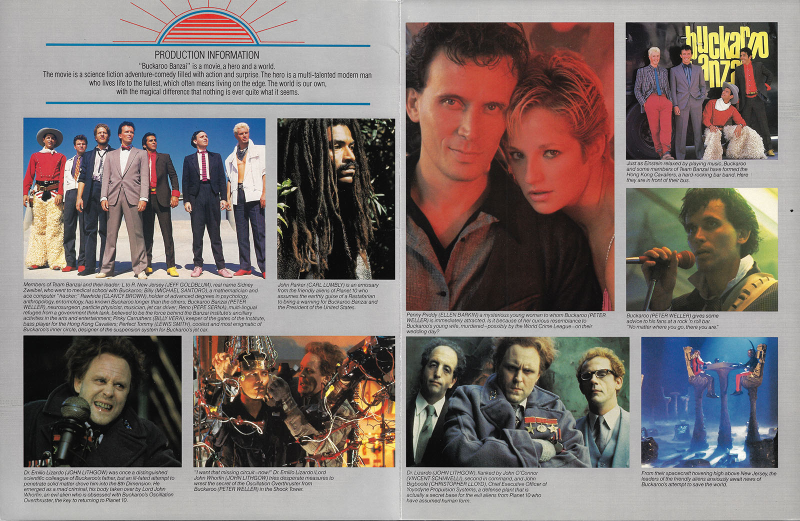
Pocket Books, 1984
The original movie novelization with a LOT of unfilmed content, of course. Written by the master scribe himself, Earl Mac Rauch.
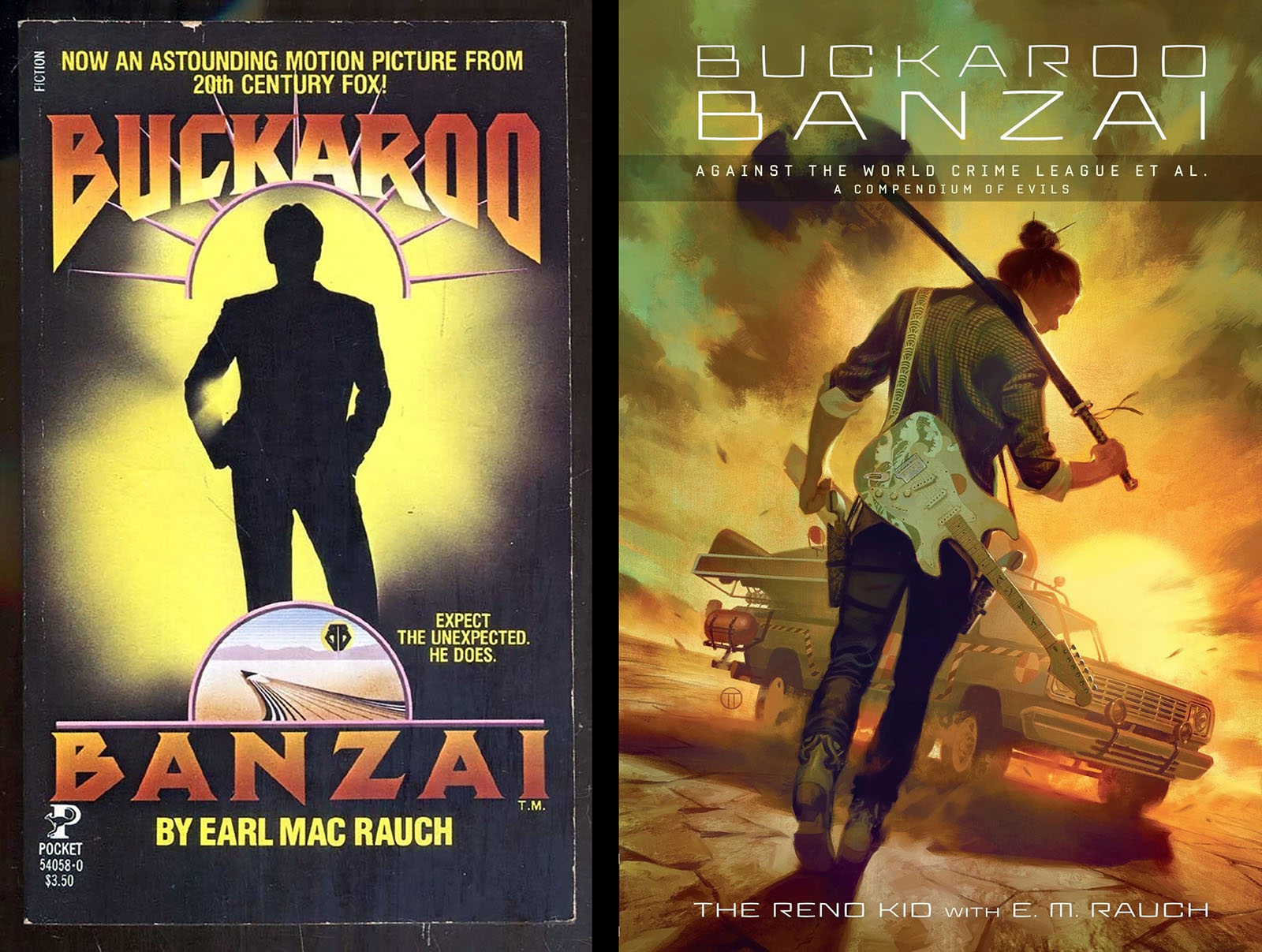
Dark Horse, 2016
The long-awaited sequel. It’s pretty flabby and delivers way more dialogue than plot, but it’s 100% authentic from the original author.
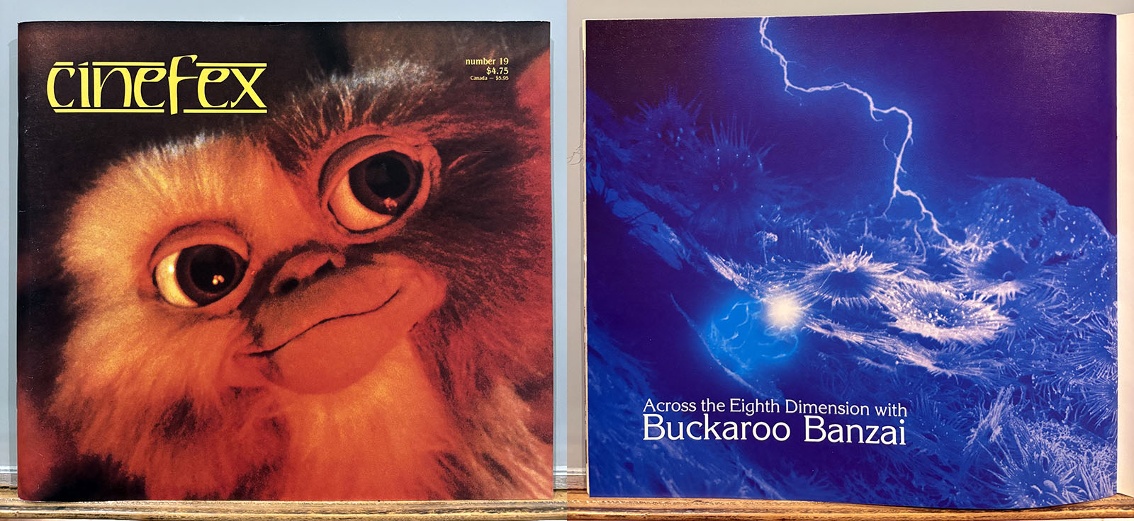
Cinefex magazine, issue 19
November 1984
Contains a 16-page article on the special effects filming of Buckaroo Banzai. See it in a PDF here.
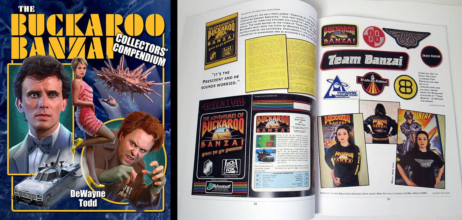
Collector’s Compendium
by DeWayne Todd, 2021
A huge 148-page scrapbook/love letter assembling every single piece of promotion and merchandising ever made. Or at least it seems like it. There’s way more than I ever imagined.
Official description:
If you’ve ever picked up a Buckaroo Banzai related item and wondered, “What is this thing, anyway?” then this is the book for you! Providing a comprehensive look at the marketing and promotional materials from the 1984 film, this book contains over three hundred full color images highlighting the wide range of materials from both domestic and international releases. Features exclusive interviews with Billy Vera, Laura Harrington, Bruce McBroom, Radford Polinsky, and others. Unique and one-of-a-kind items are highlighted, making this the ultimate guide for Banzai enthusiasts. Posters, slides, lobby cards, and original artwork from the comic book series are featured with translations for international marketing materials. One international reviewer remarked, “Does this all seem a little crazy? Then you have everything wrong because this is completely insane!”
Order your copy here
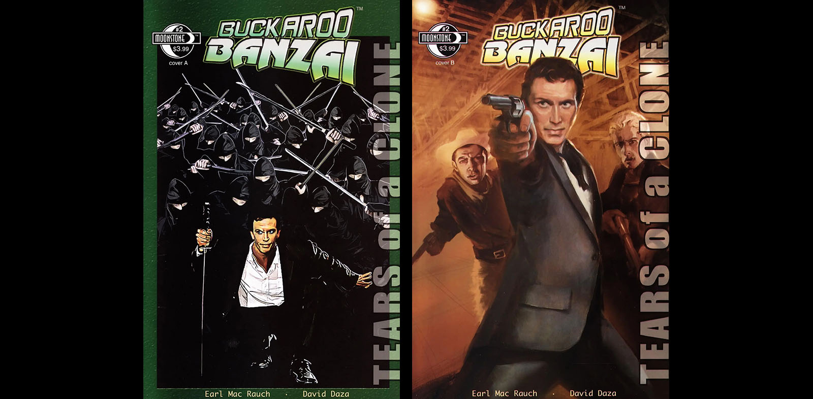
Comic Books from Moonstone Publishing
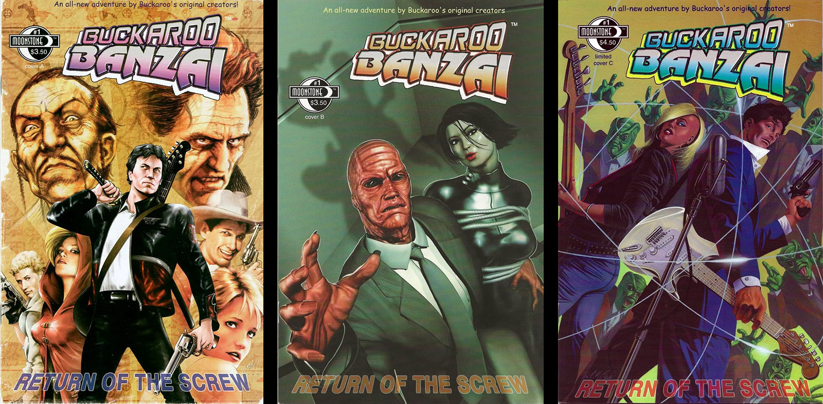
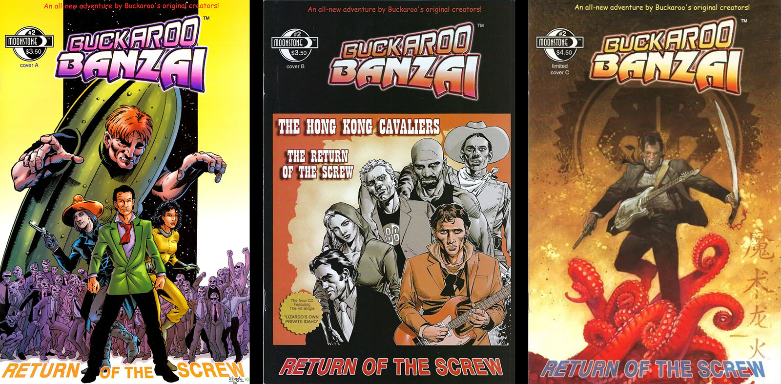
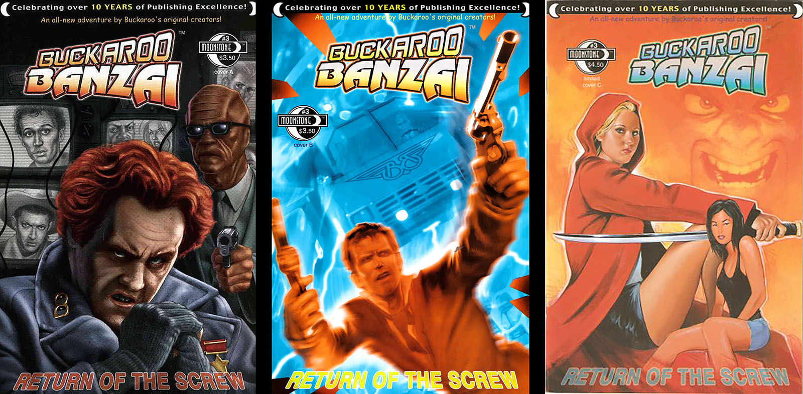
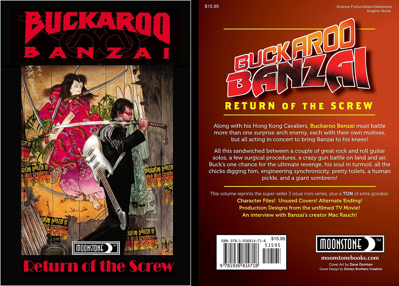
Reprints the first 3-issue series with extras
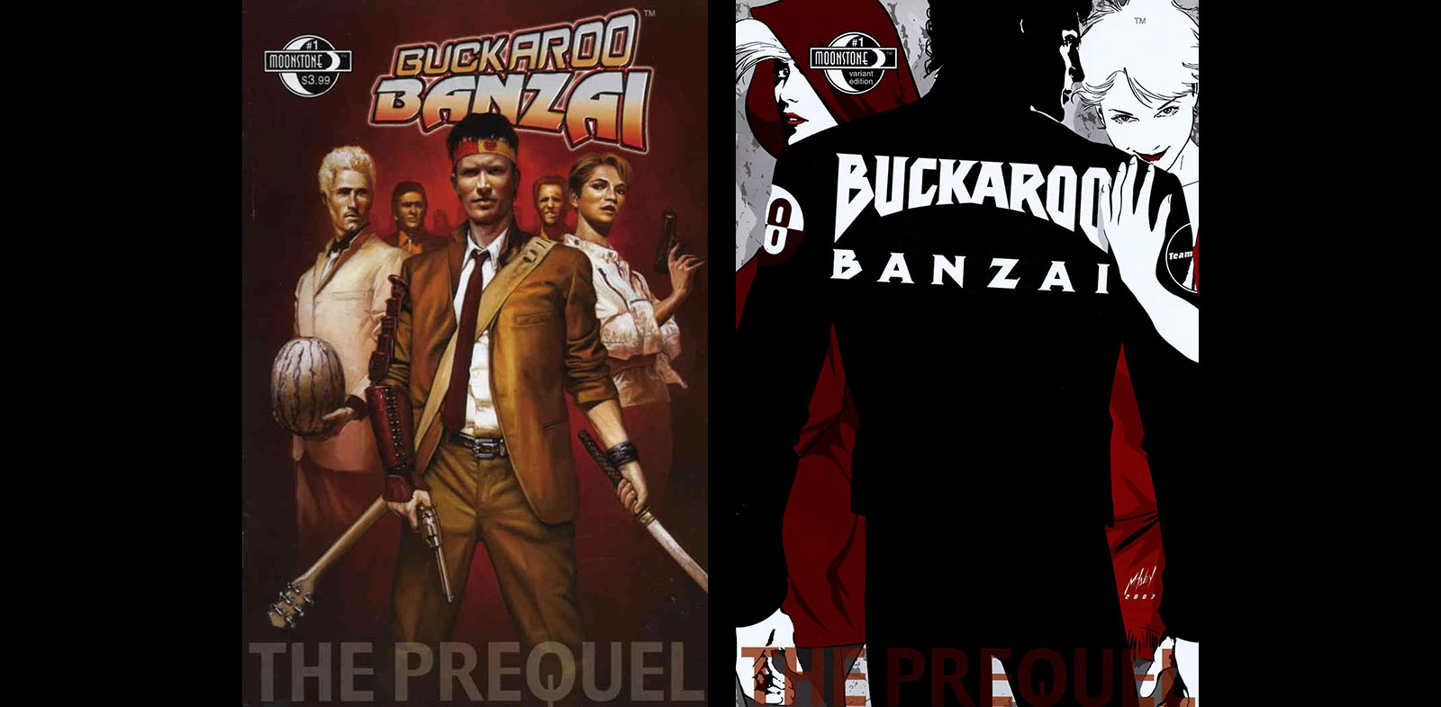
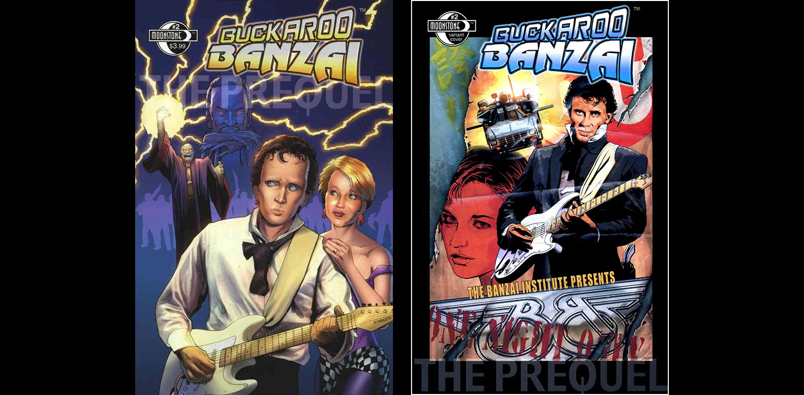
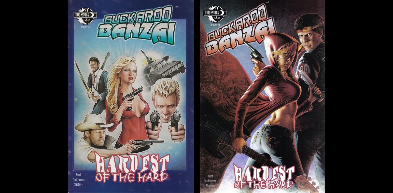
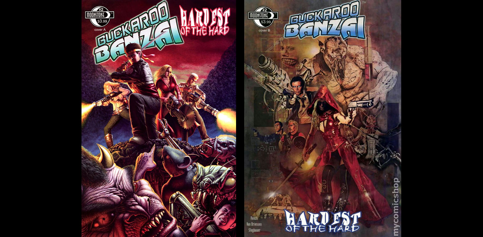
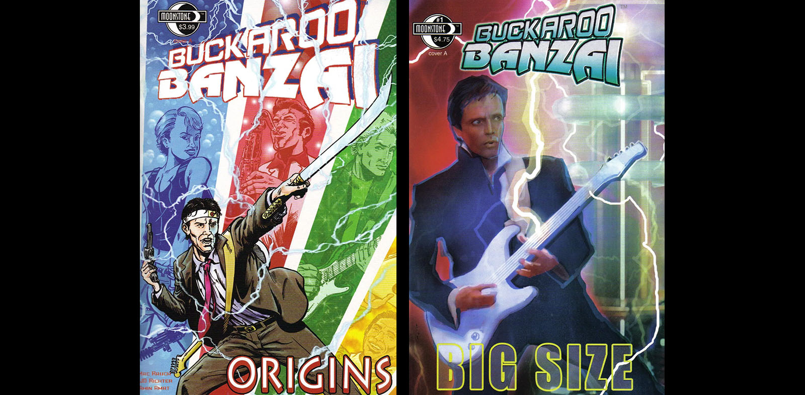
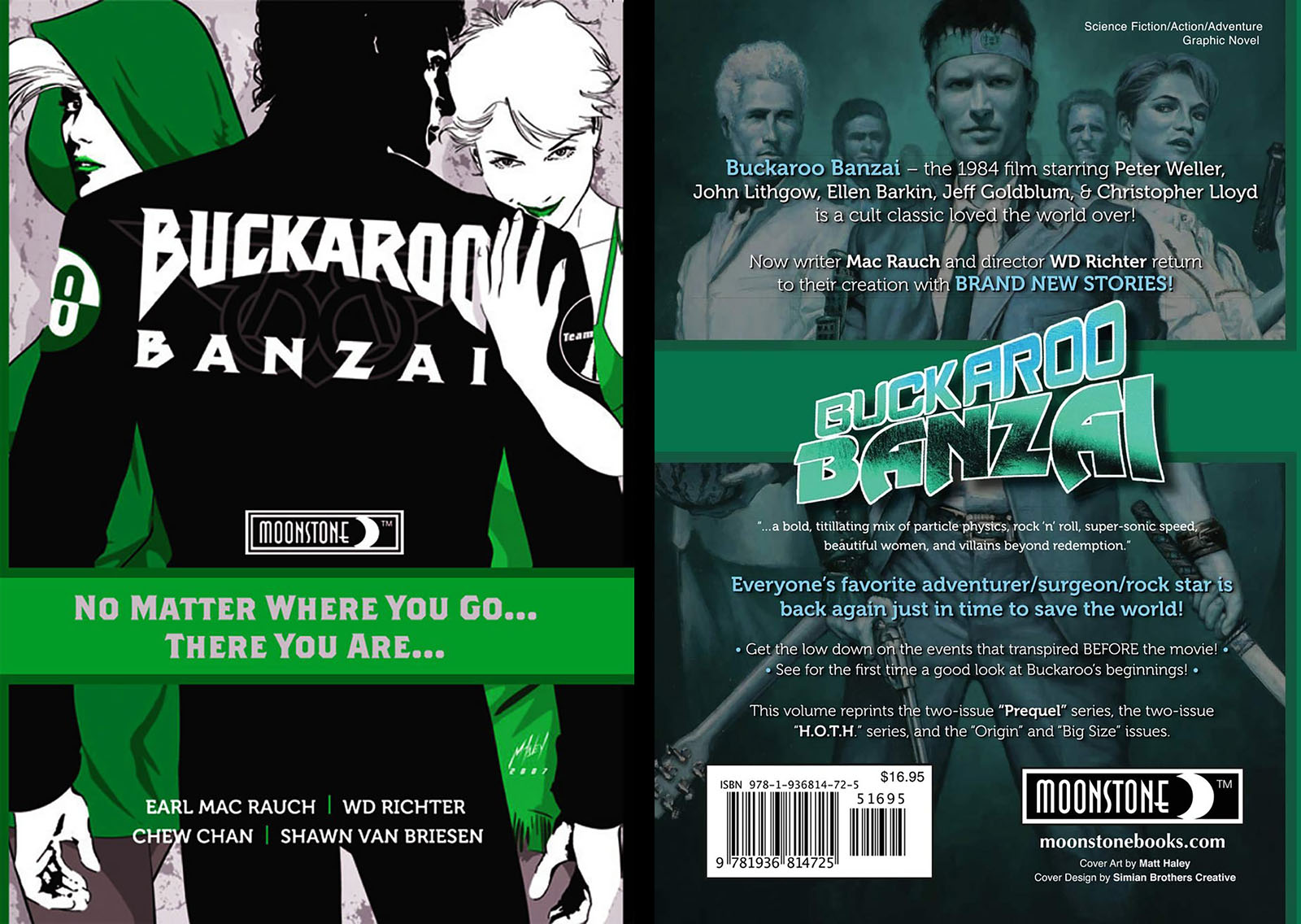
Reprints The Prequel, Hardest of the Hard, Origins and Big Size.

Related links
History of the Banzai Institute, karridian.net
Blu-ray review, RogerEbert.com
Buckaroo Banzai at 40: Accept no Substitutes, Hollywood in Toto
Does the Ultimate Sci-Fi Cult Classic Hold Up?, Inverse
A 40th Anniversary Salute to Anarchic Film Magic, 13th Dimension
Lucky Special Bonus

Animation design samples, 2011
This was one of the coolest dead-end projects ever, a moment in which I got to devise prospective character designs for a Buckaroo Banzai animated series. The assignment came through a producer friend who brokers deals between anime studios in Japan and entertainment companies in other countries. This friend was acquainted with Buckaroo creator Earl Mac Rauch, and the project was the latest attempt to bring these characters back to life.
I did the three illustrations seen here, and I was encouraged to get as stylized as I wanted. When I turned in the finished art, the response was very positive and things seemed promising. I was certain to be involved if it went forward.
Of course, it didn’t. I don’t remember the details, but the gist was that Mac Rauch did his regular Mac Rauch thing and derailed yet another Buckaroo relaunch. (It happened again in 2016, apparently.) But it was fun to dream for a few days.


Hey, Tim. My name is Steve Mattsson. Like you I worked on Dark Horse’s MECHA and I’m a big fan of Buckaroo Banzai. I’ve attached a link to my World Watch One Facebook page. I think you might like it. Also, I’d love to interview you about the Buckaroo animation pitch if you have the time.
Thanks for checking in, Steve! What was your role on MECHA? I’m afraid I don’t have any additional details about the animation pitch, since I wasn’t given any of the text material. I just received a request, showed them sketches, and they loved what I did. After I turned it in, I didn’t hear anything until I got the word that it fell apart due to rights issues. End of story.