
Star Blazers #11, 1997
I didn’t know it at the time, but 1997 was going to be my last year of making comics for an income. I made plenty of comics after 1997 (right up to today), but after I jumped into the TV cartoon biz in December ’96, a secret clock started ticking down to the day when comics would no longer pay my bills.
This right here turned out to be the very last comic book produced by my Studio Go! partners and me. At the time it was made, we were planning on at least four more to complete our adaptation of Be Forever Yamato. But life (more specifically, the comic book industry) had other plans. More about that next time. For now, I’ll focus on the puzzle pieces that came together to form Star Blazers #11.
In theory, the breakdown of tasks was the same as #10. Bruce Lewis adapted the script and laid out the pages, I drew the art, and John Ott did lettering and coloring. Then there were the editorial “housekeeping” tasks, involving the assembly of support pages, which was split up between us. It sounds simple enough in concept, but didn’t end up that way.
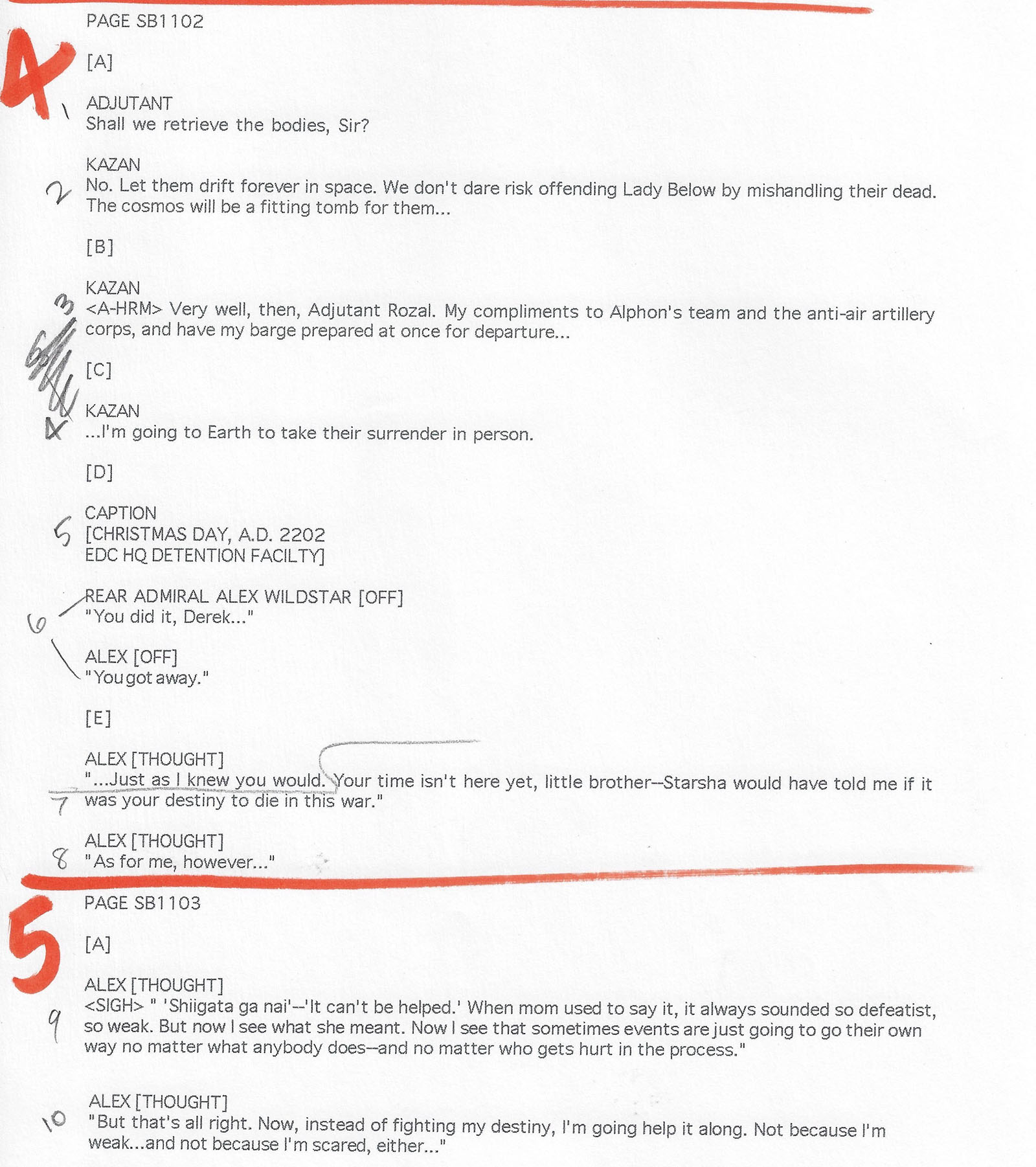
For starters, Bruce thought we could jam more story into the 22 pages we were allotted, so he overwrote the script. Two entire scenes were jettisoned, and others were streamlined. Some of Bruce’s page layouts were a bit over-ambitious in terms of how much content they could hold. Too many panels would have made for a very cramped reading experience. After scenes were cut, I managed this by compressing the loose areas and opening up the tight ones for more natural pacing.
We had to end on a big, full-page moment with the ship launching, so that became our major anchor point for the issue and everything in the second half shifted around to accommodate it. Fortunately, all the fragments were preserved and are shown below to demonstrate how it evolved.
Incidentally, the cover was a composite of two separate images. The ship (rendered in CG) came from a 1996 calendar and the background was a painting from a Be Forever Yamato art book, both published in Japan. I assembled it before the issue went into production, since it was needed earlier for promotion.
The interior art was produced from early March to early April and the finished issue was published in May.
Click here to see a PDF of the complete comic. Start scrolling to see it one page at a time…
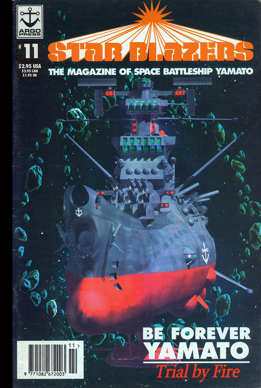
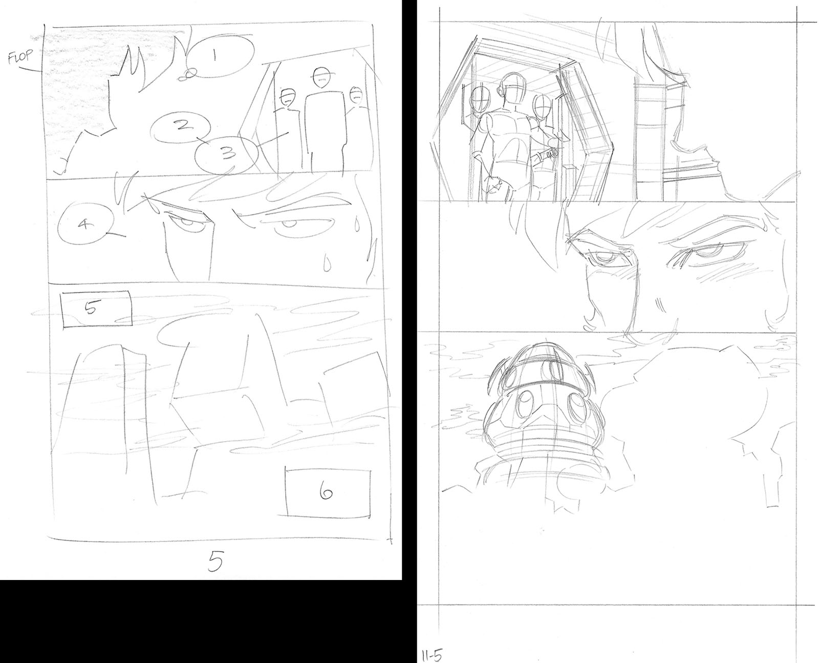
Opening scene: we had the chance to do something special with this one, which was to start with a scene that had been deleted from the movie. We knew about it because it survived up to the storyboard stage. I adapted it without a script, so the dialogue was written into the thumbnail pages (above left).


Here’s where the opening scene merged back into Bruce’s script. This is where he originally intended for the issue to start, but I wanted us to take the opportunity to show the deleted scene in full.
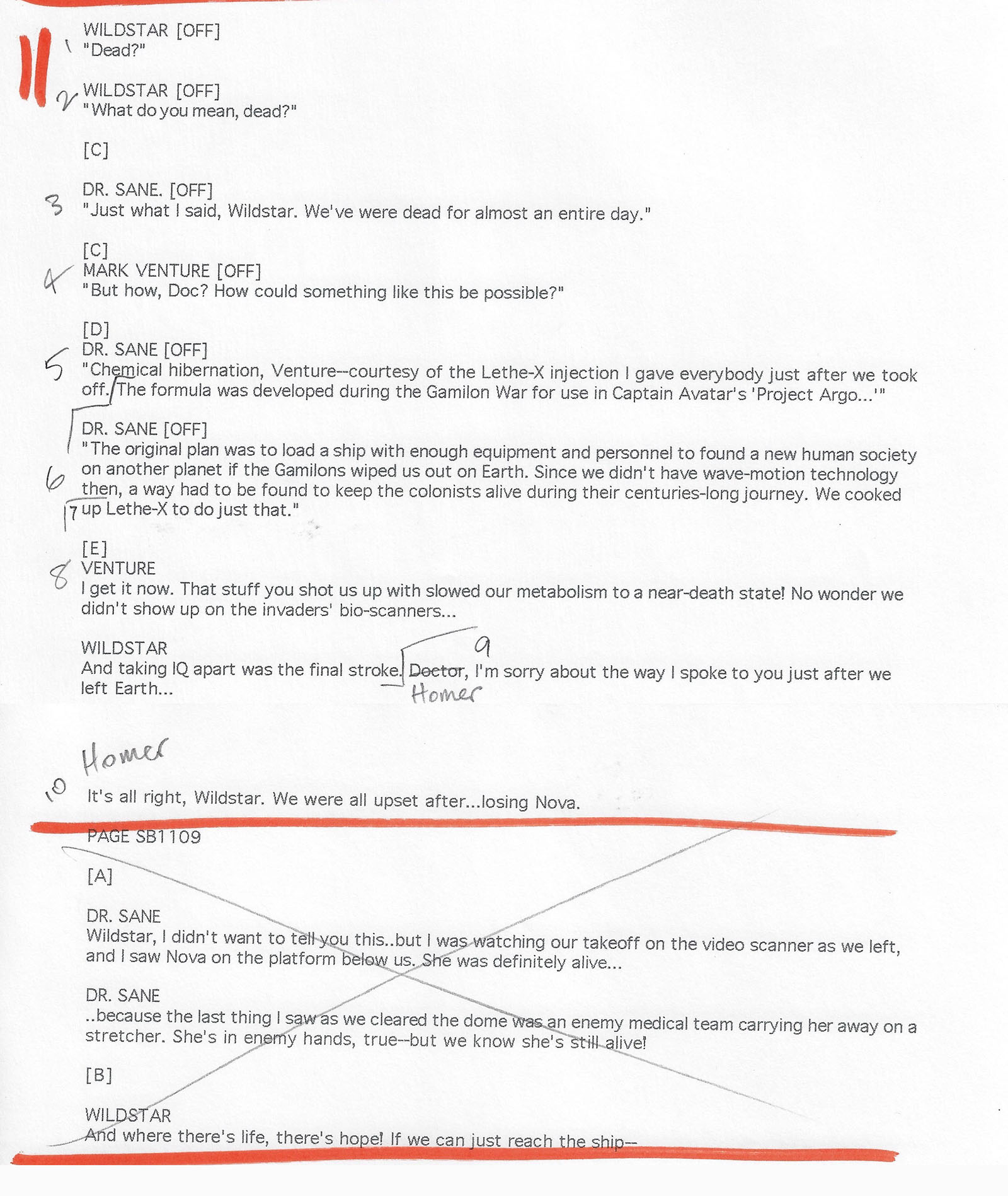
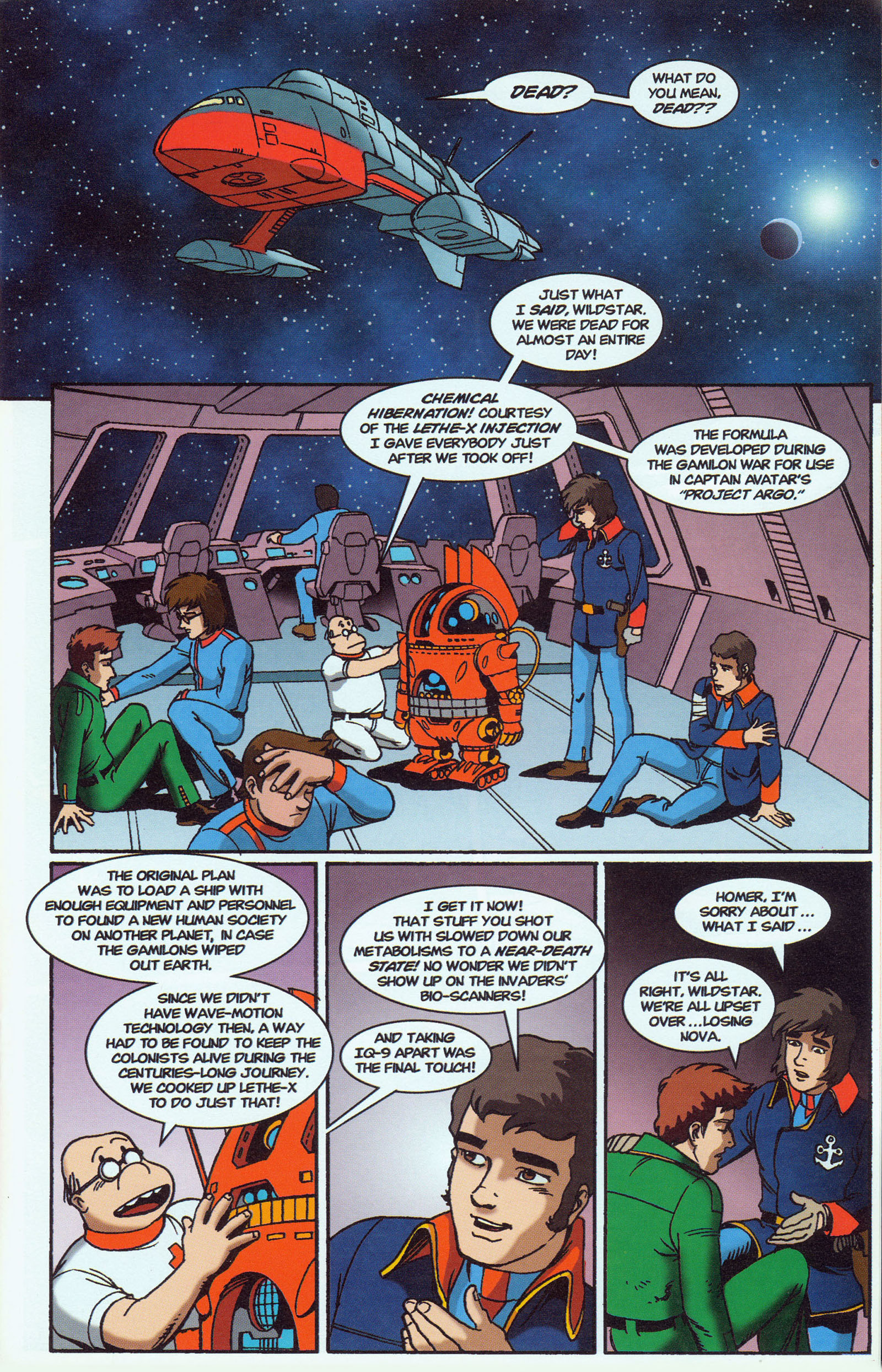
As you’ll see, turning script into pictures is a push-and-pull process. The material shown above was scripted for one full page and part of the next, but when I constructed the thumbnail I discovered that it fit perfectly well on a single page. If you track the numbers next to the dialogue, you can see how I positioned the word balloons. John Ott took this further when he got into the lettering stage. Once he knew how much space the finished lettering required, he had to adjust the balloons (and a few words) on the fly.


This is where Bruce intended for the title to go, but since we put it on page 3 it wasn’t needed here. The credits were always on the inside front cover, so that was an easy cut.

There’s no finished art in the bottom panel because it was all reused from previous issues.


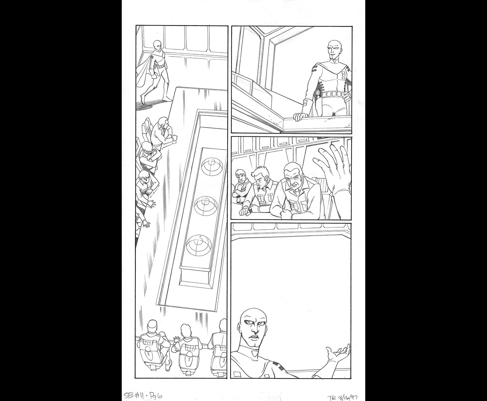
The image on the video screen in the last panel was one we could reuse directly from an art book on the film. An excellent time saver!


One thing I’ve learned about scripts is that you’re not always locked into the lines in the order they’re written. I thought it would be more dramatic to string them in a slightly different order, which is why the numbers jump around a bit. I’ve done this with a lot of TV animation scripts, too. As a director, you have that latitude. This was just one way making comics trained me to make cartoons.

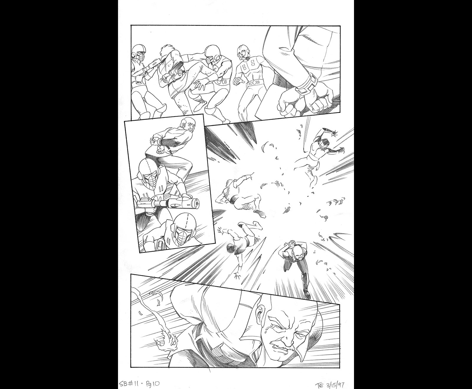
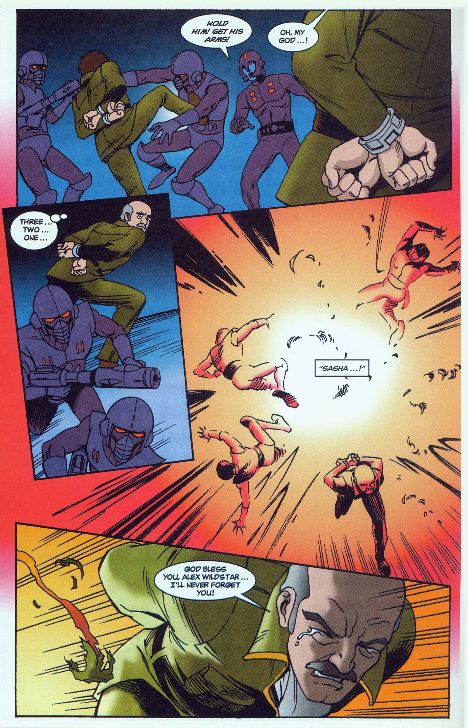
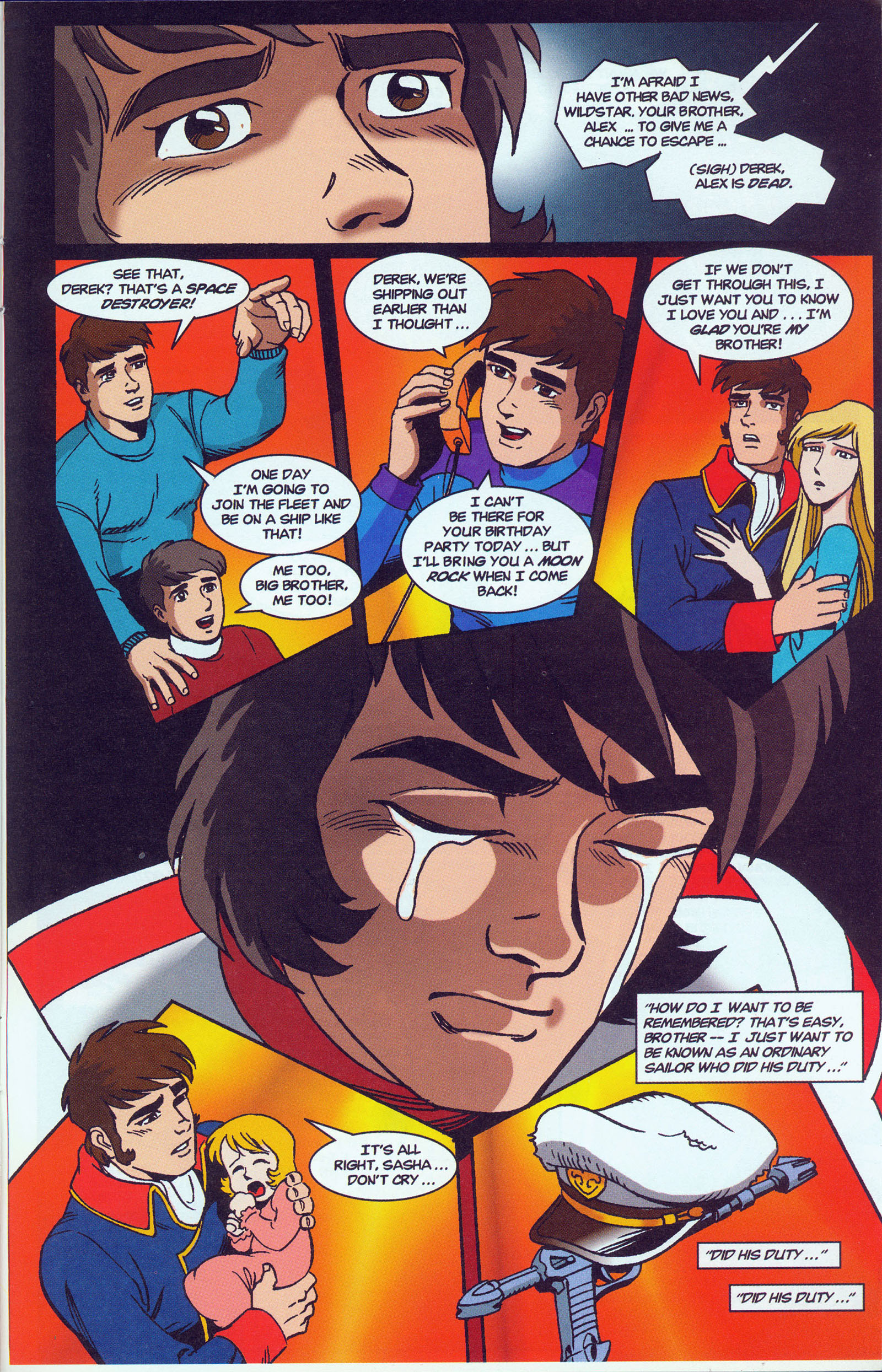
Here’s where the first scene was cut. The dialogue went on a bit long and undermined one of the subplots of the film (where Wildstar has to go on not knowing if Nova is alive), so it didn’t make it into the comic.


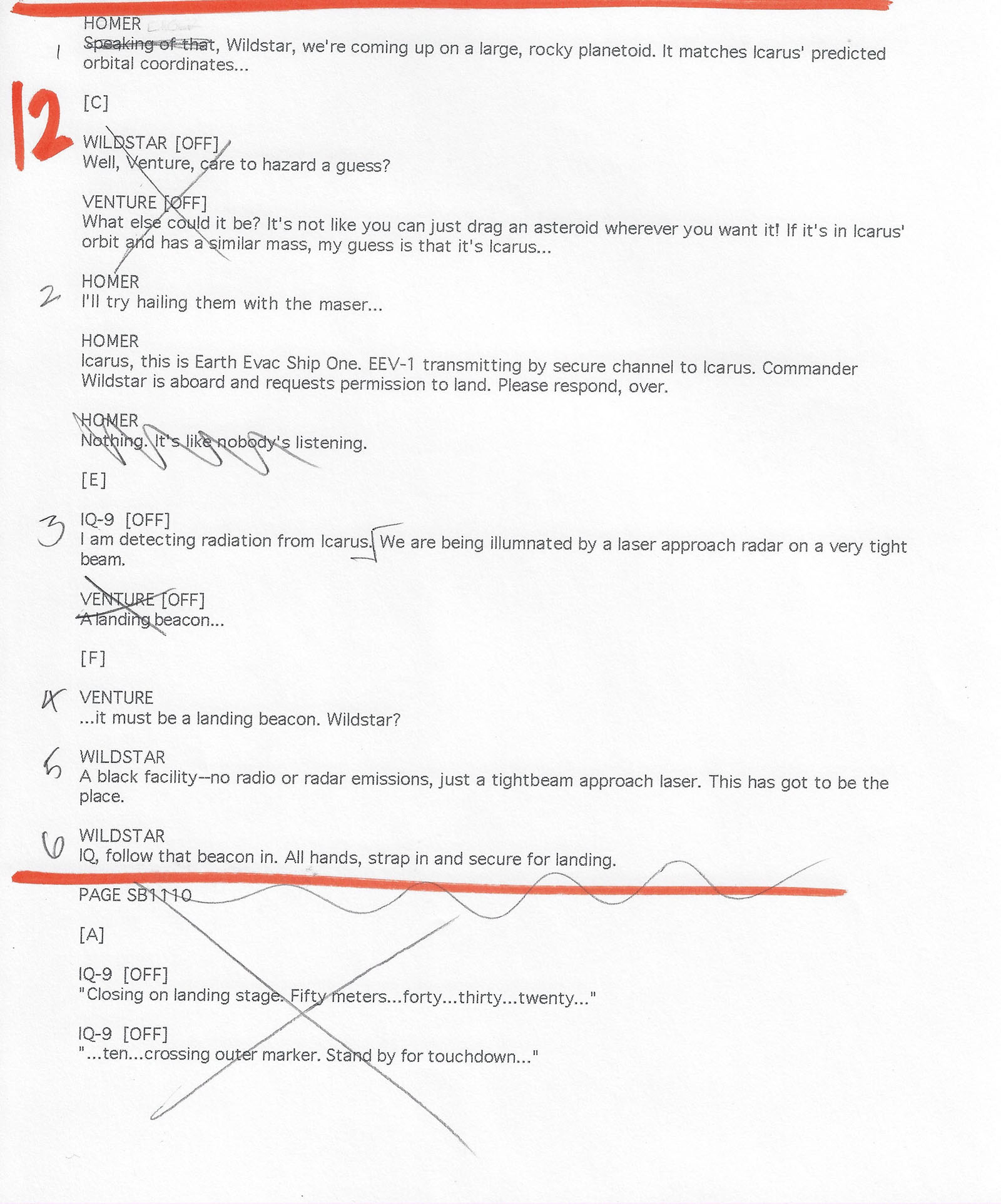
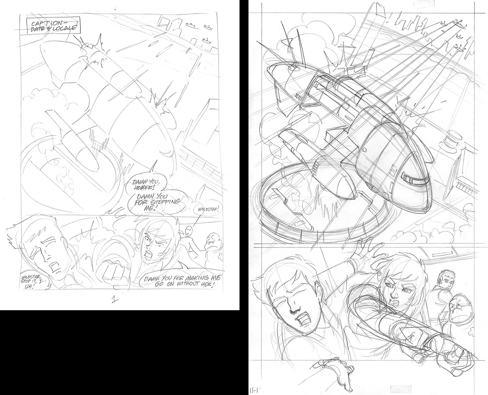
More cuts on this page to get rid of dialogue that would just take up space. The countdown to landing at the bottom of the page is the sort of thing that plays well on film, but is just deadening in a comic. Not worth the square inches it would take to do it justice.

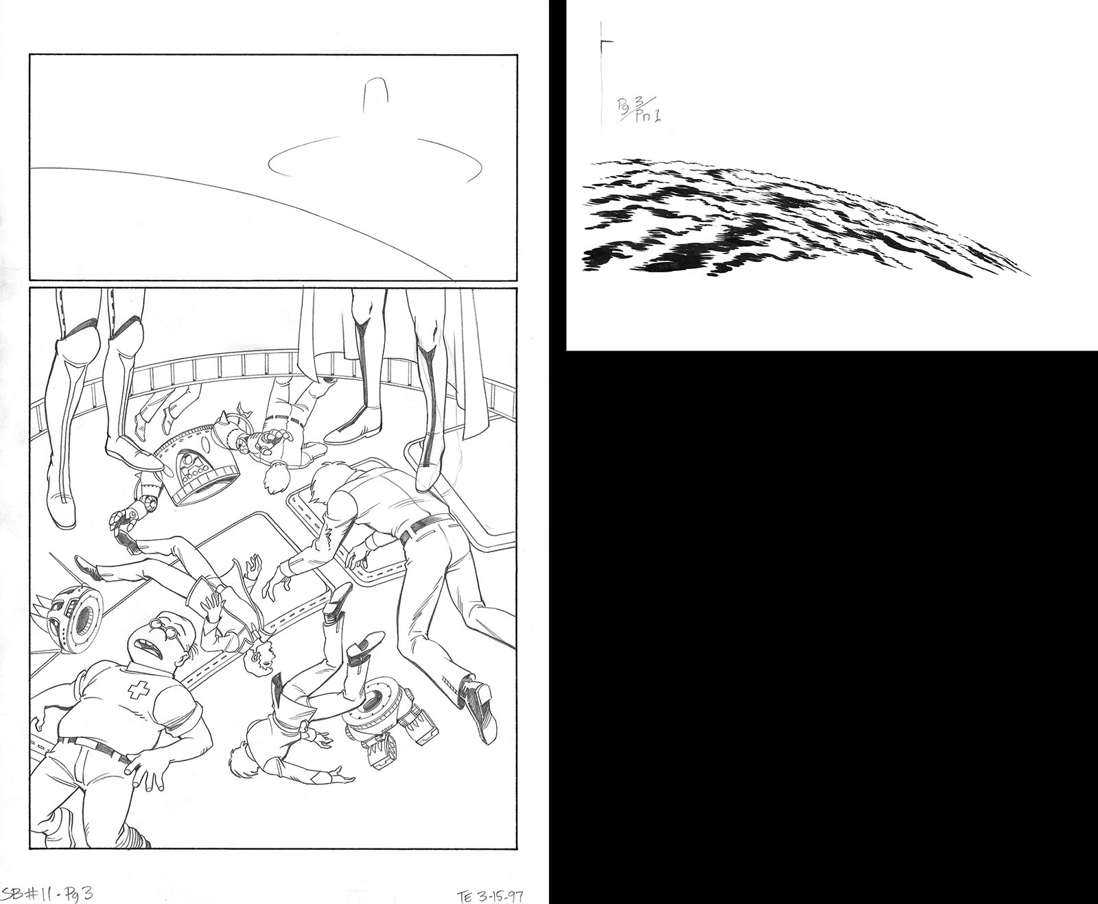
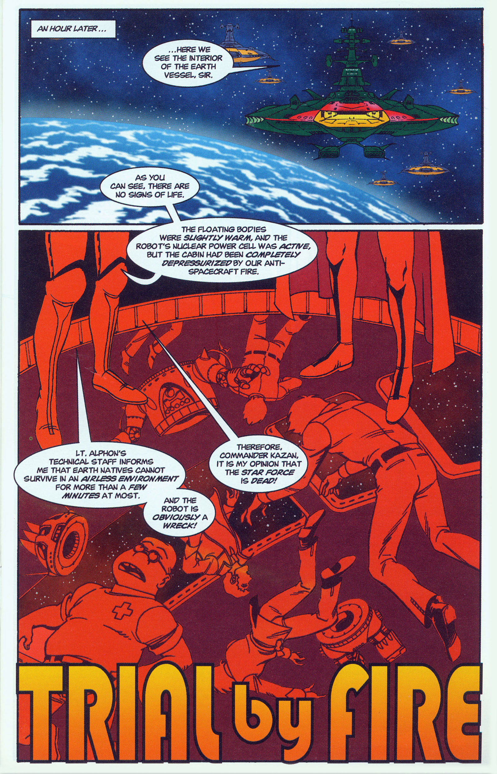
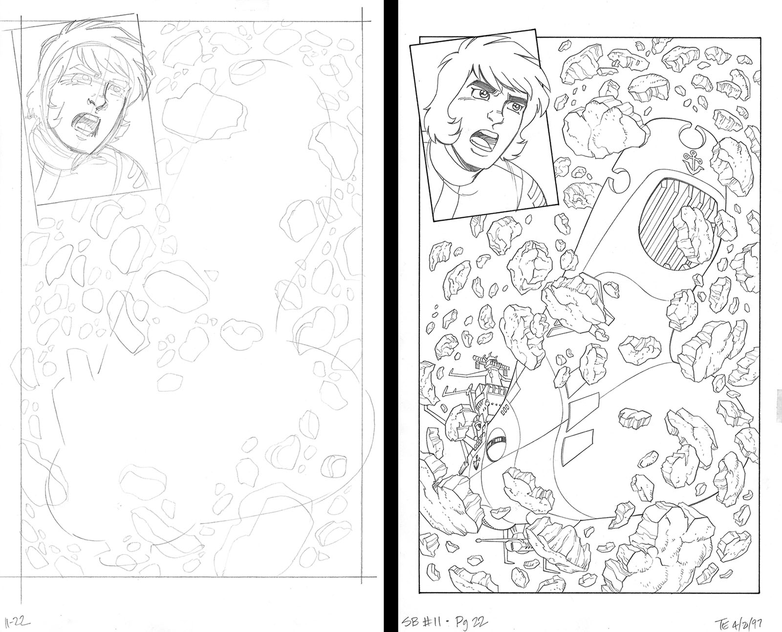
The shuttle in the first panel was changed on the final page so it would more obviously point toward its destination. The asteroid base was just outlined in the finished art because we could scan and use an animation design instead of drawing it.
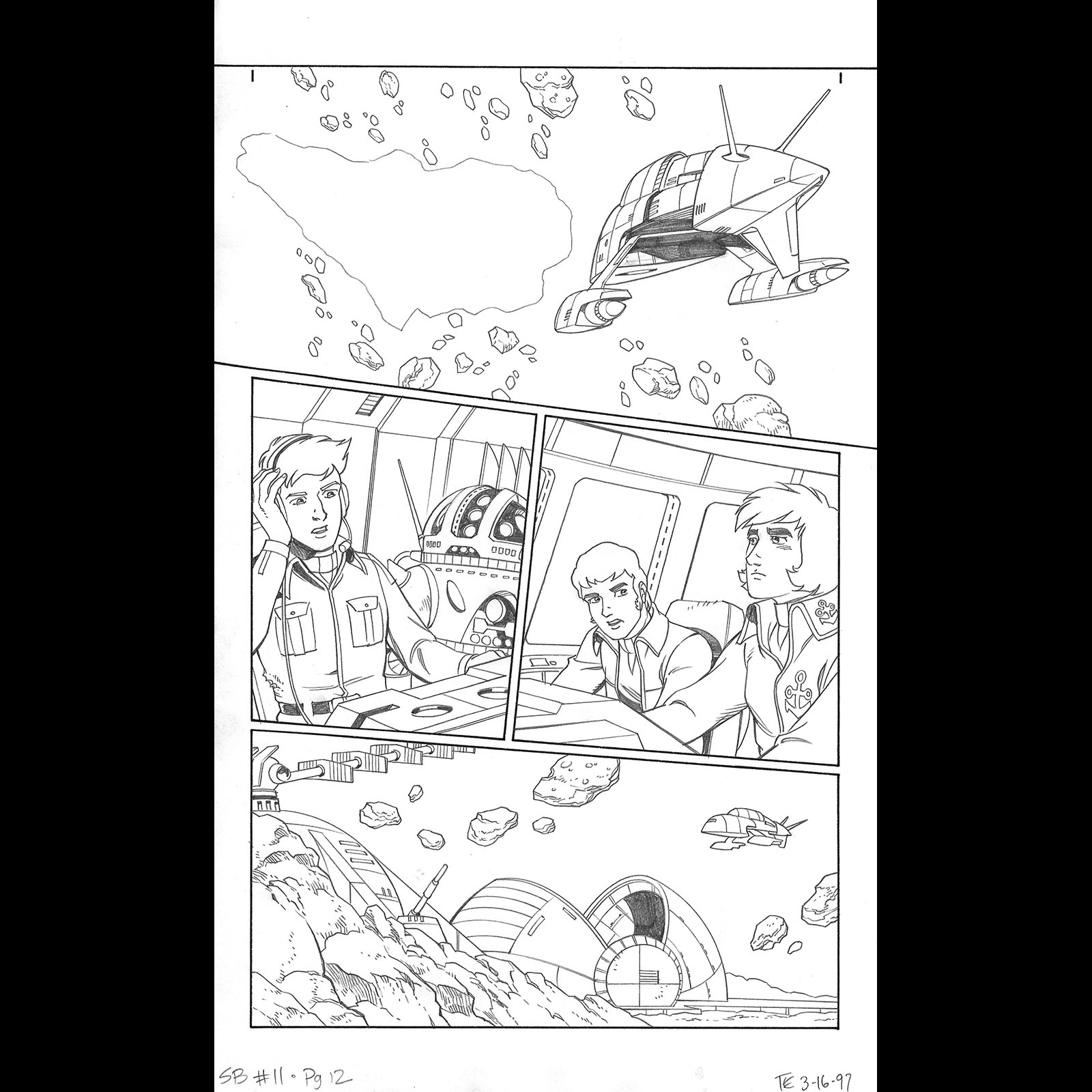


The shuttle in panel 1 was another object that could be scanned, so I was able to leave it out. The big background in the bottom panel could be traced off an animation design, so I didn’t have to construct it in the rough layout. Believe me, every time saver was a godsend on our schedule.
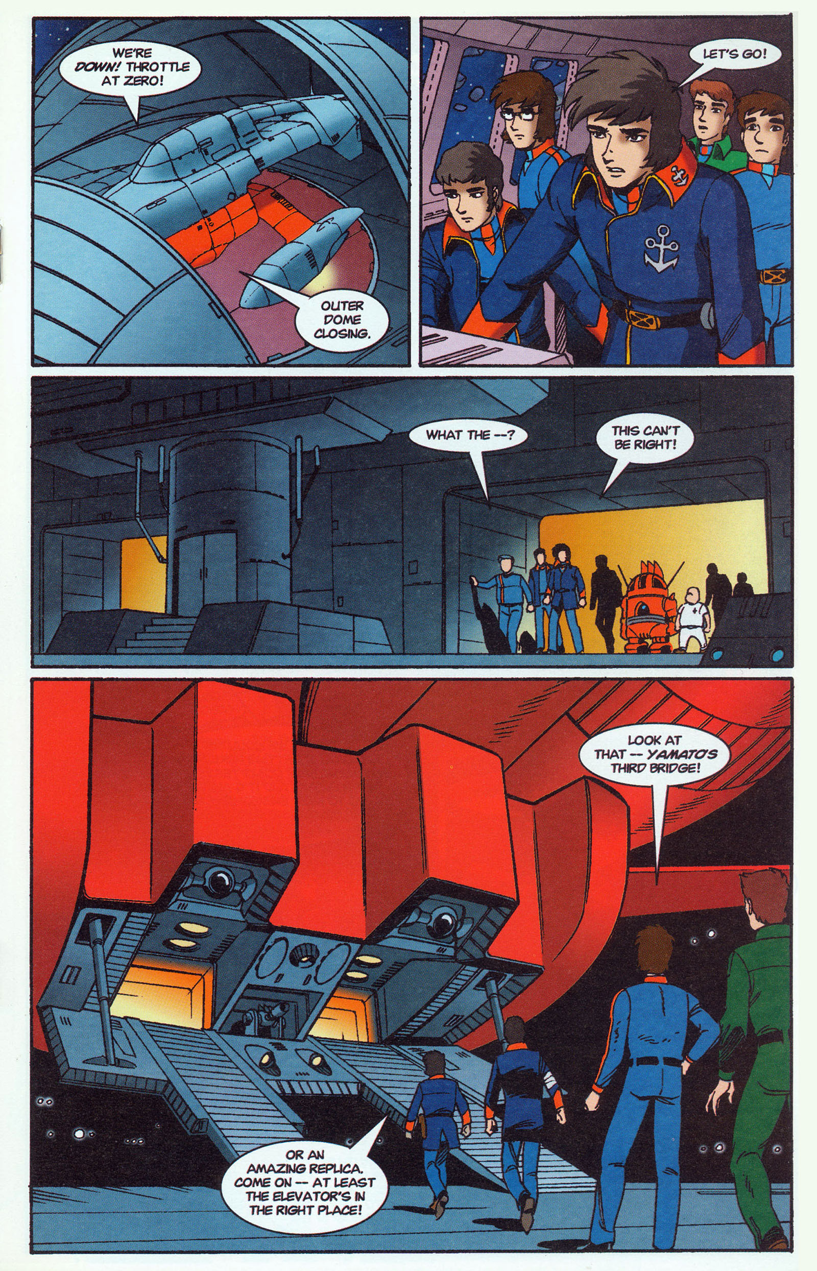

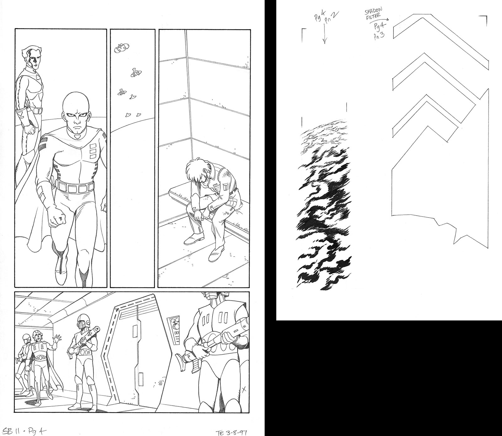
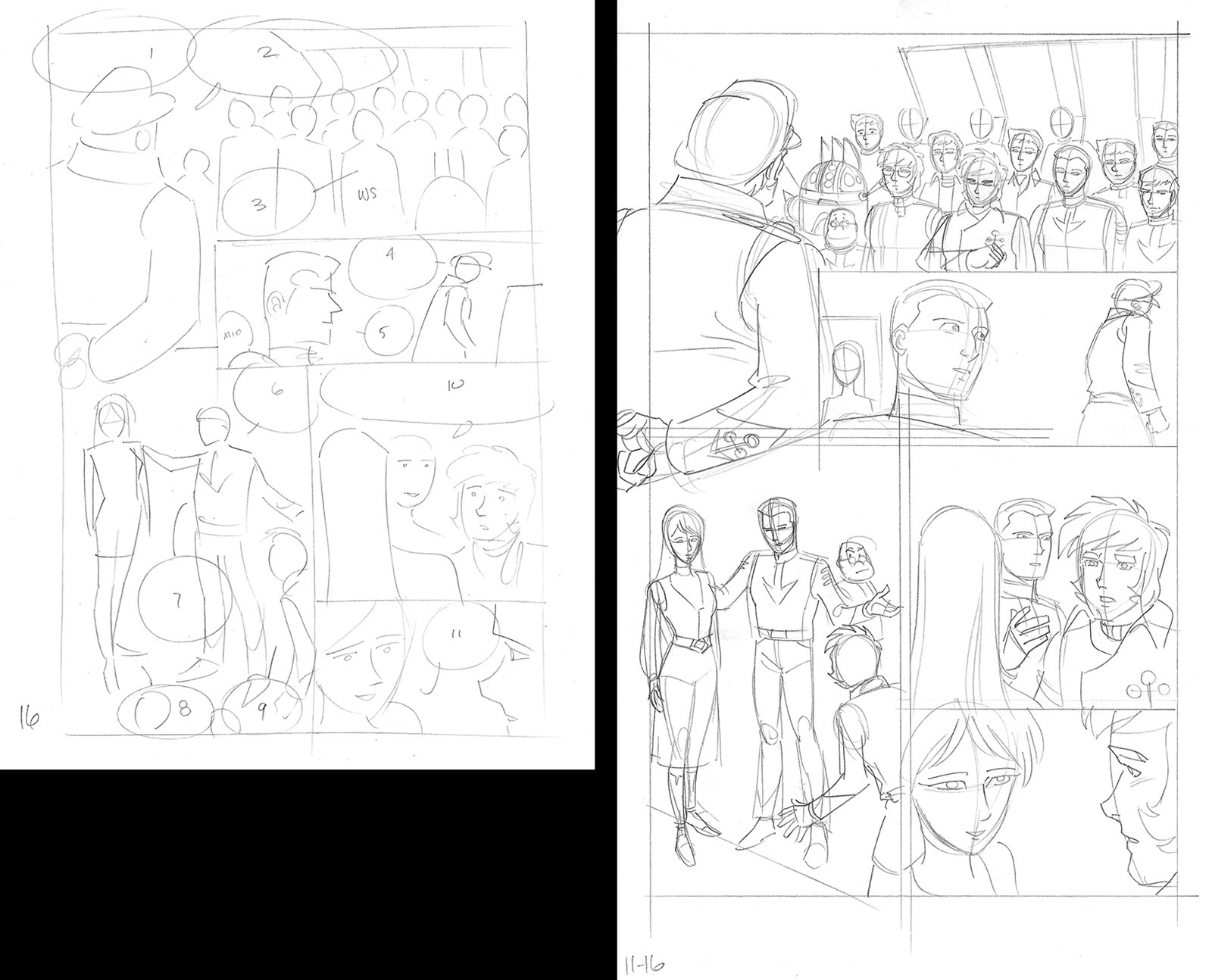
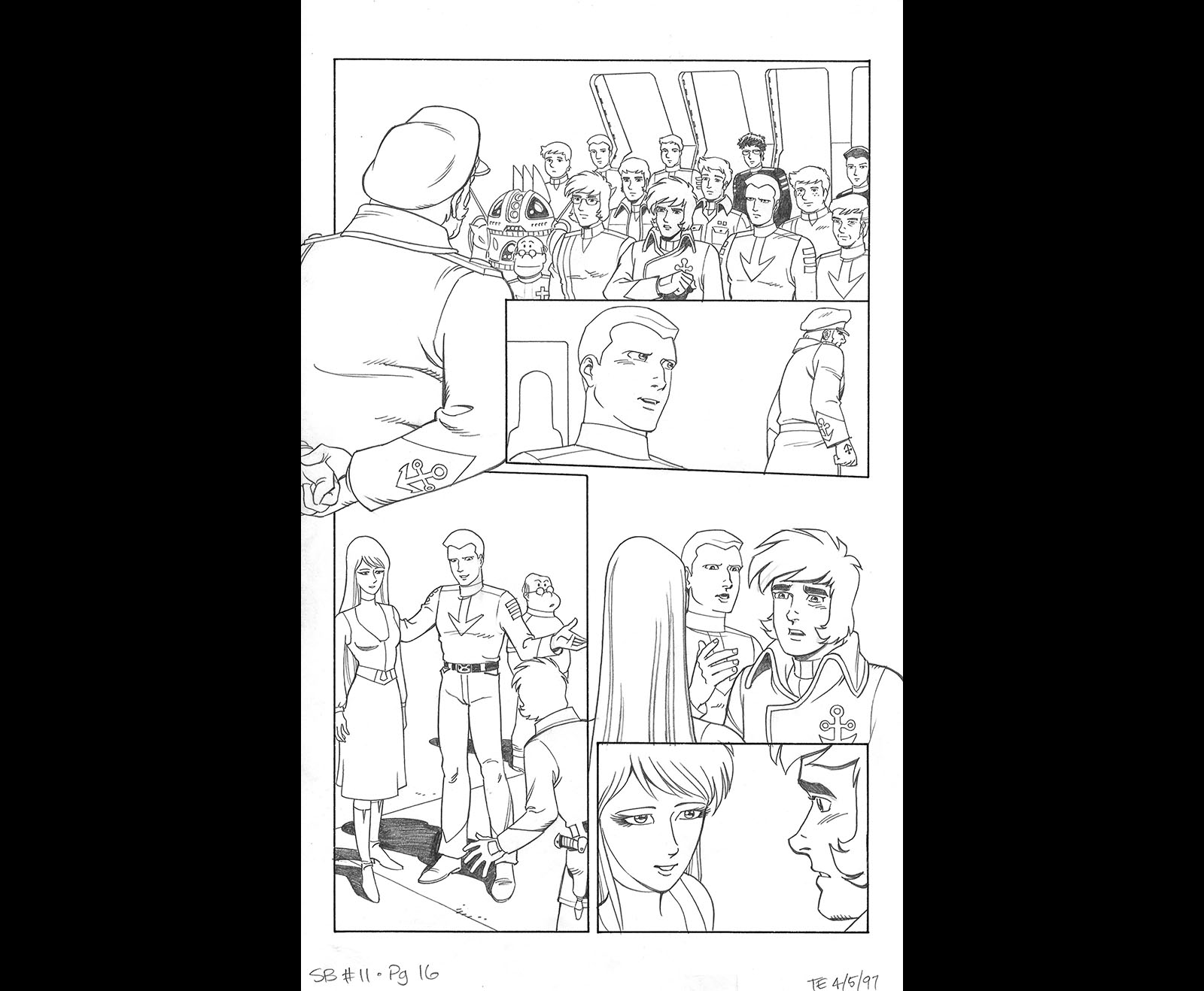
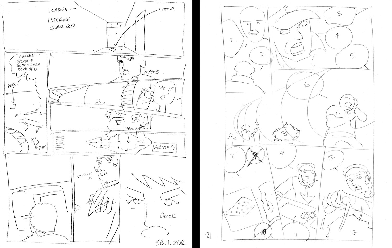
Going forward from here, we have Bruce’s original thumbnail layouts. When you compare them to mine, you can see our different thought process. Stepping onto Yamato‘s bridge, for example, really needed a big panel to do justice to the moment. Bruce’s layout squeezed down the establishing shot to the point where it was the smallest panel on the page, with a lot of empty space on either side. Fortunately, he wasn’t precious about it. That made him easy to work with.


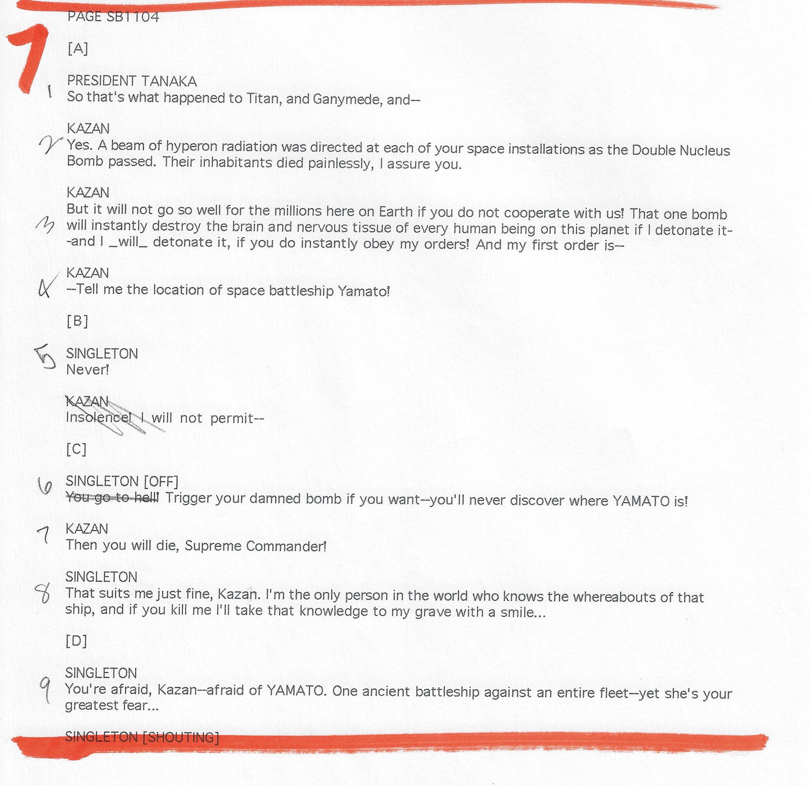
Sadly, I don’t have any more of Bruce’s script from here on, but I trust you understand the process by now. Incidentally, there’s a fan cameo in the first panel of this page. “Lt. Wakefield” was a friend of Bruce’s named Derek Wakefield, who formed one of the first Star Blazers fan clubs in the US.

Here was a case where Bruce spread a scene out over two pages. It would have been nice to keep it that way, but we were starving for space so I reduced it down to one page.


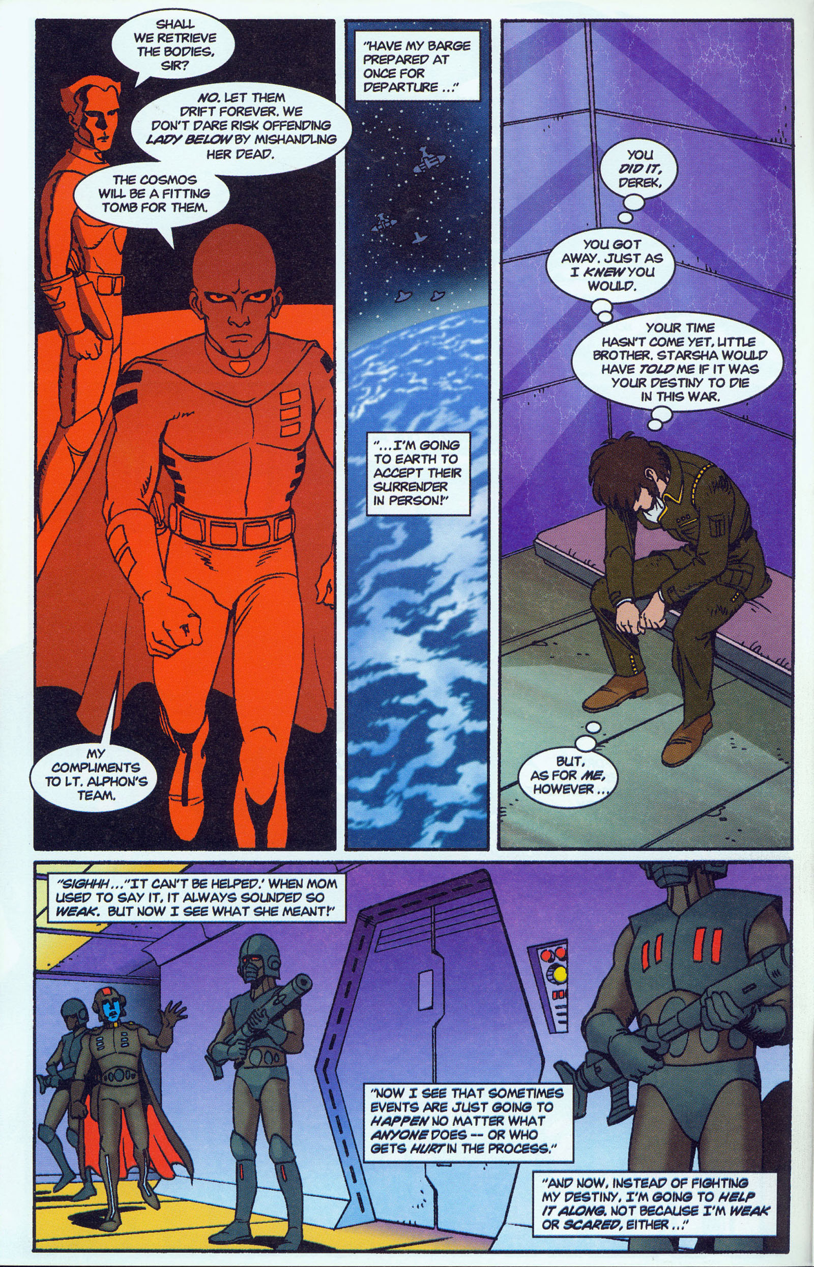
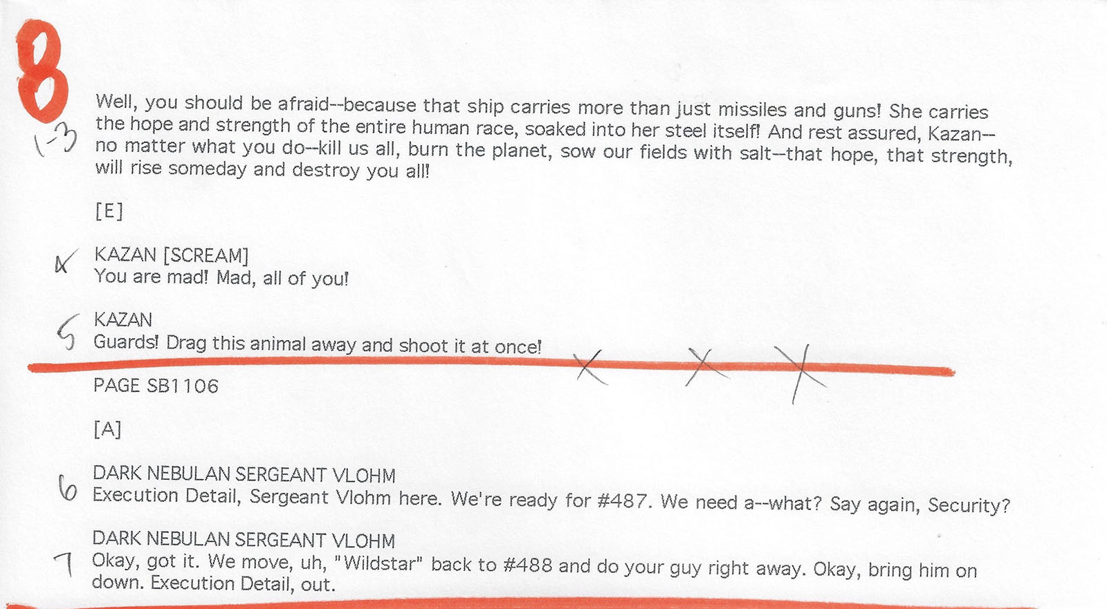
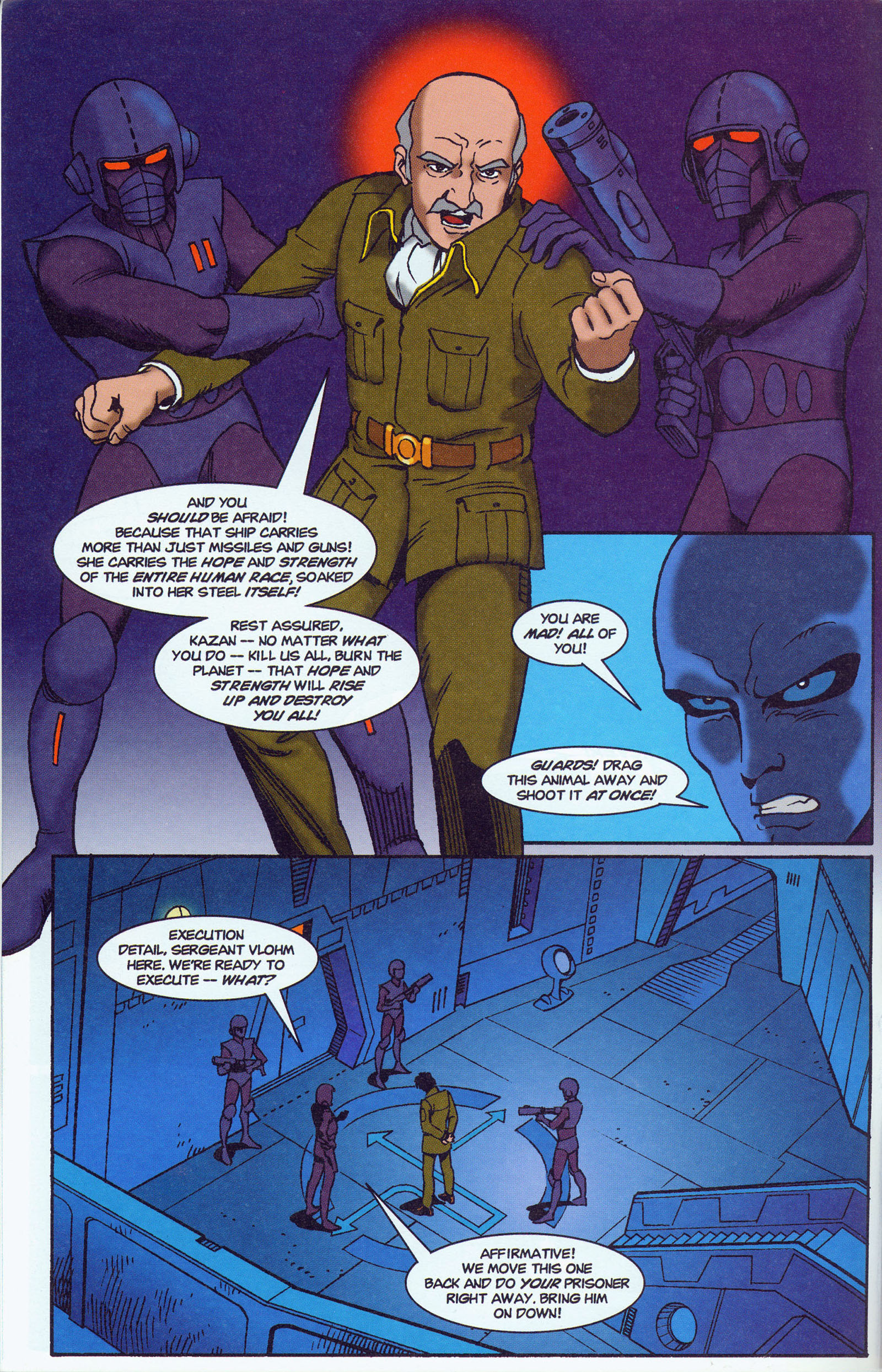
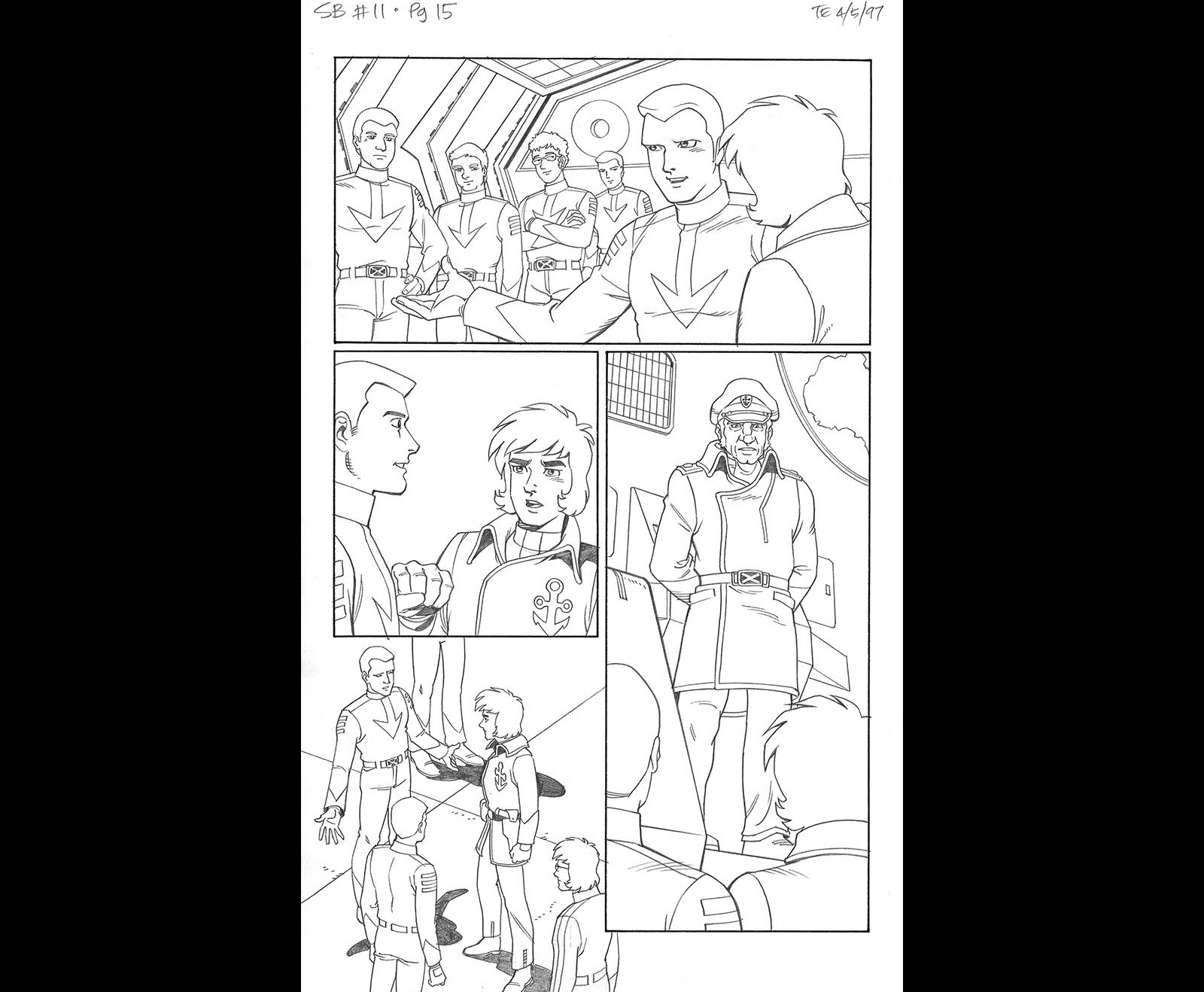
A lot of modification happened to this page. We cut back to enemy-occupied Earth for a scene we didn’t see in the movie; Bruce wanted our adaptation to spend more time on what was happening there, which (interestingly) is now happening in the modern anime remake. That’s why he added some cameos to this page. But we didn’t have room to do anything else with them in this issue, so I decided to open up the page and give it all to the speech instead. After all, we would have four more issues to tell the story…right?
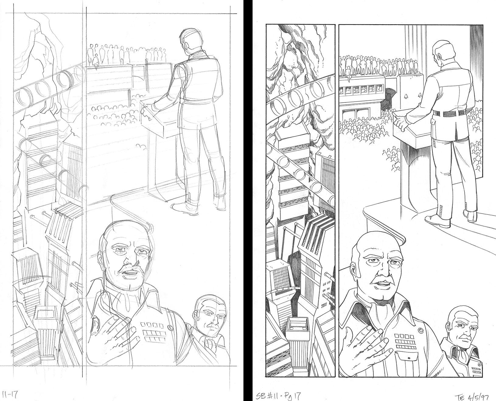
As you can see below, the word balloons ended up taking a LOT of space, so it would have been a very cramped page if we left all the pictures in. As is, we have a much more comfortable composition that adds real depth to the environment we’re in.

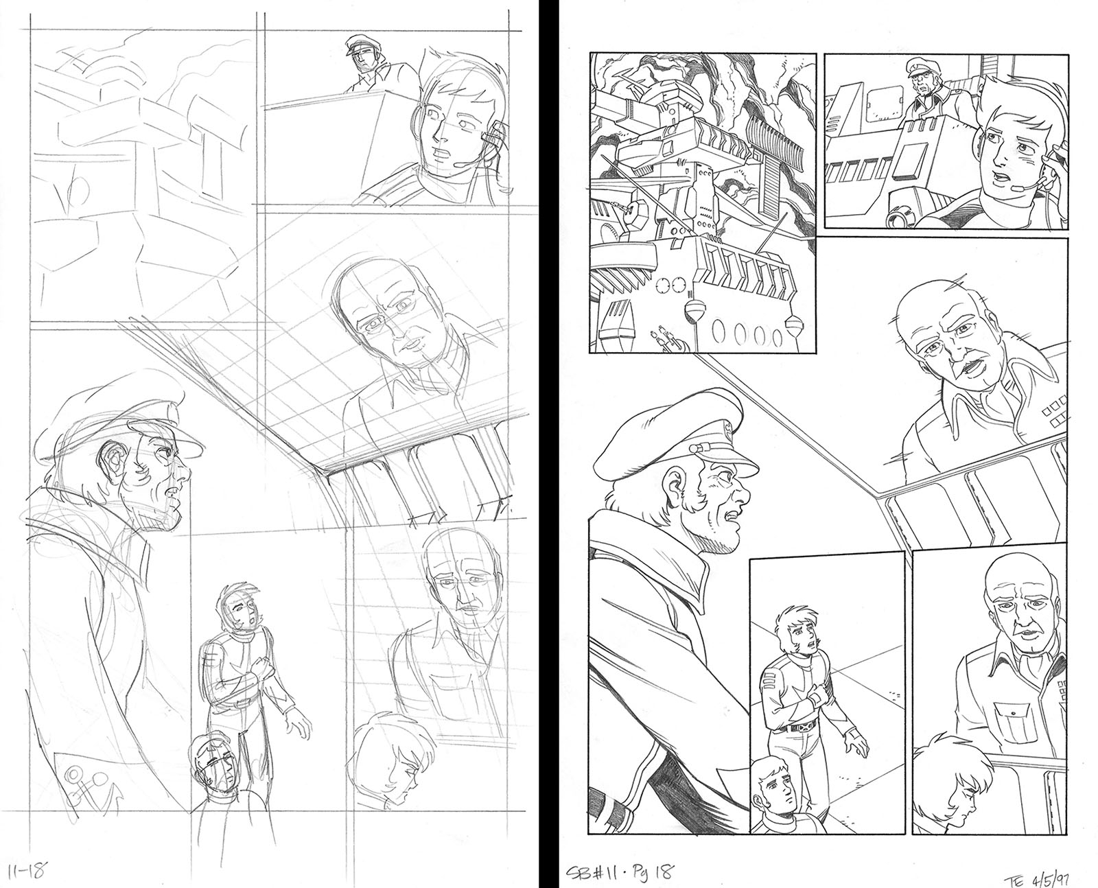
Another case where changes were needed to the page layout. Most importantly, since we’re shifting locations again, we really needed an establishing shot of the ship. (Man, that bridge is complicated.) This is an additional example of how you can use space more effectively by opening up the composition of a page. All the story info is still intact, but we have a much better sense of the environment.


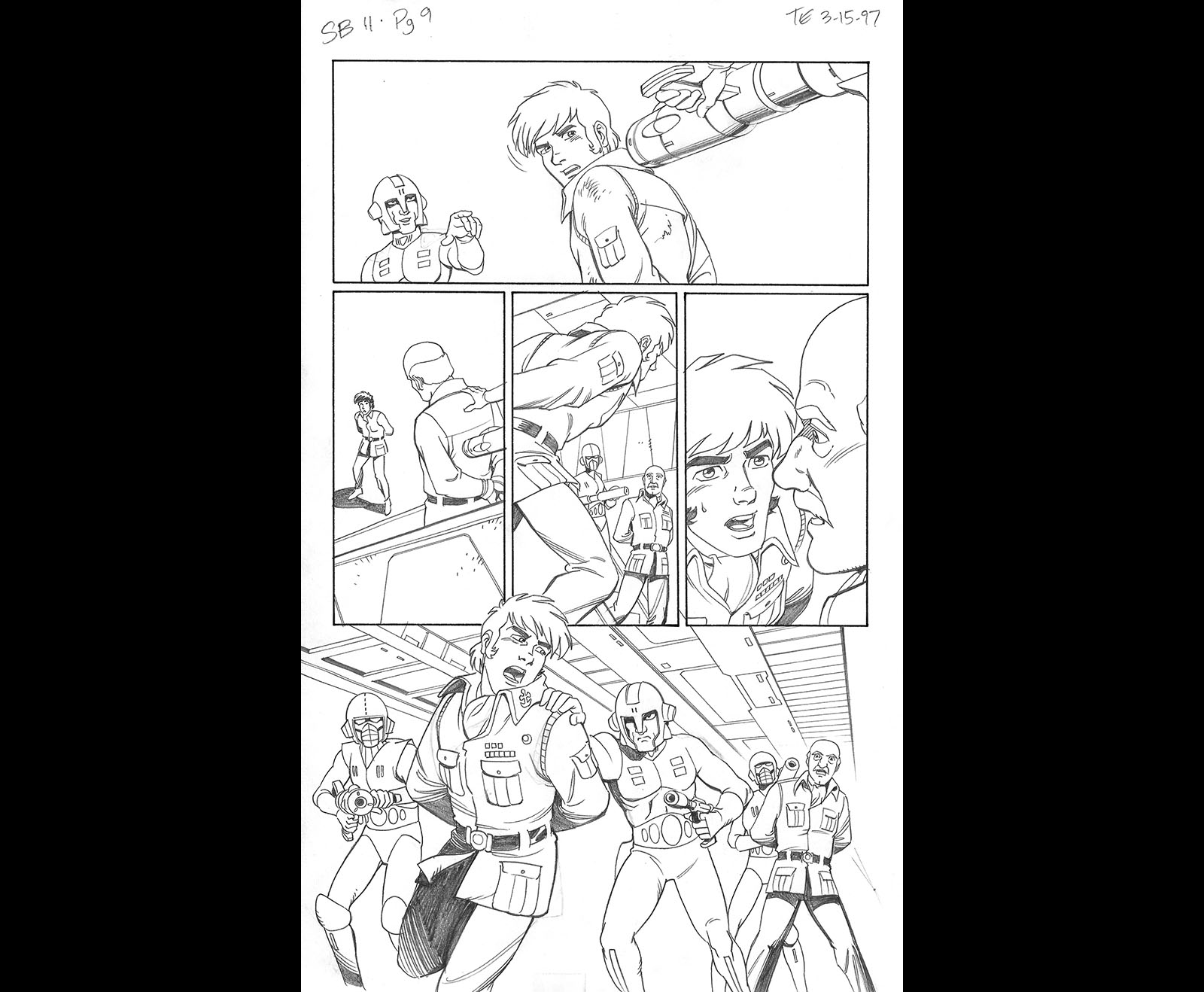
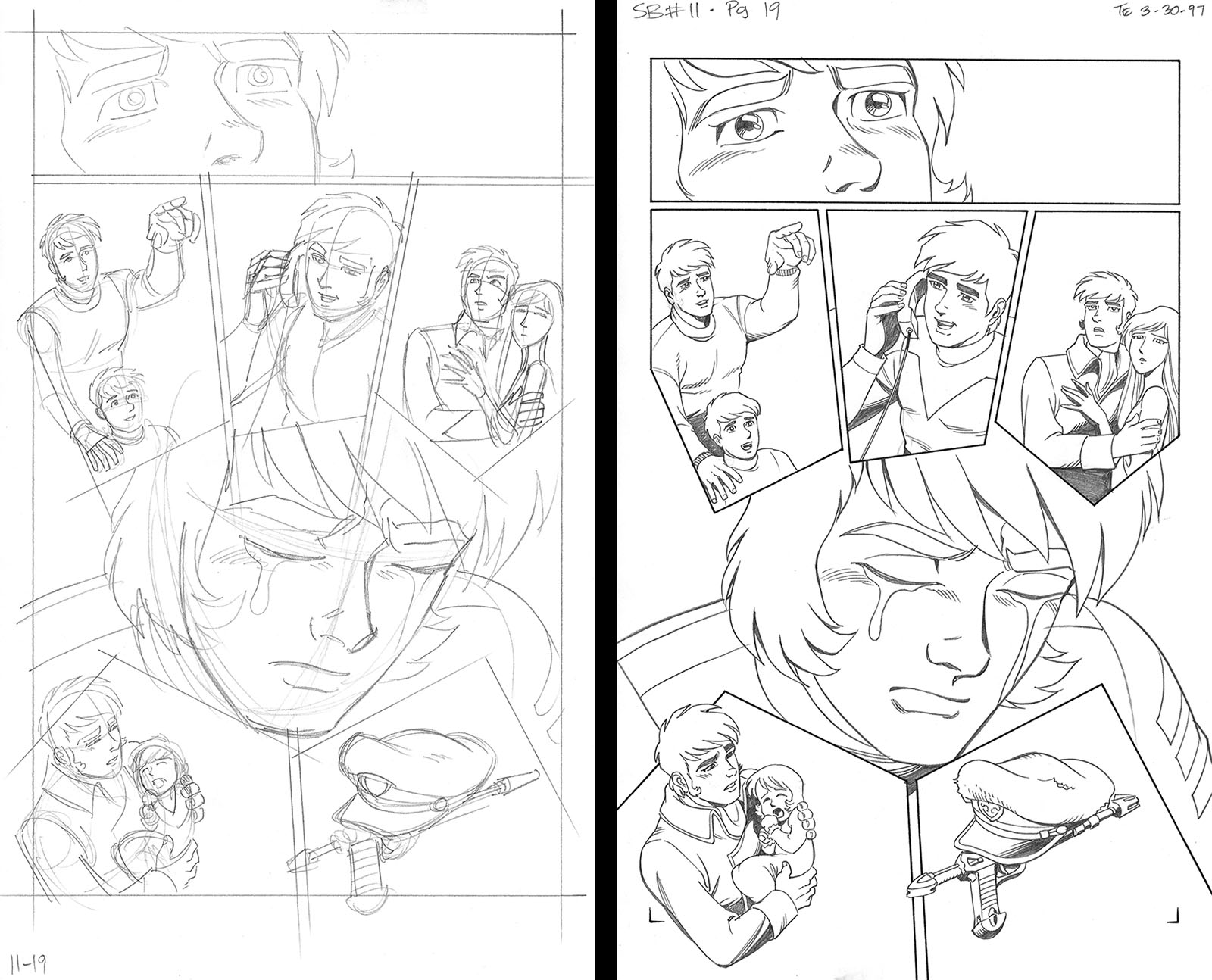
I wanted to take another shot at the layout of this page because I felt like Bruce’s version didn’t personalize the moment as much as it could. Showing characters in profile actually has more limited value than most people think. By showing them that way, you’re actually removing information (showing only half a face) and reducing the emotion. I went with a 3/4 view of Wildstar and grouped the panels around him in such a way that they all “point” directly toward him. The emphasis is much stronger that way.

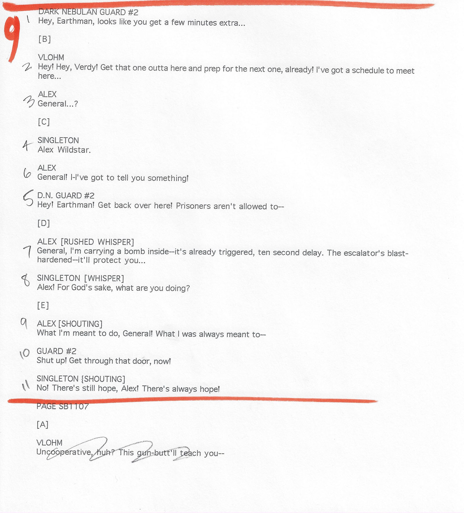
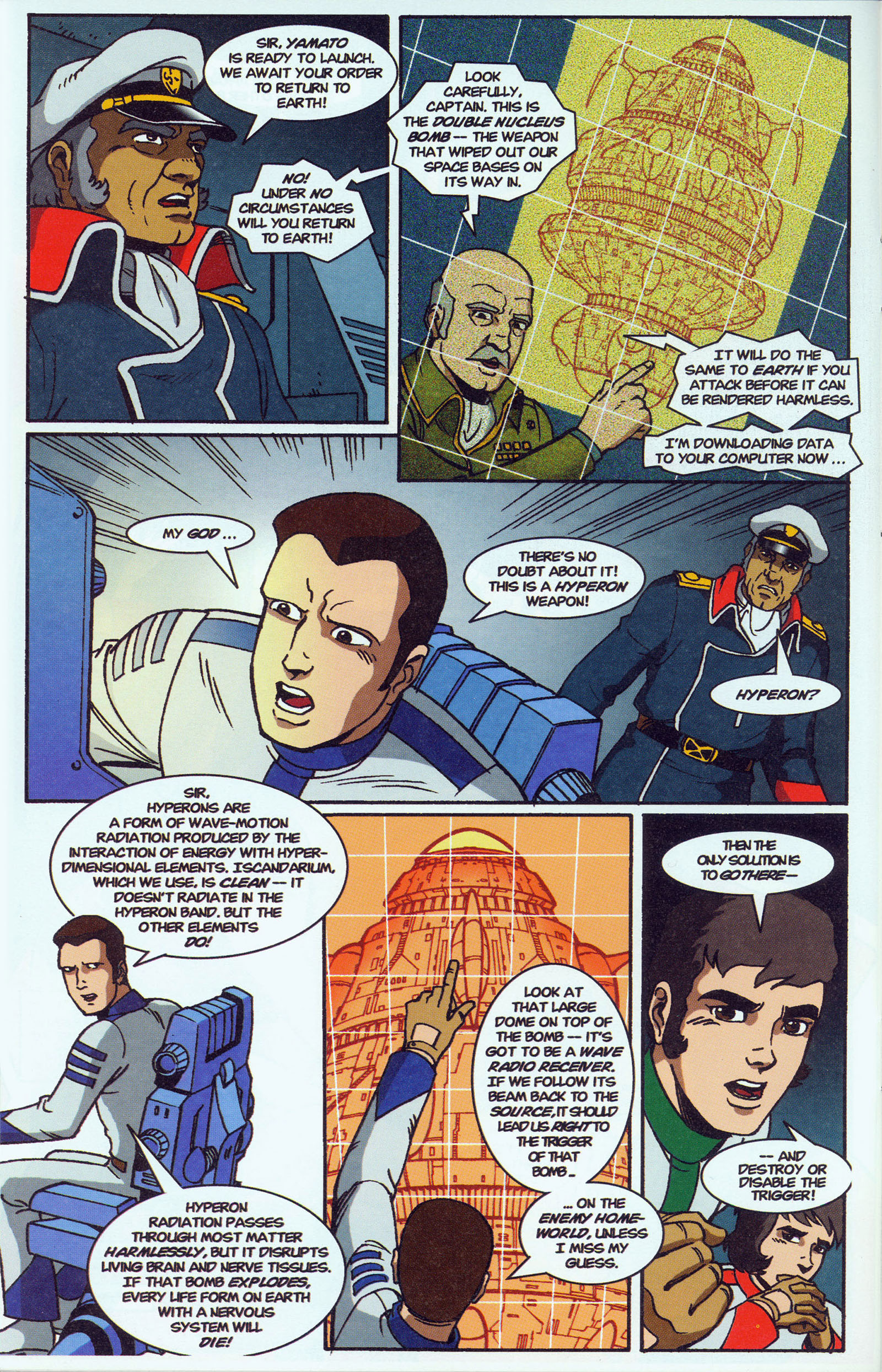
This is a heavy dialogue page with a lot of exposition, so I wanted to make sure we’d have plenty of room for word balloons. Thus, my thumbnail differs significantly from Bruce’s. There’s no way they’d all fit comfortably otherwise.

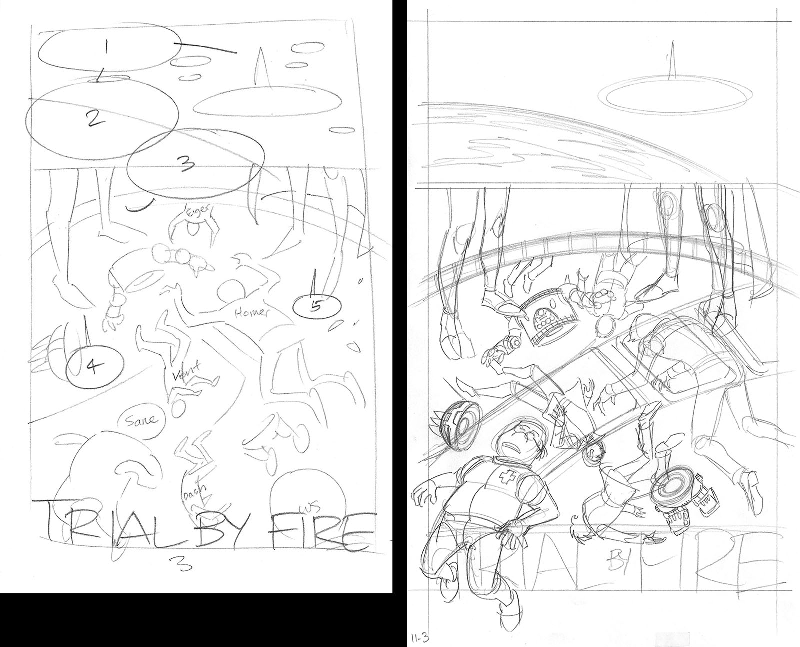
We’re almost done (just one more page after this), and the moments are getting bigger. But in Bruce’s thumbnail, the panels are getting smaller. He wanted to spend part of this page saying goodbye to Icarus, where he spent three issues, but we just didn’t have the space to do justice to both that AND a power-up sequence. It wouldn’t have that Yamato flavor if we didn’t make the most of the engine starting.


Aaaaand MONEY SHOT! Bruce’s thumbnail gave the beats, but would have reduced the impact significantly. I would have kept all that if we could have made it a 2-page spread, but we just didn’t have the luxury.


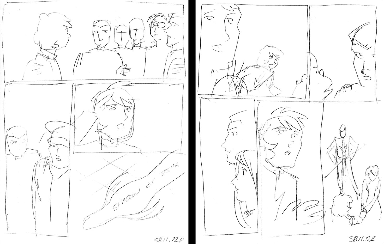
BONUS: Here’s an entire scene that was cut from the middle of the issue, Nova waking up and meeting Alphon for the first time. It was such an important moment I thought we should save it for the next issue. Which we did.

And this is the page that was originally meant to end issue 11. I wish I still had Bruce’s script for it, because it was setup for subplots that would happen on Earth. Either way, they had to be bumped for page space. In the end, I think it made issue 11 more focused, so I’d make the same choice today if we were under the same limitations.
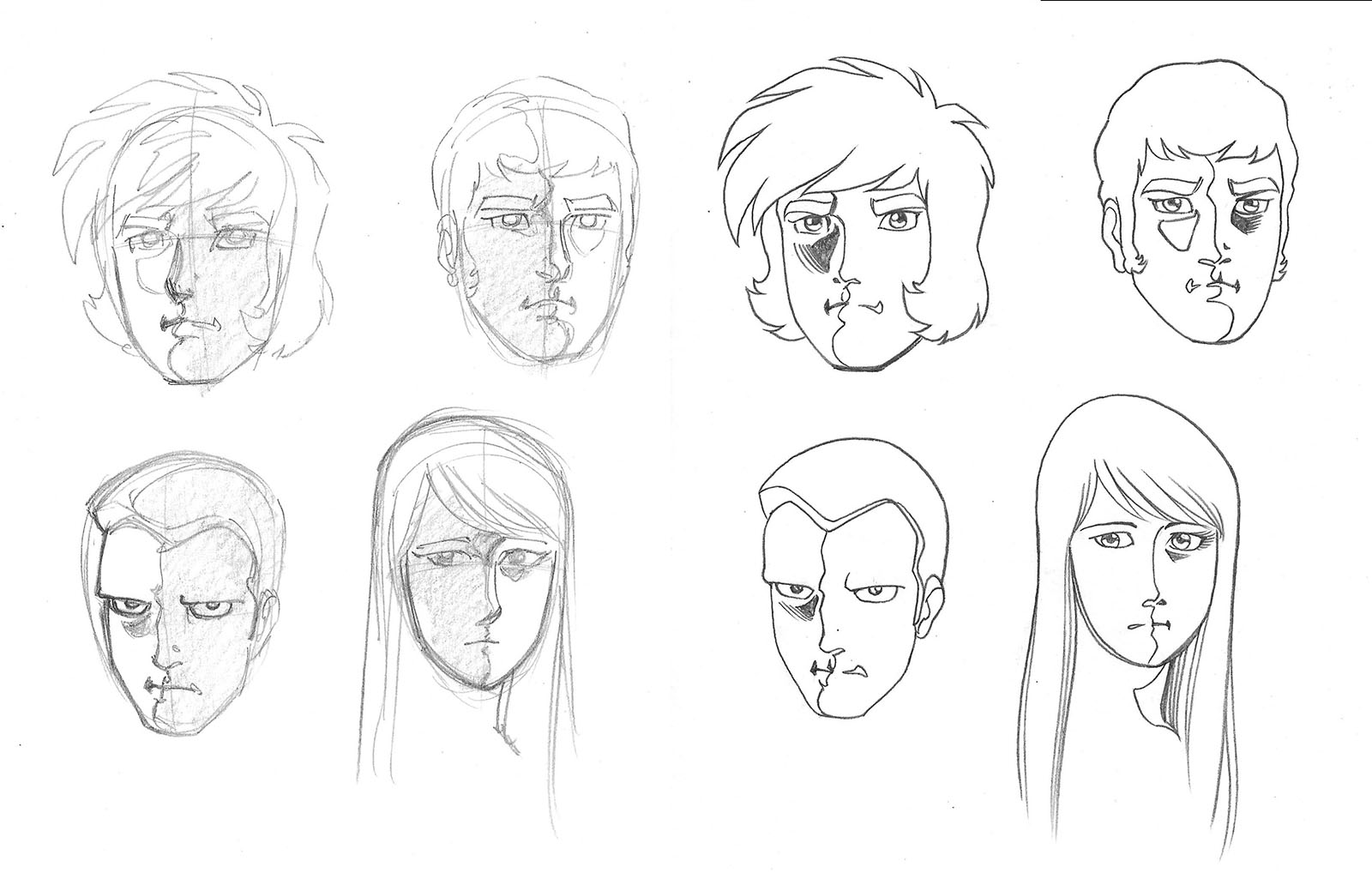
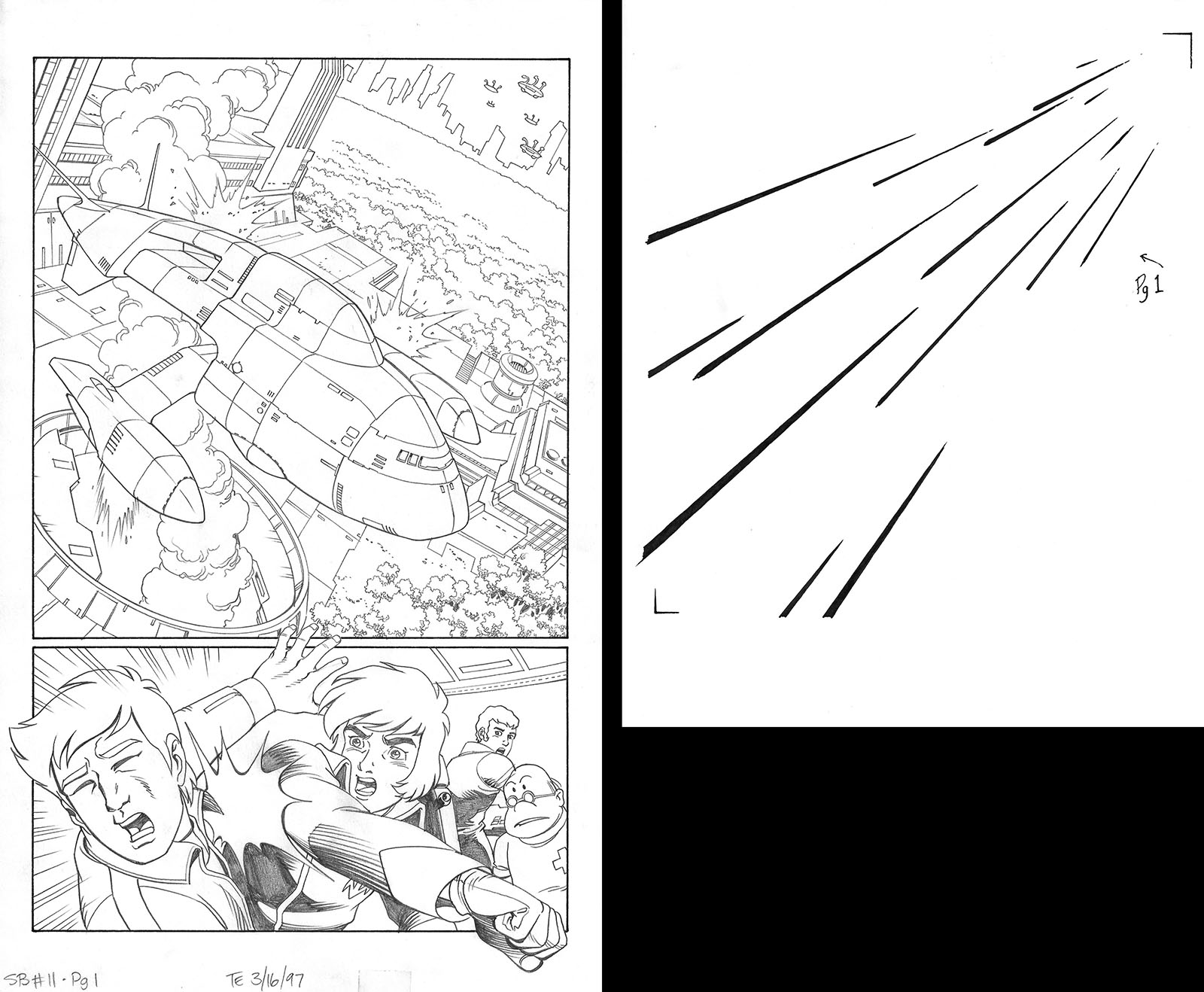
Main character faces, rough and finished. For the life of me, I can’t remember what they were for. Probably some promotion or other.
NEXT TIME: The unpublished issue and the reason it was unpublished!