
Comics go to the movies: 2001 and 2010
Not just any average comic book artist could handle a movie adaptation back in the days when movie adaptations were popular. For starters, you needed to work fast since the thing had to be ready in time for a premiere. Then you had to be prepared to stretch your reference material to the limit, since you’d never have everything you need; just whatever the studio could provide while the film was in the crush of post-production.
That was just the nature of the beast. It was inevitable that every adaptation would fall short in some way due to the brief production window available. As fans in the pre-VHS era, we simply took pleasure in having a paper version that could refresh our memories of a movie we loved. It was only later on, when the movie itself was available for comparison, that the deficits of a comic adaptation became clear. Then the comics would fade into obscurity.
As a developing artist myself in the 70s and 80s, I would sometimes wonder if the people who drew those comics wished they could take another shot at it. When you get to know the movie itself, it would certainly affect your creative decisions. You could emphasize the action with more insight or capture the look of a scene with more precision. Better yet, add some layers that the film may have only suggested. But, of course, once you have the movie itself the need for a comic book version is greatly reduced.
That’s what makes Marvel’s 2001: A Space Odyssey worth examining, because it came along a good eight years after the movie premiere. It also led to some unexpected results, which is par for the course when you get Jack “King” Kirby involved.
I started reading Marvel comics in early 1975 and picked up my first Jack Kirby comic in the summer of 1976, Eternals #1. This was during Kirby’s “Picasso” period, when he’d returned to Marvel from a stint at DC and was exploding with wild, expansive, galaxy-brain concepts. His art was pretty wonky and I didn’t appreciate all of it, but there was no doubt that he was delivering something unique and exotic.
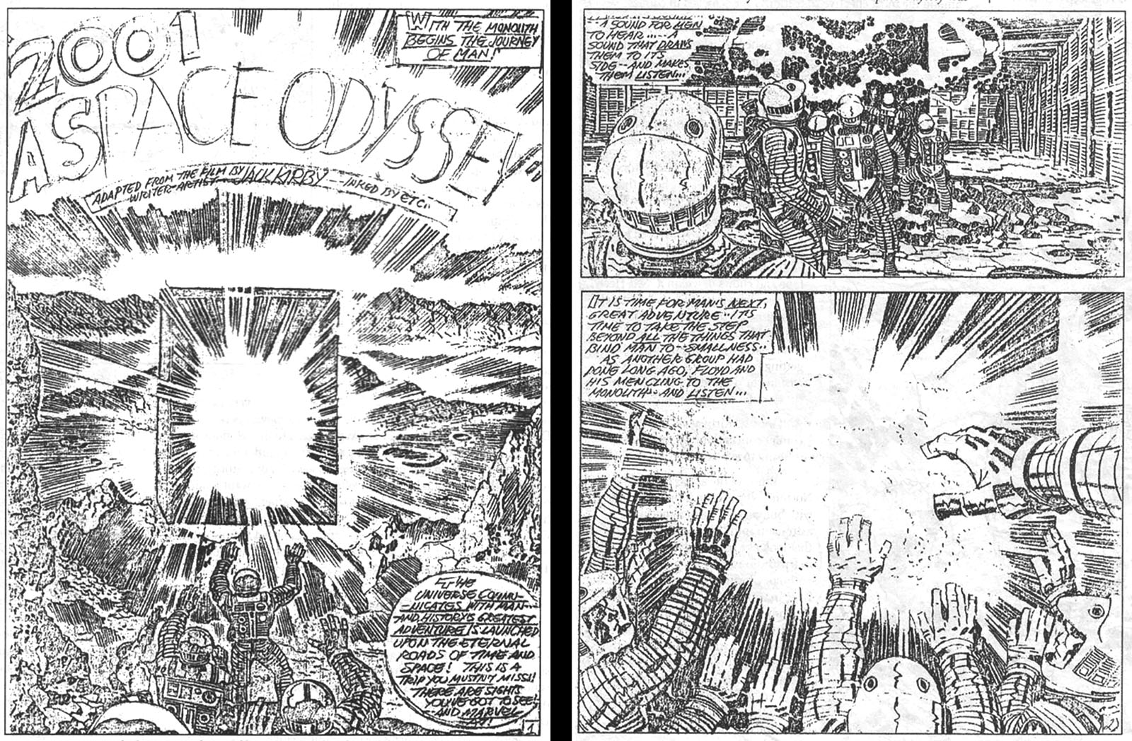
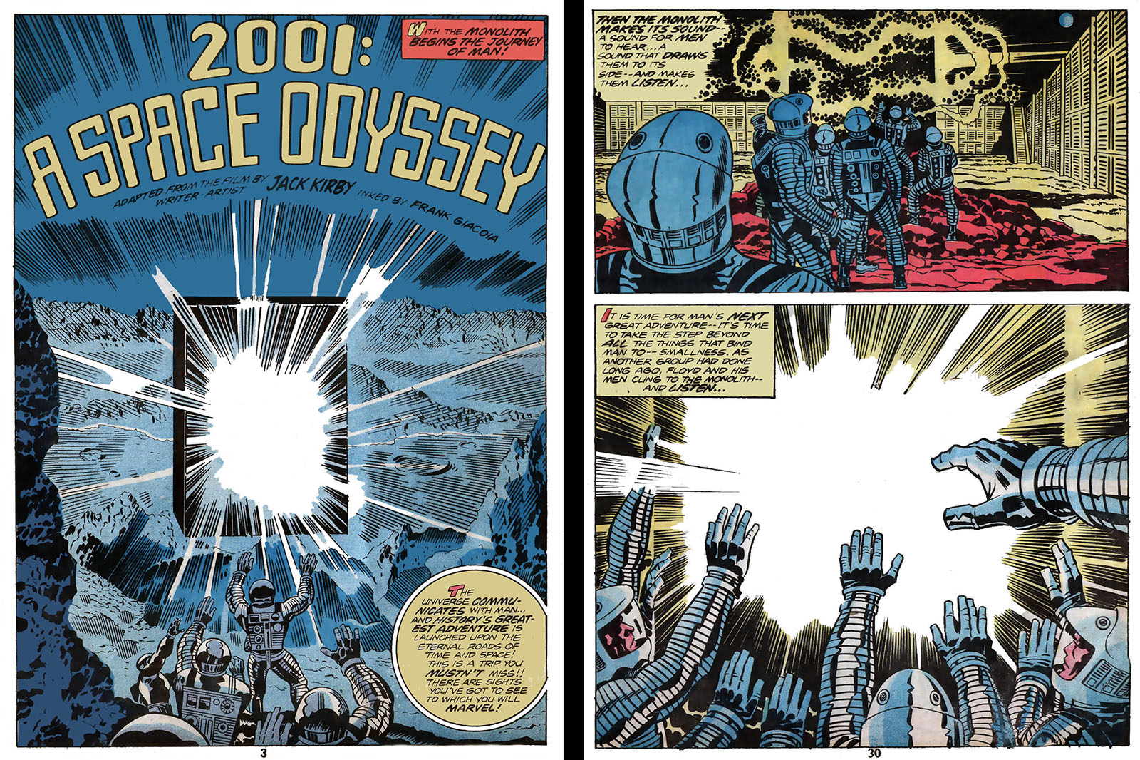
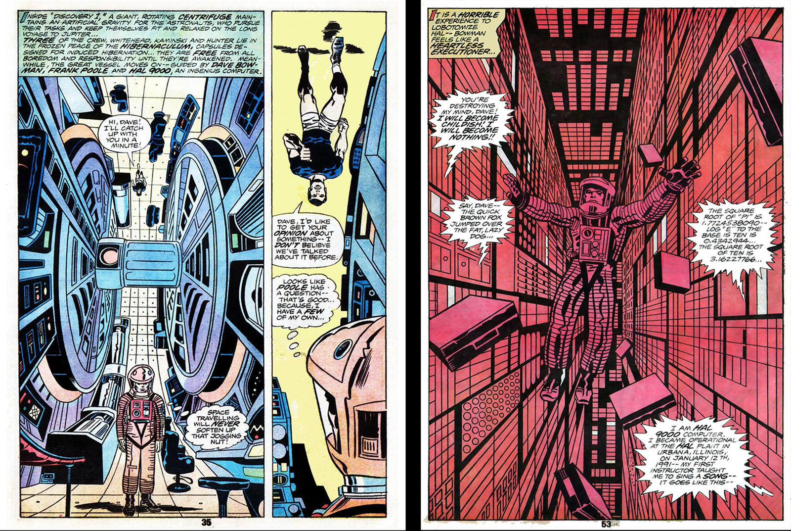
According to the account at Wikipedia, Kirby was considered the ideal candidate to adapt 2001, which Marvel had licensed from MGM. This was his most untethered creative period, so a by-the-numbers adaptation didn’t excite him. He stuck to the plot, but took creative license to work in material from Arthur C. Clarke’s novel and modify scenes as he saw fit to work in comics form.
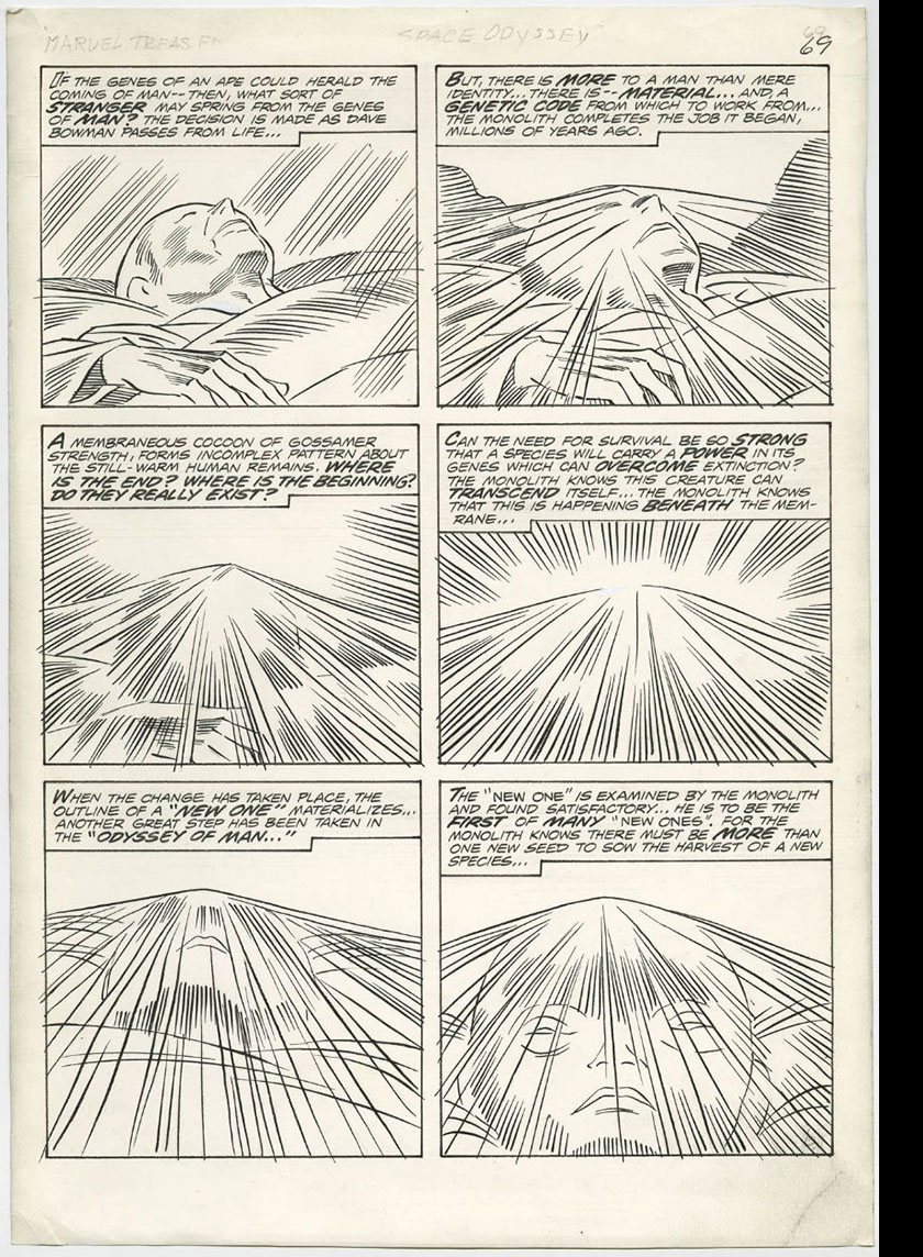
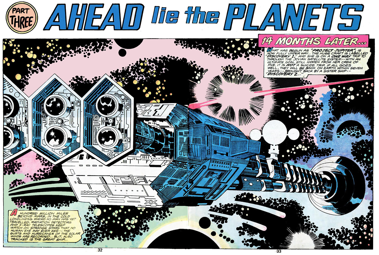
This meant plugging a lot of verbiage into scenes that played silently on screen (example at left), but he didn’t stop there. Whereas Stanley Kubrick made the film as realistic as possible, Kirby pushed it through his own personal lens, which meant every square inch of space was occupied by some unexplainable phenomenon or other. Of course, the “Beyond the Infinite” sequence allowed him to cut loose and get as crazy as he wanted. This would have been the perfect point to adapt more of the novel, but the page count didn’t seem to allow it.
Though the film wouldn’t be released on home video for another four years, it’s evident that Kirby had plenty of photo reference to work with. But you can feel him straining at the limitations of drawing someone else’s designs, especially on pages when he just dropped in photos rather than draw anything at all.
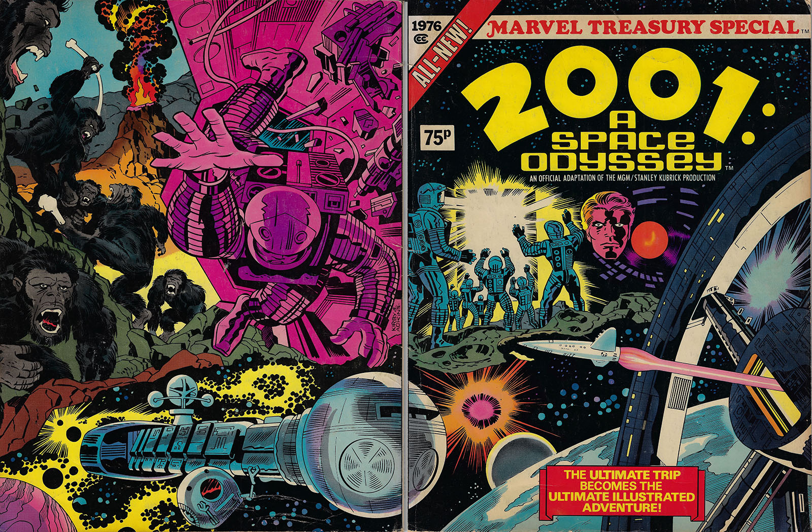
The finished product consisted of 70 pages (equating about three regular comic books) and was published as a giant-size Treasury Special (Marvel’s most extravagant format) in December ’76. Despite Kirby’s improv art style not being an ideal match for the hard-science look of the film, the big page size (10″ x 13.5″) did a good job of preserving its grandeur.
Does this answer my question about what a longer-term adaptation could achieve? Not quite. The simple fact that Jack Kirby was involved put it into a category of its own. However, it was the first version of 2001 I ever absorbed. The movie wasn’t that easy to find back then, so I didn’t get to see it until home video brought it to my house in the early 80s. In the end, watching the movie was so utterly different from reading the comic that they became two separate species.
Since comics occupy a space between movies and novels, they have their own set of strengths. Novels can do much more with words and movies can do much more with visuals, but comics can fuse the two in ways that create unique storytelling opportunities.
When adapting a novel, a single comic book panel can replace any number of paragraphs with a special method for preserving the cadences of text. The physical placement of text on a page can mimic the timing of film dialogue by leading your eye from point to point. Once you recognize the technique, you’ve found one of the strengths that sets comics apart.
When adapting a motion picture, you have no choice but to choose images to “freeze” in order to create an impression of movement, but this is balanced by the ability to reshape those images to your own discretion. Whereas a film is locked into a single frame size, comic panels can stretch and squash and distort to an artist’s discretion. Every page is a montage, and the presence of multiple images in a single glance shows the strength of impressionism. And each turn of a page gives you an opportunity to build and release tension.
Also, there’s no denying the fact that comics are WAY cheaper than movies and WAY more fun to look at than prose. When they live up to their potential, comics are no longer “less than” movies or “less than” novels. The best comics don’t try to be something else. They don’t need to.
Jack Kirby was one of the first masters of the craft, so he knew how all these mechanics worked. He didn’t apply all of that knowledge all of the time, but you always knew you were in good hands.
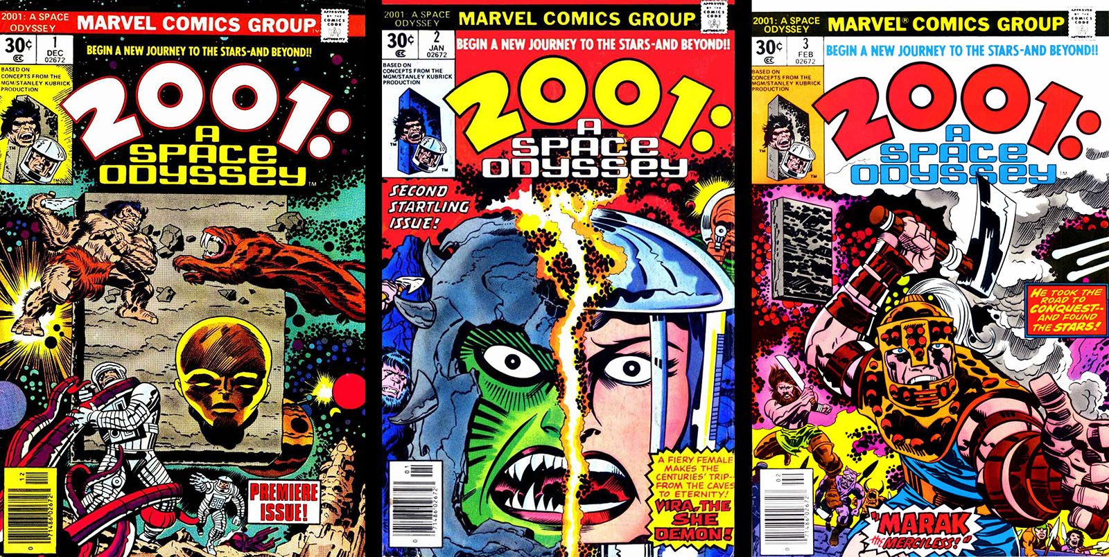
Okay, I drifted away from 2001 for a bit there, but this is the point where things get REALLY crazy. Kirby’s 2001 didn’t stop with the Treasury Special; right alongside it in December ’76 was the first issue of a monthly 2001 series that picked up where the movie left off.
Like his other projects at the time, his credit read “Edited, Written, and Drawn by Jack Kirby.” For better or worse, that translated to, “Nobody tells Jack Kirby NO.” I remember picking up the first issue back then with no real context, and it was just as off-the-wall as The Eternals. It was the first-ever sequel to the film, beating Arthur Clarke’s 2010 by a good five years.
Even without those credits, it was self-evident that Kirby didn’t have to check in with anyone, since he took the concepts of 2001 in his own direction. But in deference to the source, most of the ten-issue series essentially recycled the meta-plot of the movie, tracking the Monolith through different phases of human history as it gave evolutionary nudges to key individuals. The stories would then jump ahead to their future descendants, who would follow the path of Dave Bowman to become a “New One.”
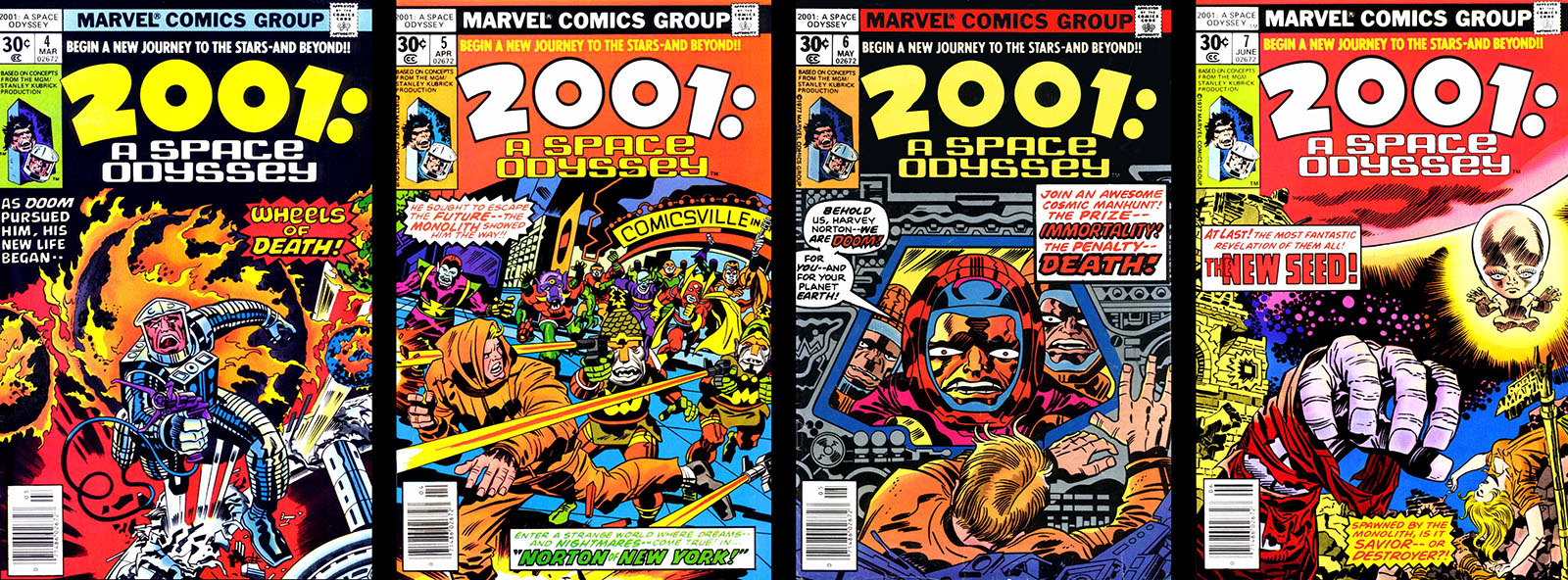
The thing is, the series never really went past that. Because once a character becomes a god, it’s very difficult to write a relatable story about them. To his credit, Jack tried it when he got to issue 7, but the wheels just spun, seeking traction but not finding any. Afterward, Jack tossed out any attempt to continue that story and rebooted with issue 8.
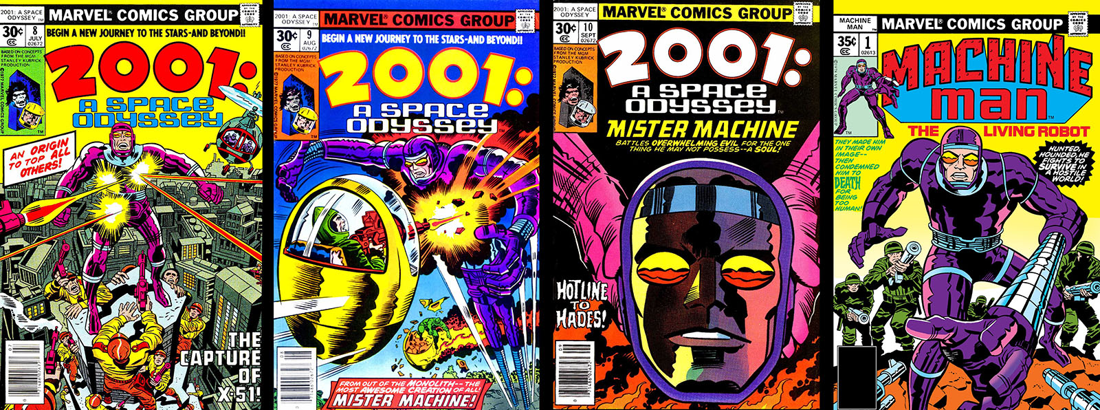
It focused on a mechanical man named X-51 (A.K.A. Mr. Machine or Aaron Stack), the most sophisticated android ever made. Since the title of the series was still 2001: A Space Odyssey, you’d think X-51 would be an outgrowth of HAL-9000, but he was instead an independent android who encountered a Monolith. Other than that moment, there wasn’t a trace of the movie over the last three issues of the series, just Jack’s desire to develop a new character.
In fact, that disconnect allowed Mr. Machine to have a long life of his own. About six months after the 2001 series ended, X-51 got his own title under the name Machine Man and was officially folded into the Marvel universe. He’s appeared time and time again in the decades since, and we have 2001 to thank for it. A skewed adaptation in exchange for an enduring character. That goes into the “win” column.
RELATED LINKS
2001 Treasury Special at Readallcomics
Complete 2001 Marvel series at Readallcomics
Complete 2001 Marvel series at Internet Archive
Complete Machine Man series at Readallcomics
Another analysis of Kirby’s 2001
2001 article from American Cinematographer at Internet Archive
Lucky Special Bonus #1
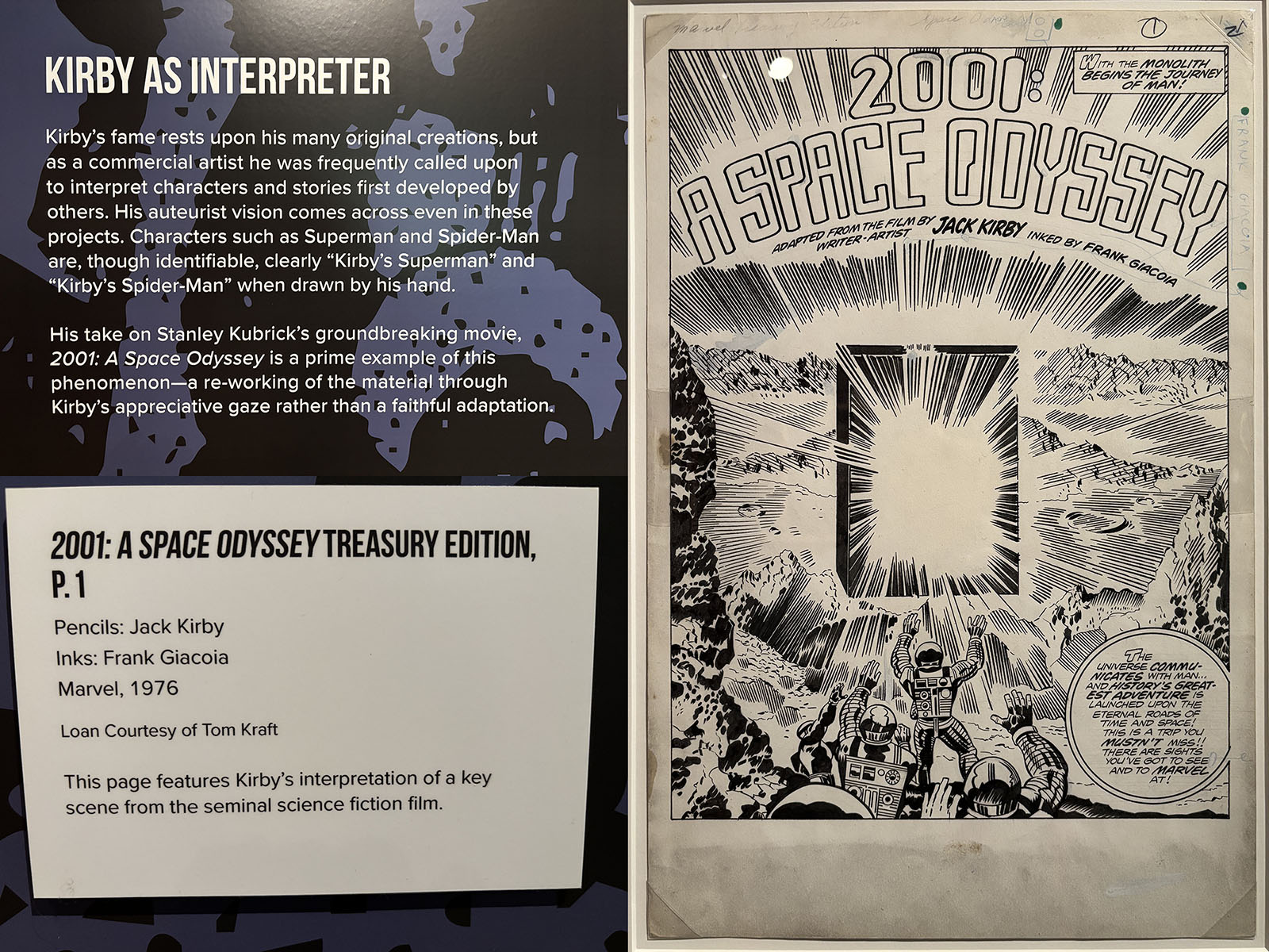
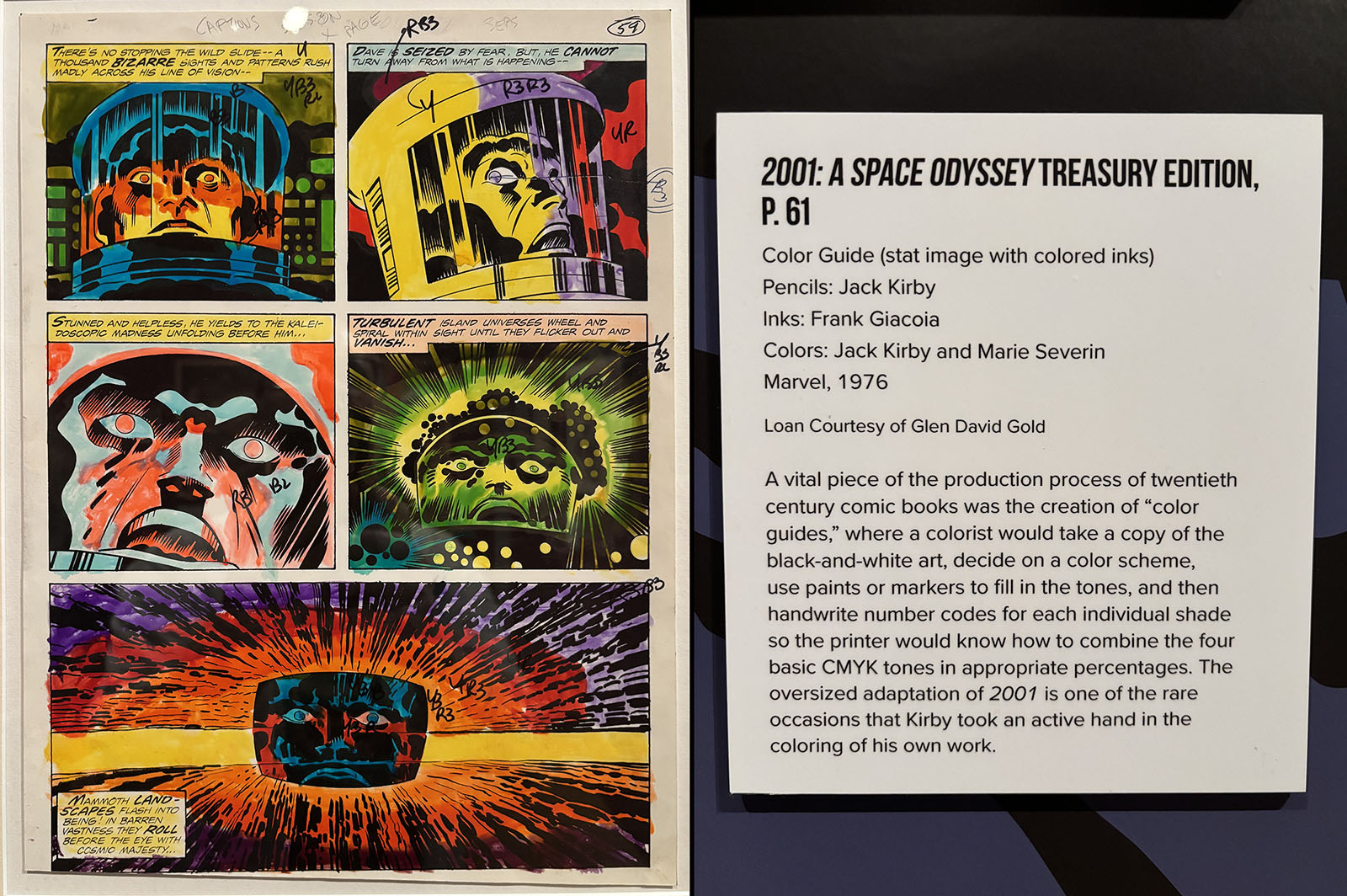
Just before publishing this article, I hustled myself over to the Skirball Cultural Center (in Los Angeles) for the closing weekend of Jack Kirby, Heroes and Humanity. This extensive exhibit showcased original art from across his entire career and included the following on 2001:
Lucky Special Bonus #2
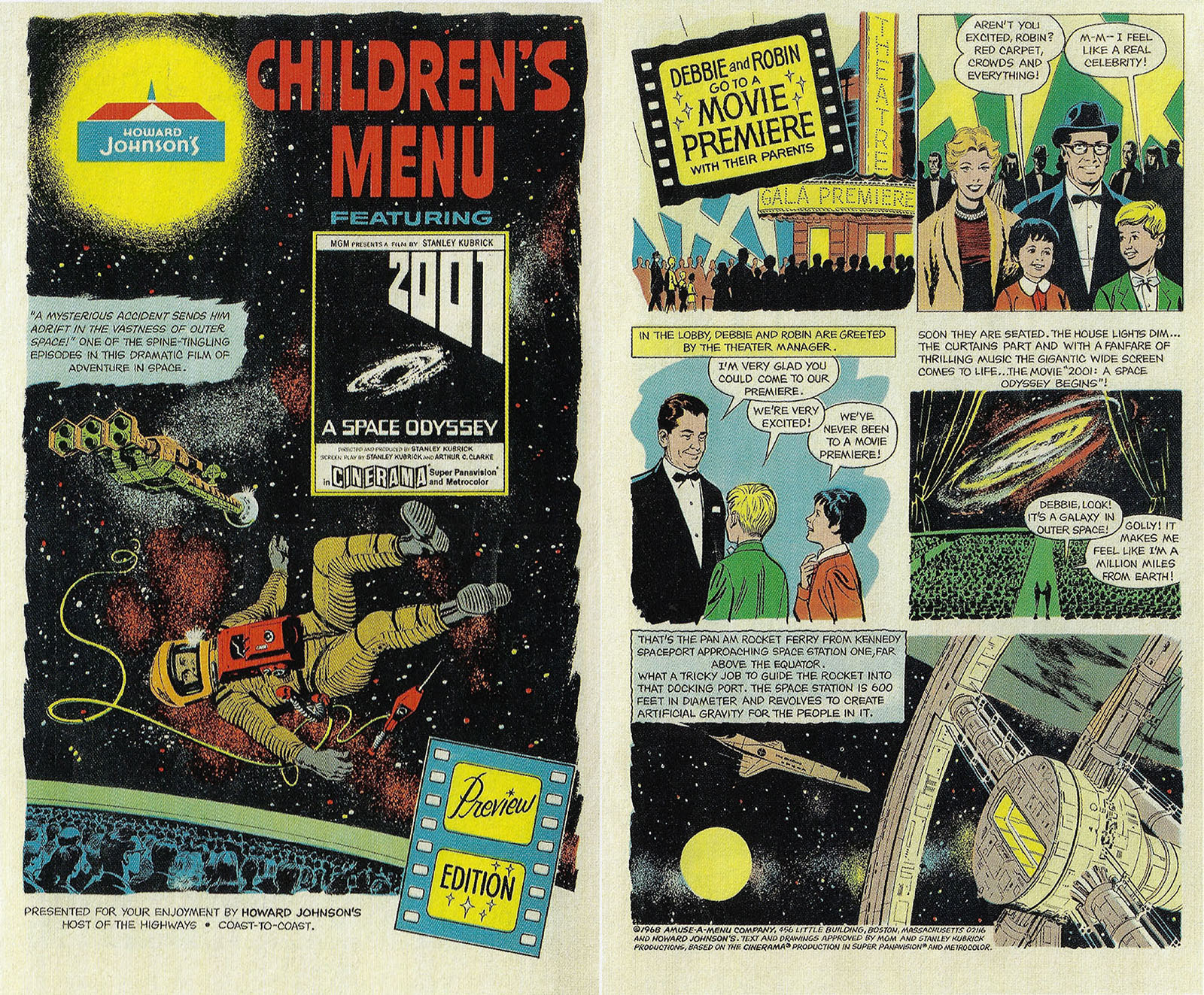
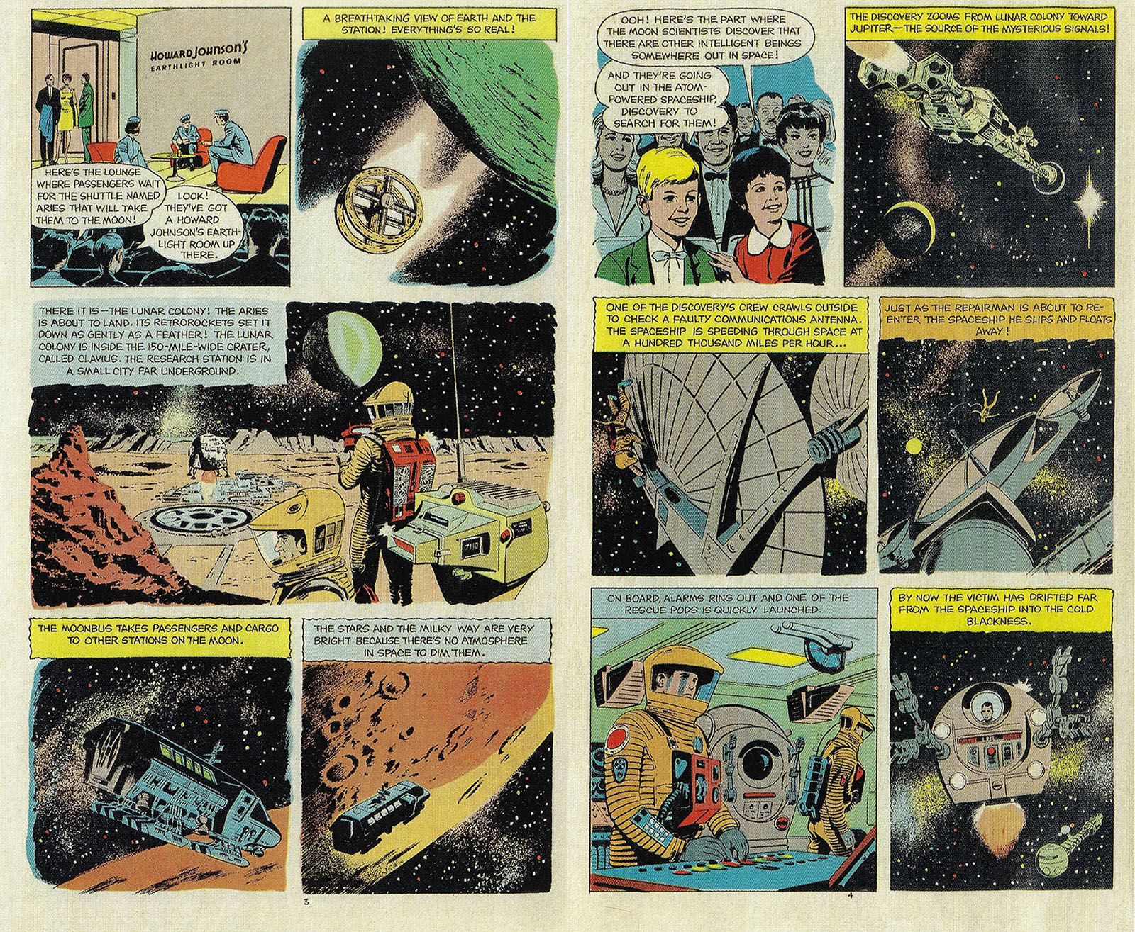
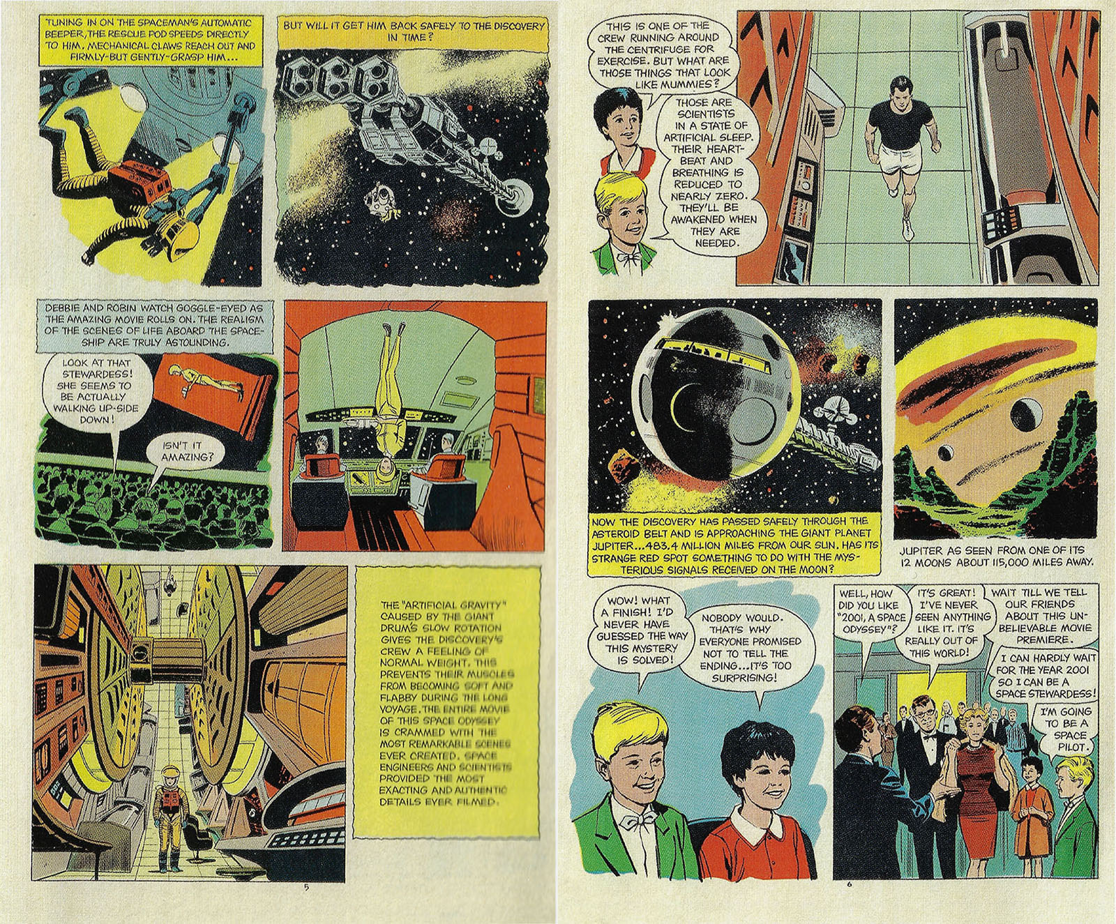
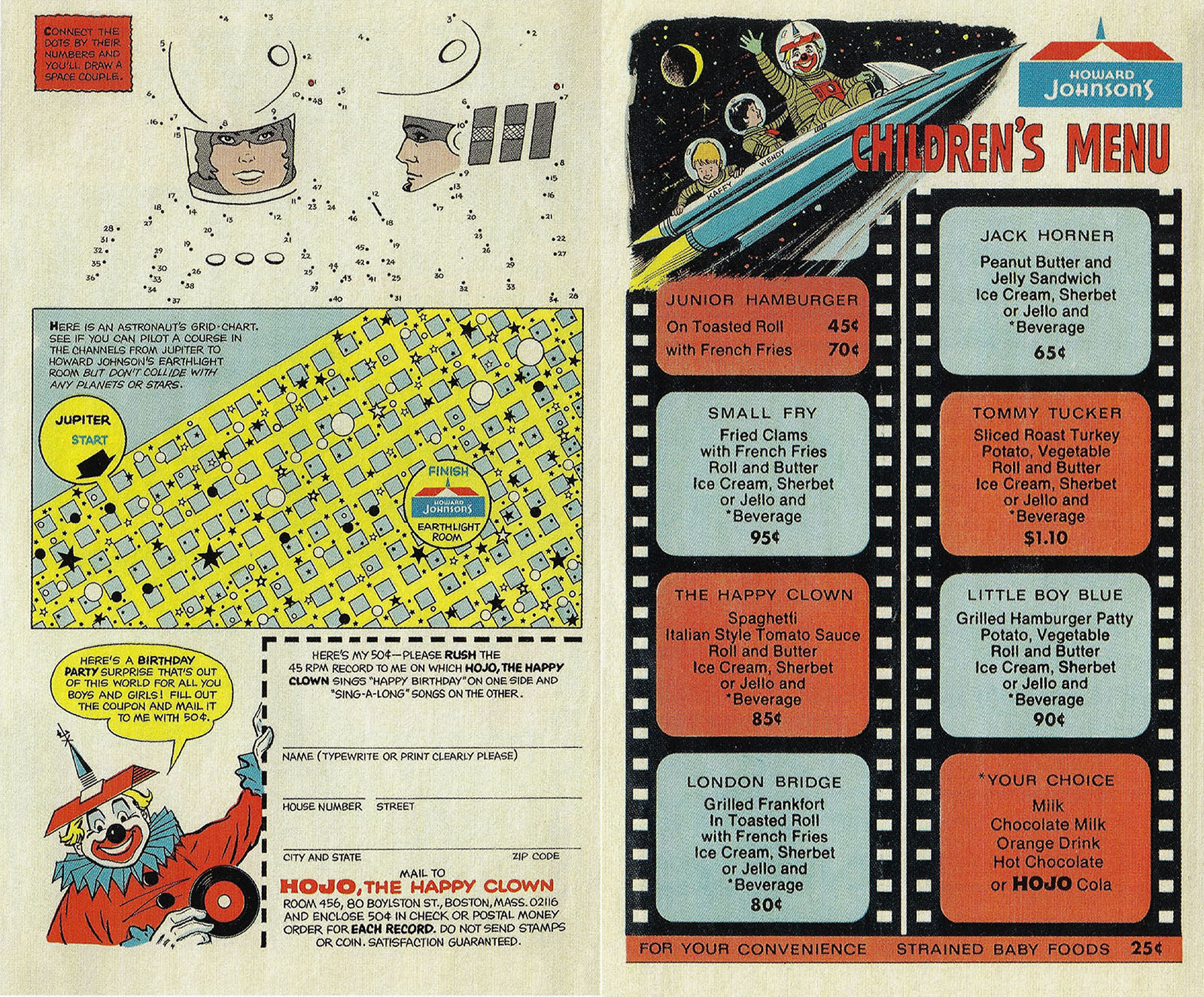
While researching this article, I was delighted to find that Jack Kirby was not actually the first comic book artist to tackle 2001. Instead, that honor goes to his contemporary Alden McWilliams, who got his start in 1950. This wasn’t an adaptation of the movie, but instead a 6-page comic that promoted the movie, doubling as a children’s menu for Howard Johnson’s restaurants (stemming from the on-screen tie-in).
Produced in 1968, the photo-references are obvious but notably more precise and accurate than Kirby’s renderings. All the pages from the menu are shown below. See a larger, more readable version here.
Part 2: 2010, Odyssey Two
By December 1984, I was out in the adult world with a job and a car and the freedom to finally see any movie I wanted. Thus, I was primed to see 2010 on opening day and enjoy it from end to end. It was tonally similar to 2001, but paced and performed like an 80s movie rather than a 60s movie. This gave it more energy and urgency, and though it hasn’t aged as well as its predecessor it’s still pretty darn engaging.
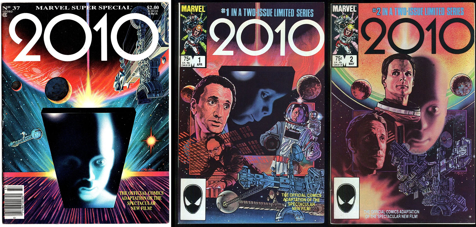
Marvel was there again, bringing us a magazine-size comic adaptation in Marvel Super Special No. 37. The Super Special series was tailor-made for prestige projects, starting with a KISS comic in 1977 and evolving into a vehicle for movies. It would end in 1986 with No. 41 after such high-profile adaptations as Close Encounters, Indiana Jones and Return of the Jedi, and such low-hanging fruit as Sheena and Howard the Duck.
As the world eased into the home-video era, a movie’s tenure in theaters got shorter and adaptations shrank to match. The standard length of a Super Special was 48 pages, allowing the content to also be published as a 2-issue comic book miniseries. This was a notable step down from the days of Star Wars, which filled up 6 issues. (Star Wars also stuck around in theaters a lot longer, another index point for changing times.)
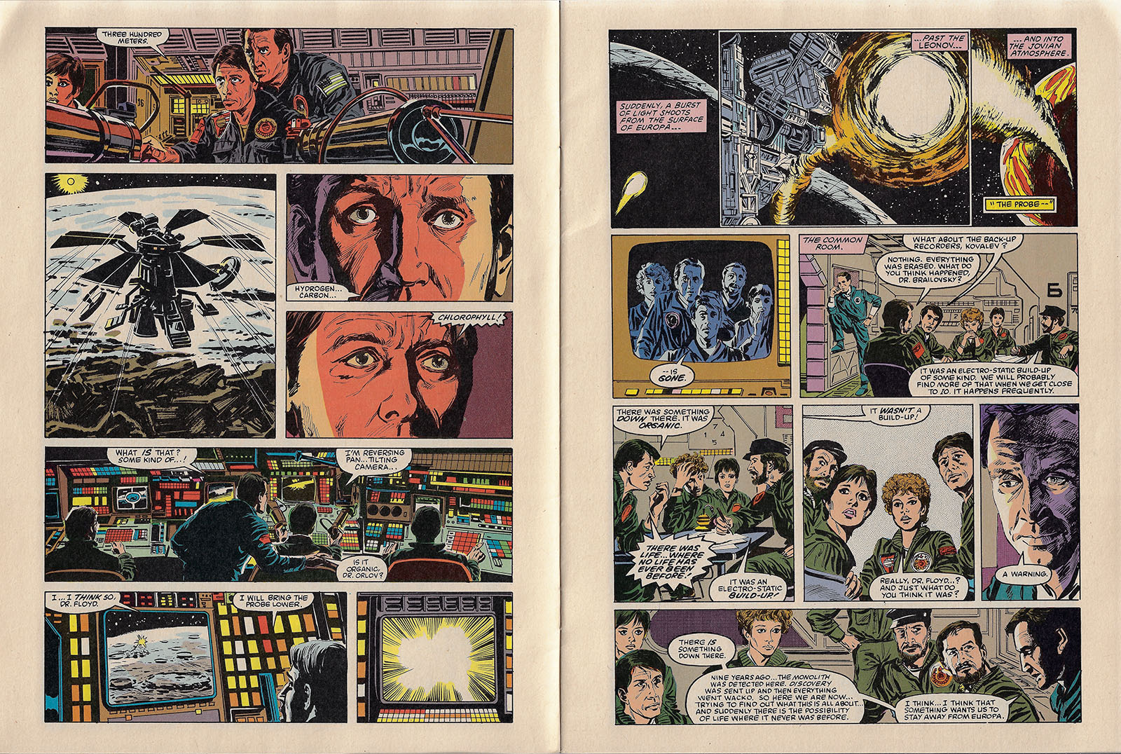
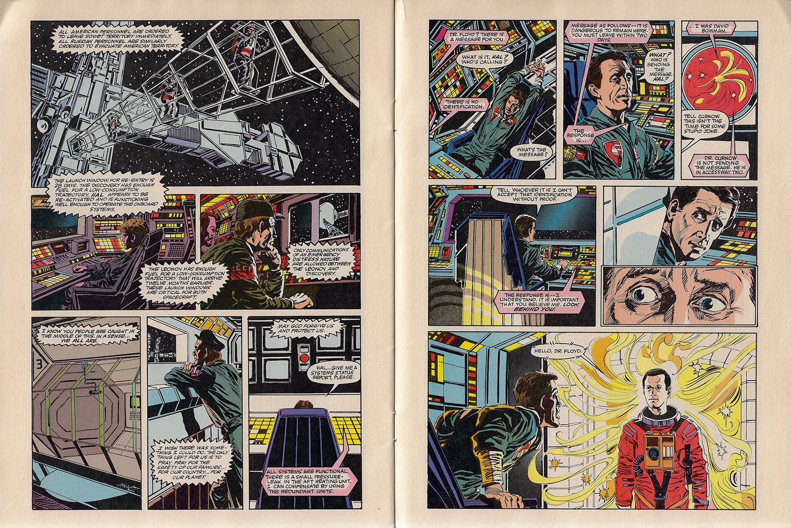
The comic’s shorter production schedule and lower page count meant less room to tell the story, but in the case of 2010 it may have worked out for the best. It didn’t feel as cramped as other examples I could point to, and they hit on a new formula that made the art better: separating the layout stage from the finished art. Let me explain what that means…
The first step when you get a script is to break it down into pages. You start with a thumbnail sketch and then expand that into a full-size rough. Together, this amounts to “layout.” Its main purpose is to capture the images needed to tell the story, decide how to arrange panels on a page, and create a composition for each panel. Most of the storytelling choices are made during that phase.
Usually, that’s the job of a penciler, who goes on to draw all the details for an inker. If one artist has to do all the layout and all the penciling, it eats up a lot of time and brainpower. But if you split those jobs, the process can speed up quite a bit.
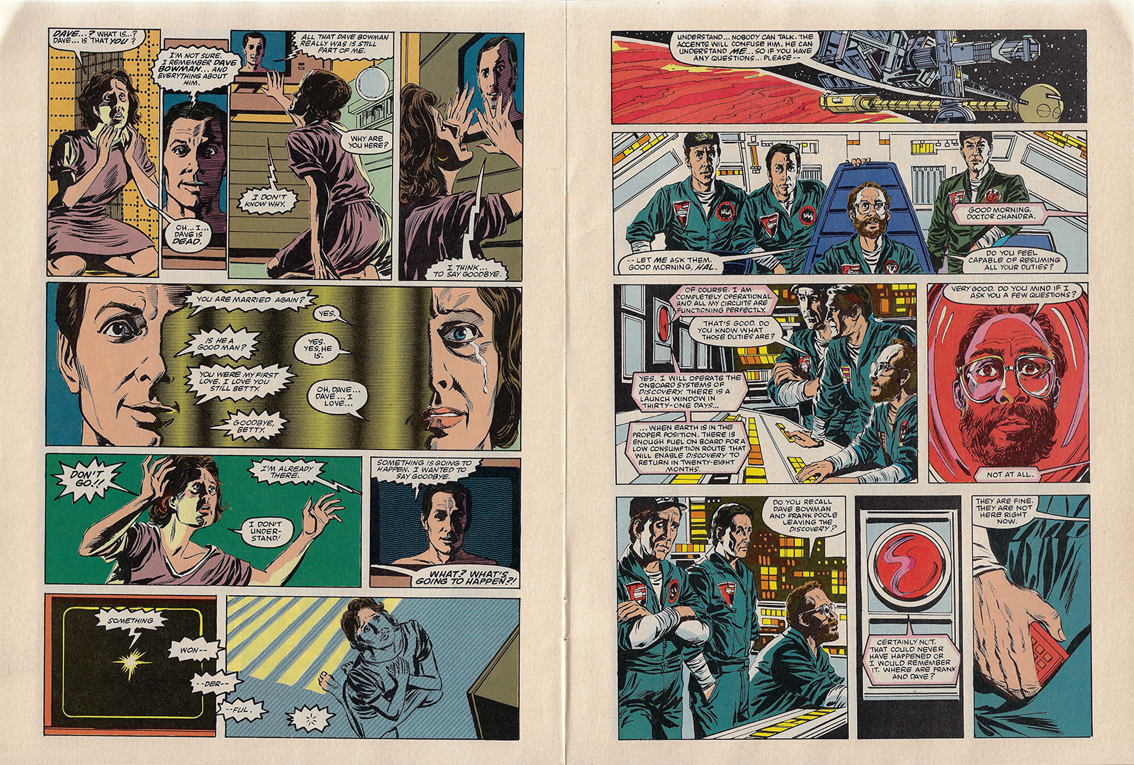
In this case, layout was handled by two artists: Joe Barney and Larry Hama. As soon as a page was laid out, it could be turned over to someone else to finish. On 2010, that was the very accomplished Tom Palmer. An inker by trade, he was credited on this project for “finishes, inks, and coloring.” Since he didn’t have to also do layouts, it gave him an earlier start. And because he took every page all the way to the finish line, he had much more artistic control. He had an innate sense for where inking could stop and coloring could start. A good way to stop yourself from over-inking.
The end result was outstanding on every level, including actor likenesses. It’s also clear that Palmer had a deep well of reference material, so fidelity to the source material was far closer than Jack Kirby’s take on 2001. And since the art was less stylized (more realistic), it naturally had broader appeal. In my book, that makes 2010 a shining example of a movie adaptation done right.
On the other hand, as is the nature of the beast, it doesn’t give you more than the movie did. Under what circumstances could that be flipped? We saw one example of that by accident with Marvel’s Star Wars adaptation; it was based on the shooting draft of the script. As with the novelization, that draft was handed over before the movie was finished, so both adaptations preserved all the deleted scenes. That’s something we didn’t see much of in later movie comics. So where else can “added value” come from?
Personally, I would have loved to see an adaptation of the Clarke novel with this same level of care and craftsmanship: same artists, same designs, same style, just expanded to capture the bigger version of the story. It’s far too late now and the licensing mechanics would have been different, but if Marvel had been in the novel-adapting business rather than the movie-adapting business back then, the multimedia landscape of the 70s and 80s might have a stronger legacy today.
Part 3: A Merch Odyssey
Part of the reason I like writing these retrospectives is that it gives me a chance to round up interesting spinoff products that may have escaped notice. If you’re pursuing a 2001/2010 collection of your own, here are some targets…
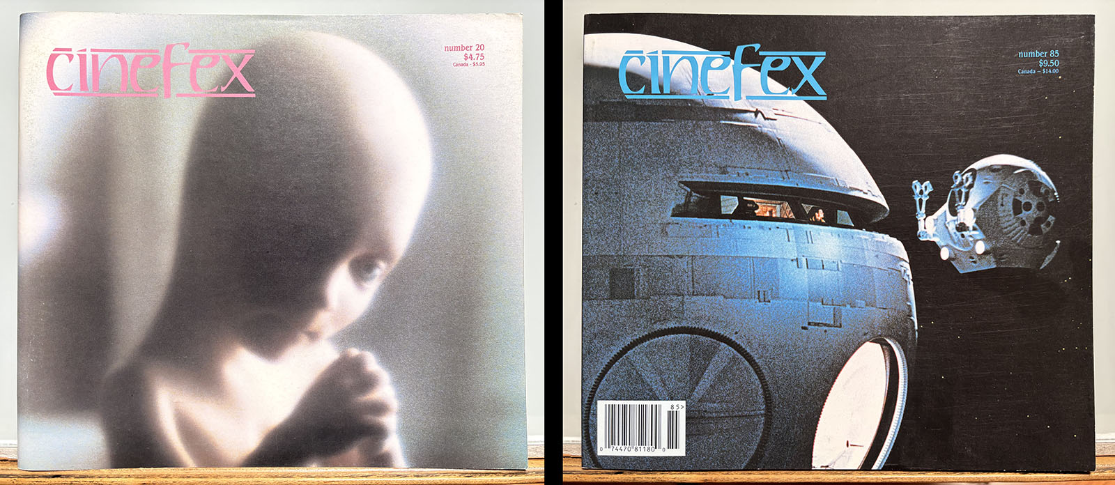
Books and Magazines
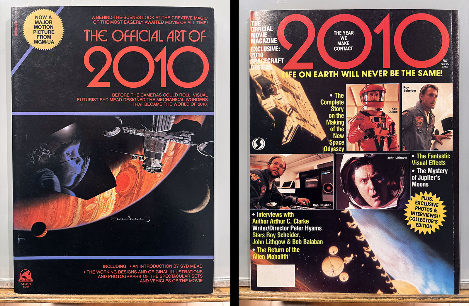
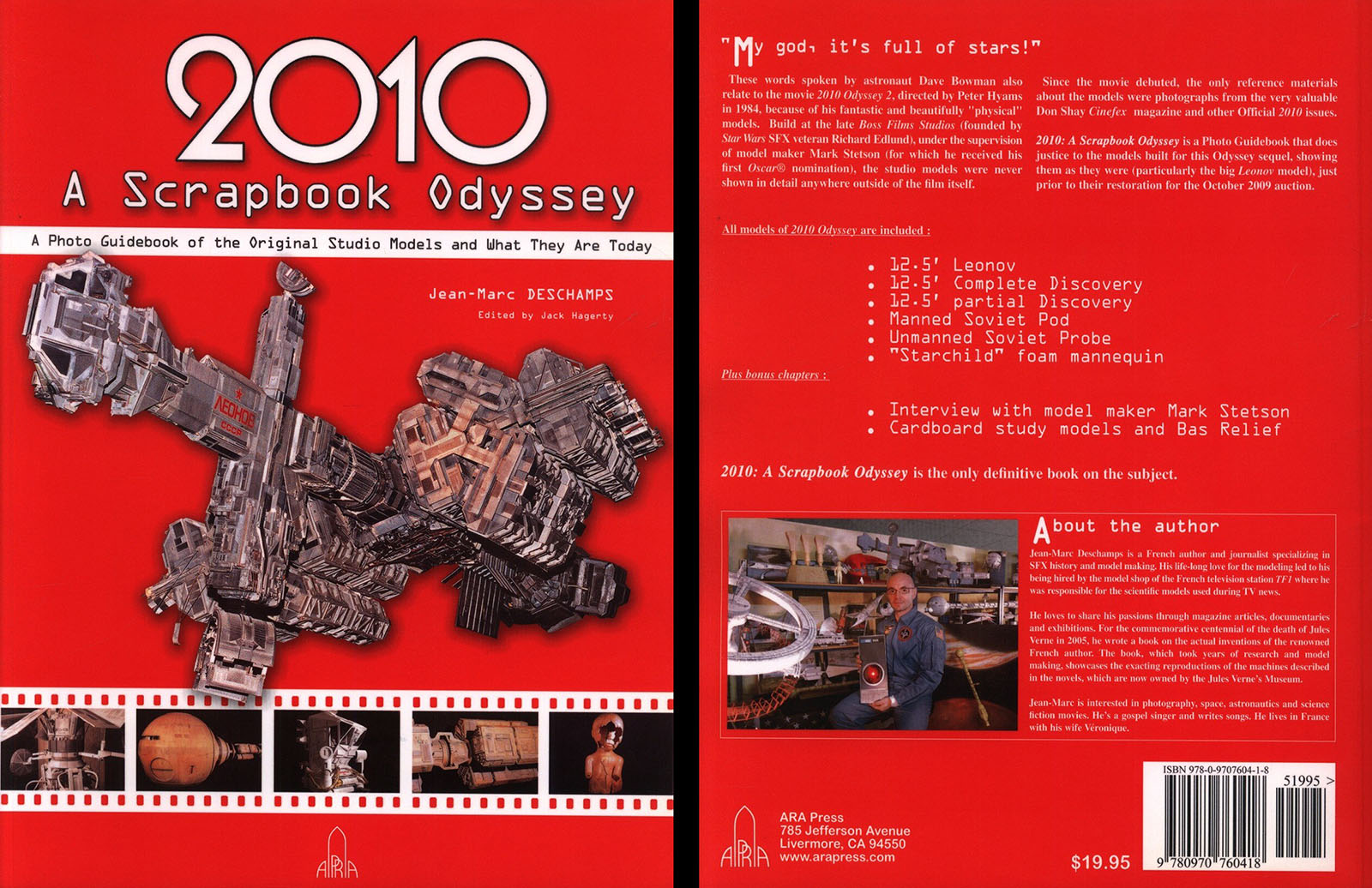
2010: A Scrapbook Odyssey (2010), ARA Press
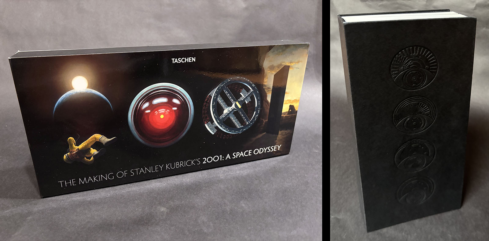
The Making of Stanley Kubrick’s 2001: A Space Odyssey (2015), Taschen
As content goes, this book is unbeatable. It’s very difficult to imagine a more complete and comprehensive collection of art, photos, and text devoted to the film. The gimmick is the vertical format, following the dimensions of the Monolith.
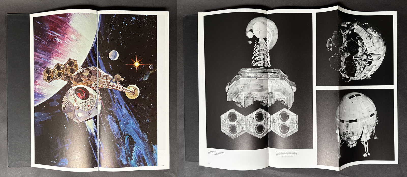
Clever in concept, but less so in execution. There’s almost no art that doesn’t get broken over two pages, and foldouts are very common. The book needs to be handled with extreme care to avoid damage, and isn’t exactly built for comfortable reading.
Music
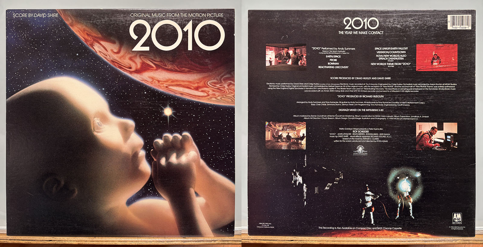
2010 Soundtrack LP (1984), A&M Records
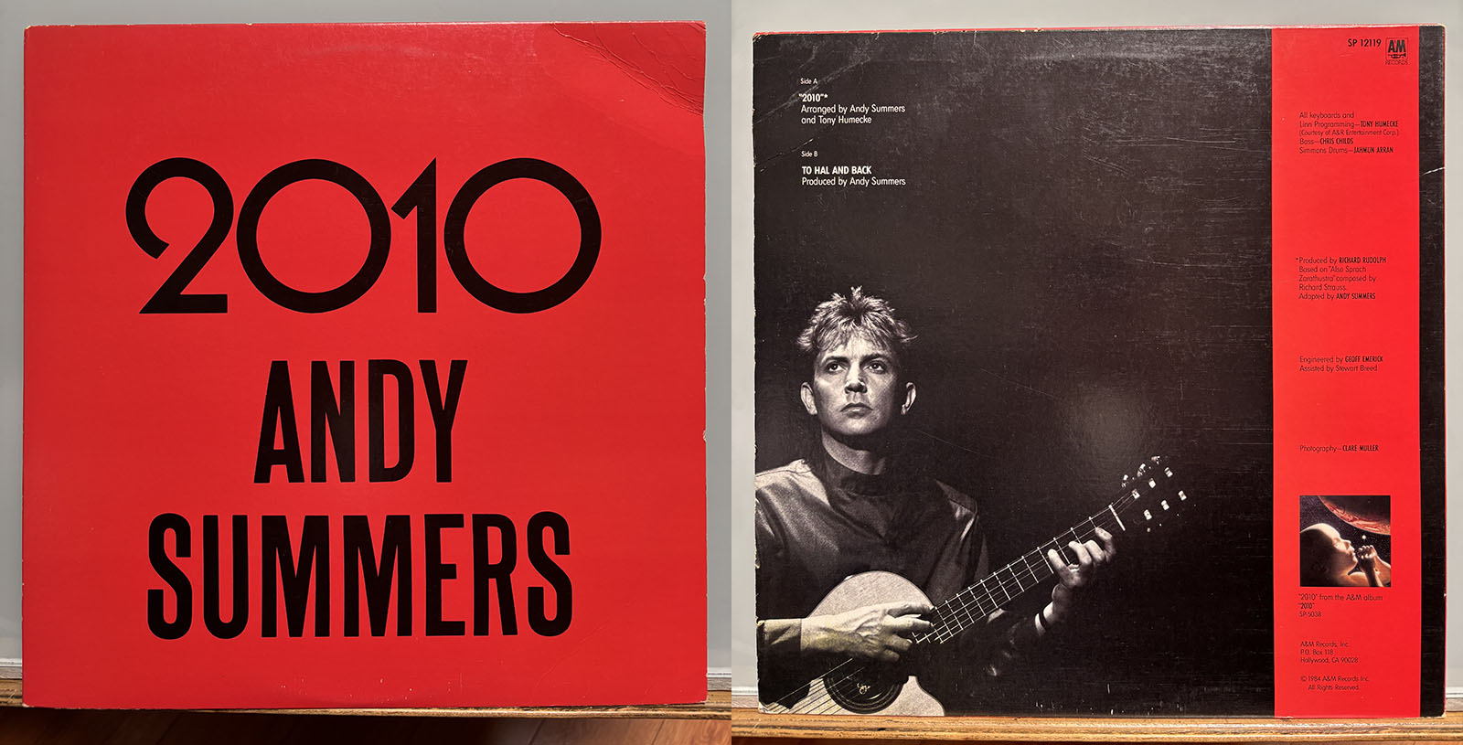
2010 EP single (1984), A&M Records
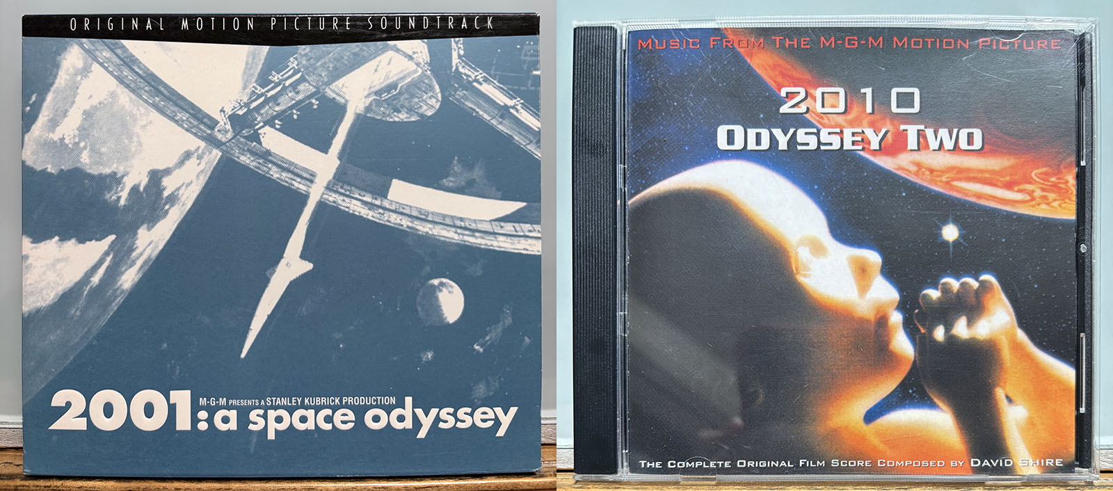
The 2001 score needs no explanation from me, and will be famous for all time. The 2010 score, on the other hand, relies heavily on synthesizers and (apart from a handful of moments) started to sound dated as soon as it was released. Still worth having, though.
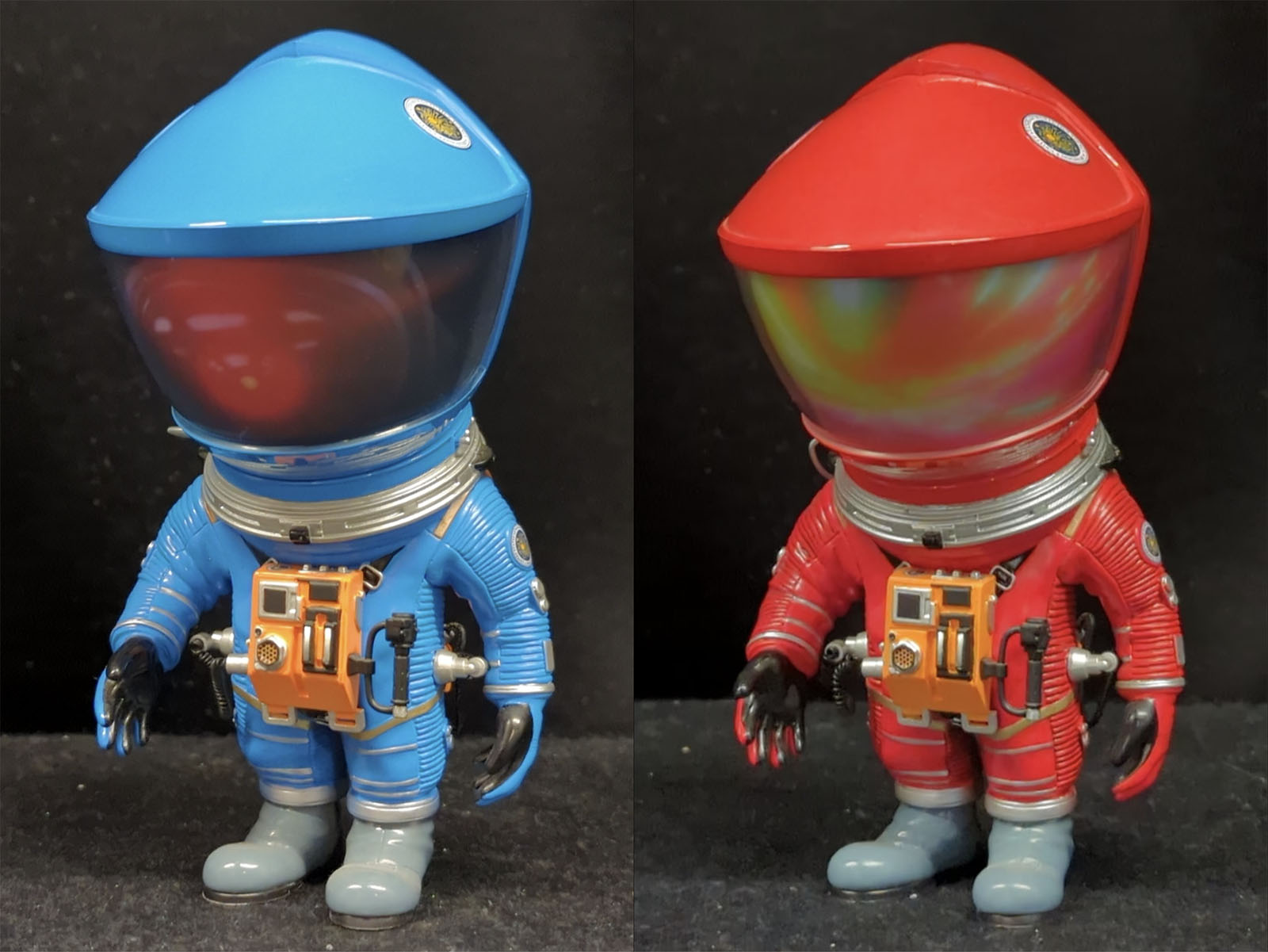
Figures
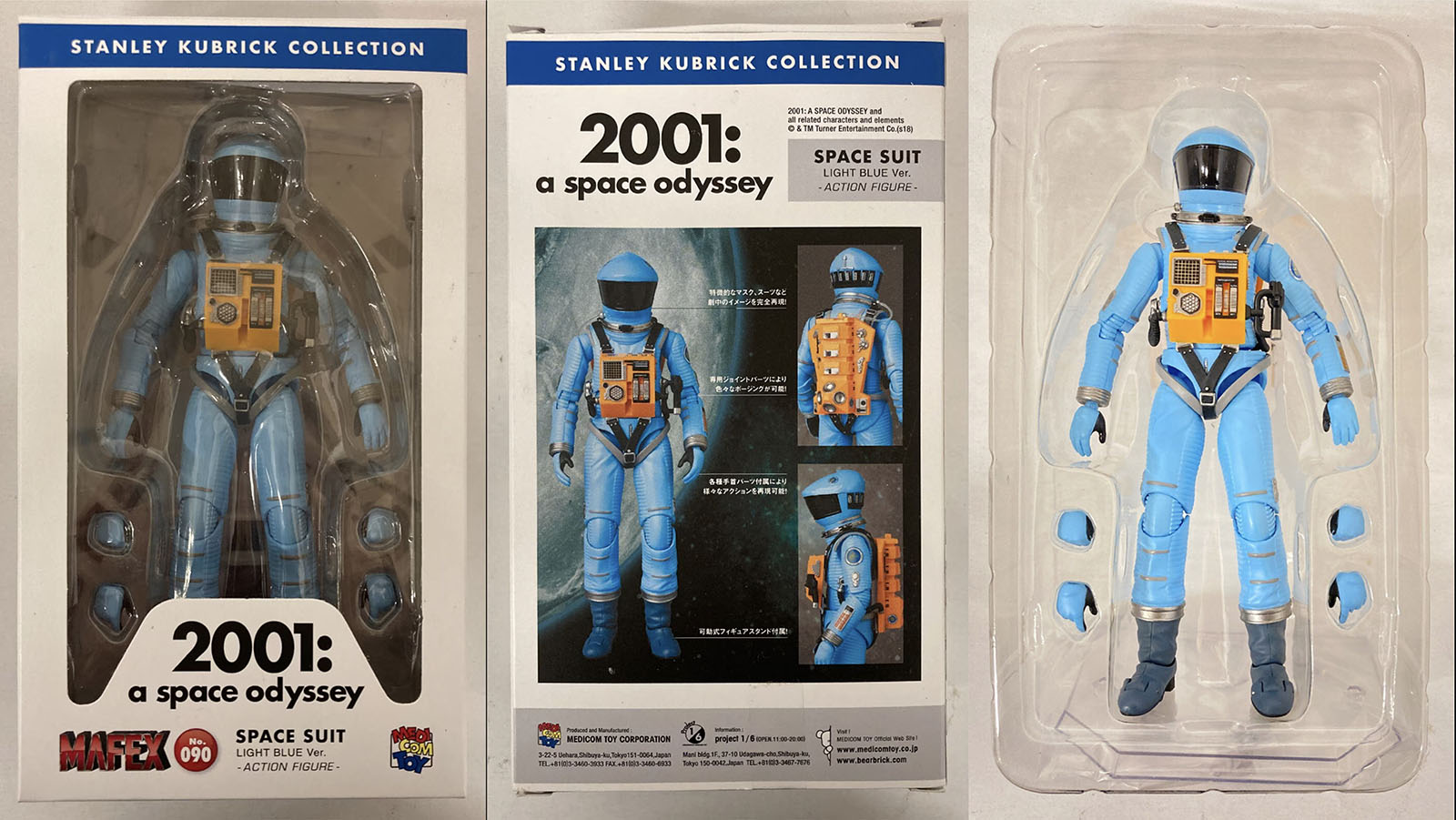
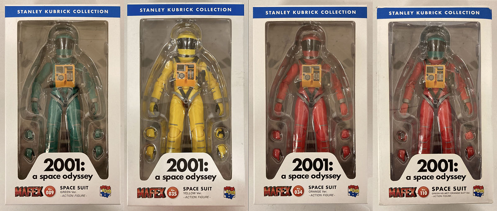
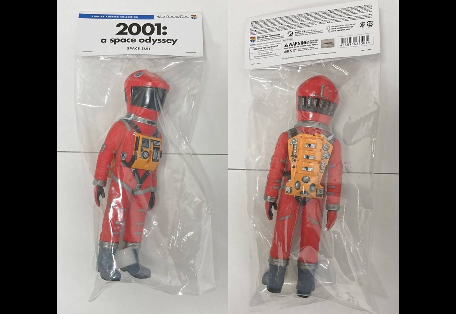
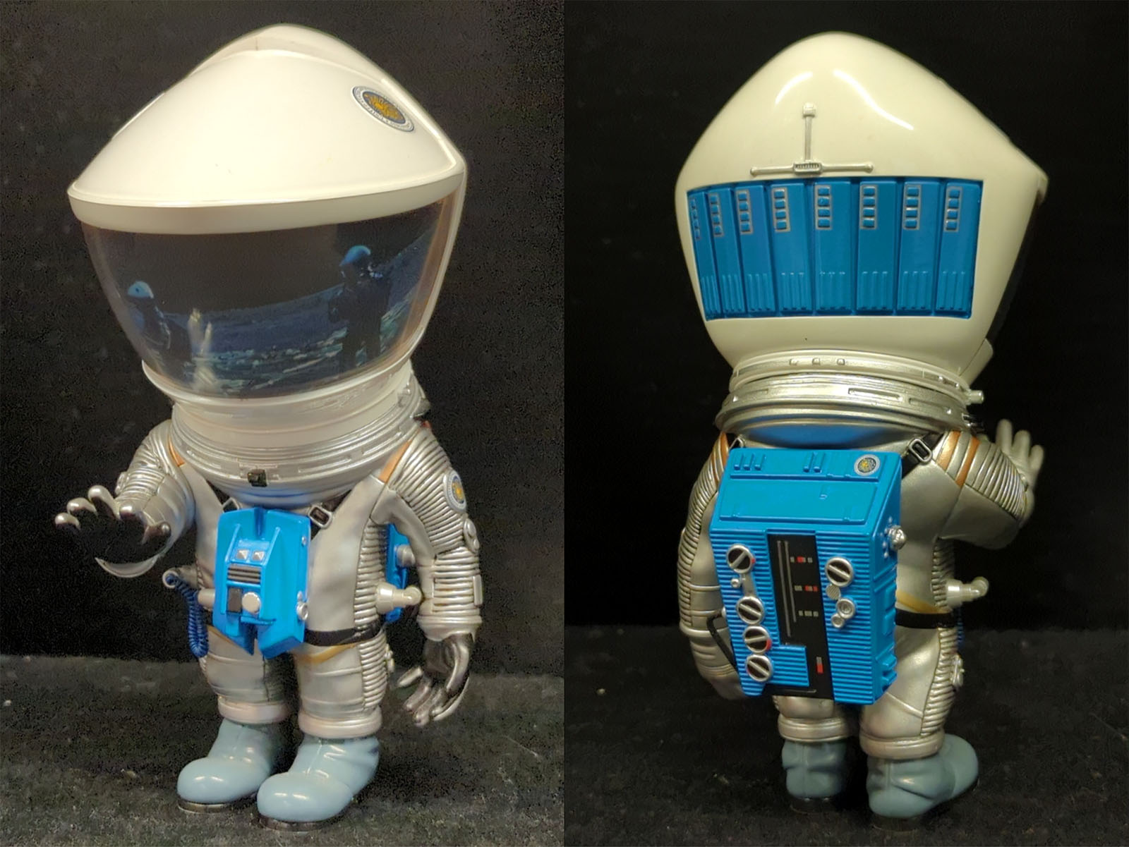
Action figure series, Medicom Toy (Japan)
Model kits

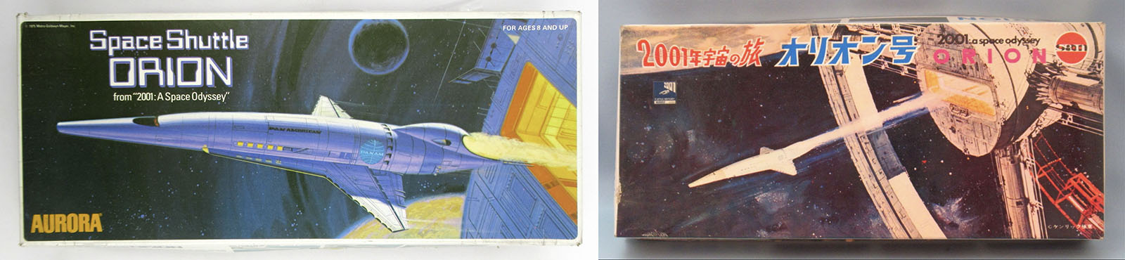

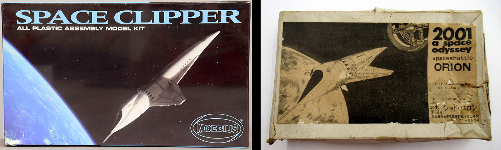
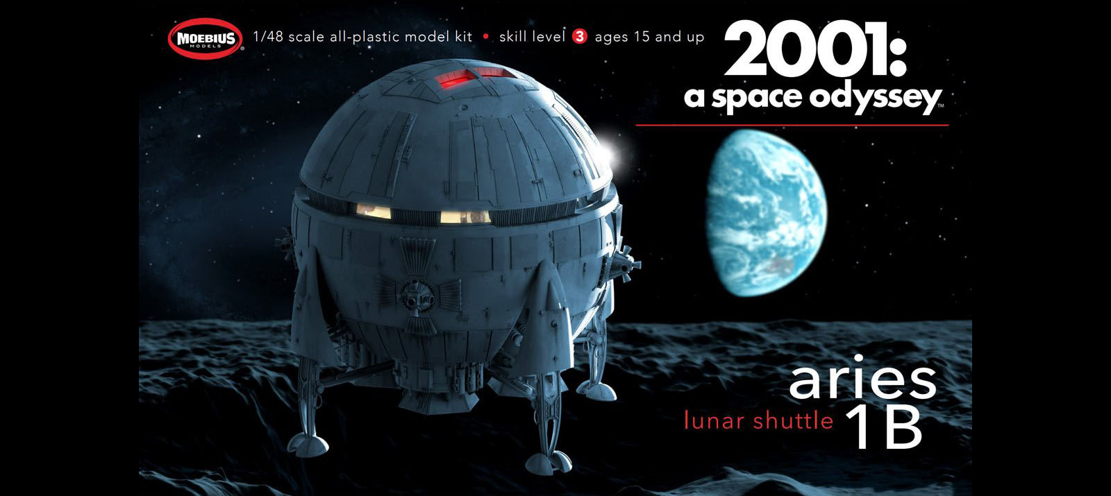

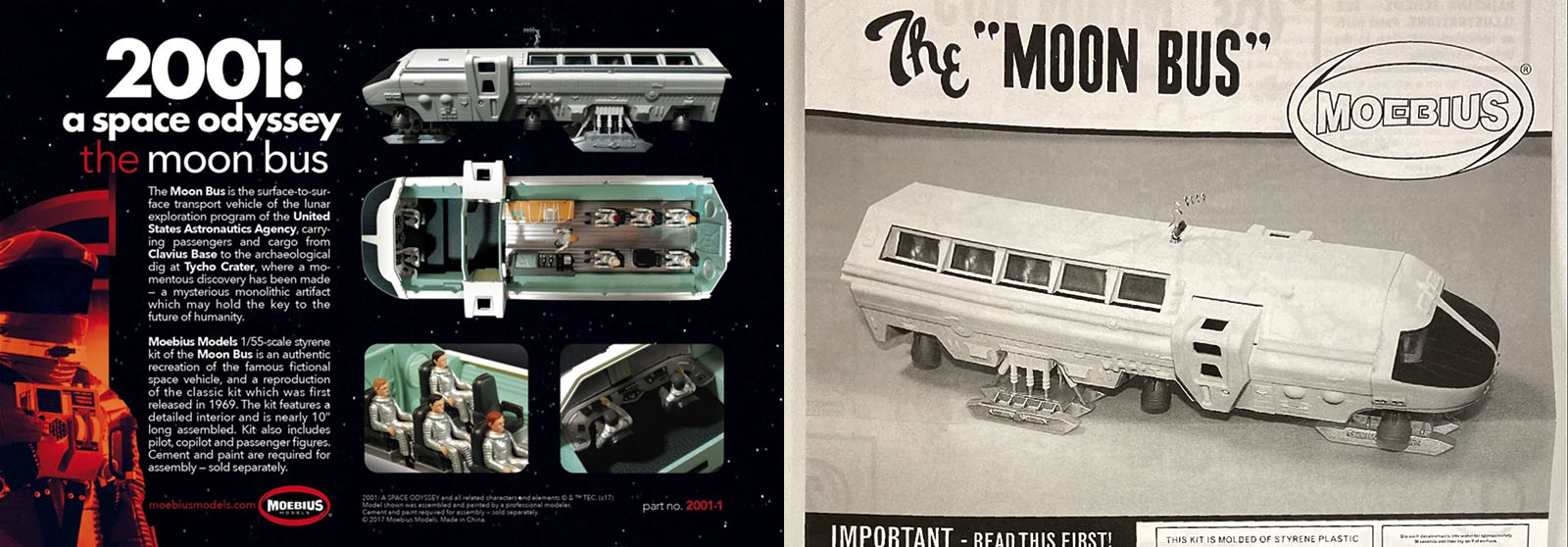
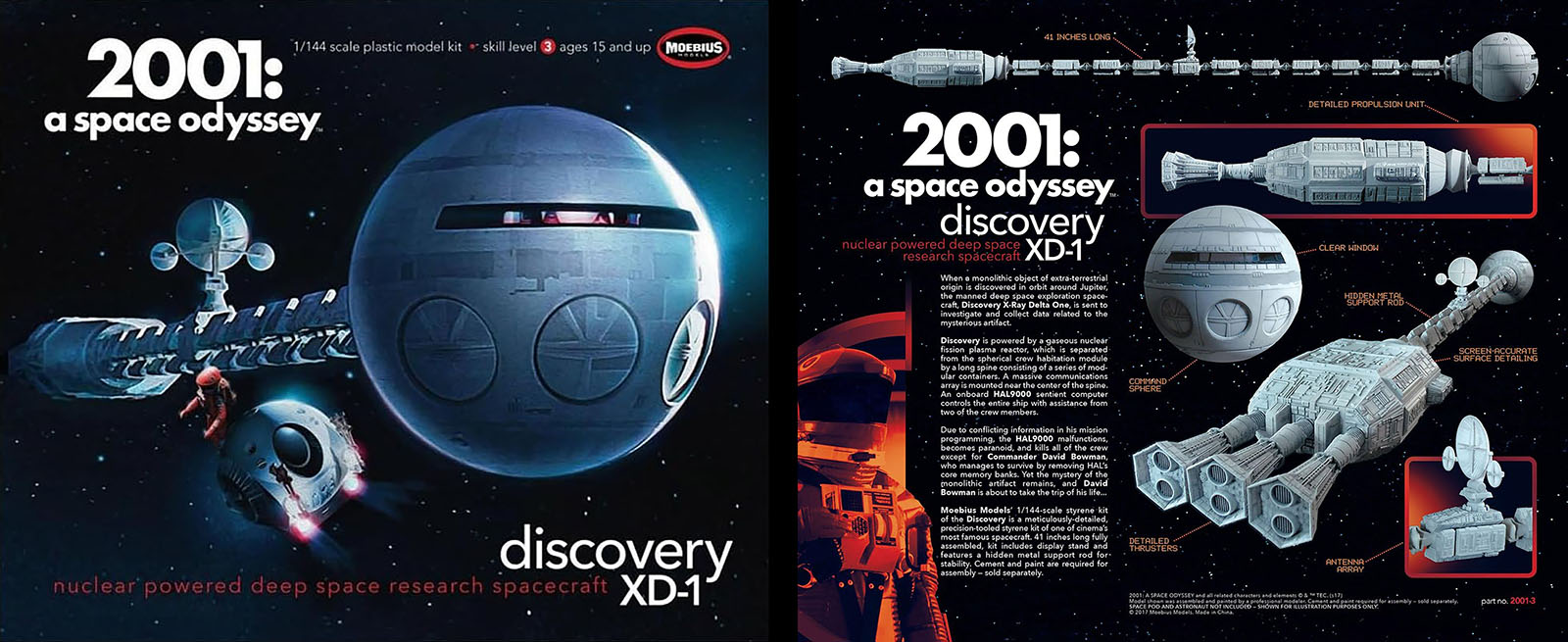
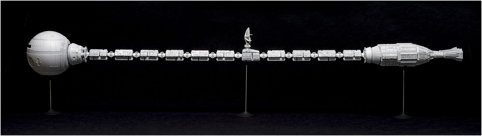

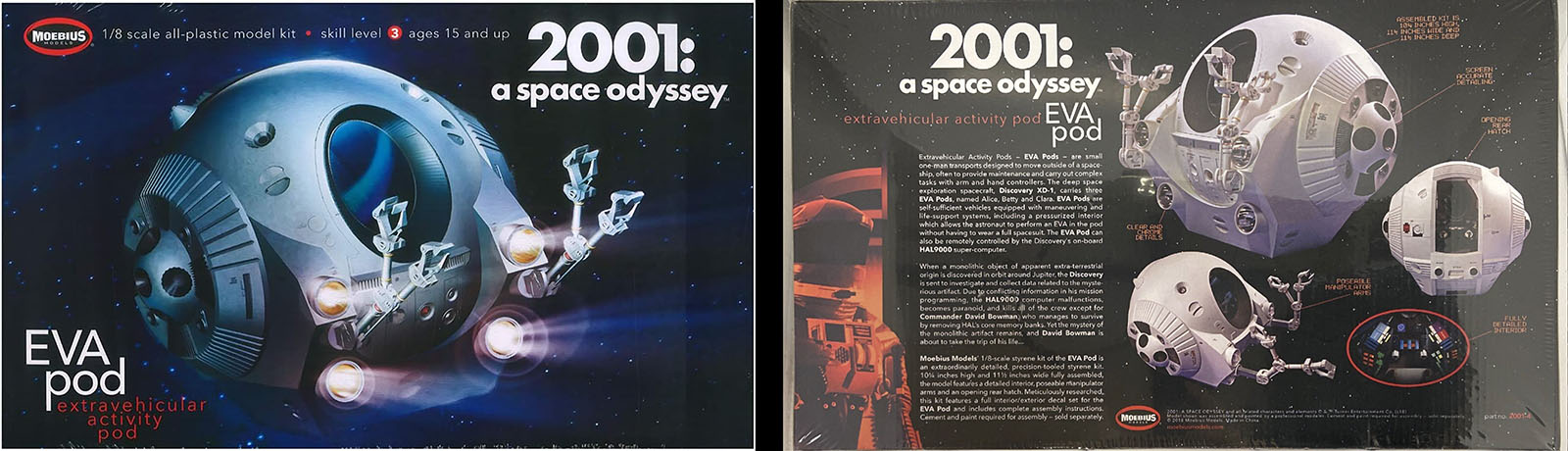
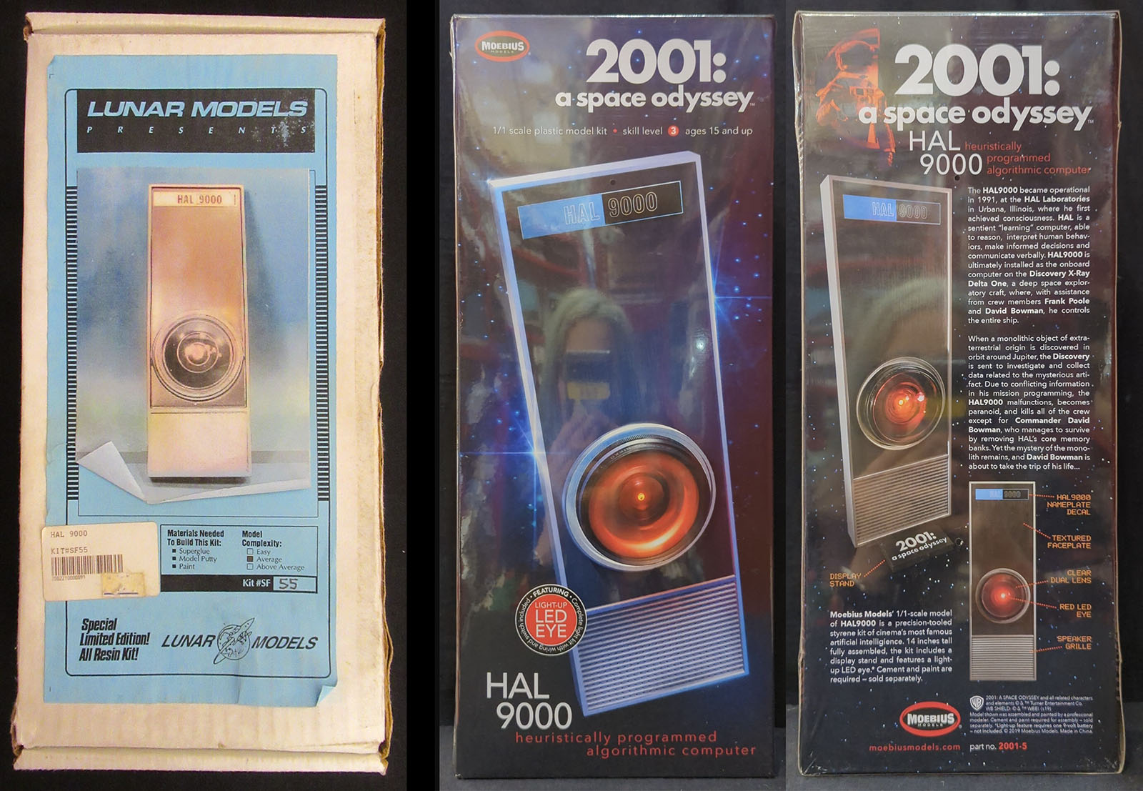
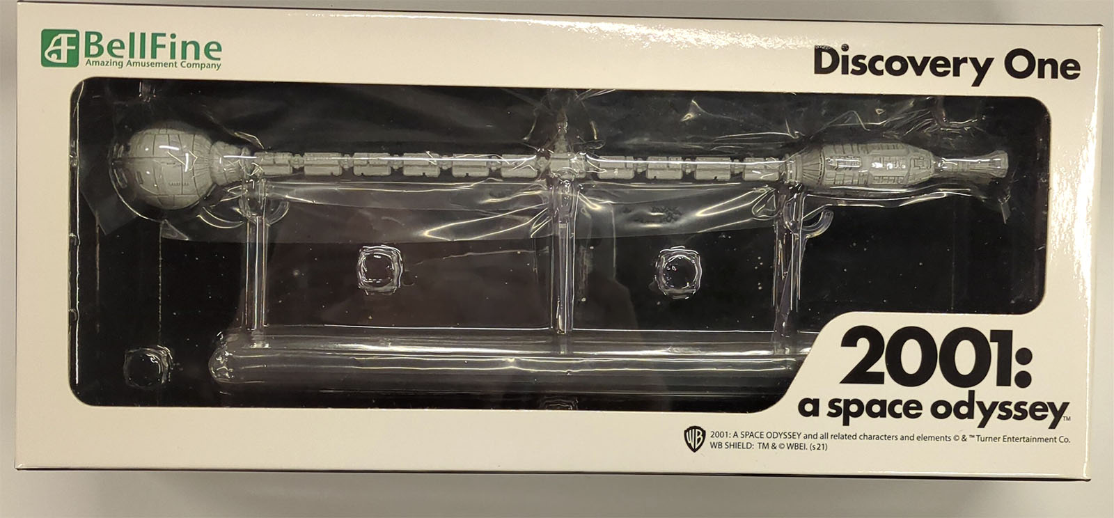

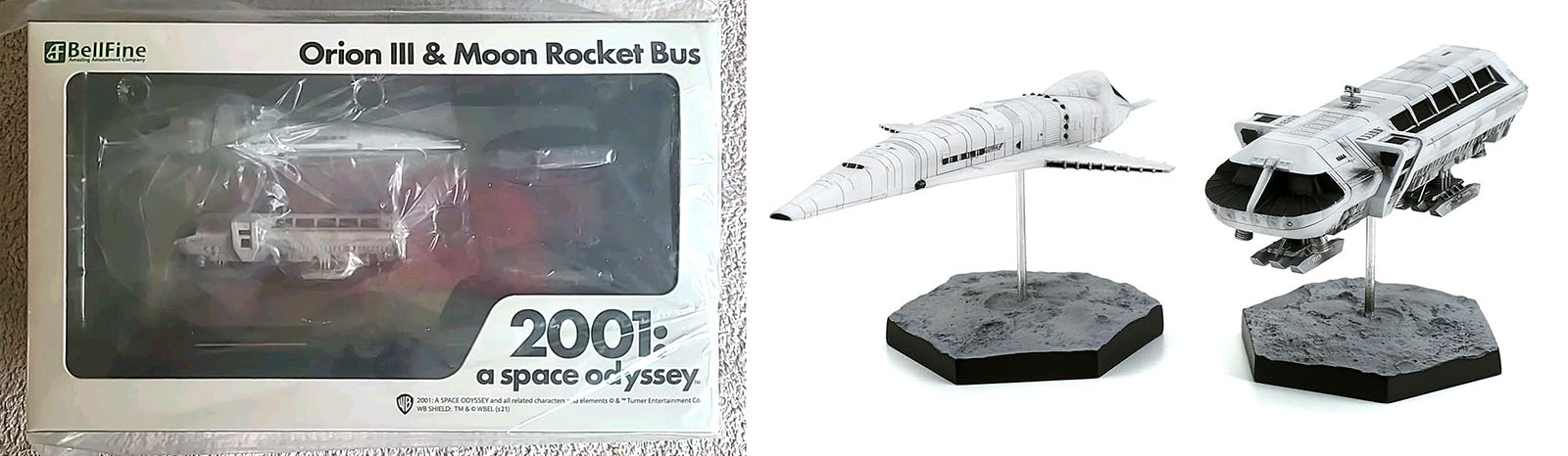

Find the models at these sites: Monsters in Motion | Noble Knight | Cult TV Man | Moebius