
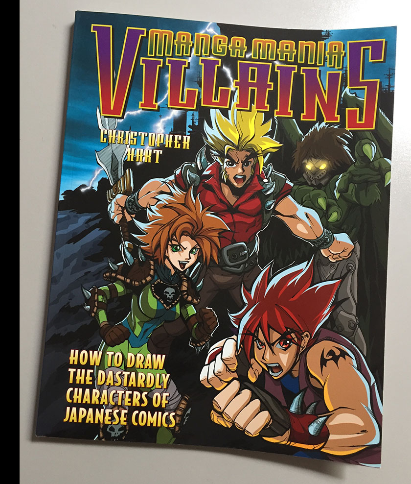
Manga Mania Villains, 2003
This was my second project for Christopher Hart, who previously employed me to design anime-style robots for his art book Mecha Mania. In case you missed it, you can see that project (and my grievances) here and here. I don’t remember whether or not I passed those grievances on to Chris at the time, but if so it didn’t stop him from hiring me again. And I was still recovering from an extended bout of unemployment, so I wasn’t in a position to turn him down.
As I explained last time, I throw instant skunk-eye at western artists who set themselves up to teach Japanese manga/anime art techniques to youngsters. It’s a minefield of presumptions that is just as likely to backfire against the teacher as it is to put flawed ideas into minds starving for input.
Can these techniques be taught by a non-Japanese teacher? Sure they can. But it’s not just a matter of imitation. Art is always a product of the culture it comes from, and unless you make an effort to understand that culture, you’re just reproducing its surface textures. Not unlike applying a foreign accent to your own language. And that, fundamentally, is the wrong way to teach art. Unless you build upward from a foundation, you’re not training yourself to understand it.
Unfortunately – and this is true of comics everywhere, not just Japan – nobody starts from the foundation. The first thing you see is the surface, and that’s the first thing you imitate. To see the results of that writ large, look no farther than the US superhero boom of the 1990s. It was engineered primarily by a generation that grew up reading only superhero comics and taught themselves to draw by imitation. Everything looked pretty much the same, obsessed with surface detail (style) over fundamentals (substance). Predictably, it collapsed like a house of straw. (And the next decade of comics performed a welcome course-correction.)
The anime/manga boom of the 00s sparked a similar phenom; kids were justifiably fascinated by this edgy, groundbreaking artform and were inspired to imitate it. I can’t blame them, it had the same effect on me back in 80s. The problem comes in when you don’t continue down past the surface to the foundation. Artists like Christopher Hart try to help when they publish “how to” books on the subject, but without cultural knowledge to back them up, they can only go so far. There is no world in which you can learn everything you need from a Christopher Hart book (as I hope he himself would admit), but there’s no overt signal to a reader that this is the case; no red flag saying “don’t stop here.”
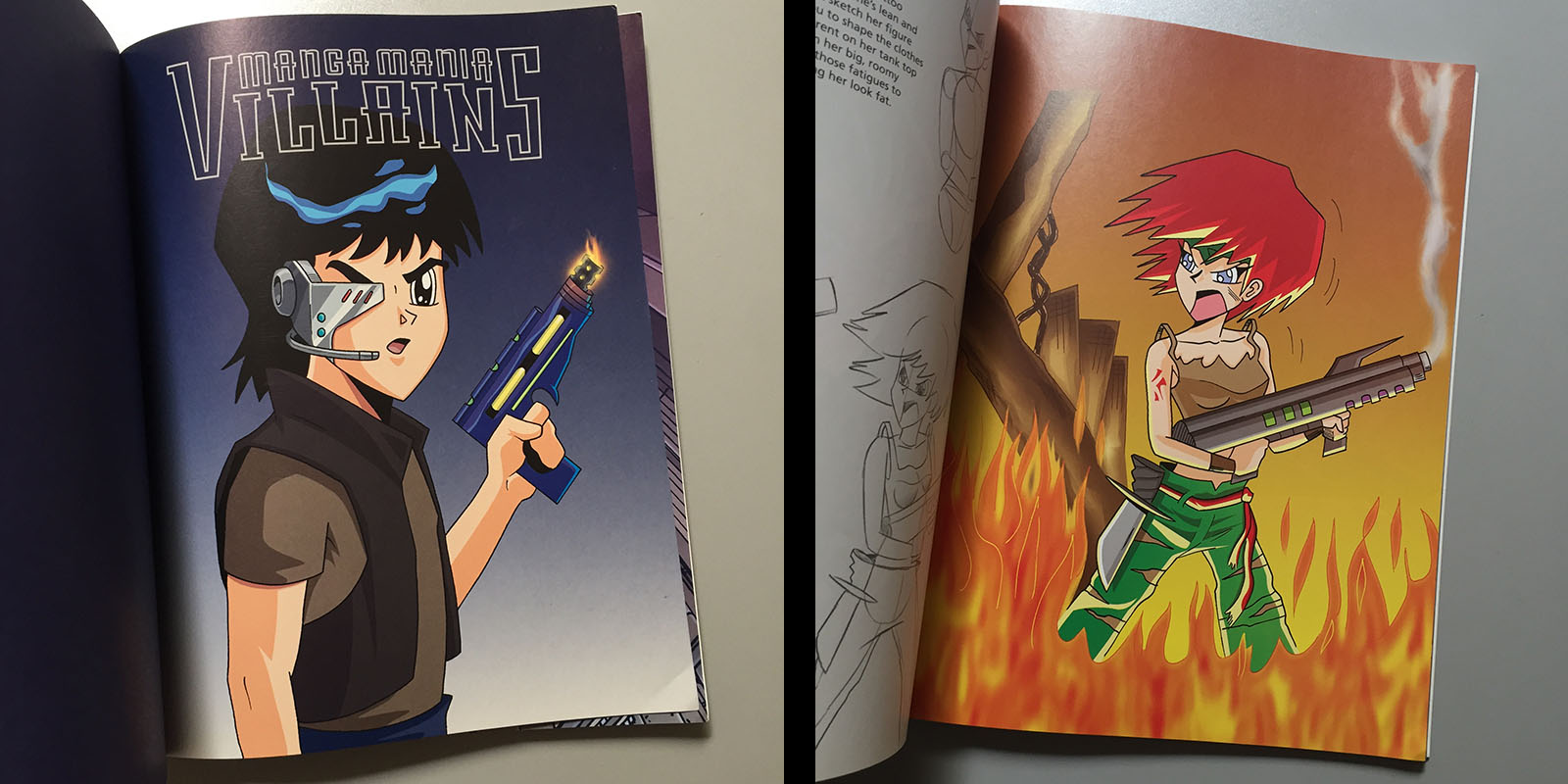
I was one of ten artists who contributed to Manga Mania Villains. Most of them did good stuff. At least at a level where I could tell (as someone with experience) that they were building up from foundations. But one artist in particular delivered some of the worst, most uninformed, most superficial “manga imitation” art I’d ever seen. Someone who displayed – even flaunted – no working knowledge of the subject matter. That artist was…Christopher Hart.
I’m not going to dissect his drawings. That’s not what ArtValt is for. I bring it up here as a way to underscore my point about those who set themselves up as teachers. Be careful who you take your advice from. If they don’t apply it to their own work, they can’t give you much help with yours.
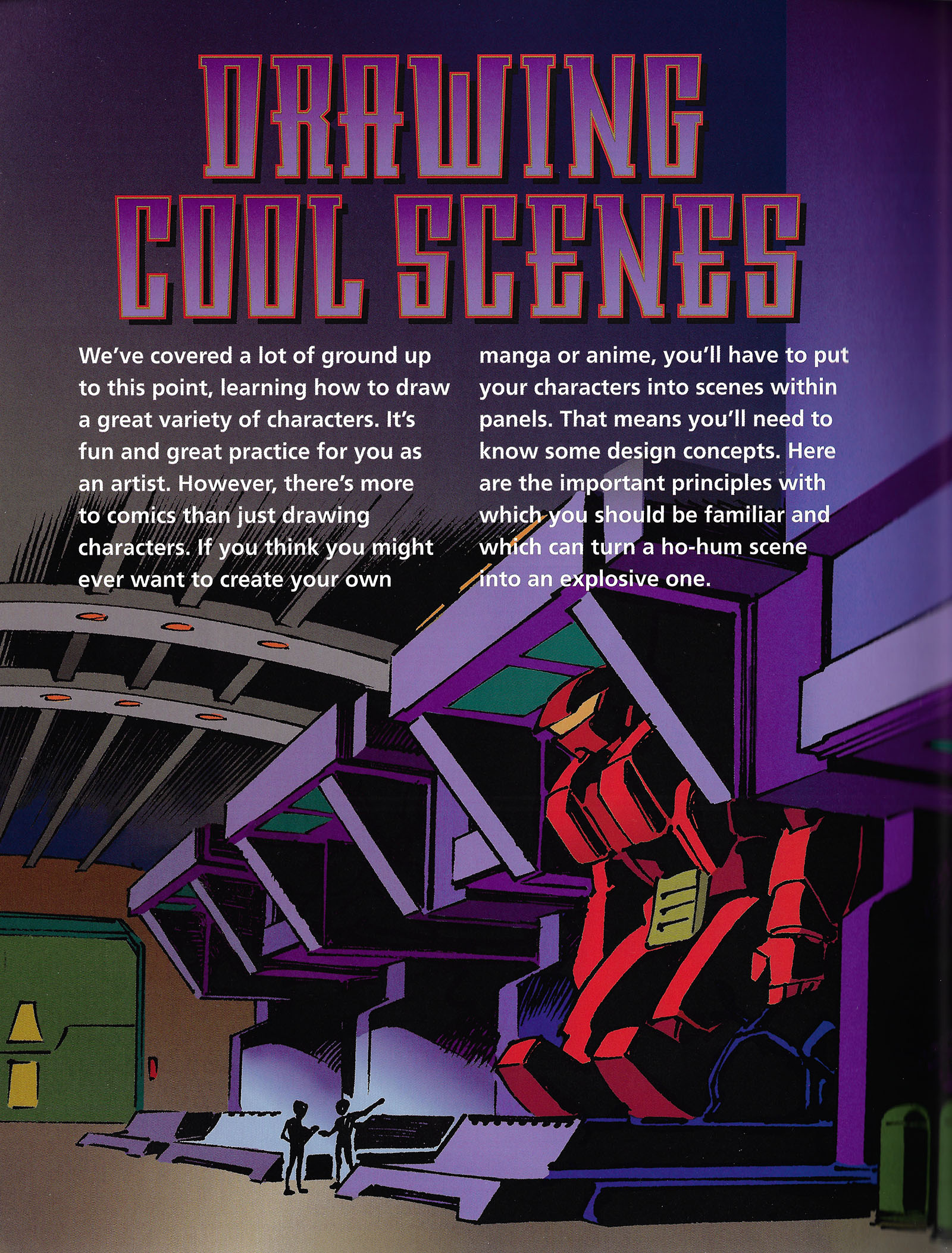
All of my work for the book was found in the last section, which was devoted to scene-making rather than character design. This created a good opportunity for foundational study, since composition is the subject instead of surface detail.
I actually really enjoyed this assignment for that reason; it was a chance to peel off the surface stuff and look underneath. I’d been drawing comics for over ten years, and it gave me a rare peek under my own hood. Always a healthy exercise for an artist.
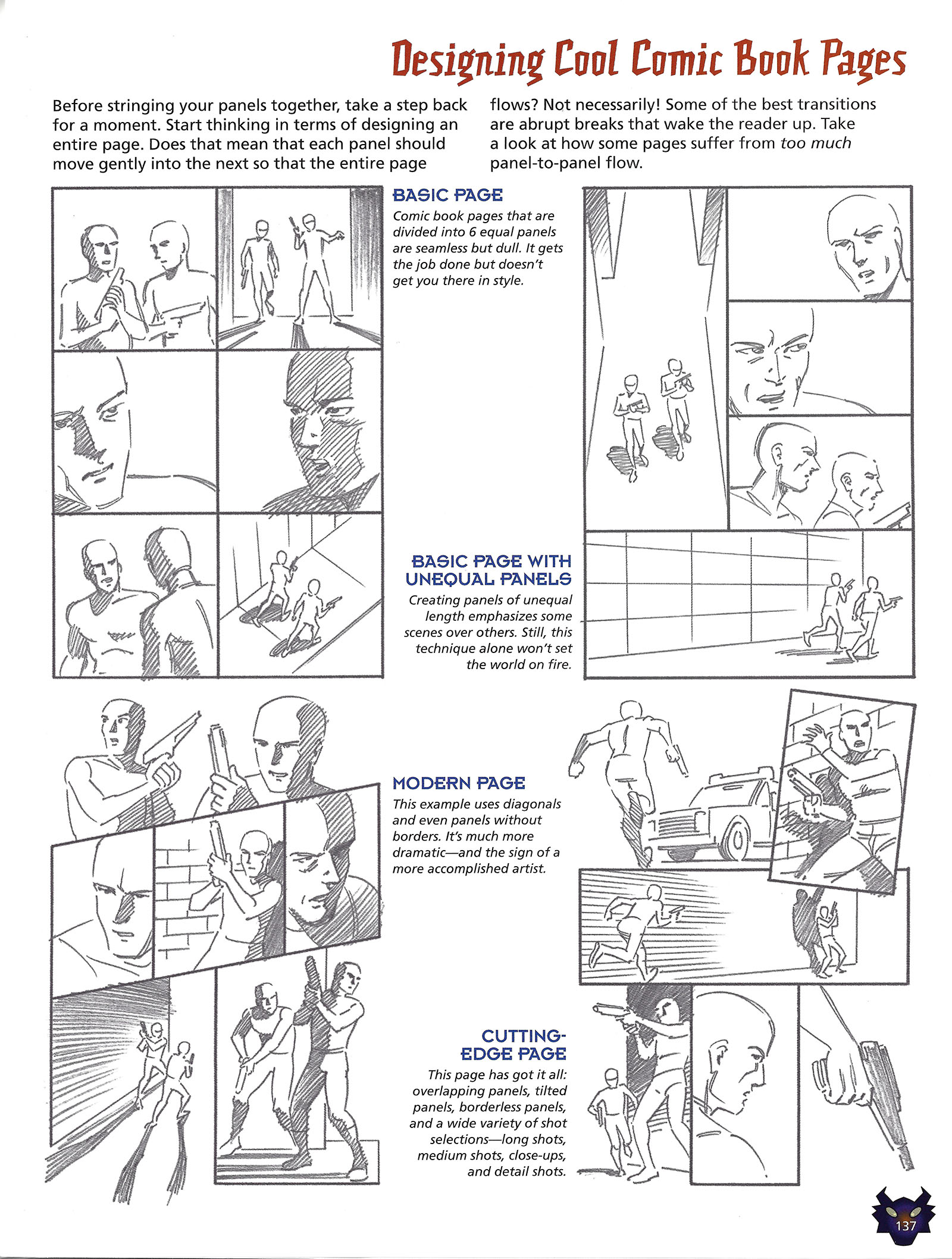
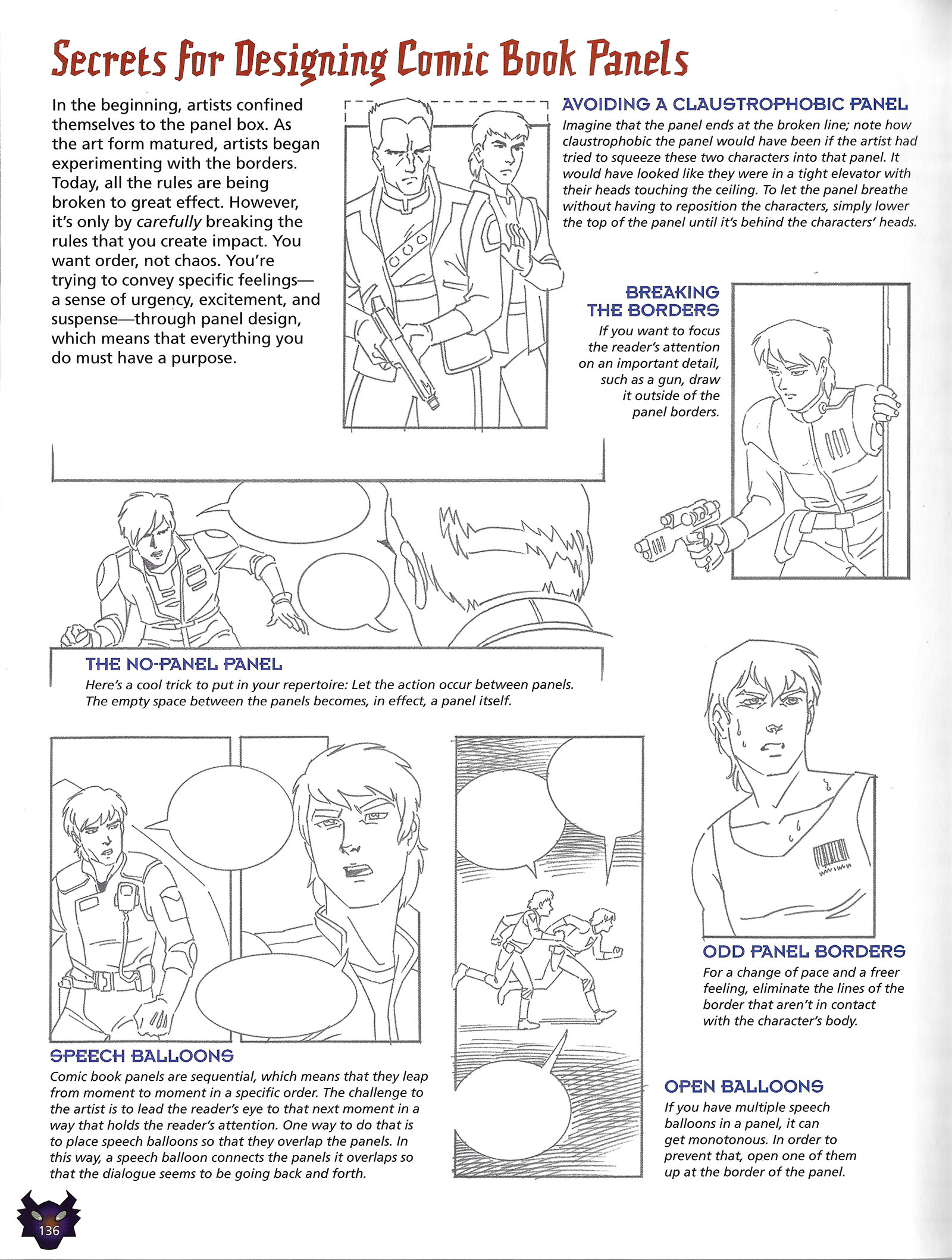
Comic book page layout is a VASTLY under-served topic. There are as many ways to lay out a page as there are pages. My favorite part of the famed How to Draw Comics the Marvel Way opened up this topic in my head and I’ve never lost my interest in it. Here I was able to construct my own version.
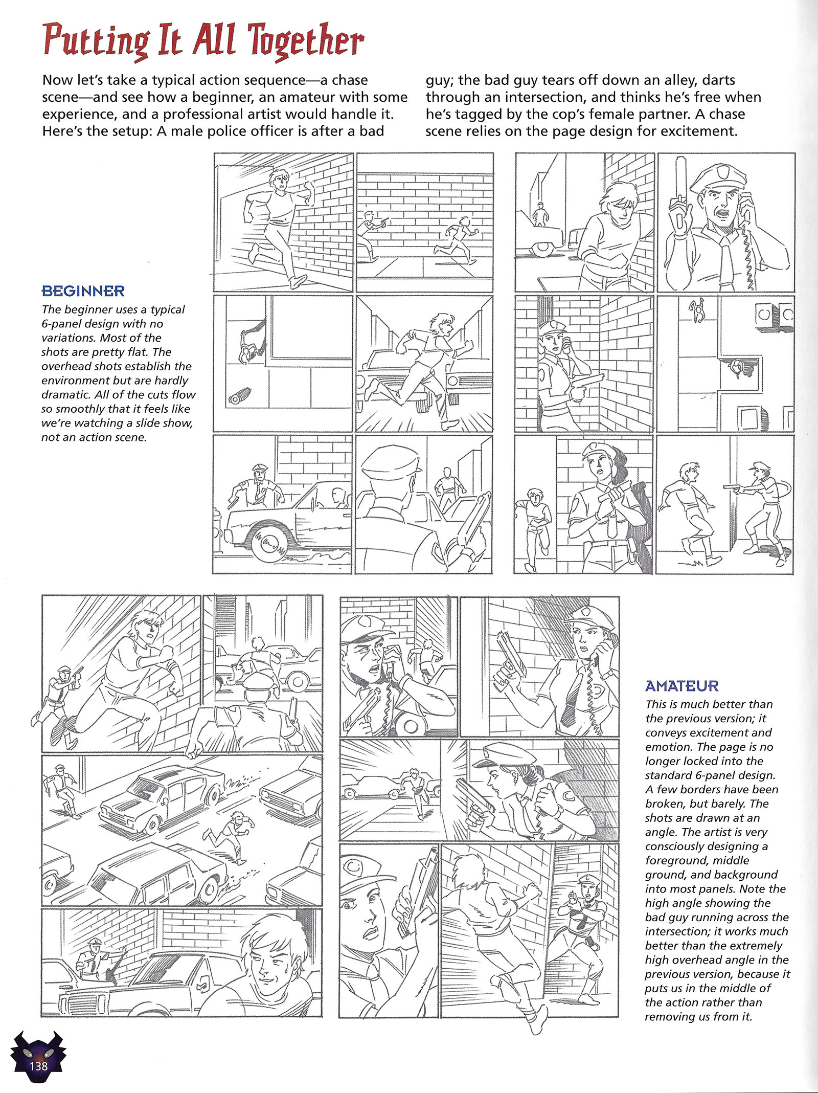
This was my favorite part, because it presented what I always considered to be the most helpful advice: what NOT to do. Chris Hart asked me to show the same comic book scenario as three different artists might present it at different levels of expertise, and I relished it. Chris did an okay job of explaining why they’re different, but there’s more to be said (below)…
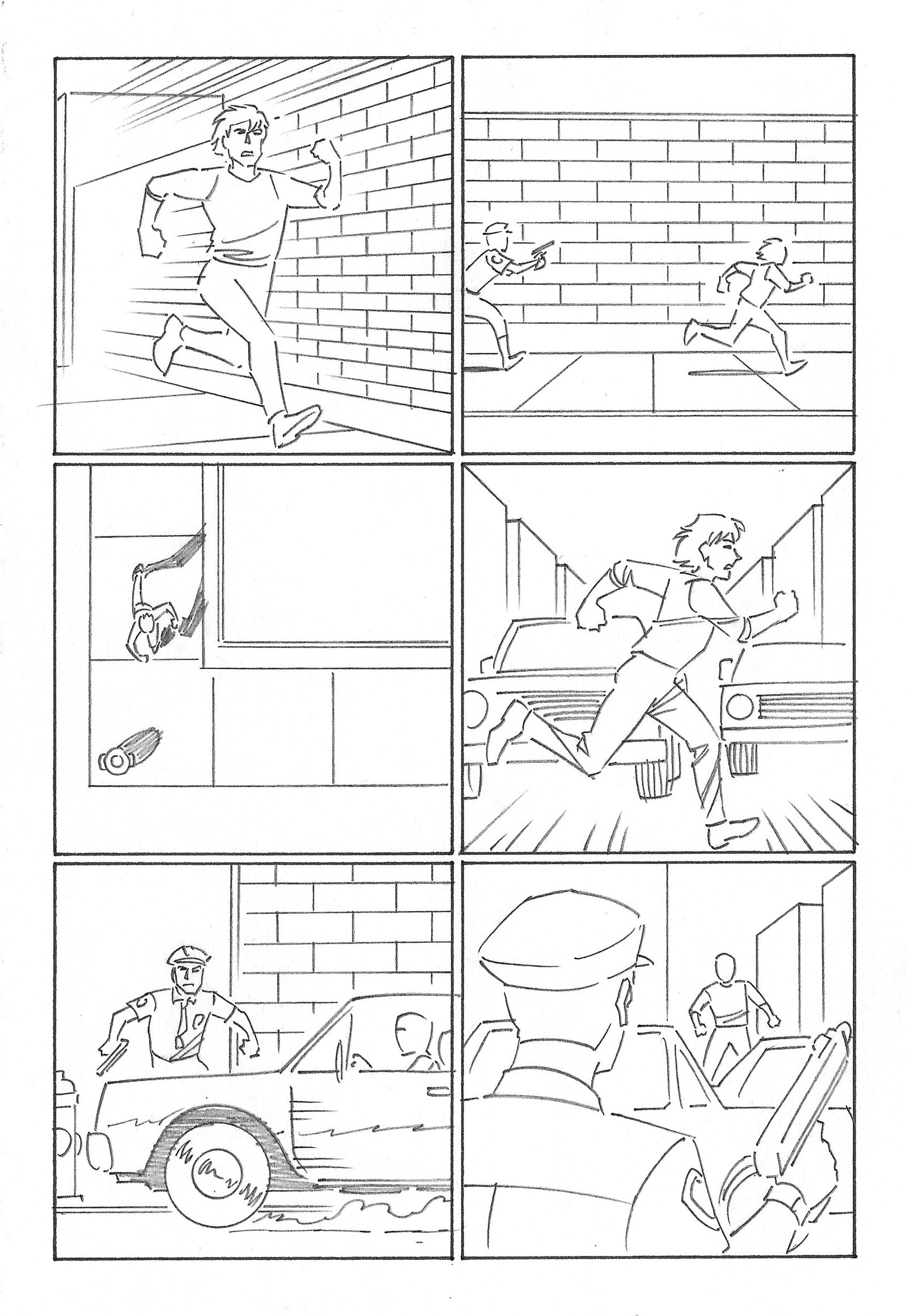
Above and below are the “beginner” version of the sequence. Here I used a lot of what I’d seen in portfolio reviews, where I got to be the “pro” behind the table and looked at pages drawn by hopeful artists. Leaving aside anatomy or proportion problems, I just focused on panel compositions. All of these panels communicate the basic information, but it only works on a technical level. It’s not very exciting.
In particular, there’s the third panel of the page above, which is a direct downshot. This shot can only give you minimal information, but I saw it over and over and over in pages by beginners. In all cases, they just weren’t experienced enough to think of a better camera angle so they all defaulted to the same thing. There must be some anthropological reason for it, because it’s incredibly common.
Another thing I wanted to emphasize was flat backgrounds and limited perspective. Again, they’re technically correct, but not fun to look at.
In the second page, you can see another “direct downshot” panel. Its only purpose is to show you where the two characters are in relation to each other. There are many, MANY better ways to show this. And since everything is uniform and mostly vertical, there’s no surprise in the final panel. It’s the most dispassionate, uninvolving shot you can get. Showing it that way was the whole point.
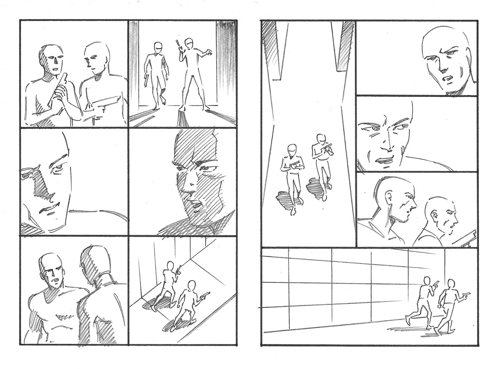
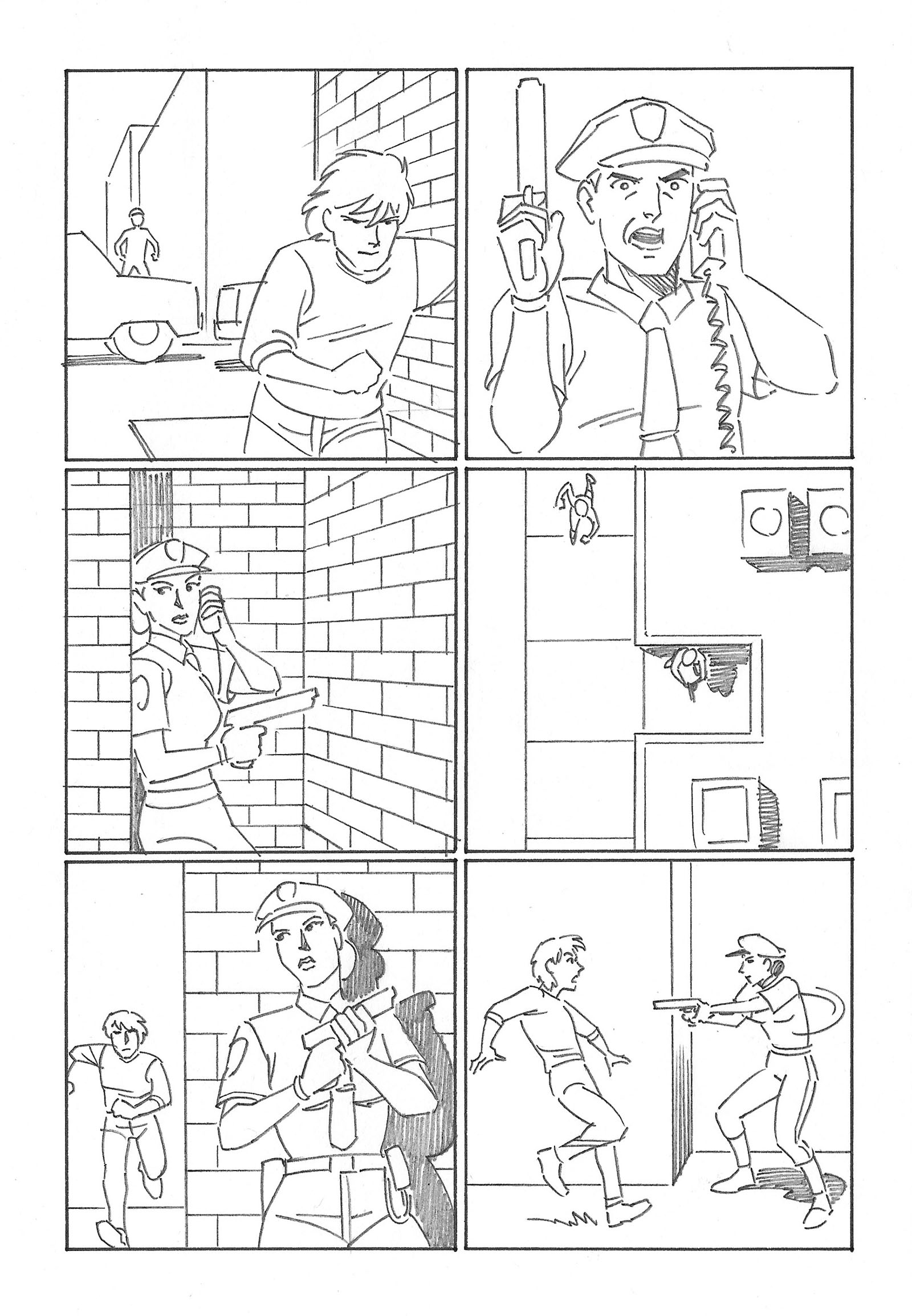
The “amateur” version was misnamed in my opinion. It should have been “intermediate.” This pretty much represents where I was in my first year drawing comics. The camera angles are more interesting and the action flows well, but there’s always room for improvement. If there wasn’t, I wouldn’t have been capable of imagining a better version.
The big panel in the center is what I later learned to call a “three-quarter downshot.” I learned the term once I made the jump into TV animation and found out that (like the direct downshot) it was a common default angle for storyboards. Everyone used it without understanding what a cliche it was. You almost never see it live-action filmmaking, for example. Once it was beaten out of us, we all learned how to find better alternatives. But until you get that training, you just think of it as a helpful way to convey geography.
The second page isn’t different from the “beginner” version in terms of information, but more engaging camera angles make a huge difference in how that information is conveyed.
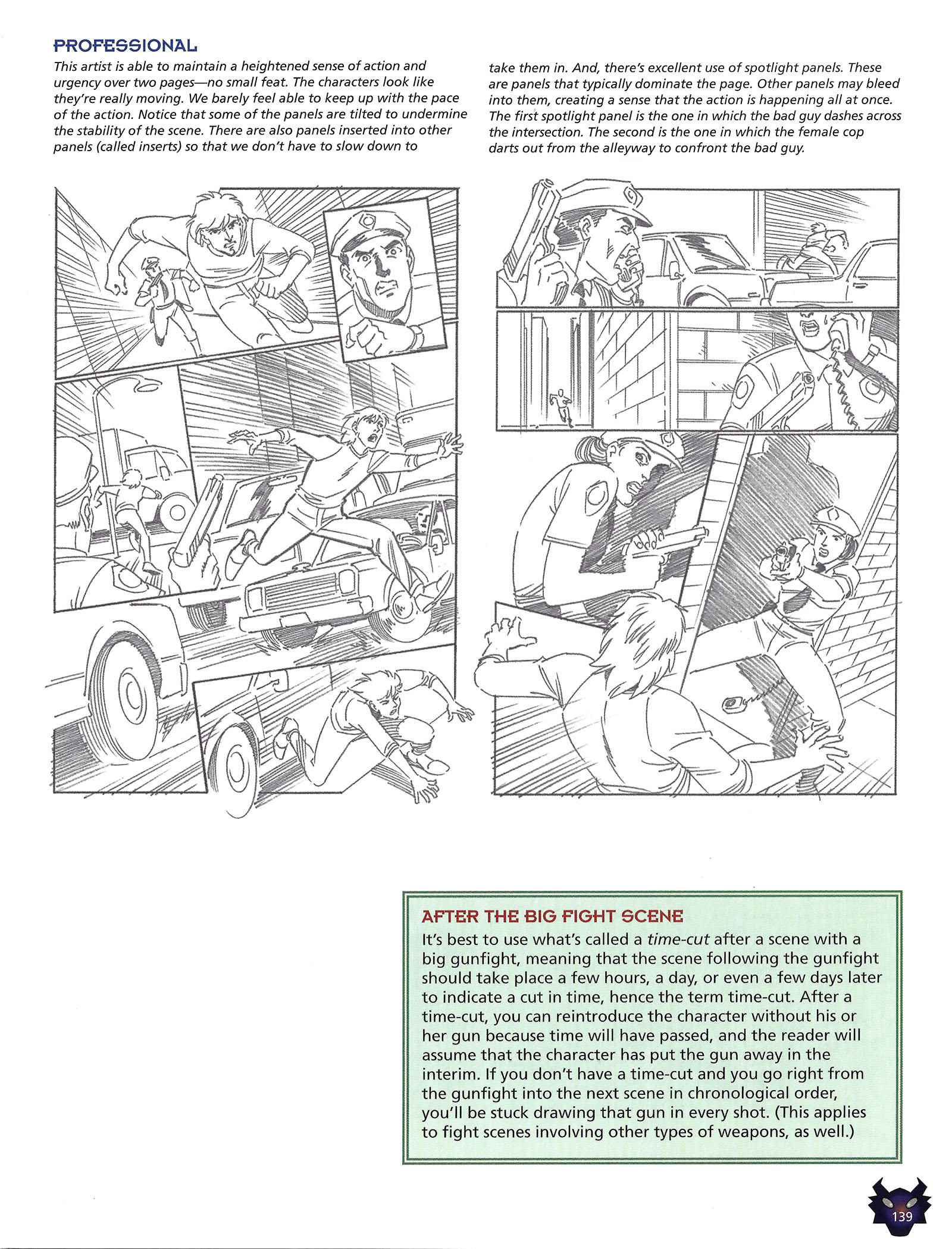
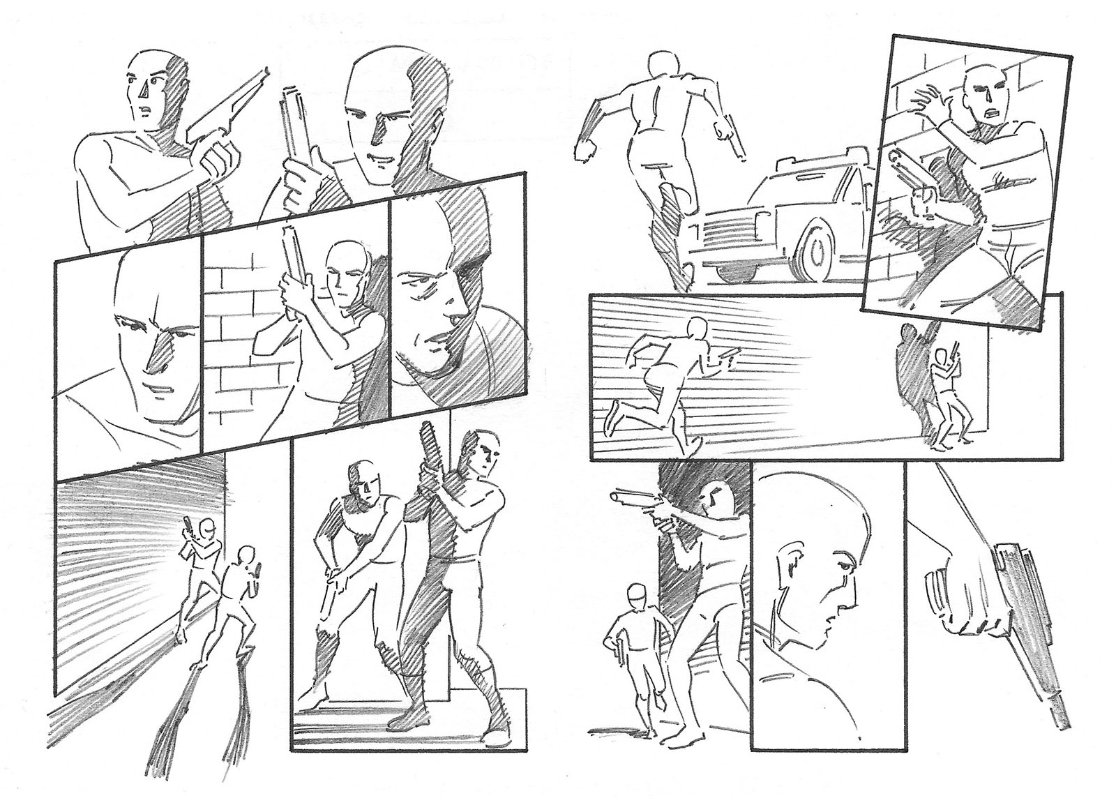
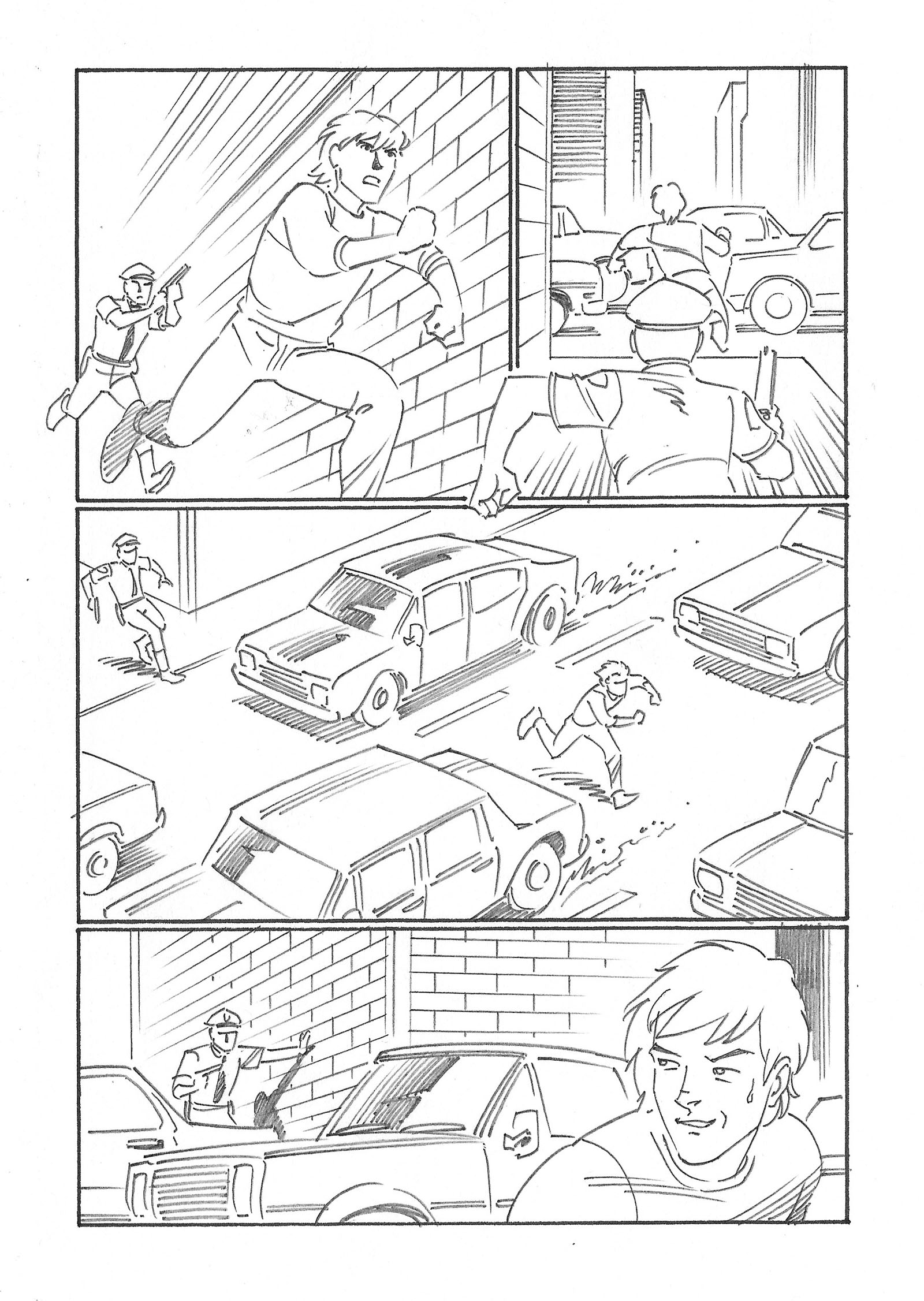
The third version of this sequence is the one with all the bells and whistles. Chris called it “professional,” but I would have called it “advanced.” The reason is simple: the definition of “professional” has nothing to do with quality; it just means you get paid for your work. Being “professional” doesn’t make you good.
The paragraph Chris added to the bottom of the page (“After the big fight scene”) is absolute nonsense, based on nothing. I’d like to pretend I never read it.
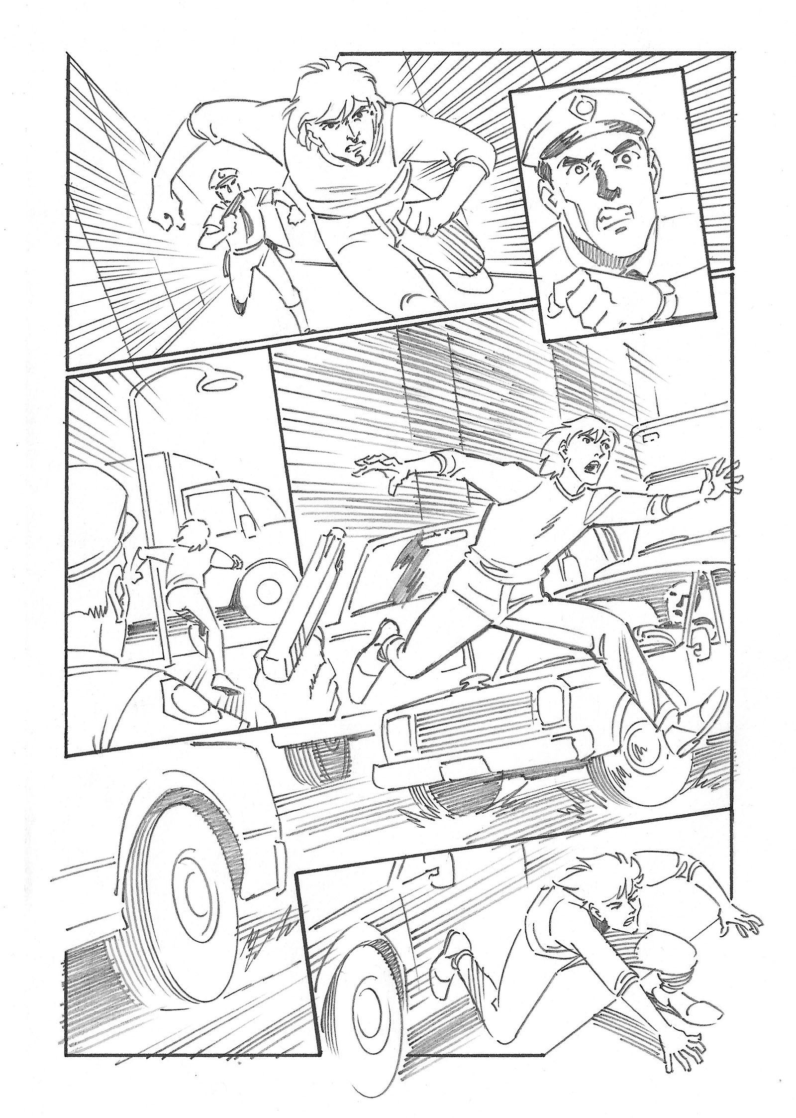
The layout of this page and the next one reflect how much I’d learned in the 14 years since getting my first comic book job. It also helped to have six years of storyboarding under my belt, since it teaches you a lot about which pose to capture in a shot. Ideally, it should give the viewer an idea of what JUST happened and also what’s ABOUT to happen. That’s exactly what an animator needs to know when they turn your storyboard into moving pictures.
Also, tilting your panels is a simple trick that amps up momentum in a big way. It’s like the whole world is tilted against the guy running from the cop, and he has to go “uphill.” You get a much better sense of his mental state.
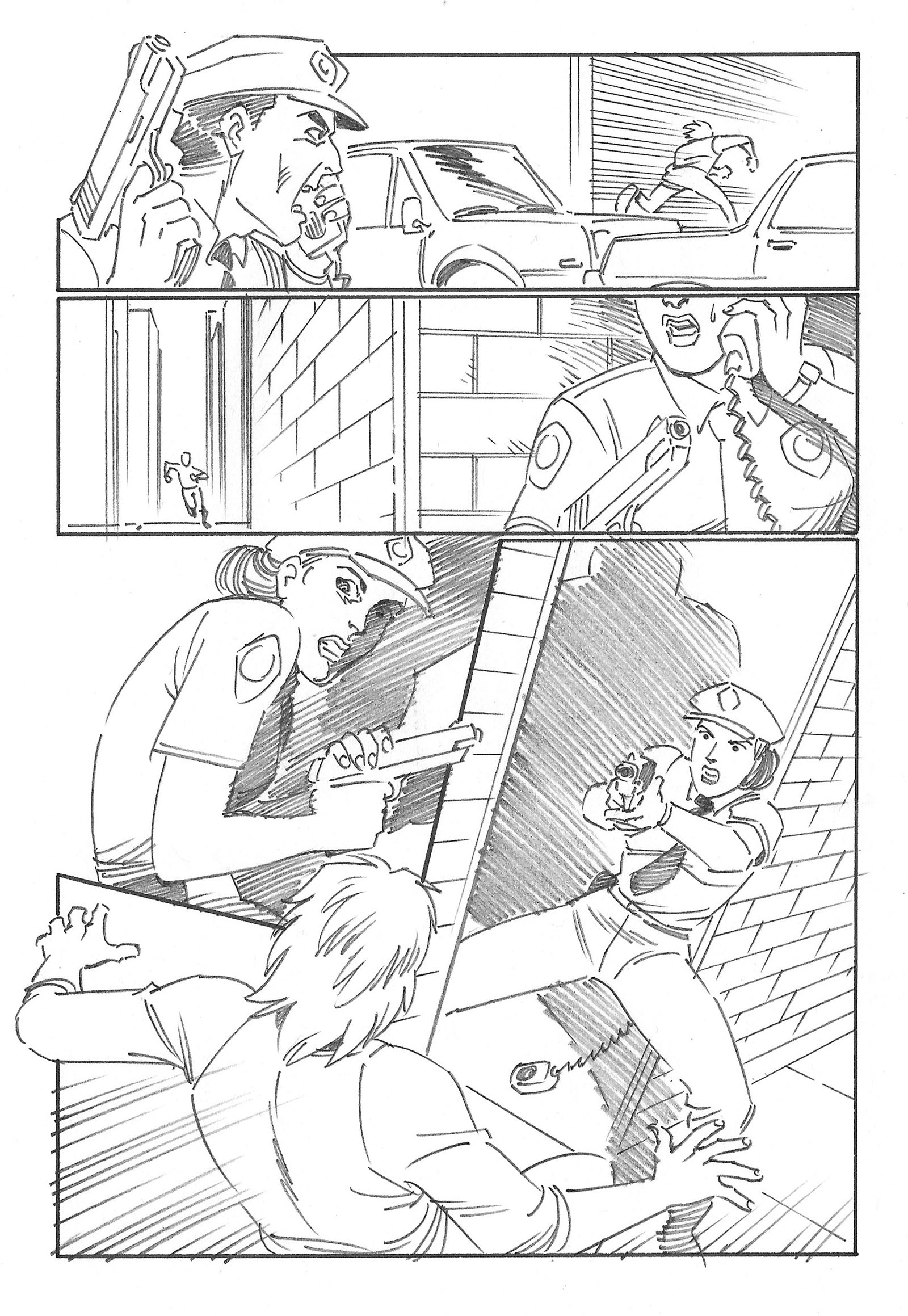
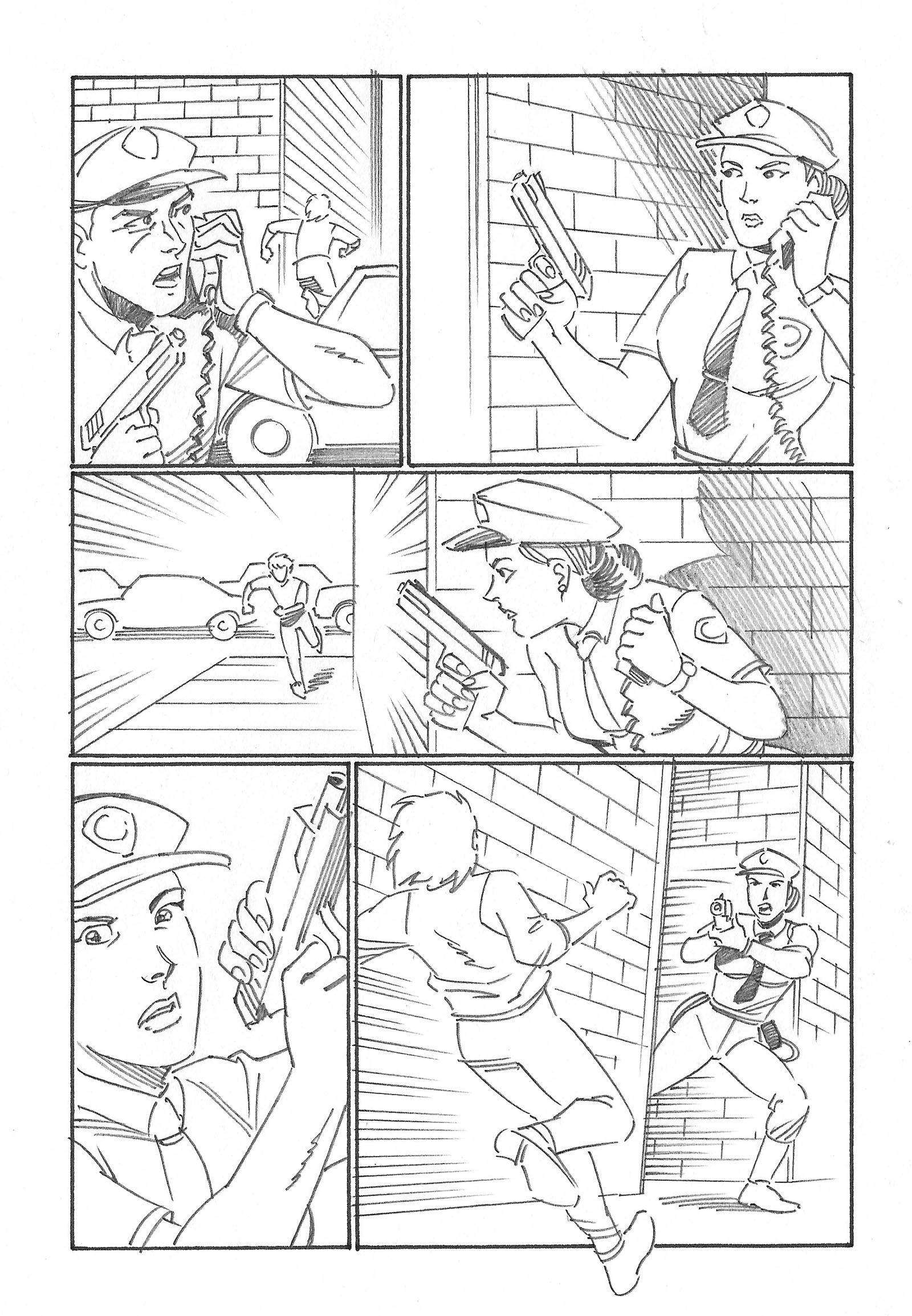
Tilting works the opposite way on the second page. The guy thinks he’s escaped, so now the world tilts in his favor…but then the female cop lunges RIGHT into his path to stop the momentum. I love coming up with stuff like this. Especially when it sort of happens on its own.
Another trick was to reveal the female cop in stages, starting close and pulling out for the full reveal at the bottom of the page. it’s another thing that helps amp up the surprise.
I could go on, but I was really glad to run this exercise. It told me a lot about what I’d learned.
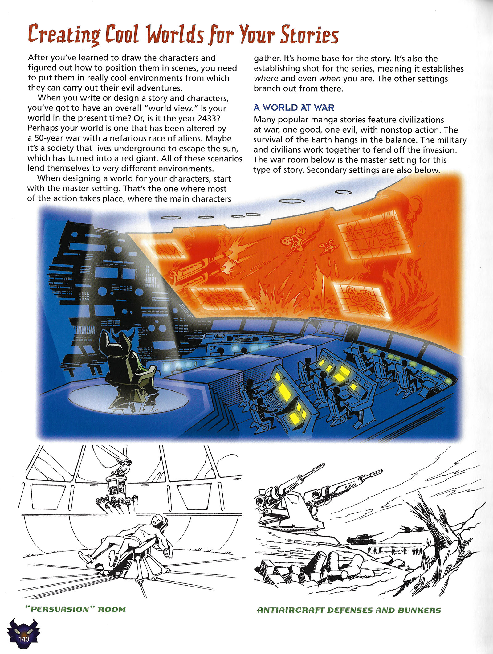
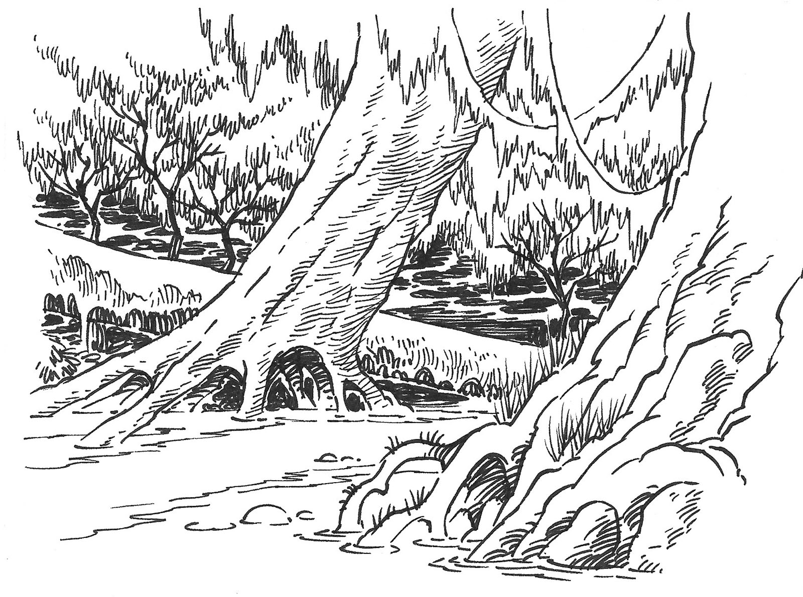
The rest of the chapter was about “creating cool worlds.” Chris was still overusing the word “cool,” something that bugged me about Mecha Mania. (Don’t put a value judgment on it! Let the reader decide that!) He gave me five different environments to visualize and briefly described five different things to show. It was exactly like an assignment for an RPG book in that way.
By this time I’d also gained some experience designing backgrounds for the TV cartoons I worked on, so that came in handy.
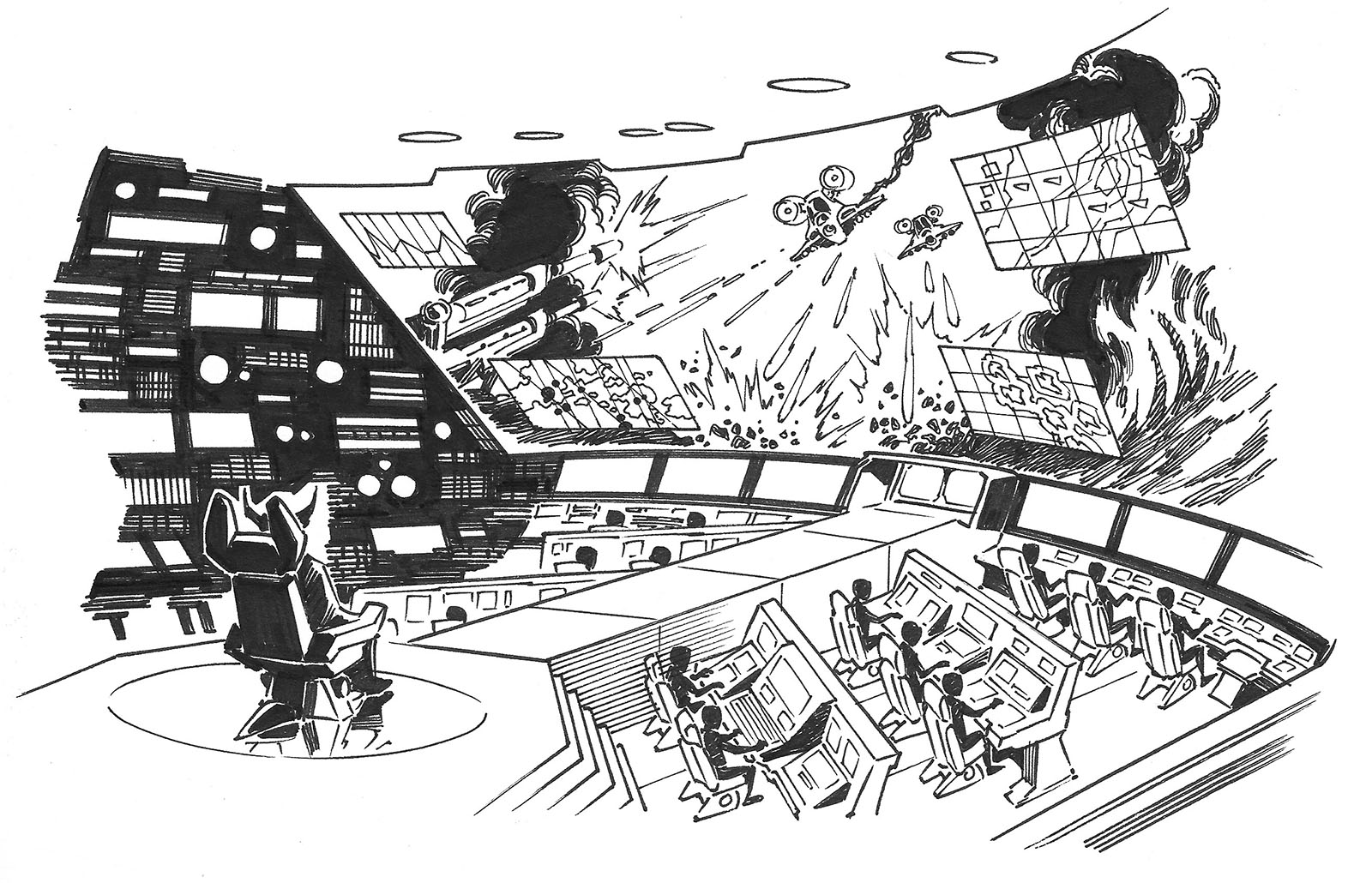
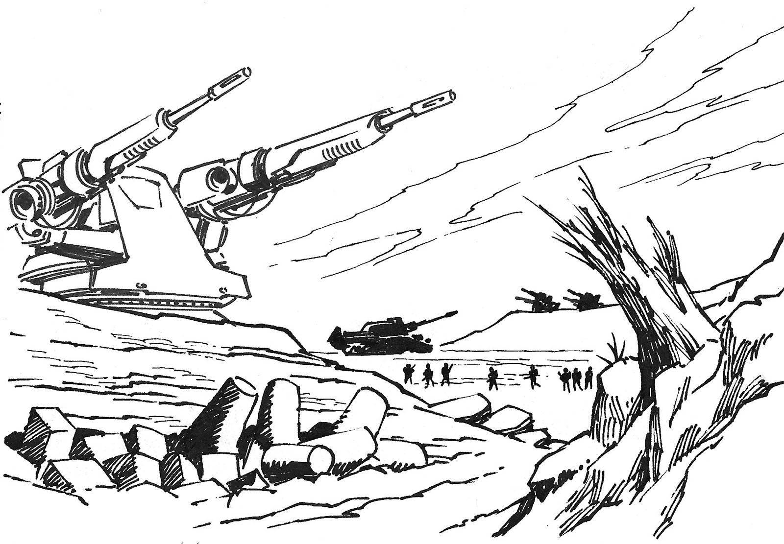
This drawing and the one below were part of the “World at War” set, but didn’t end up on the “World at War” page. The one above was blown up to full page size and used as the title page. Not the best move, since it was drawn at postcard size.
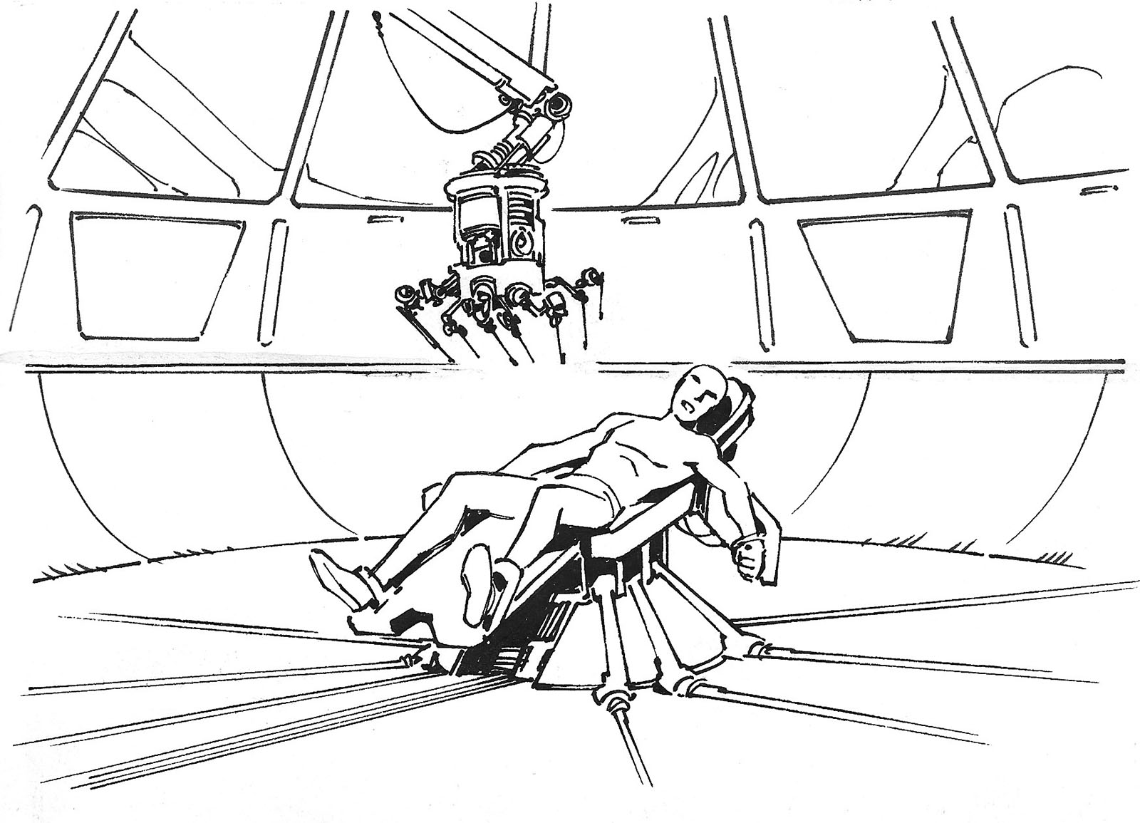
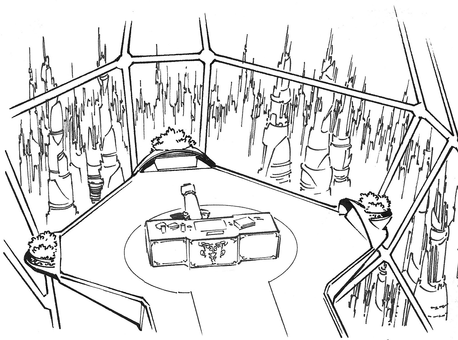
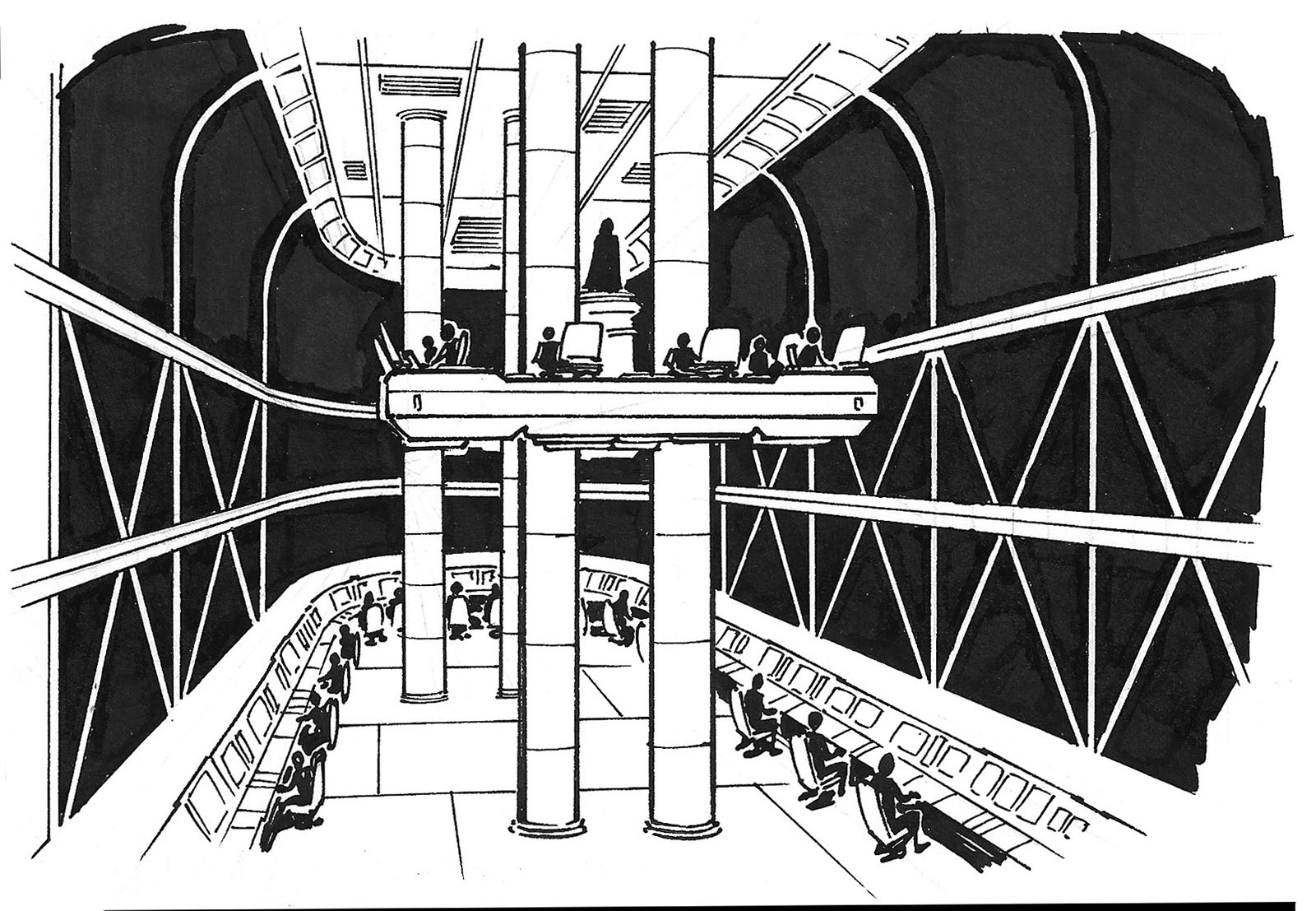
This image didn’t appear in the book at all. It’s meant to be an underground control room.
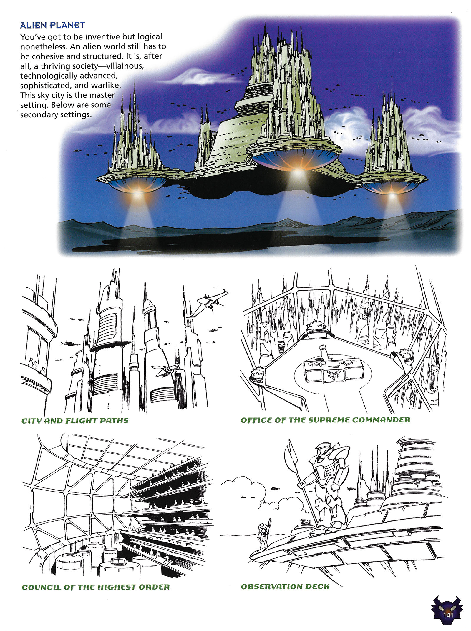
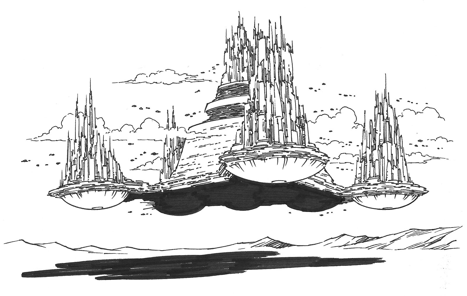
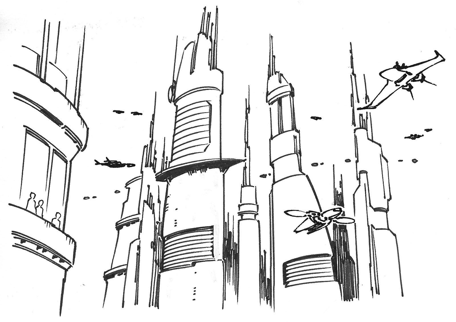
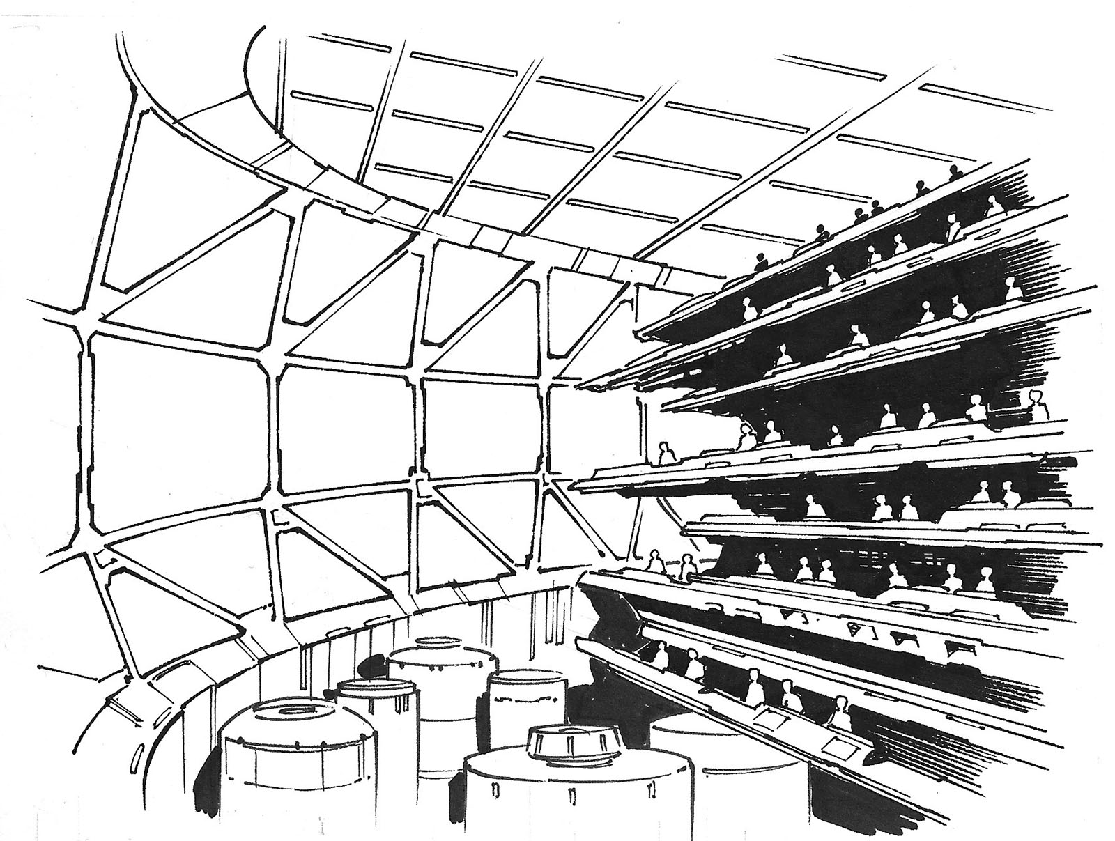
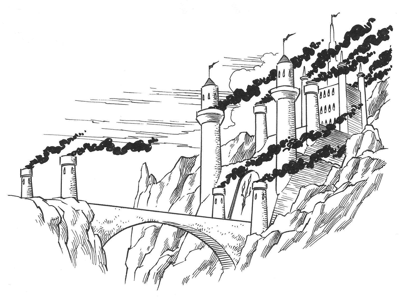
Here’s set 2, the “Alien planet.” Again with the presumptive labeling.
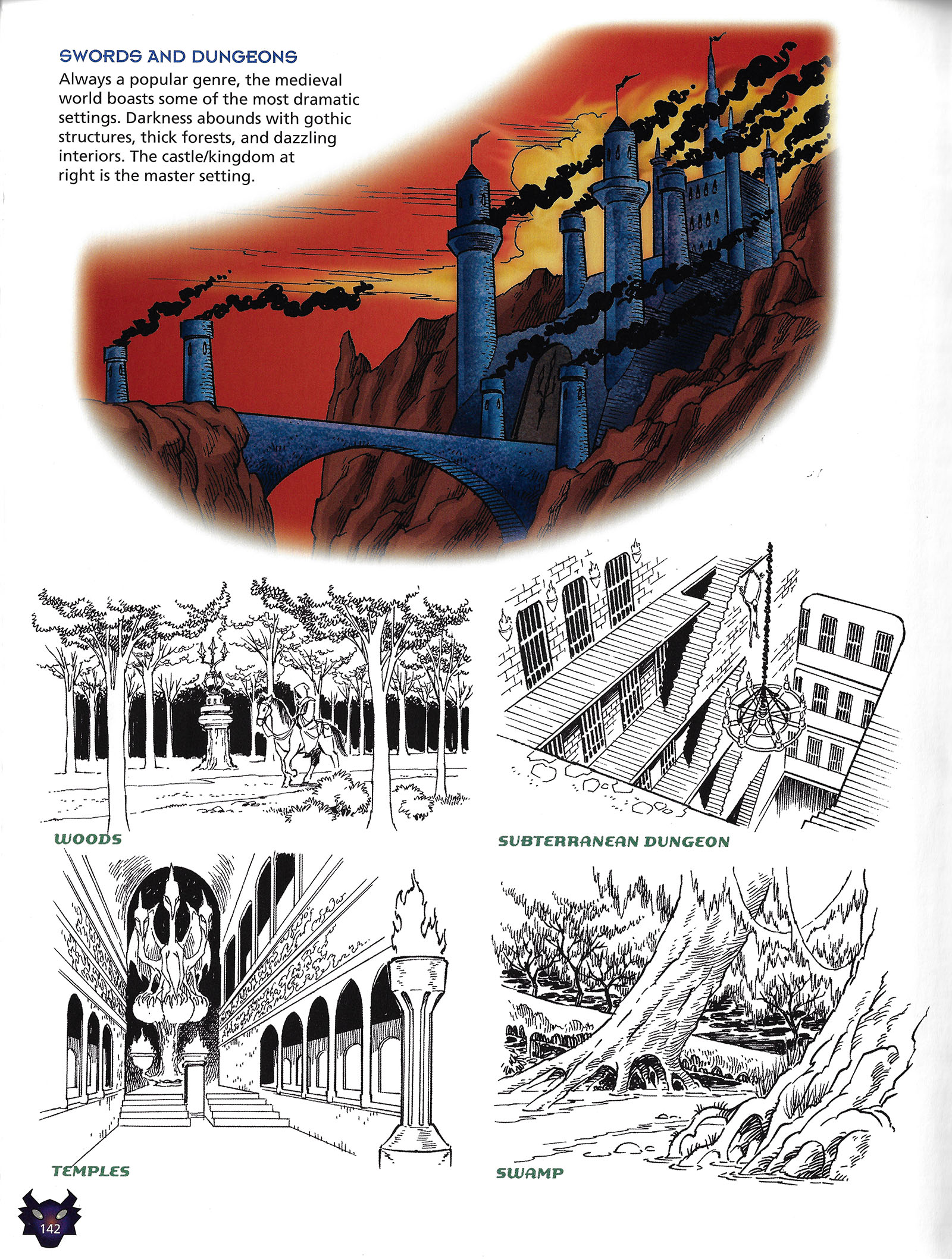
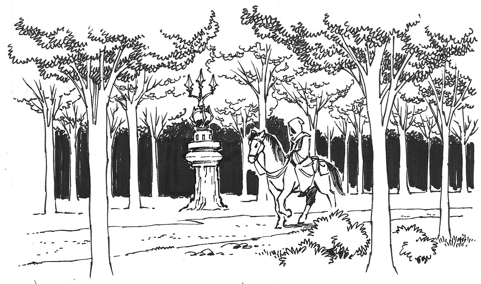
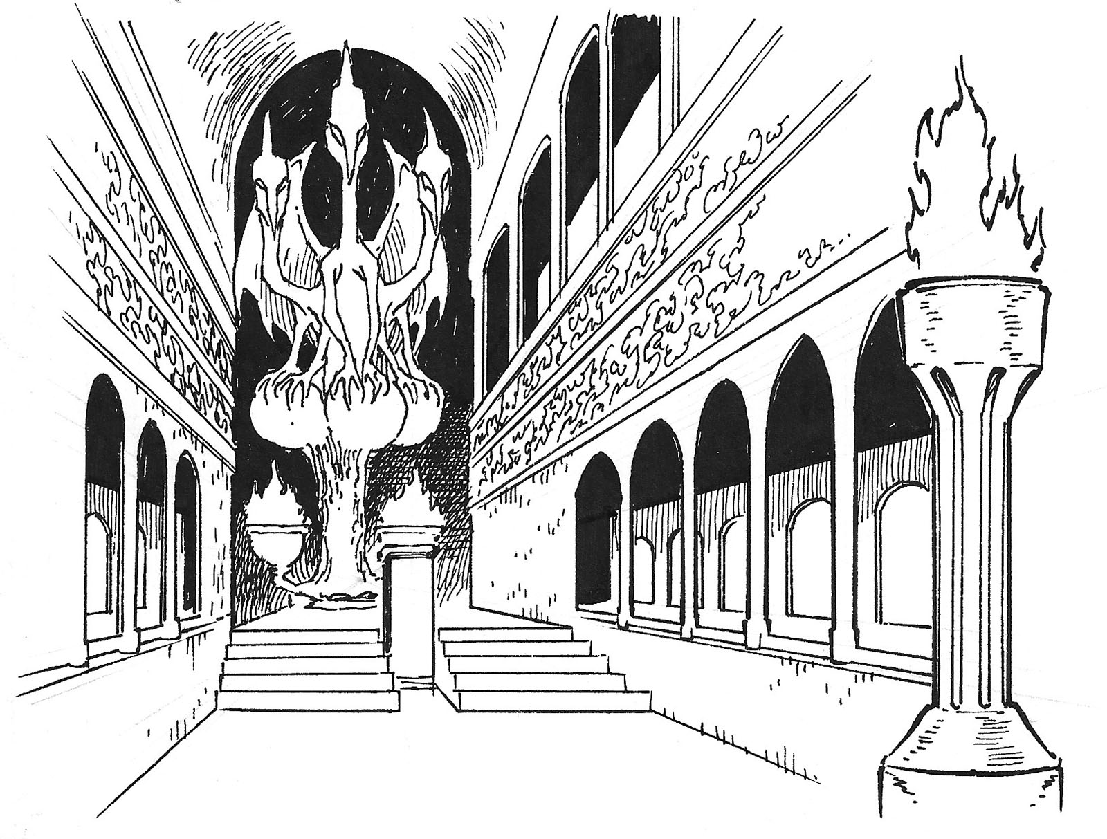
The third set, “Swords and Dungeons.” It’s like I was illustrating RPG books again.
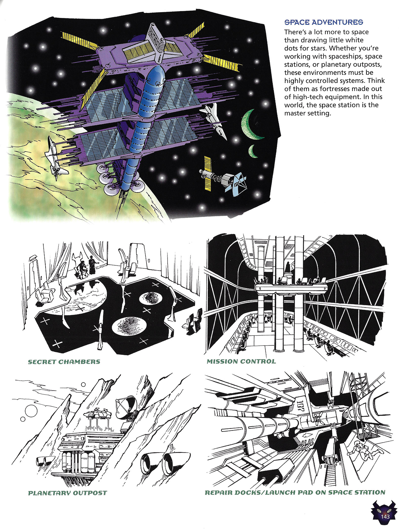
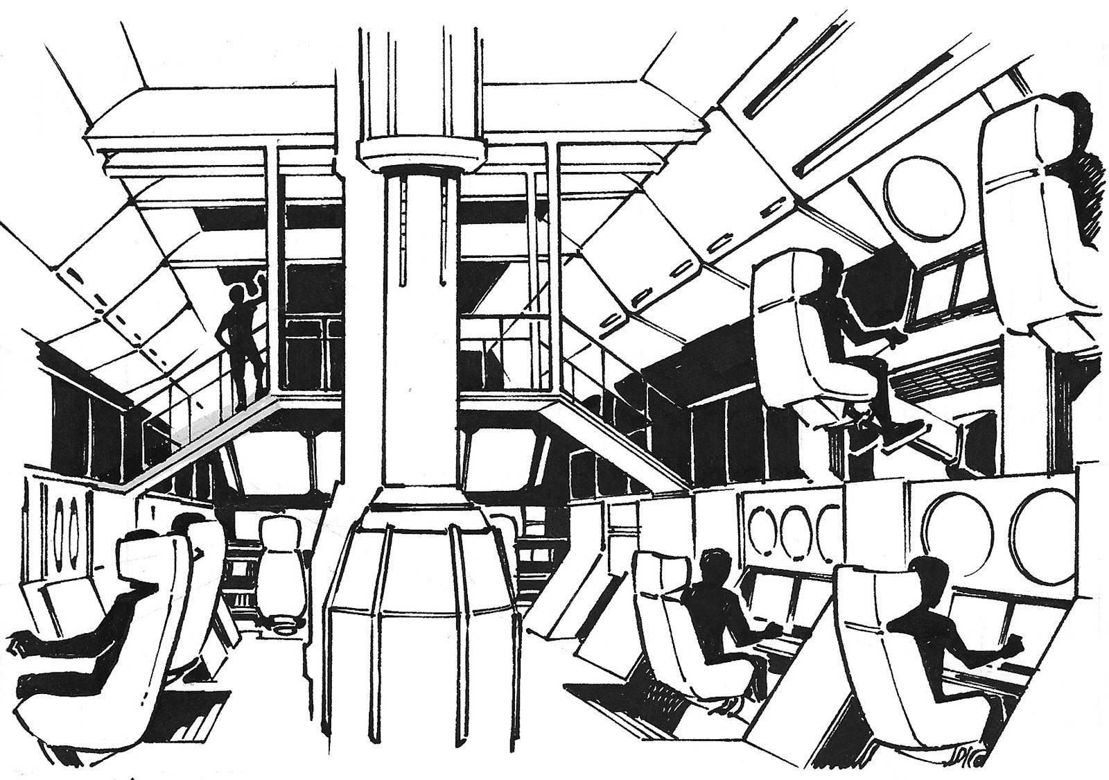
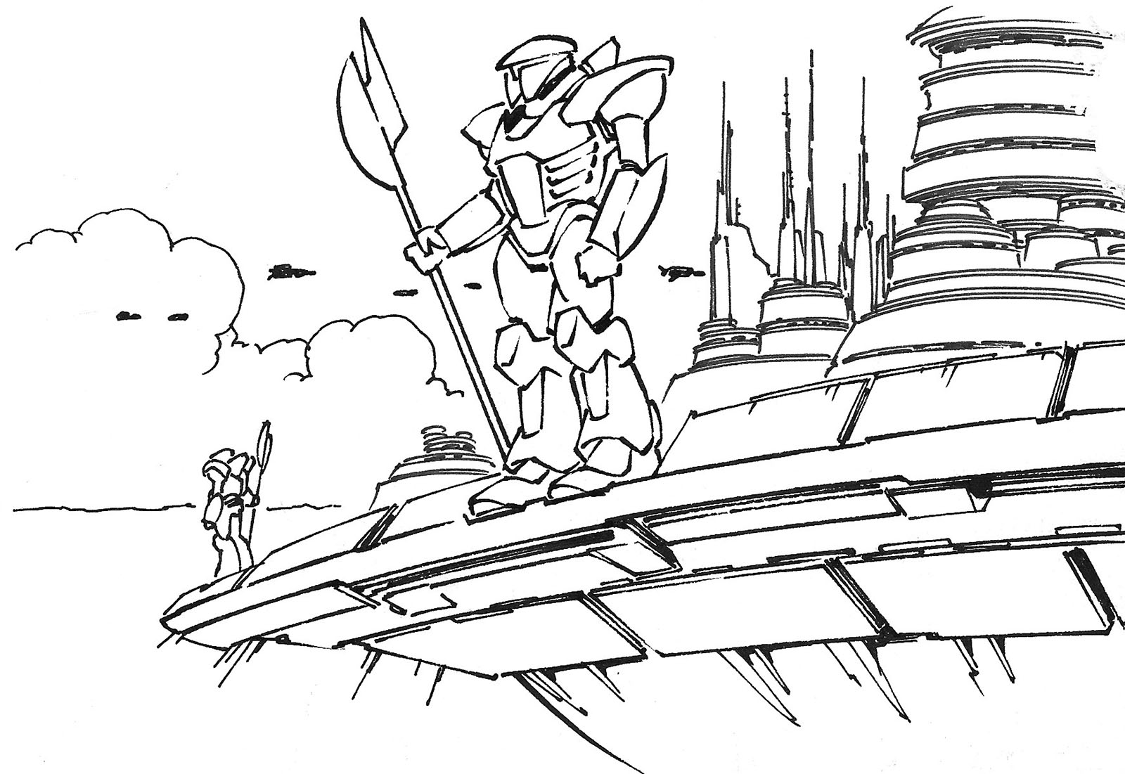
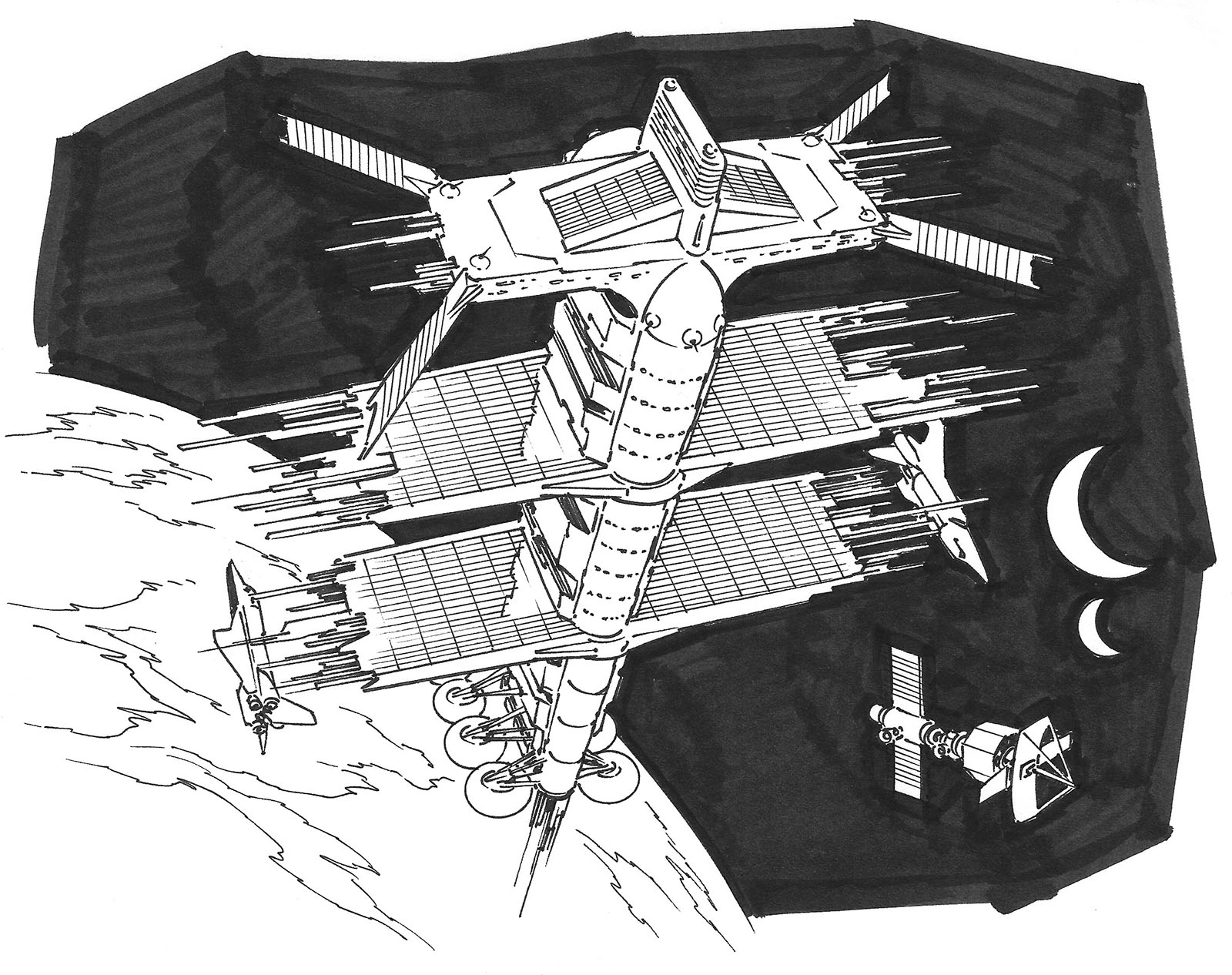
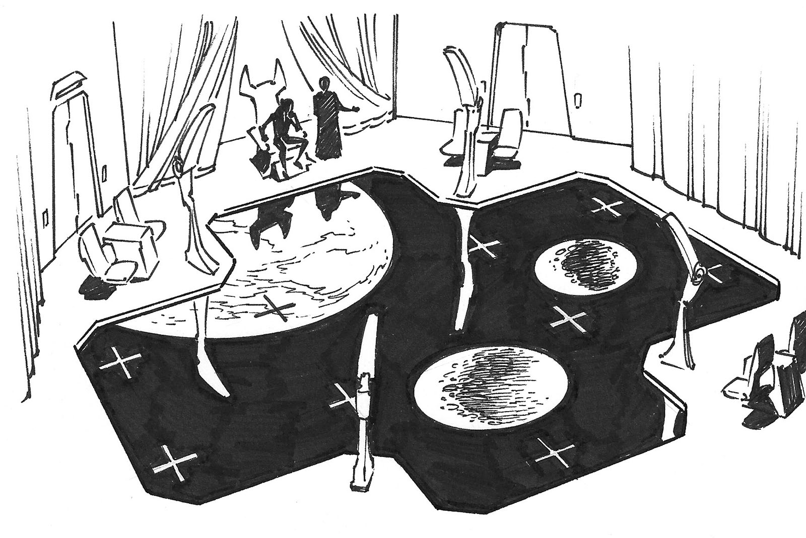
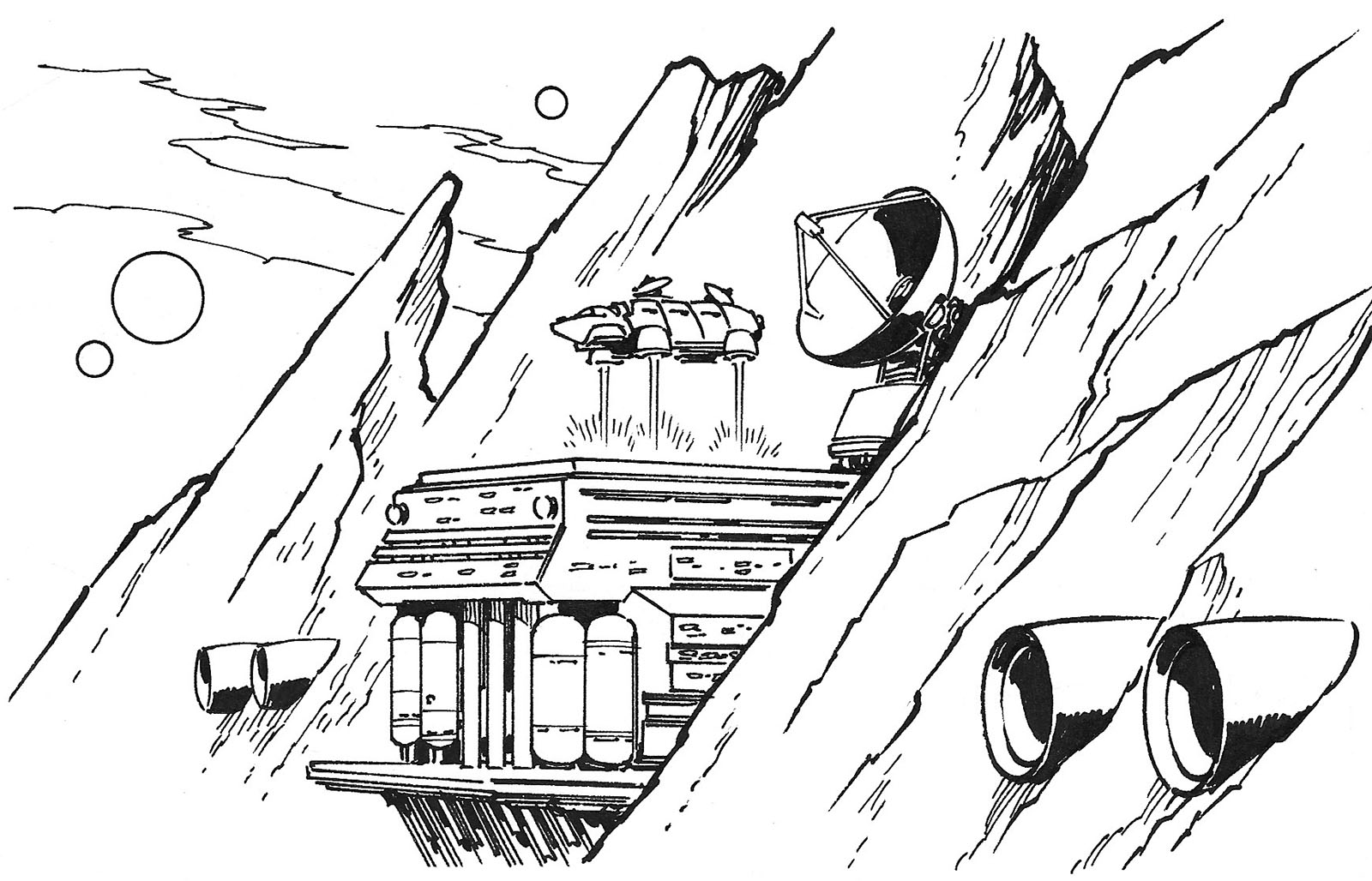
The fourth set took us into space, my natural habitat. My one overall gripe about this section of the book is that it would have been a perfect opportunity to talk about scene composition. There was a reason I chose to show these things from specific angles, to maximize the information in the picture. Seems like that would be valuable for a beginner to know. Another example of how you need to think for yourself instead of just imitating others.
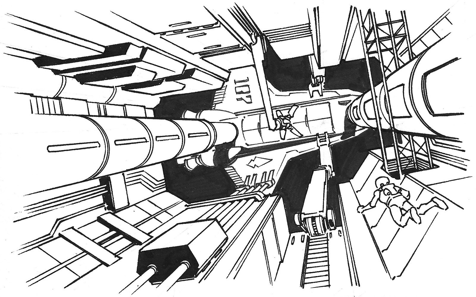
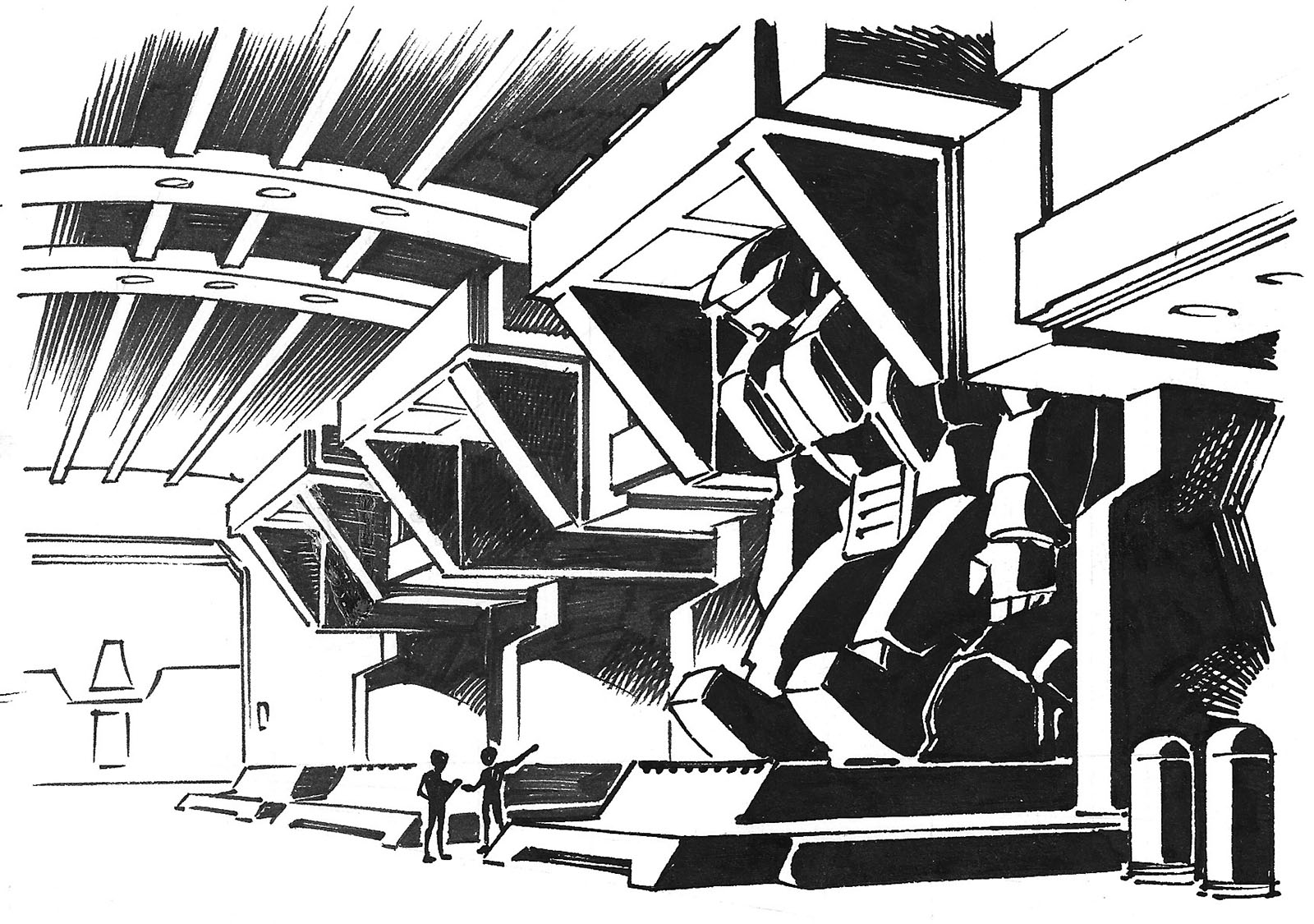
The last set was supposed to be a post-apocalyptic environment, but for whatever reason it was cut from the book. This first image was heavily inspired by Akira and Fist of the North Star. If you’re gonna swipe, swipe from the best.
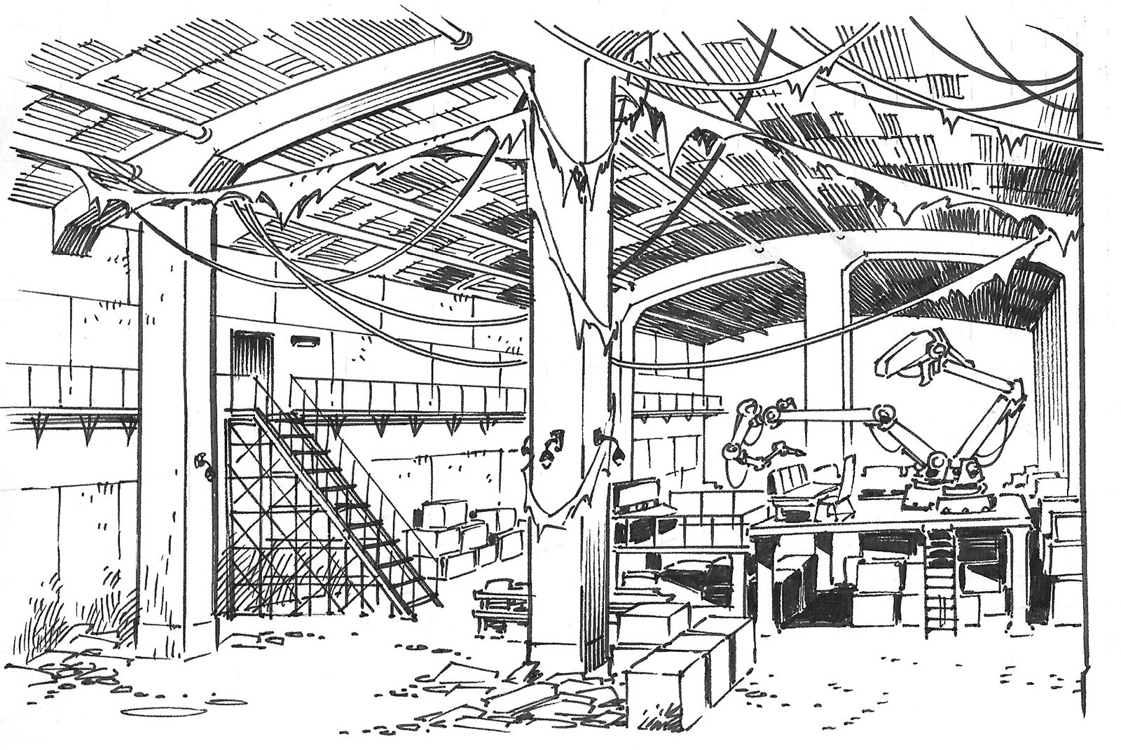
Underground workshop with salvaged equipment. Maybe a rebel camp.
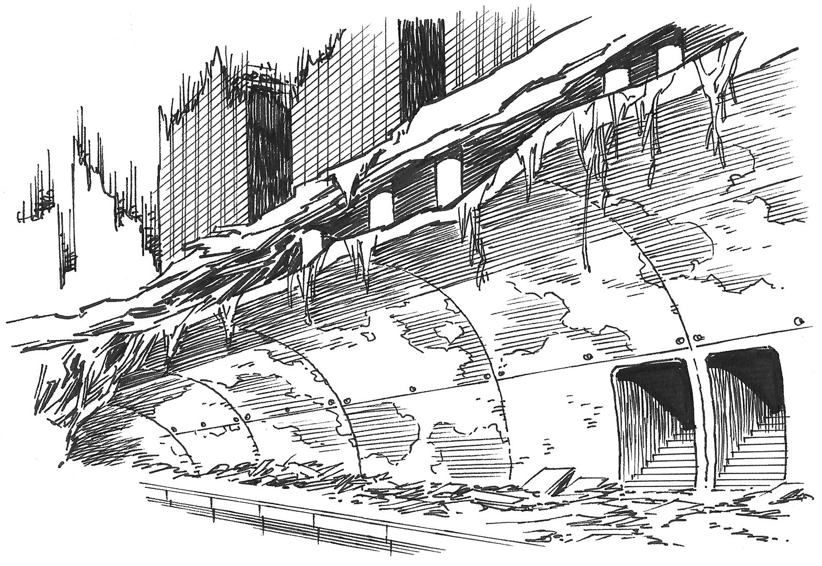
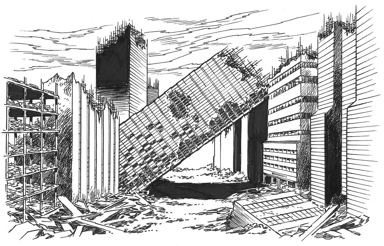
A collapsed/exposed subway tunnel in the middle of what used to be a city street.
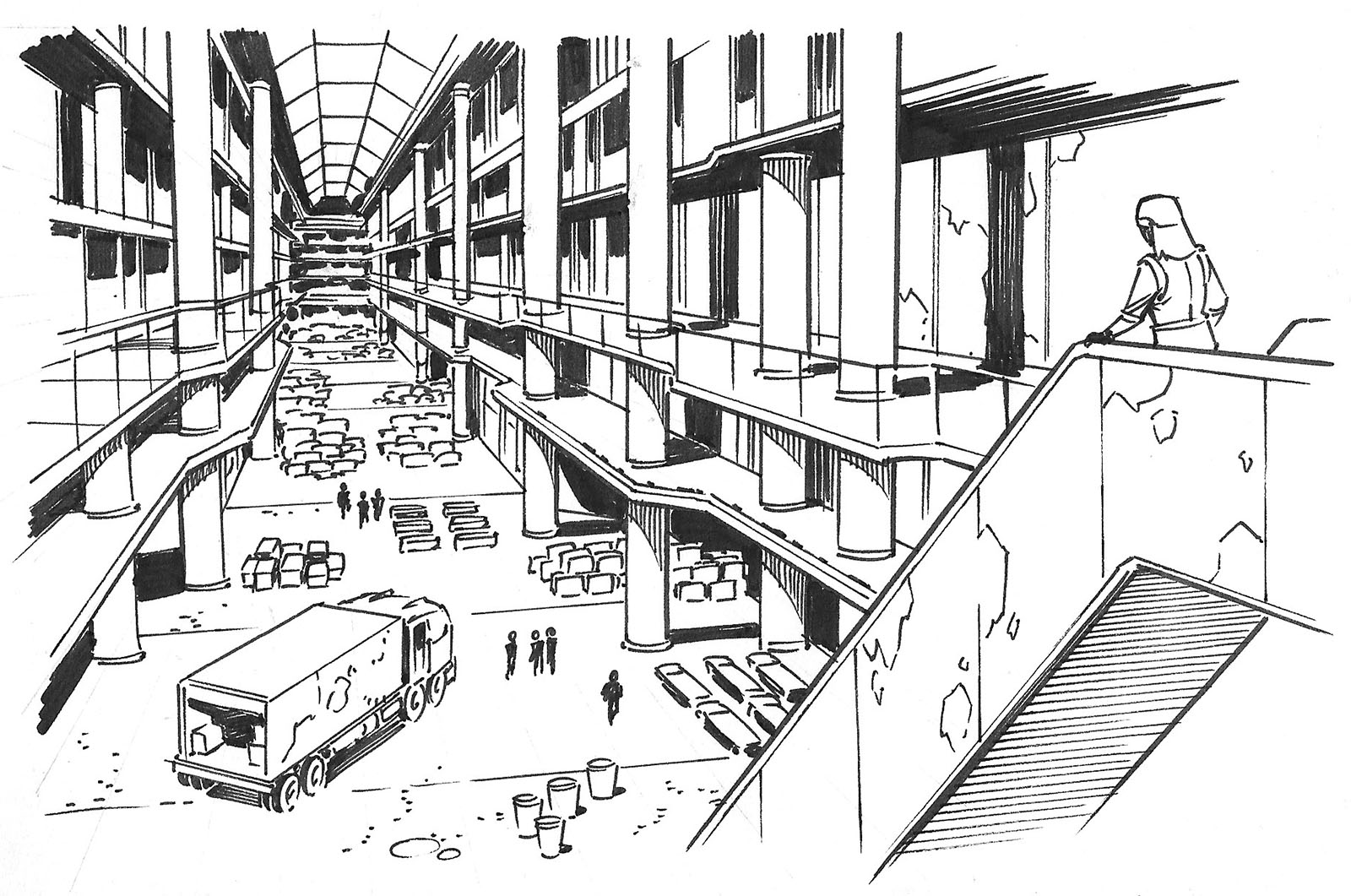
Shopping mall converted into a supply depot.
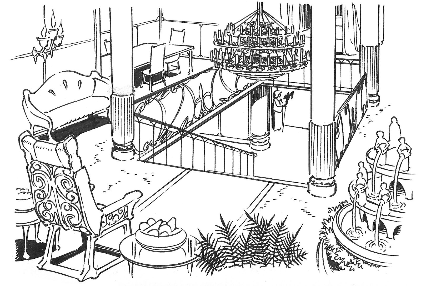
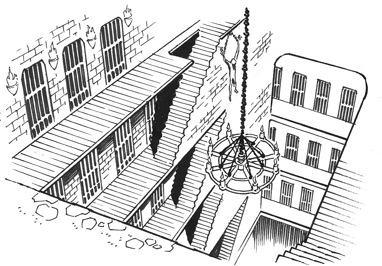
Evil enemy lair, maybe in the remnants of a hotel.
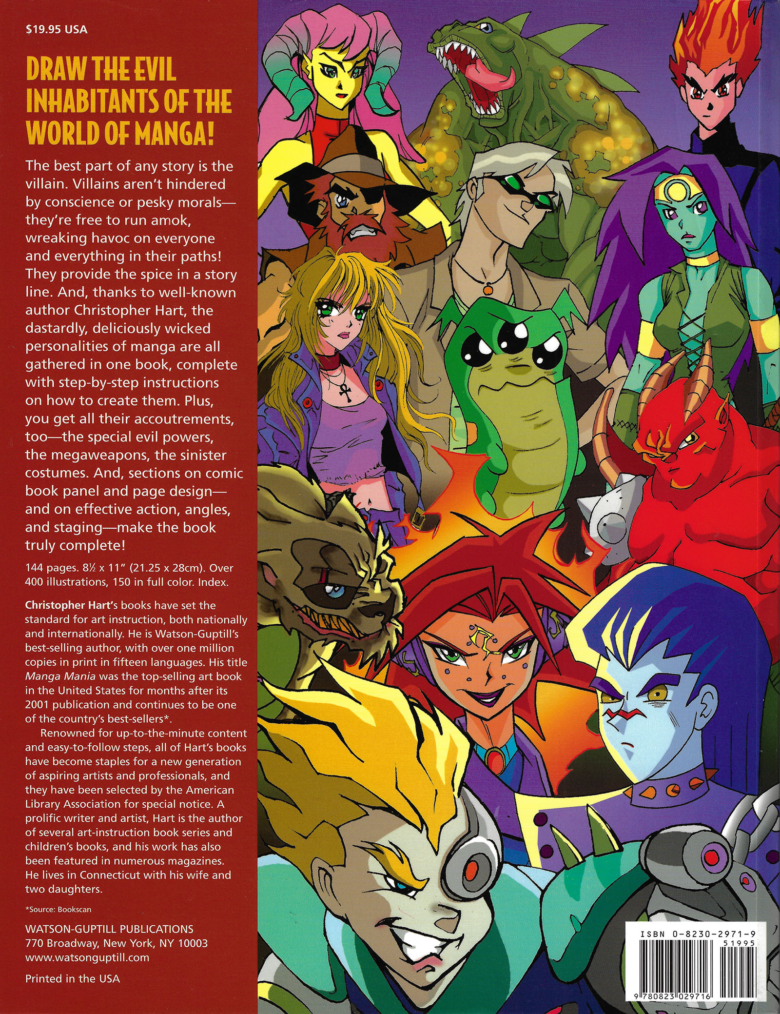
That’s the back cover for the book. Remember what I said above about the absence of a red flag saying “don’t stop here”? The blurb does the exact opposite with the claim that this book is “truly complete.”
No, it isn’t. Not by any definition. I hope nobody took that claim seriously.