Star Wars: Splinter of the Mind’s Eye, 1979
Allow me to try and explain what it was like to walk up to a wall of new paperback books and see this one sitting there in April, 1978. It didn’t say Star Wars on it (something that was rectified in later editions), but it didn’t have to. There was Darth Vader, Princess Leia, and Luke Skywalker. There was Ralph McQuarrie’s unmistakable signature on the cover. All of a sudden, seemingly out of nowhere, there was a new, OFFICIAL Star Wars novel to absorb. I could feel the top of my head blasting off into space as I wrapped my hand around it.
All we had at the time was the first movie and the Marvel Comics. Everything else, including home video, was still in the future. So what was this? A sequel, obviously, but was it the basis for the next movie? Yes and no. As I understand it, the book was written while A New Hope was still in post-production. As the ghost writer of the original Star Wars novel, Alan Dean Foster was contracted to write the adaptation (which came out a full six months before the film, unthinkable now) and create a followup that could have been turned into a second movie if A New Hope did only moderately well. In anticipation of that outcome, the book was intentionally limited in scope by excluding Han and Chewie (Harrison Ford hadn’t signed on for sequels yet) and taking place on a single fogbound jungle planet. If this had become the second movie, it would have been a step down. And probably the end of the franchise.
Lucky for everyone, A New Hope was a GIANT hit and gave George Lucas a mandate to level up. The whole Star Wars machine just rolled right past this story, eventually leaving it behind as a curio of the early years. But when it was brand new, nothing was more important. And one day in 1979 (when I was 14) I took it upon myself to turn it into a comic book. It taught me an unexpected and really valuable lesson.
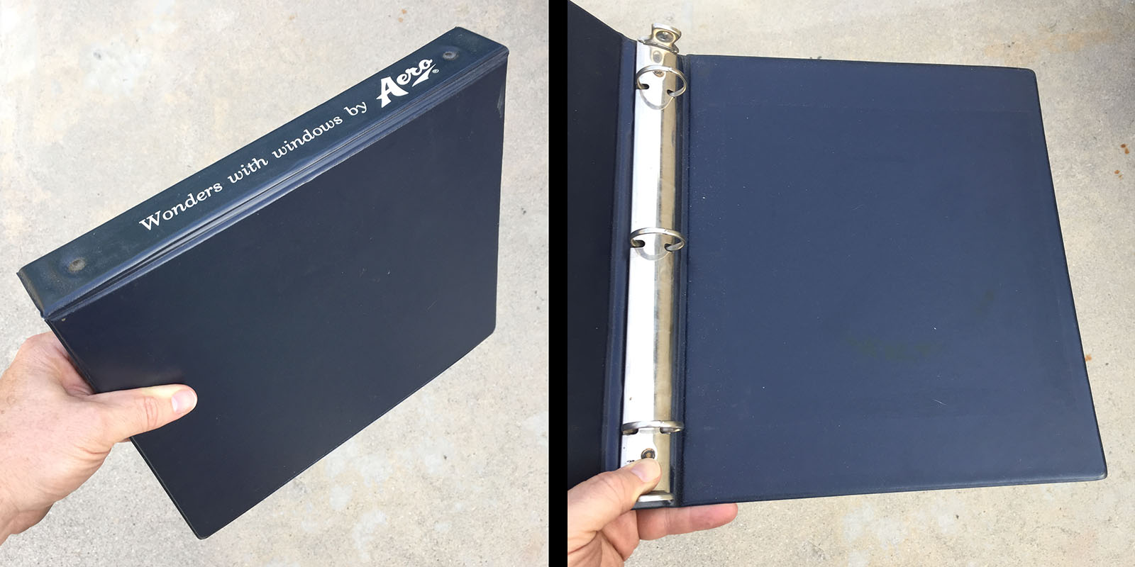
This right here was one of the most important acquistions of my early teens: a 3-ring binder. It was given to me by my grandmother, who at the time was a secretary in a housewares company. It was a sales brochure for windows, containing 32 transparent pocket pages, which were a revelation to me. As soon as I opened it, my brain saw comics in those pockets. It was a perfect presentation package. Thus, it instantly became my new format. (Side note: when I started drawing comics as a pro, binders and pocket pages became my archival storage medium. It’s one of the decisions that made this website possible.)
The gift of this binder prompted me to stop drawing on notebook paper. The pockets took 8.5 x 11, so I switched to that instead. No more blue lines. 30 pockets contained 60 pages, so that became my new target length, what we now call a graphic novel. And Splinter of the Mind’s Eye would be my first.
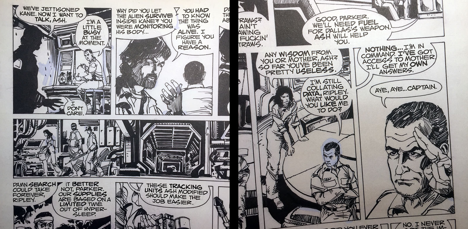
A actual graphic novel that caught my eye in 1979 was ALIEN, adapted from the film by the great Archie Goodwin and drawn by the great Walter Simonson. Suprisingly, what stood out to me the most was the lettering style. It was by John Workman, a frequent collaborator with Simsonson and a graphic designer in his own right. He brought that design sense to the sound effects and had a unique approach to word balloons, merging them with the white space between panels. This served the dual purpose of opening up more room for art and turning the balloons themselves into a design element. I loved the look and wanted to try it out.
The other thing that drove me was an observation I’d made about previous adaptations. No matter what vector they took, film to comic, TV to comic, book to comic, etc., something got left out. That bugged me. I wanted to see the WHOLE story, not someone’s edited version. So when I started on Splinter, I made it my policy to leave NOTHING out. Alan Dean Foster was a big-time writer, and every word of his dialogue was going to be on the finished page, dammit.
That decision set in motion the valuable lesson I was going to learn.
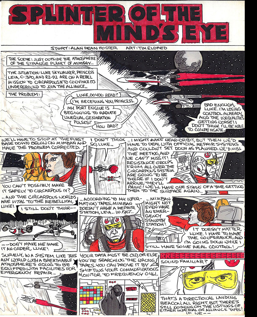
I sat down and started drawing on November 16, 1979. I know this because I finally got smart enough to put dates on every page, a habit I would keep until a computer started doing it for me. However, upgrading to slightly larger paper only encouraged my bad habit of jamming way too much information on a page. If I were to redo them now, I’d break each of them up into three or four pages for proper pacing. But that particular lesson was still in the future. Right now the mission was to adapt a 199 page novel into 64 pages of comics.
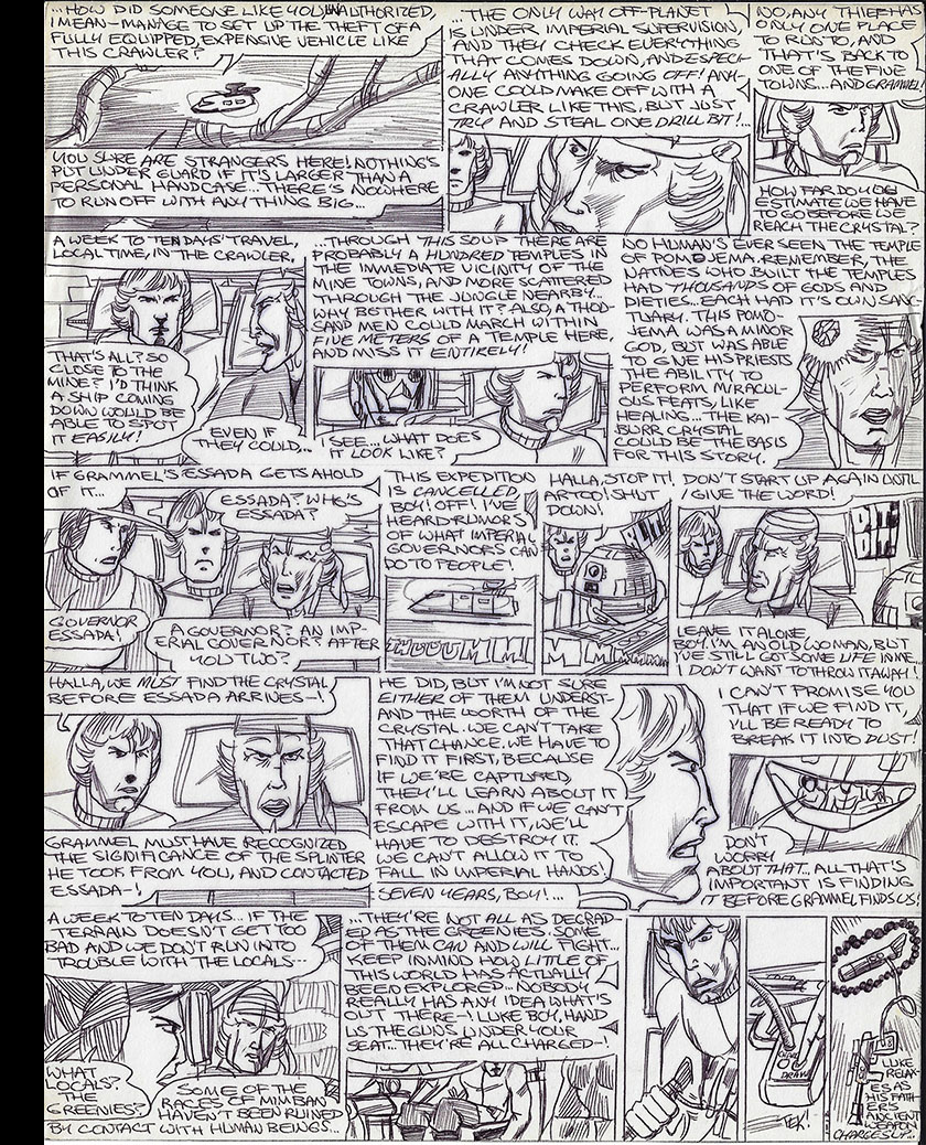
I discovered pretty early that the novel was quite wordy. I was only transcribing the dialogue, but that alone ate up a lot of space, even using the John Workman method. My panels were already too small, and the words took up more room than I expected. Nevertheless, I pressed on. I got all of chapter 1 (15 text pages) into just three comic pages. Chapter 2 (18 text pages) came to a little over seven. It was with chapter 3 that the trouble started. Dialogue ramped up significantly and 16 text pages took eight to draw. That condition did not improve, since the chapters only got more talky from there. I was itching to get to the action in the second half of the book, but these characters just kept talking…and talking…and TALKING.
By the time I got through chapter 7, I was just over halfway through the book (104 pages) but had filled up 41 comic pages. That left room for only 21 more in the binder. There was no way I’d get it all in. And the pages were now SO filled up with words that the pictures were being crushed under their weight. Quite frankly, it had become exhausting and I didn’t want to do it any more. It wasn’t much fun to make, and even less fun to read. The last page was dated January 12, 1980, and that’s where I called it quits.
The lesson I’d set myself up for was this: how adaptations work.
The point is not to get every word in. It’s to present the story in a way that uses the strengths of your medium. The strength of a novel is in its words, which don’t have to share space with pictures. By contrast, the strength of comics is in the pictures. (More specifically, the craftsmanship of choosing exactly the right pictures.) Words are obviously a critical part of the storytelling, but the pictures are the point. If the words get in the way of the pictures, the words must give way instead.
It was an equally valuable lesson in comic book writing. The pictures take the lead, so they should also carry the bulk of the storytelling load. My Splinter comic became a series of talking heads, undermining the purpose of it being a comic book. If I’d put an editor hat on and distilled the dialogue down to its minimum, it would have given the pictures room to do their part.
I’m still kinda bummed that I never got to the second half, where Darth Vader joined the story and the talking finally gave way to action, but what I got instead was a lesson I couldn’t have learned any other way. I’m grateful for that, and I’ve never forgotten it.
See the entire project (all 41 pages) here
Postscript
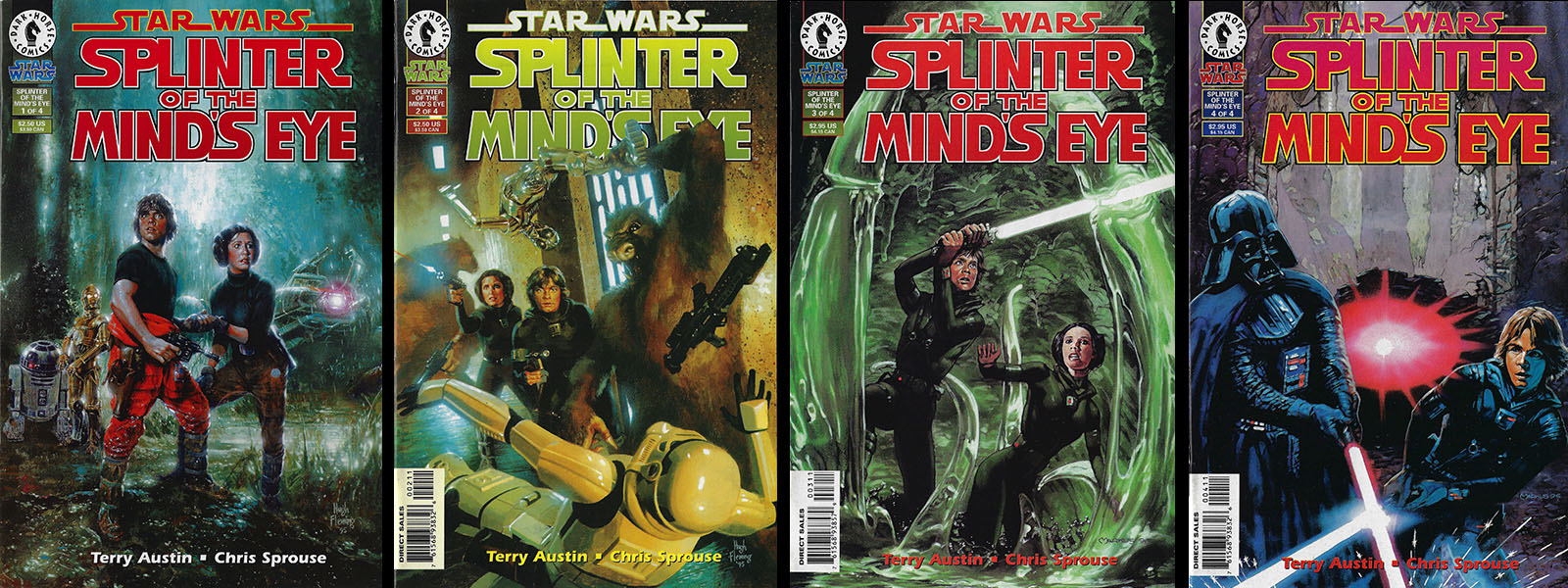
In 1995, Dark Horse comics accomplished what I did not: adapted the entire novel into a 4-issue series, totaling 97 pages. Oddly, we went at about the same pace. My page 41 roughly matched their page 45. The difference was, their version put the pictures first and properly boiled down the dialogue. The adaptation was by Terry Austin and Chris Sprouse, both of whom did a masterful job. See all the issues for yourself here (I recommend the TPB collection).
If I’d kept going, I might have pulled even in terms of page count, but the end product would have been entirely different; a novel with pictures rather than a proper comic book adaptation. And it was fascinating for me to see this version 15 years after I’d abandoned mine. It was final proof of the lesson, and I enjoyed it from start to finish. Which, after all, is the entire point of making it.
Read more about the original novel here and here.


