
Supreme Survivor graphic novel, 1997
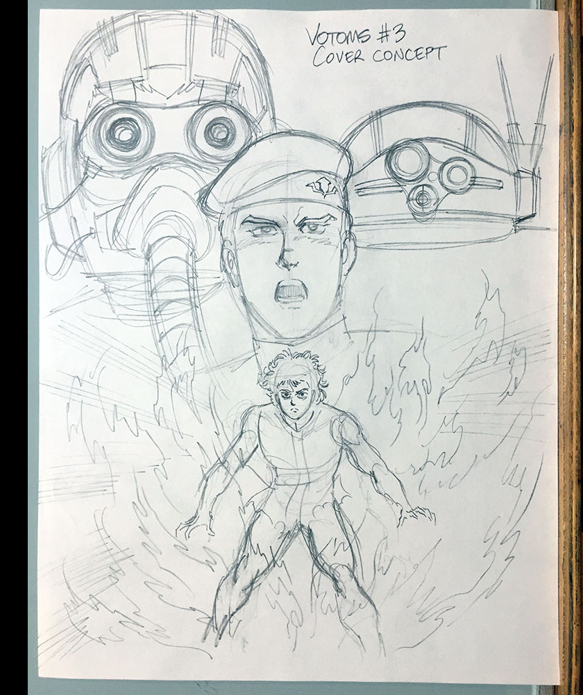
In the year 1986, it was my dream to one day draw a for-real Armored Trooper Votoms comic book series. I developed one and put a lot of it on paper (see it here) before abandoning that dream as untenable. There just wasn’t a path to make it happen.
Ten years later, that dream came true. This is the story of how it happened.
In all honesty/modesty, it began with me. When I took my first deep dive into the show, I started researching and writing a ‘zine called The Votoms Viewers Guide. It topped out at 172 pages and can be seen here. Lots of copies went into circulation and eventually paid off in ways I could not imagine. In one instance, it led to a Votoms-inspired RPG and animated series called Heavy Gear. In another, it led to Votoms itself being imported to the English-speaking world. That’s how the path opened for the comics.
The importer was Central Park Media, also known as U.S. Manga Corps. Based in New York, the company was founded in 1990 by John O’Donnell, who I would meet a couple years later when he hired me as a freelance copywriter for video packaging. They were desperate for anyone who was knowledgeable about anime and could string an attractive sentence together. I happened along at just the right time to stumble in.
Setting the table
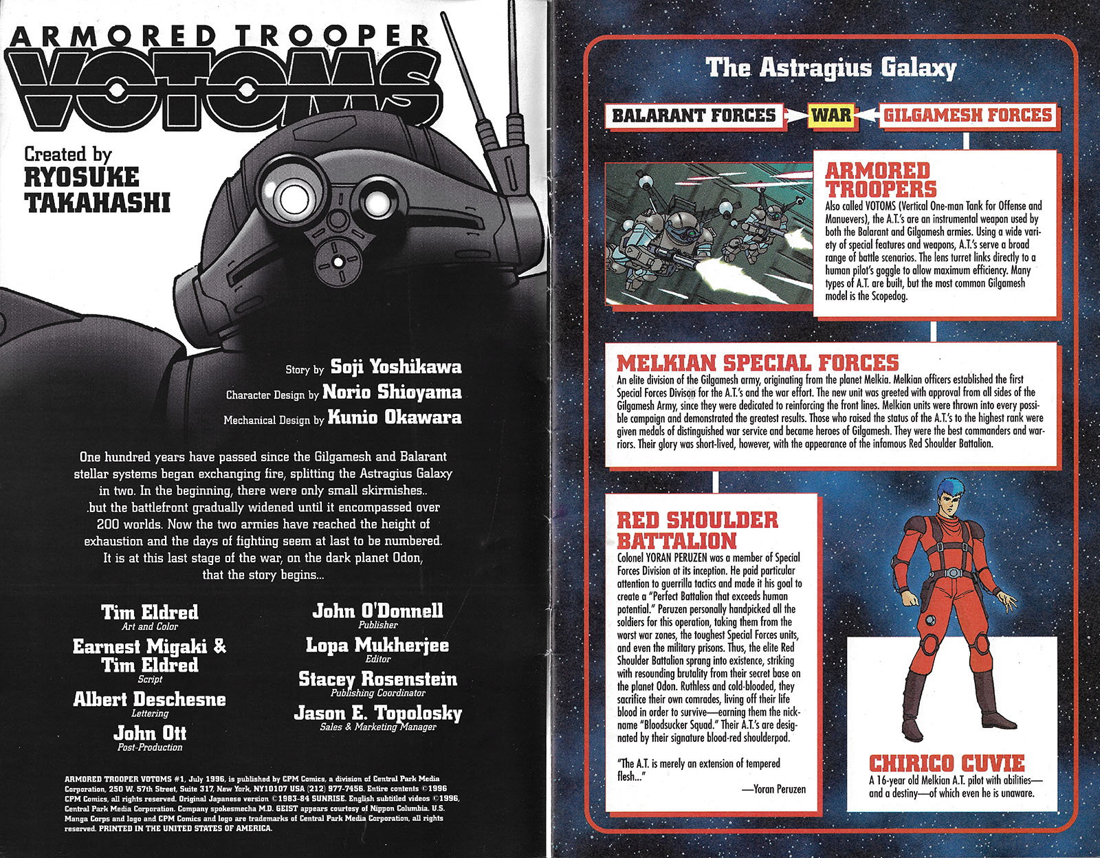
In 1995, I put together a production studio with two close friends to make comics for John O’Donnell under his “CPM Comics” imprint. As we toiled away on Project Ako, Gall Force, MD Geist and Cyber City, John was working his way through a licensing maze with Sunrise to acquire Votoms. I crossed my fingers so hard they nearly snapped. And it worked; he not only secured rights for video, but also for publishing. He was now in a position to authorize my dream project.
The first VHS releases would happen in 1997. It was going to be a big deal, so 1996 became a year of preparation. It was decided to publish a 4-issue Votoms miniseries that summer as early promotion. That meant I would have the honor of creating the very first English-language Votoms product.
In terms of content, I thought we should begin at the beginning and adapt the Roots of Ambition OVA. John didn’t have the video rights for it, so a comic version would add value and stand on its own. Four issues were more than I actually needed to adapt a one-hour film (20 minutes of screen time fills an average comic) so I thought it would be cool to cover TV Episode 1 in the 4th issue. I could slot in the prologue from The Last Red Shoulder, fill a couple gaps, and give everyone the first linear presentation of all that material. John was fine with it and gave me the green light.
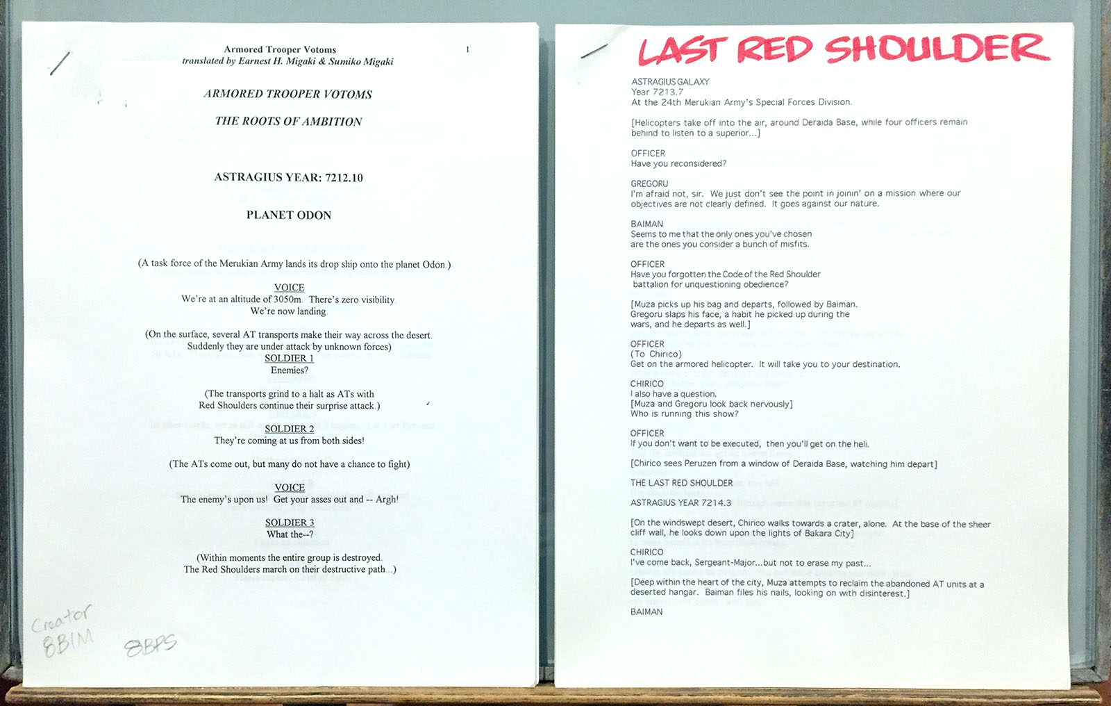
The first step, as with any anime import project, was to get the material translated. For this, I went straight to my longtime friend Earnest Migaki. He was one of the first Votoms fans I ever met. We encountered each other in the pages of an anime APA in the mid 80s and found instant kinship. He previously translated The Last Red Shoulder as a passion project, but I managed to get him paid for Roots of Ambition. Remember, this is WAAAAY before all the OVAs finally showed up from Maiden Japan. I still have both of Earnest’s scripts in my archives, as you can see above.
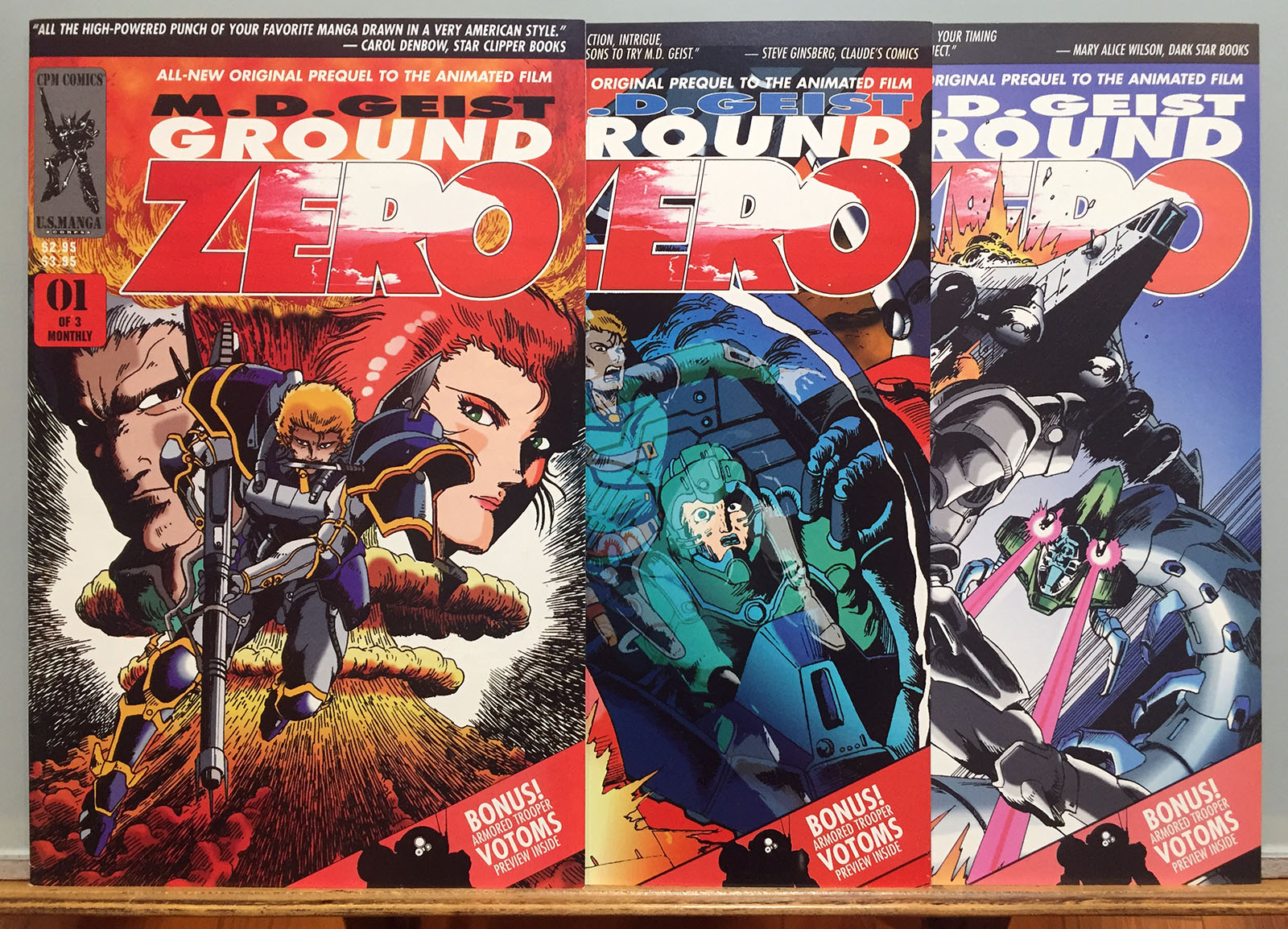
The production schedule was a little wonky. The actual first appearance of Votoms in comics form happened in the pages of a 3-issue MD Geist miniseries called Ground Zero. For this, I split TV Episode 1 into three parts (8 pages apiece) and it ran as a backup feature from March to May 1996. The first issue of the Votoms series would debut in July. This required me to jump back and forth between Roots and the TV episode to meet the various deadlines, but it was my dream come true, so I didn’t mind it one bit.
The best and worst thing about the project was its timing. Here’s why…
The best timing
If I’d somehow gotten my wish granted in 1986, I wouldn’t have been ready for it. I hadn’t broken into my comics career yet, and didn’t have enough experience under my belt to do it justice. In all likelihood, I would look back on such a project now with regret. But by 1996, I’d built up exactly enough experience and expertise to make it shine.
I’d also assimilated the first wave of desktop publishing technology, mastering the Photoshop skills I needed to color and enhance my art. It was important to me that the comic look as authentic as possible, so I extracted screenshots from my VHS tapes and built them into page layouts. All the finished art was my own, but it was heavily referenced for accuracy. It was my reply to all the artists who drew Star Wars comics without taking their responsibilities seriously. Their day was OVER.
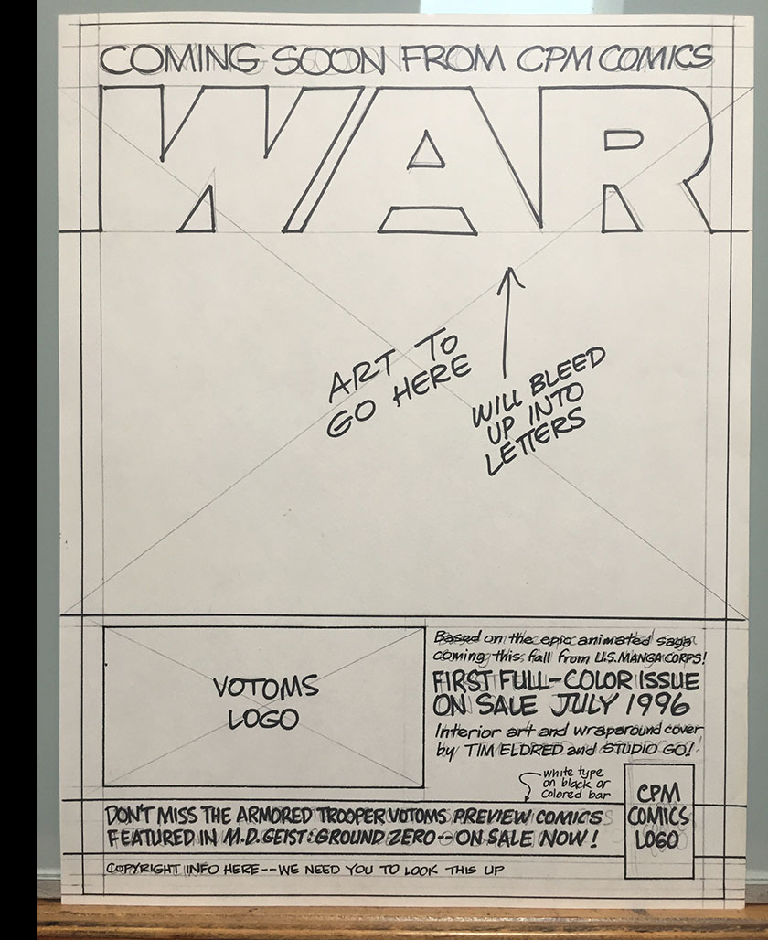
(Unused ad idea shown at right.)
The worst timing
It may sound like all of this was a cake walk for me once the long wait was over and the green light was given. Far from it. Various forces of nature were doing everything they could to crush this dream into ashes.
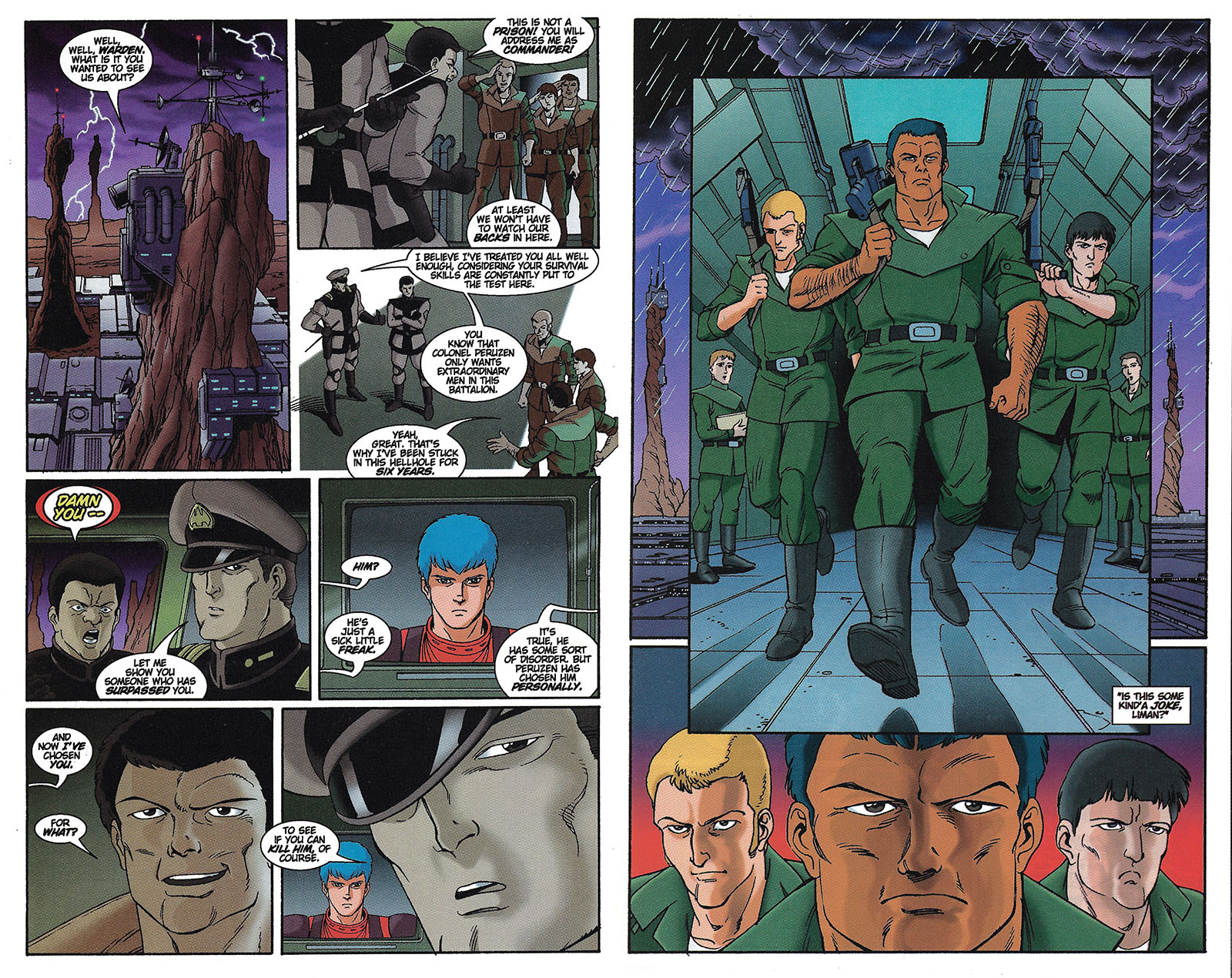
First, I had to deal with an editorial shift at Central Park Media. After all the comics my guys and I produced in 1995, we suddenly found ourselves dealing with a new editor in 1996, and she seemed dead set on kicking us to the curb. There was a point where she’d gone as far as finding her own artist to take Votoms away from me, and – as you can imagine – I flamed up WHITE HOT when I found out. If I remember right, it came down to me sending in my first sample pages to prove my worth to John. Fortunately, I passed the test. I don’t know what I would have done if the editor’s little scheme had worked. But it wouldn’t have been legal. (By the way, she was given an editor credit on the book despite having almost no interaction with me and no creative input whatsoever. Frankly, I don’t know what she was there for.)
Second, the comic book industry experienced a massive implosion the very month Votoms #1 was released. The largest distributor (Diamond) bought out the second-largest distributor (Capitol City) and all the smaller publishers lost a huge chunk of their sales practically overnight. Our little studio was specifically set up to serve smaller publishers, so this move by Diamond was a knife in our backs. Central Park Media could no longer afford to publish the Votoms miniseries as planned.
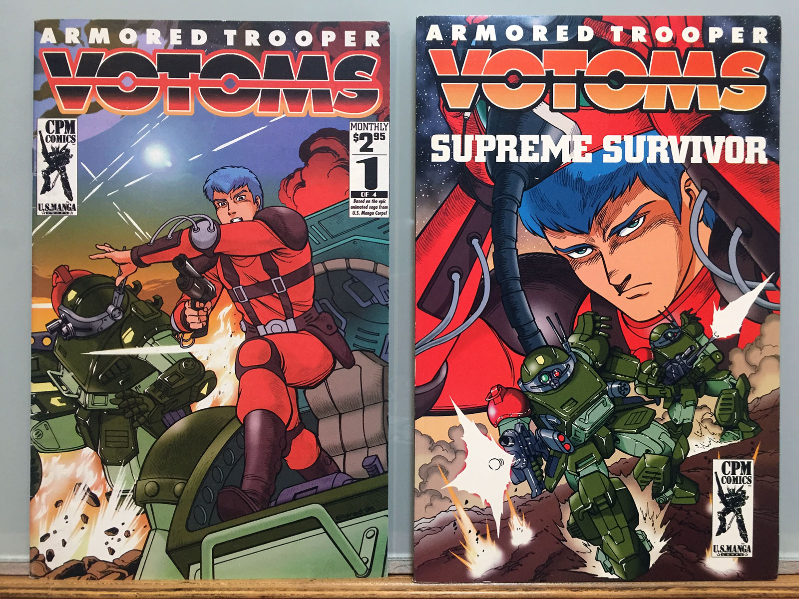
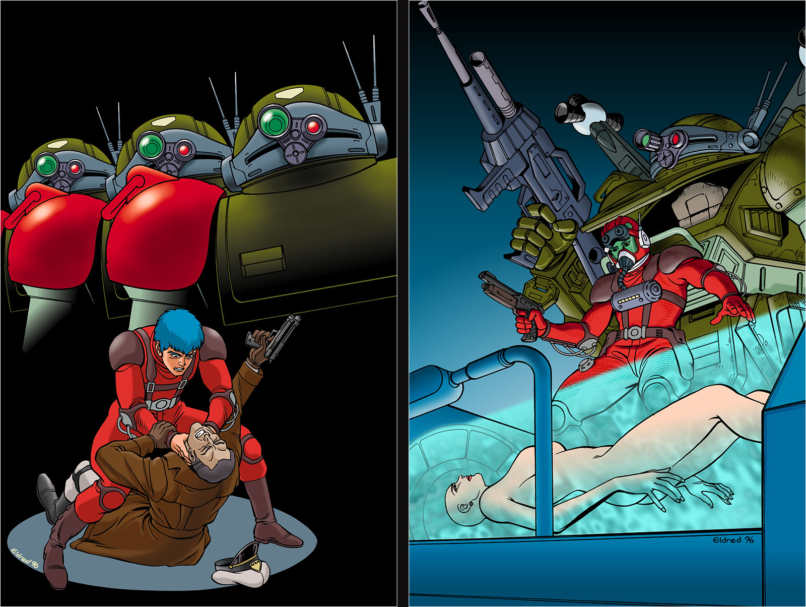
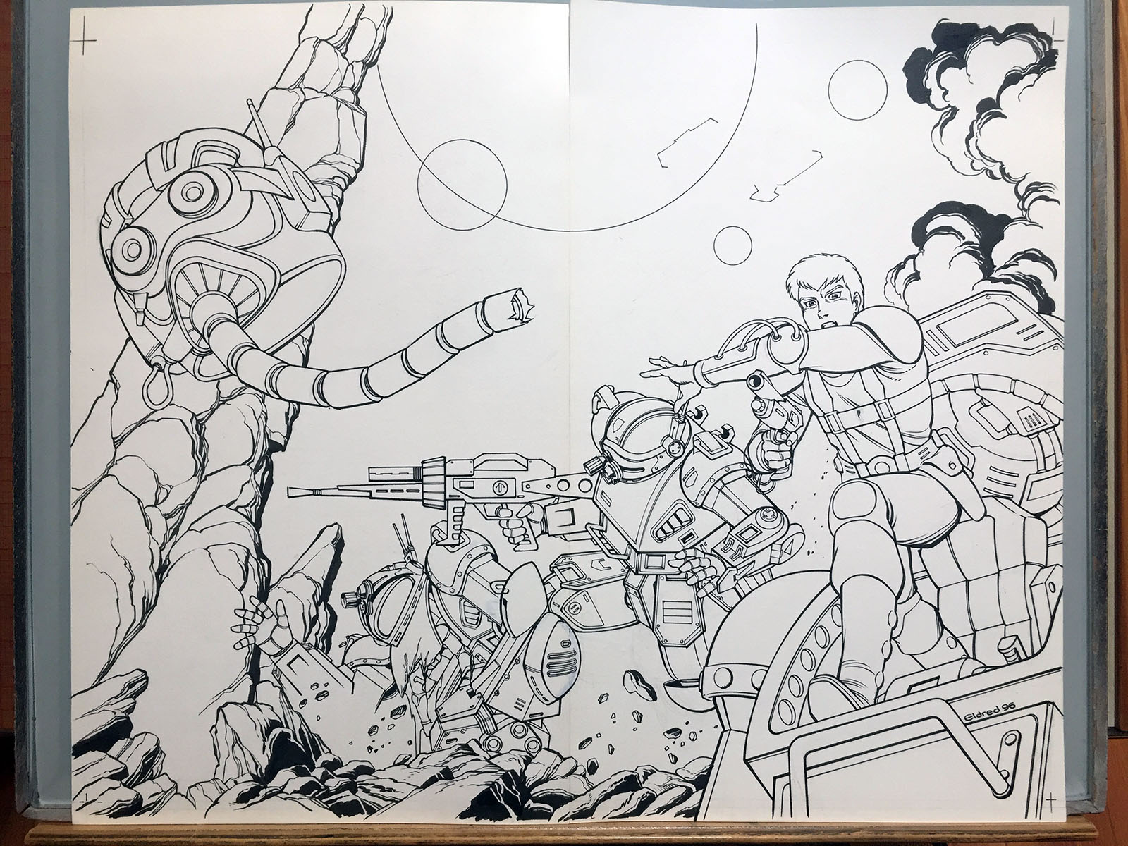
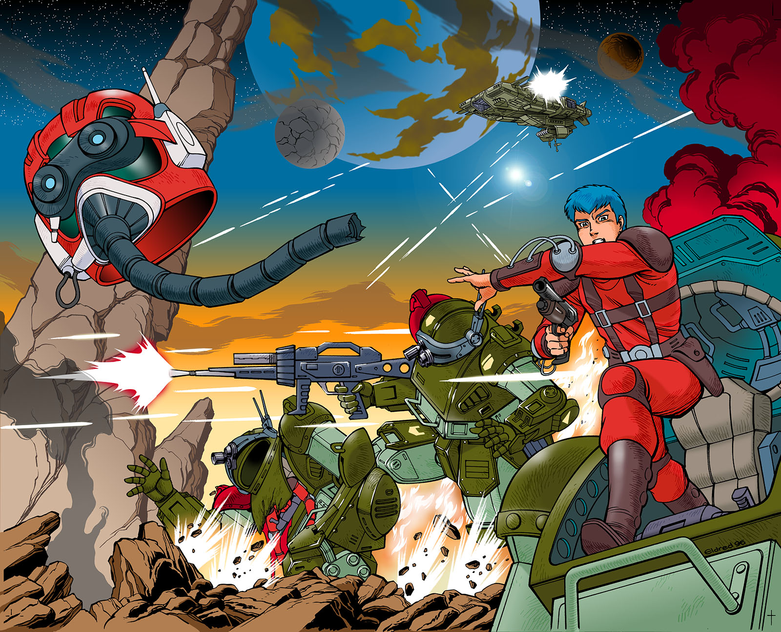
Left: issue 1 (the only one), July 1996. Right: graphic novel, July 1997
The saving throw
But now we shift back to better timing. By July, I had finished three issues of material and was starting on the fourth. John O’Donnell had already invested enough in the project to see it through, so I was permitted to finish all the art and package it up as a graphic novel. It would be published a year later, in sync with the arrival of Votoms on video.
There would be no more Votoms comics for me to draw after that, but it was already a miracle that I’d gotten to draw any at all, so I accepted it with gratitude. Supreme Survivor was published in July 1997 and looked as good as I could possibly make it. I doubt I could improve on it very much today.
My career had moved past comic books into TV animation by then, but I was still happy to help CPM with their Votoms release by writing promo text and creating a mini guidebook for their first box set. In fact, I also helped them out with subsequent DVD releases (see a full video history here) and was later hired by R.Talsorian Games to help create a fully-licensed RPG book.
I returned to the role of collector/fan after all that, but every time I look up at my Votoms bookshelf I spot Supreme Survivor and take immense pride in having contributed to this amazing world.
Read a complete PDF of the graphic novel here
Production Archive
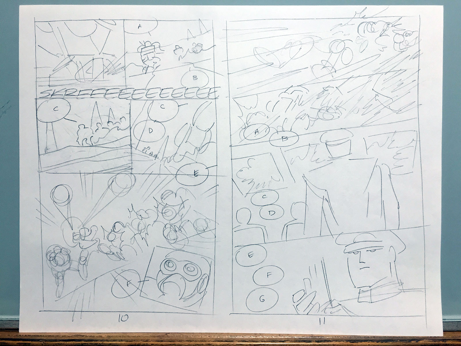
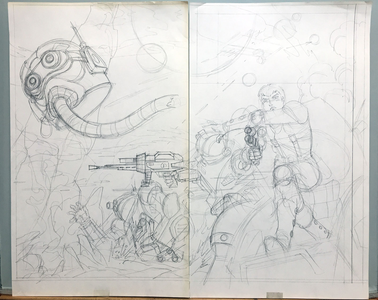
Every page of a comic starts out as a thumbnail, where I figure out the compositions. Pictured below is the evolution of page 10.
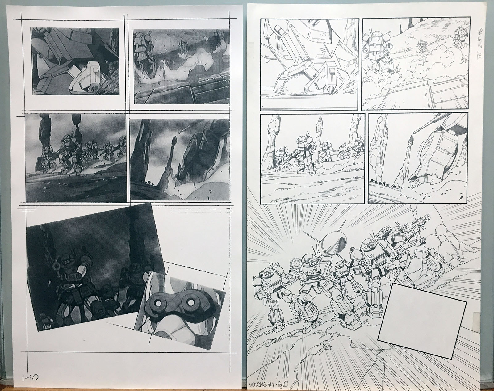
At left is my digital layout, in which screenshots from a VHS tape were laid in for drawing reference. At right is the finished version of the page, expanded to include whatever needed to be added. The pilot’s face in the last panel was drawn separately and layered in. At this stage of my career, I was drawing everything in pencil and using Photoshop to darken it. Taking ink out of the process sped things up immensely.
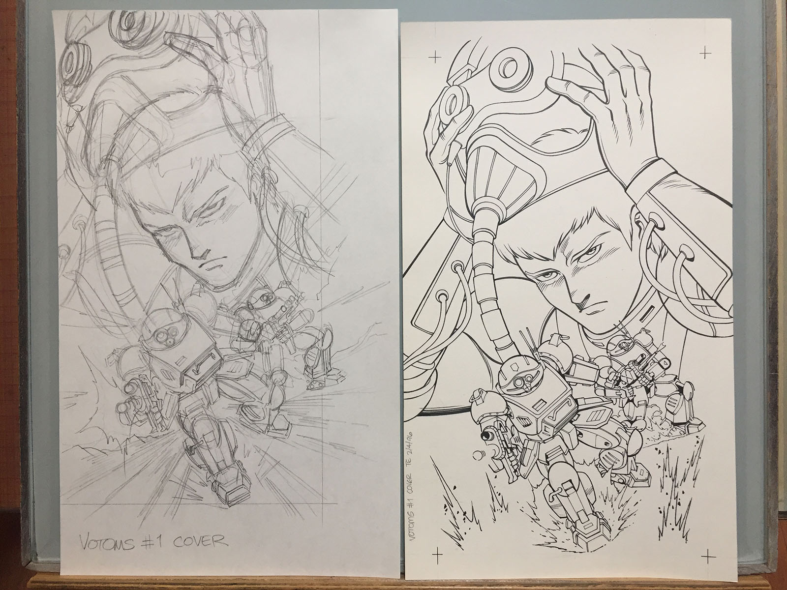
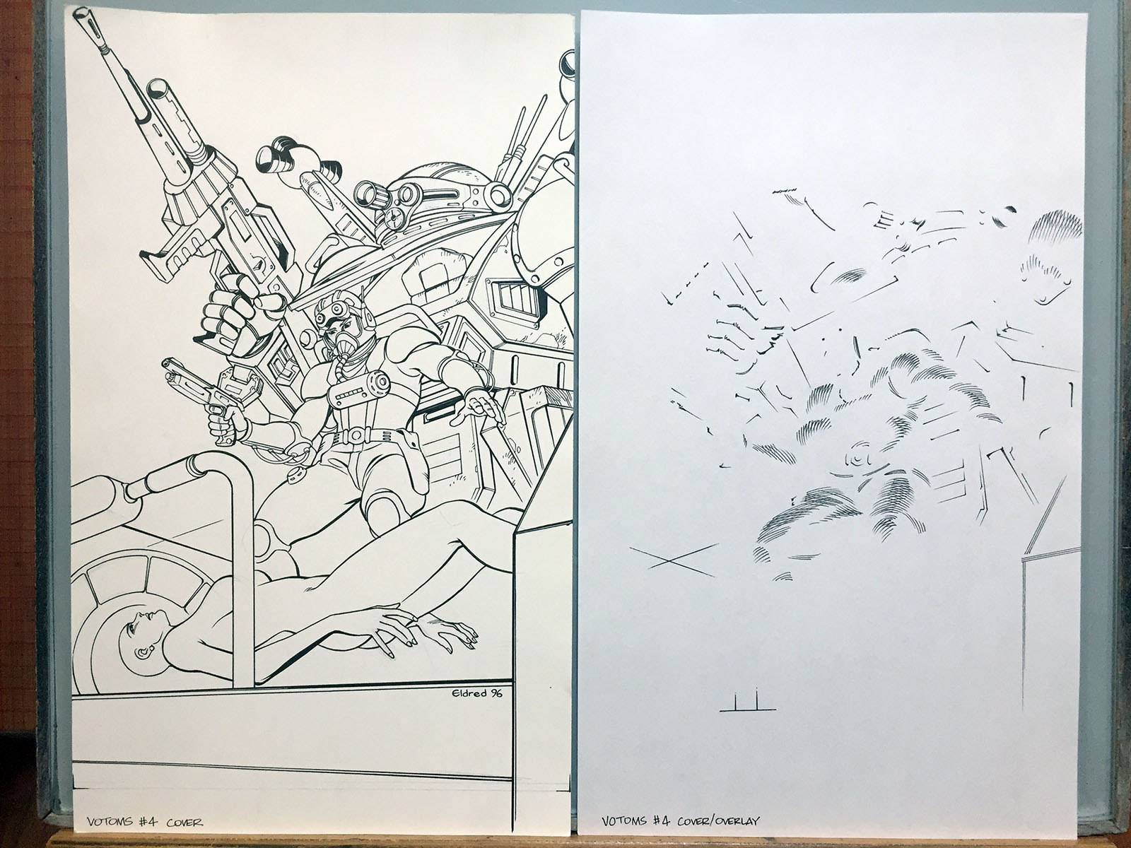
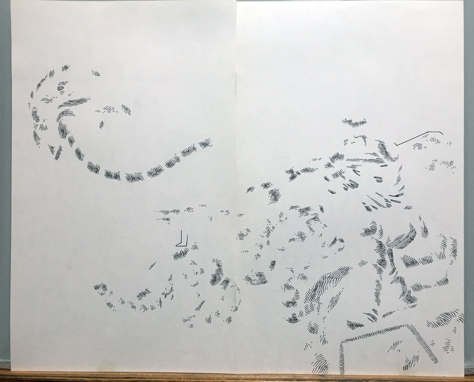
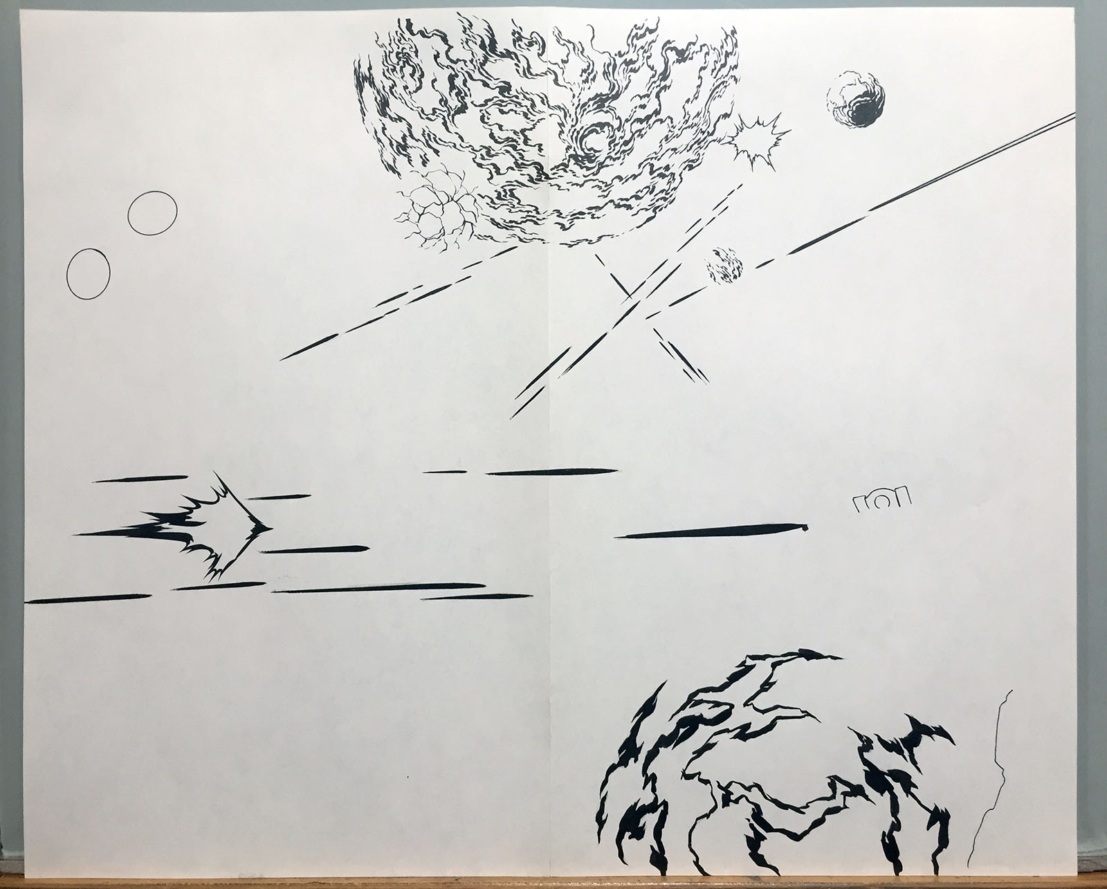
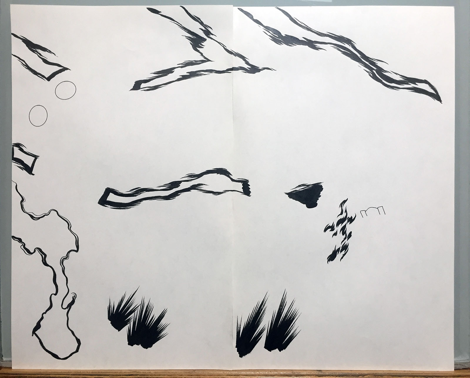
Eventually, this idea became the basis for the graphic novel cover. The penciled and inked versions are shown here.
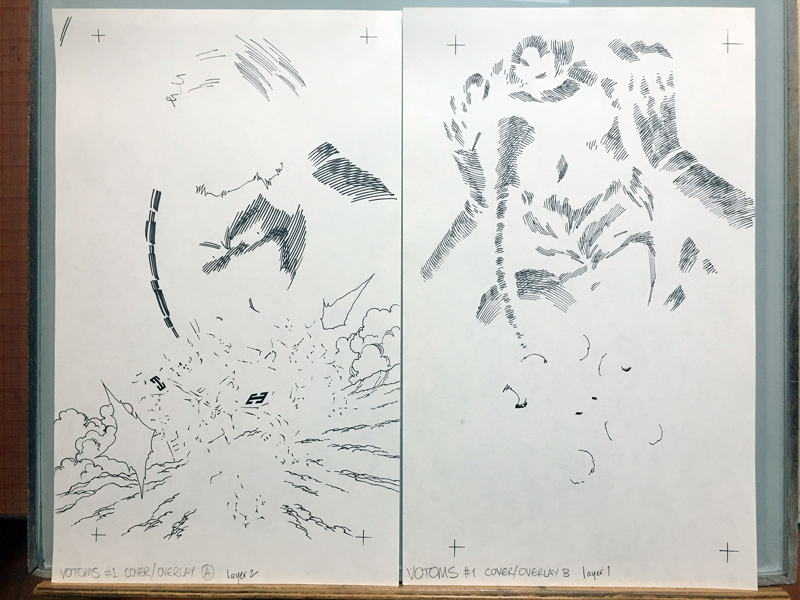
These were layered effects, drawn and scanned separately for color treatment. Everything in the upper half was looking too thick and scratchy, so I started over on a separate page. That’s a luxury we didn’t have in the pre-digital era.
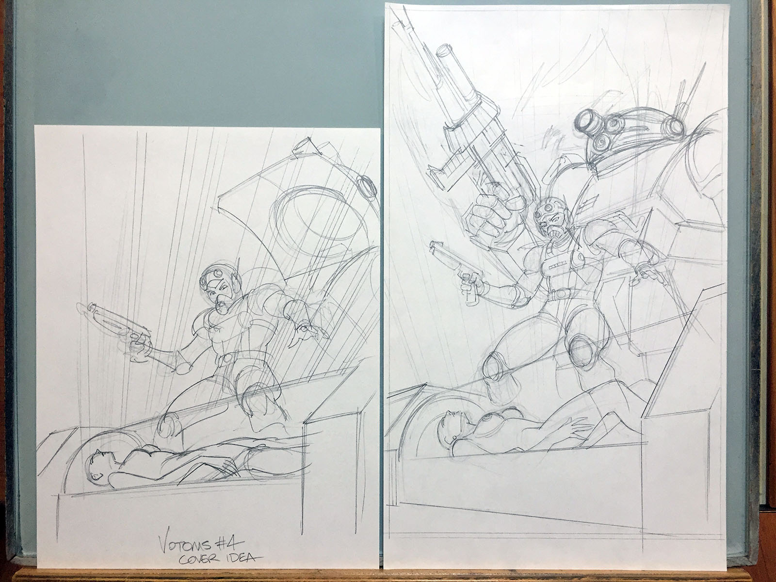
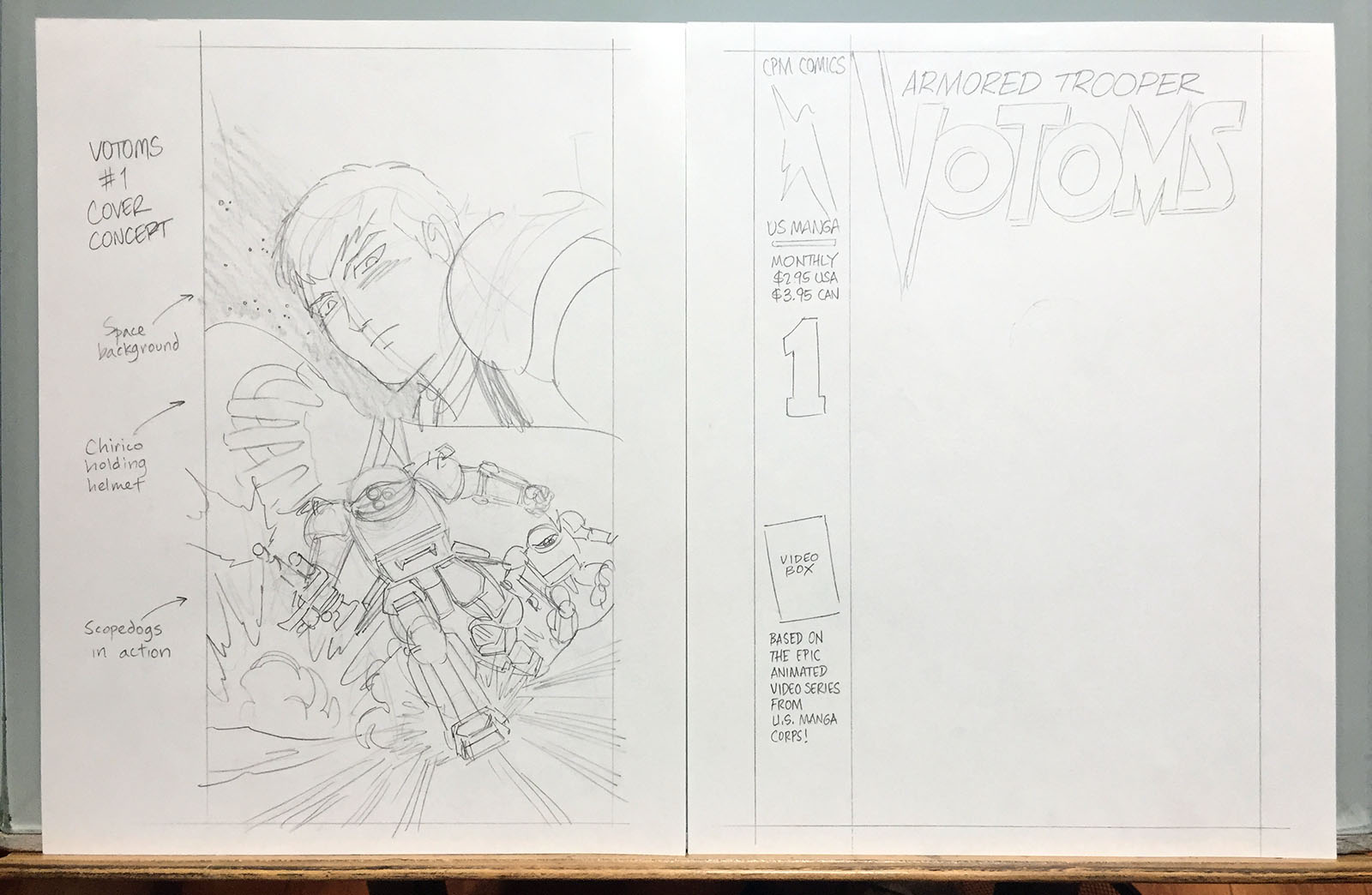
The cover for issue 1 was the most elaborate single piece I’d done up to that point, but I wanted to go all out with it. Here’s how I built it up, starting with the layout.
Liner Notes
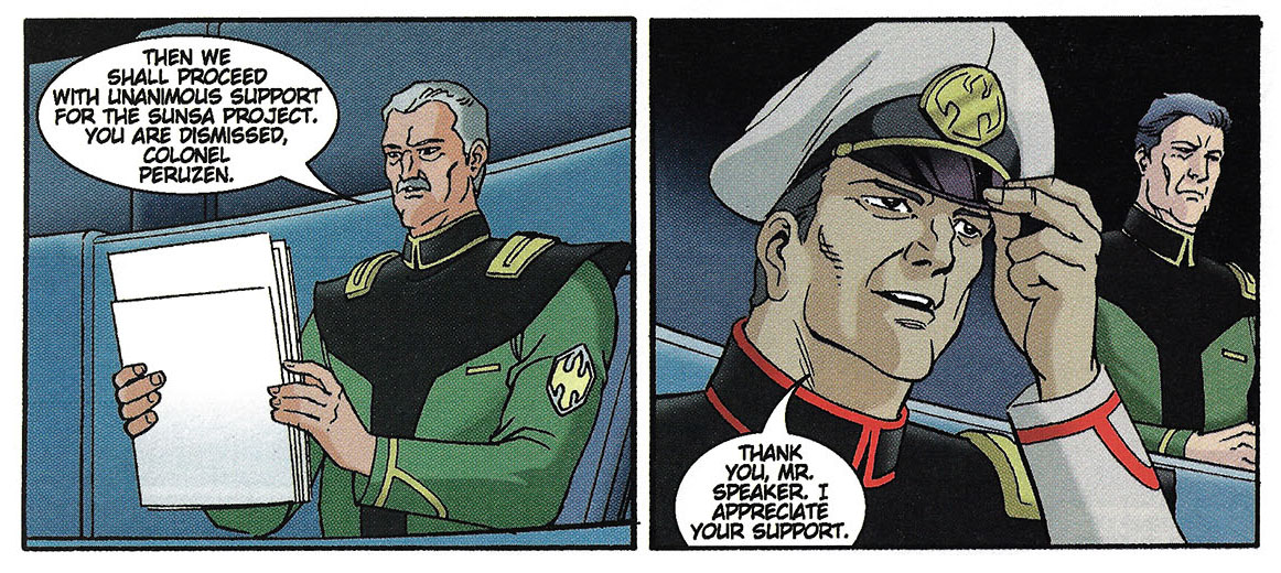
“Peruzen” was the spelling I went with, because that’s the most direct way to interpret the katakana in his name, and that’s how you hear it spoken in Japanese. “Pe-ru-ze-n.” It was a letdown for me when it was officially rendered as “Pailsen” in 2007. It just sounded wimpy by comparison.
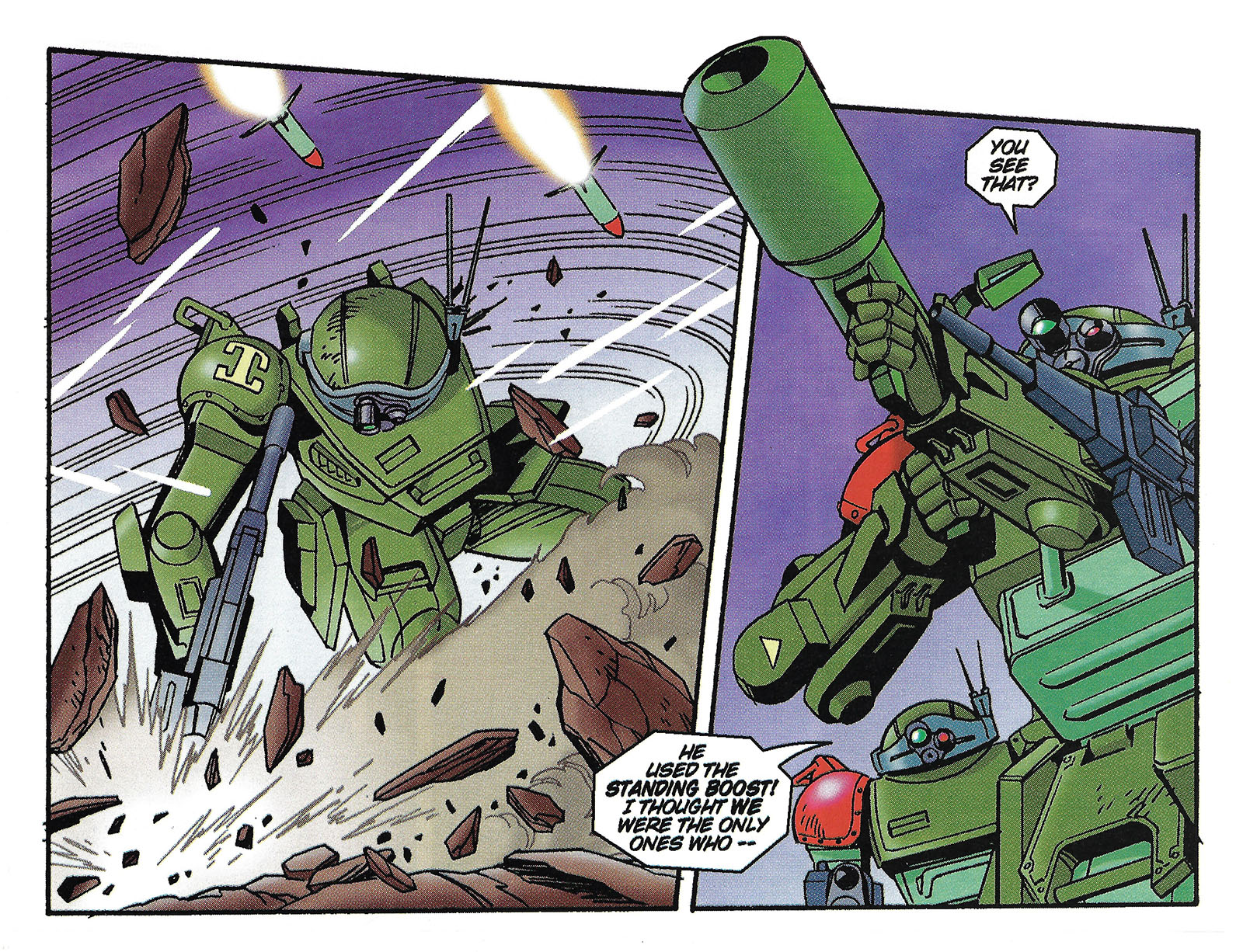
“Standing boost” was how I interpreted an A.T. maneuver nicknamed “boostand” in support materials. The move is to stand still and then suddenly boost forward to another standing position. A good way to quickly dodge something. I called it “standing boost” so English readers would have some idea what the hell it meant.
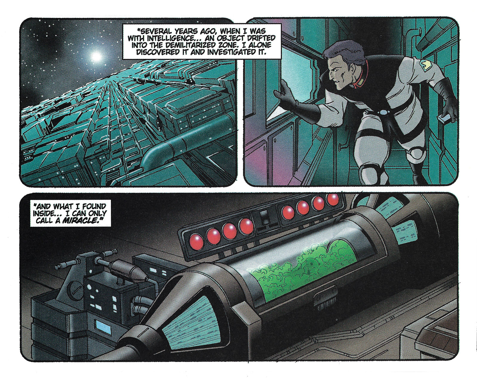
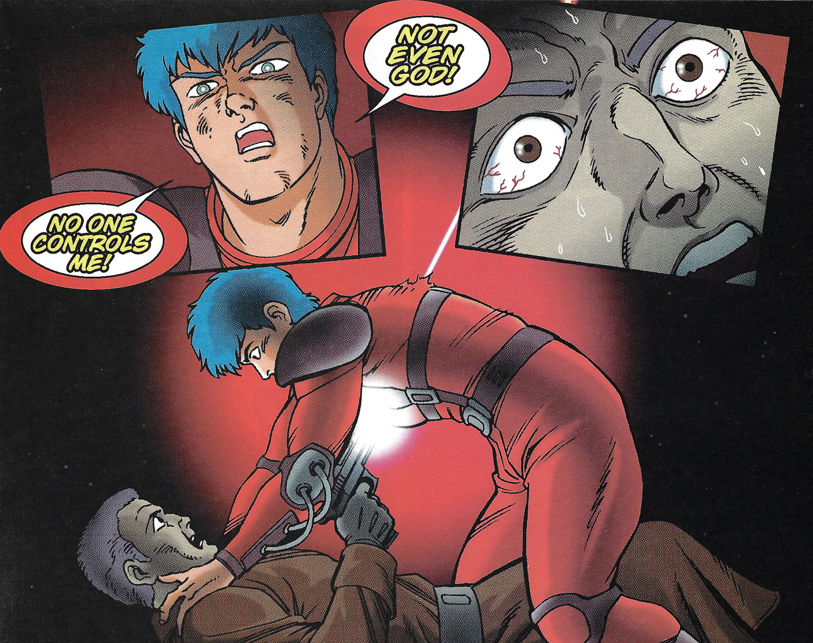
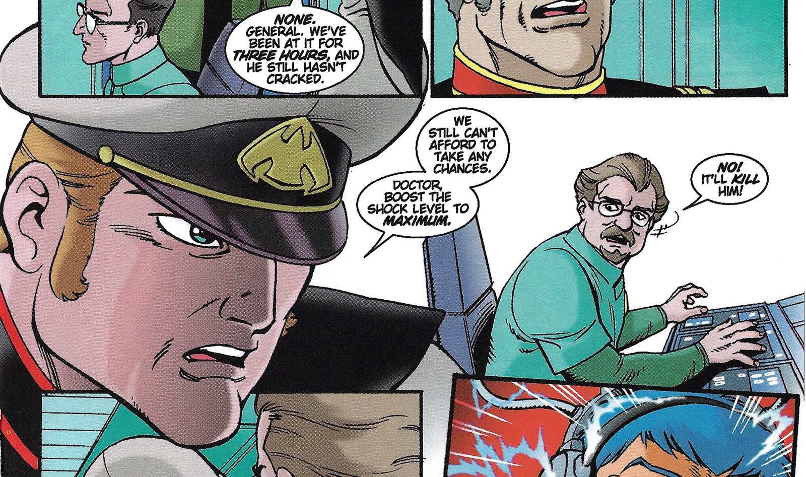
Peruzen’s flashback played without narration in the OVA. You can get away with that in film, since sound comes to your rescue. A specific sound balance informs the audience that the memory is intentionally silent. But comics don’t work that way, so I had to plug in some words. This is just my own speculation of what we see in the flashback. I left it as vague as I could.
Here’s another case where the OVA left out the sound on purpose. Whatever words Chirico was saying were the most important of the entire story, and Peruzen couldn’t hear them. Again, can’t get away with that in comics. However, I didn’t make them up this time. They came from the novelization.
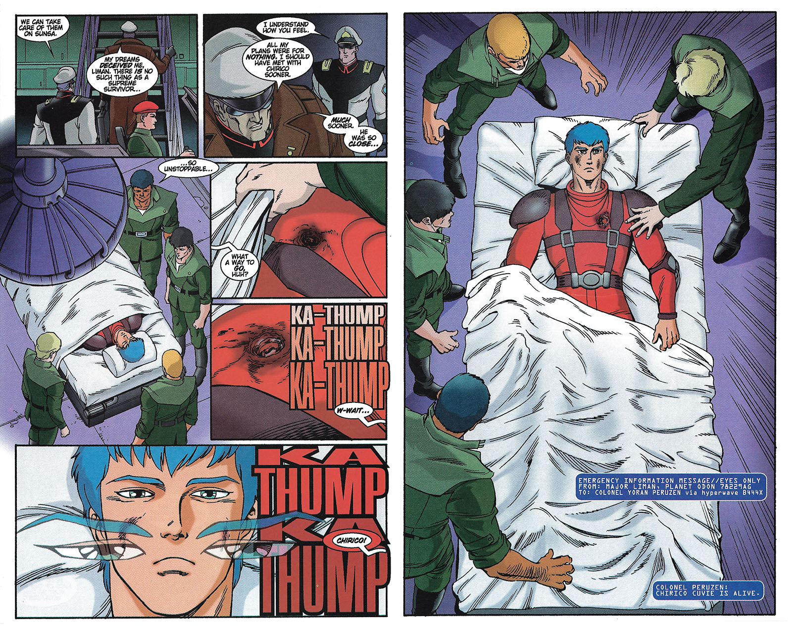
Chirico’s narration here was another element extracted from the novelization. Since the comic might have been someone’s first exposure to Votoms, I didn’t want to leave big gaping holes in it.
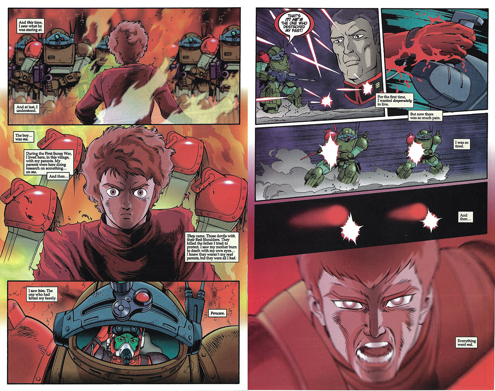
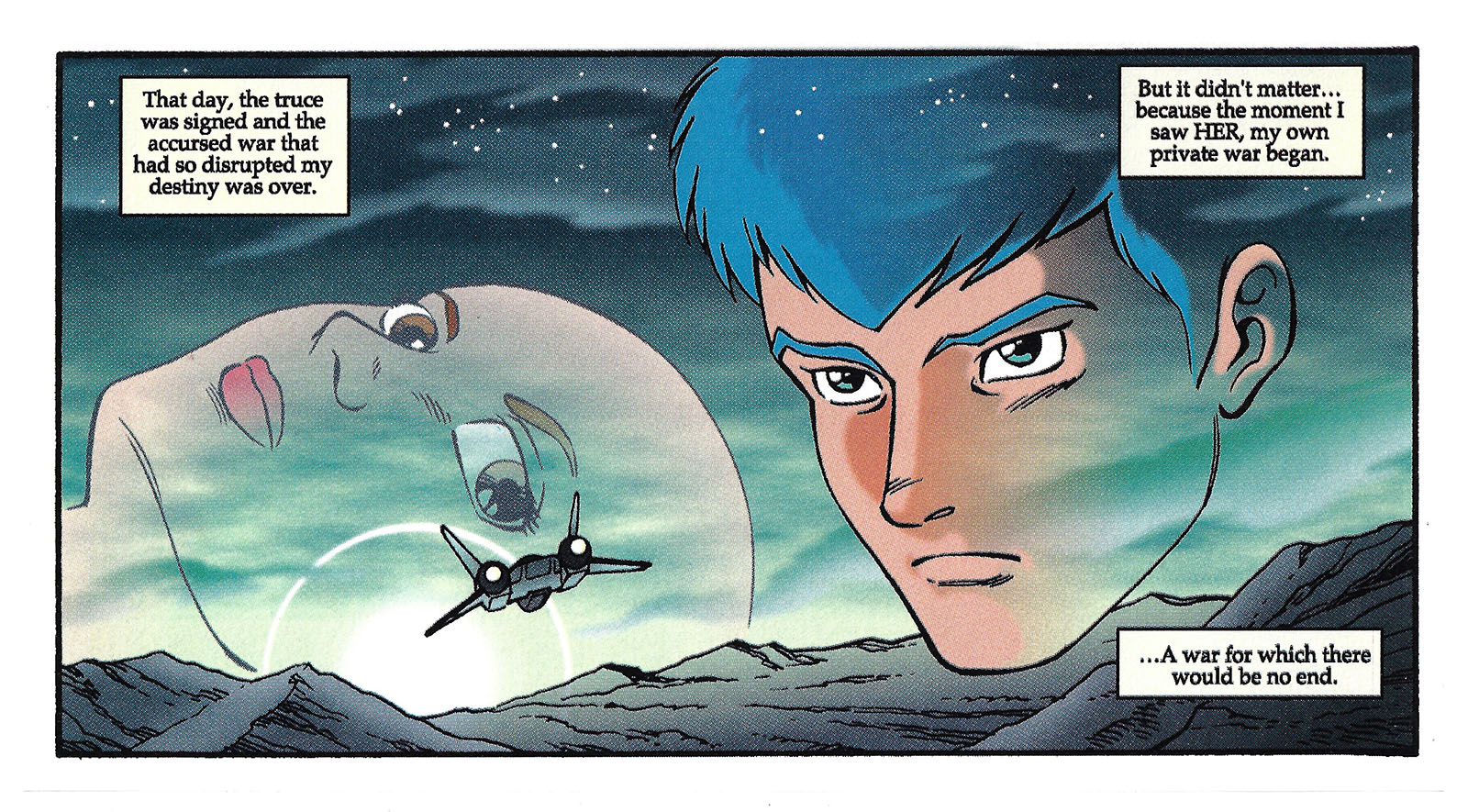
There are those words again, and this is where I stepped in to add my own ideas to fill in the story gap. Everything here is what I imagined happened immediately after Roots, leading into the prologue of The Last Red Shoulder.
And there’s the handoff into that prologue. I didn’t see a need to spend more than two pages on this gap, but when the Pailsen Files OVA series came out, they filled it with 12 episodes. I didn’t like that series at all. Not because it contradicted what I came up with, but it made a mess of continuity, forcing a story on us that created more problems than it solved.
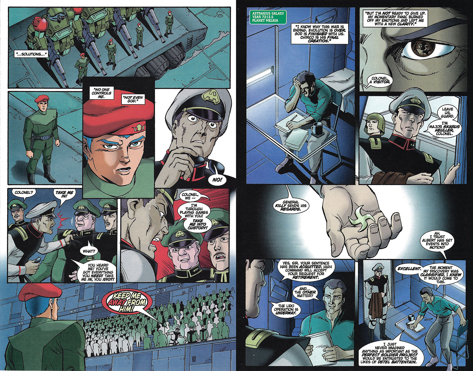
Did you notice that the Melkian Scopedogs aren’t colored properly? That’s one of the things that went against me. I gave them their proper pink/lavender tones, and one of the higher-ups at Central Park Media gagged on it. “PINK ROBOTS?” Basically, I was ordered to change the colors against my will. So I tinted them into the range you see here. That’s gonna stick in my craw forever.
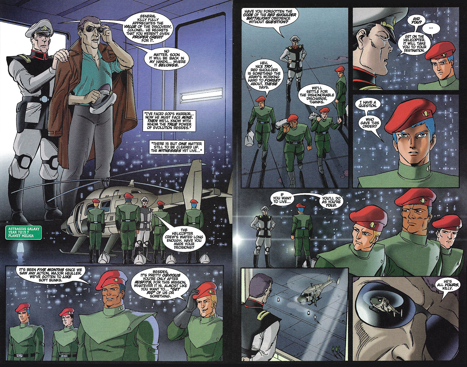
To this day, I’m not sure why I had Rochina’s massive chin stick out over the next panel. I wasn’t making fun of it, I swear. It just had a mind of its own.
The last panel of the last page. We end with the beginning. If I’d been able to keep going, the next story would have been completely original. During the six months before Chirico gets to Uoodo City, he has his unexplained cameo in Armor Hunter Merowlink. I wanted to make a story out of that, actually having them meet at Dopper Penitentiary at a moment of truth, and Merowlink’s earnestness would help to put Chirico back on his path.
Would I have liked to move into the TV series, adapting every episode into a comic? You bet I would. I just never believed for a moment it could go the distance in the shitty comics market of the 90s. It would have taken over four years to do them all in a monthly series, and there just wasn’t enough support. But in a world where that was possible, I would also have enjoyed spending some time on that year between the end of Quent and the epilogue of the TV series. If there was room for The Big Battle in that year, there was room for a lot more. I wish they felt the same way in Japan…
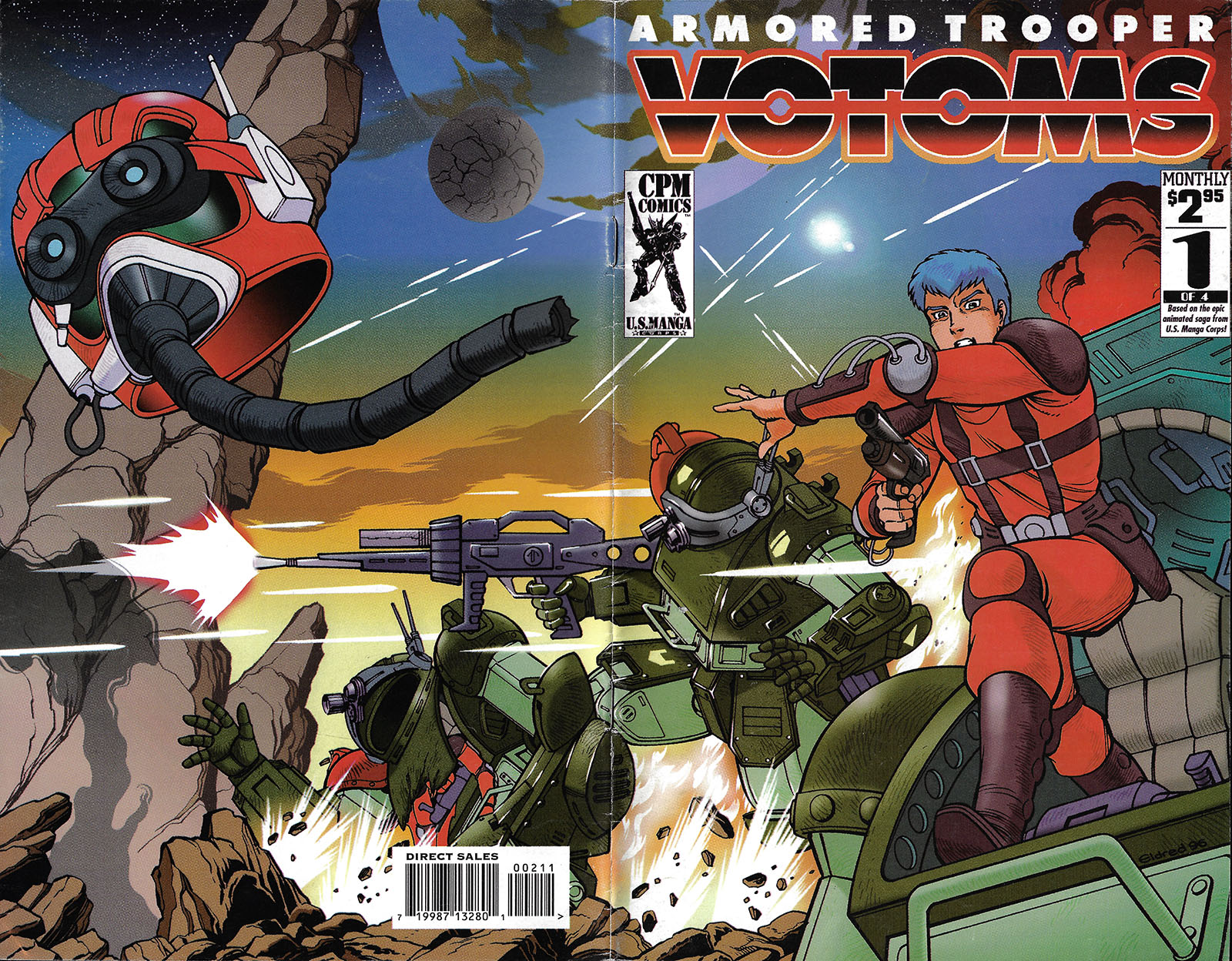
Lastly, here’s the wraparound cover and first interior spread of issue 1, the single comic that didn’t get a followup.
I really loved this! I ended up buying the graphic novel itself (collecting all of the issues) and I was extremely happy when you signed it for me at an anime convention in NYC back in ’06. At that time, I had never seen ROOTS OF AMBITION but had read about it (I had watched the VOTOMS TV series though), so this was as closest thing I could get.
Thankfully, in the years since we’ve managed to get pretty much all of the Votoms shows in the US (except MELLOWLINK) so I was finally able to watch ROOTS OF AMBITION. Even so, your adaptation is superb.
Thanks a lot, Marc!
Thanks for the shoutout on the translation, Tim!
kinda hard to believe it’s been 26+ years since going through the novelization text to decipher what was going on in that OVA…
but always great to see your dedication to the art and promoting of one of my fav anime series! Stay the course! 🙂
Nice story, nice book, nice memories !
It never occured to me that there was anything wrong with the coloring of the Melkia/Melquiya Scopedogs in your version. You made a good choice and this reminded me that a similar color scheme was made by Kaiyodo:
https://m.media-amazon.com/images/I/617+3P8NGhL._AC_SL1011_.jpg