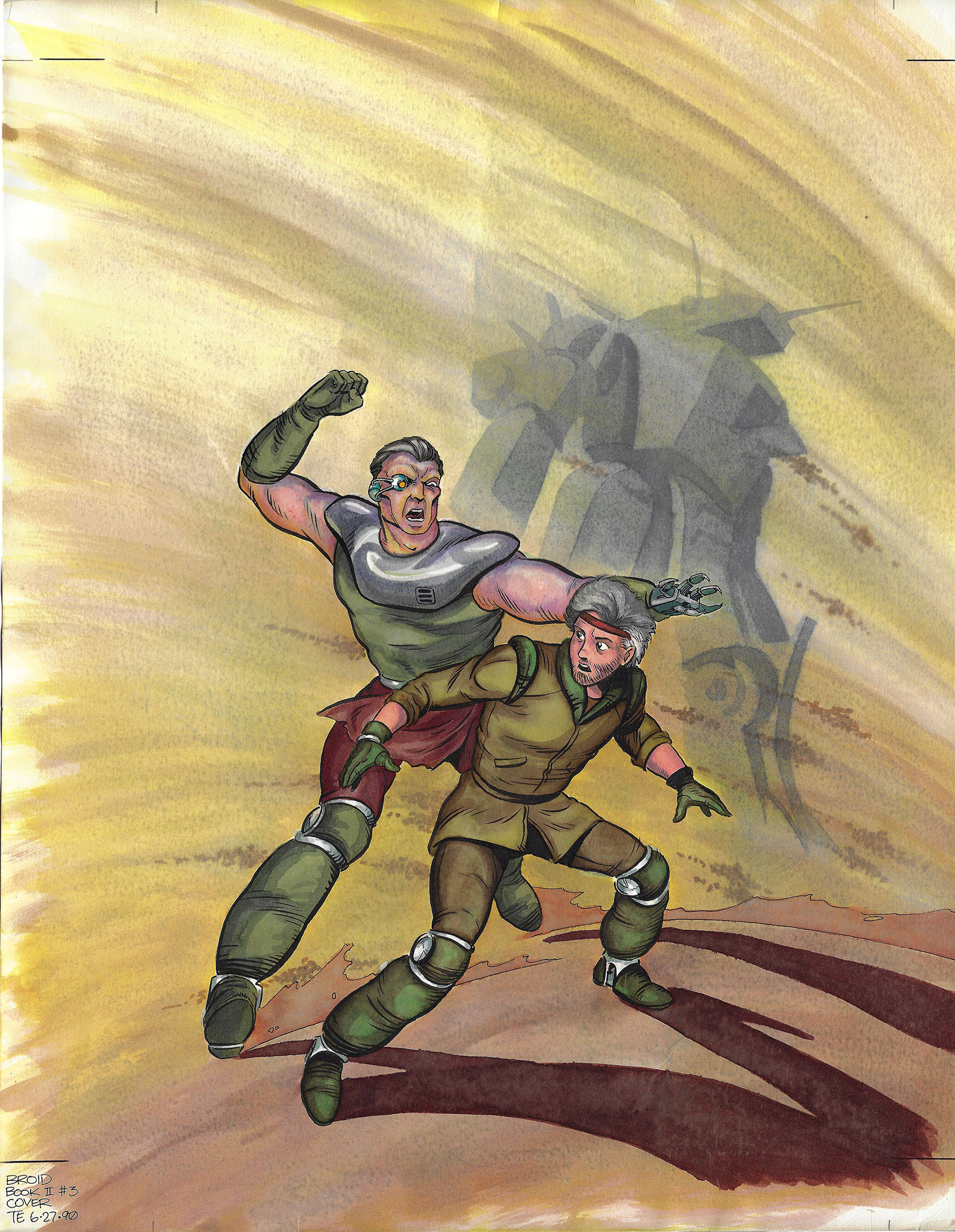
BROID: Shatterpoint #3, February 1991
We begin this issue with a changing of the guard on the enemy side. When the effect of this hits our rebel group head on, help comes from an unexpected source and a major step forward is taken on the path to the shatterpoint.
In the real world, it was June 1990 and my first few comics were in stores, so I should have been flying high. Instead, I was working harder than ever. I was now juggling three regular comic book assignments for Malibu: this one, the next Lensman series, and another original called Chaser Platoon (which I’ll get to in the future). This was necessary because I’d agreed to take less money for BROID just for the sake of getting to draw the four Shatterpoint issues. I was hoping against all odds that it would earn a sales bounce so I’d get to draw the last four issues to finish the series.
BROID #2 and #3 came out as I penciled this issue, and sales were only descending. That weighed heavily on me as I toiled away in my basement studio to keep cool in the sweaty summer. I’d draw three pages of one comic during the day, and just one BROID page on the night shift. Whenever I finished a page, I’d tape it up on the wall so I could see the book grow. As more pages went up, I kept telling myself those sales numbers would rebound. Hard work and faith in my story would win out in the end.
They did, in their own way. Regardless of BROID‘s fate (which I’ll get to pretty soon), I now had a full-time comics career that paid enough to let me work at home with my baby daughter, who was coming up on her first birthday. By every measure that mattered, that was success.
I had completed nearly 20 full-length comic books at this point, and was steadily improving with each one. There was still plenty of learning ahead and experience to be gained, but I was now reaching a level of quality that, while still uneven, hit some notable high points. I knew them when I saw them. Today they stand out to me as drawings I could not improve at my current skill level, over 30 years later.
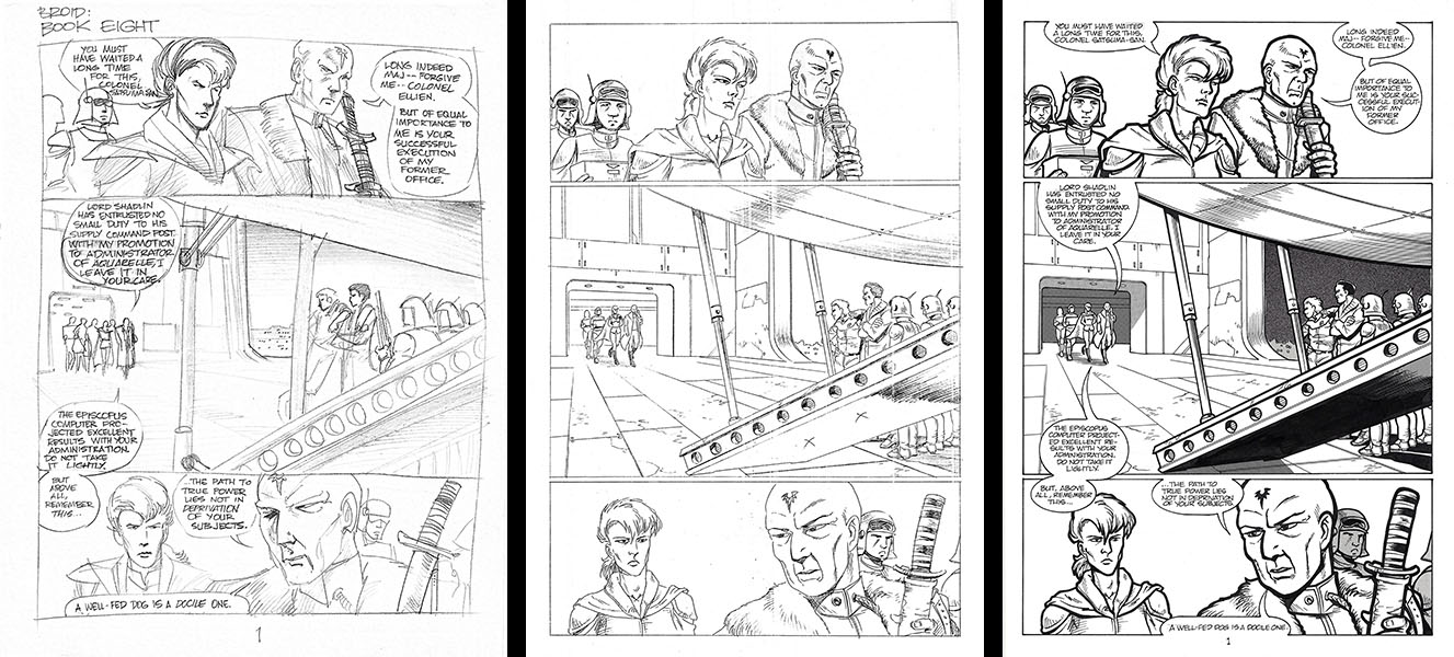
These two pages in particular rise above the rest. Not because of what I thought of them at the time, but thanks to some external validation. After finishing the pencils for this issue, I put photocopies in my portfolio and took them to the next big comic book convention (probably my first San Diego Comic Con). Those were the days when you could still walk right up to an editor at a company booth and try to catch their eye with your work.
One editor (at DC, if I remember right) looked at the bottom panel on the left page and said, “That’s great. There are guys who’ve been in this business for twenty years who can’t draw that shot.” That pretty much floored me. First of all, he called it a “shot,” as if we were making movies. And truthfully, the jargon we use to describe our work is loaded with filmmaking terms. Second, I sort of assumed guys who’d been drawing comics for twenty years could draw anything. That’s what kept them employed, right? MAN, did I have a lot to learn.
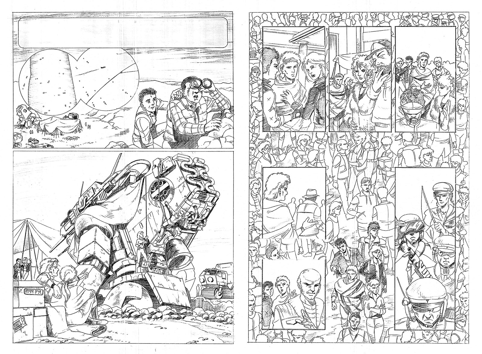
Another editor (for Eclipse, now defunct) looked through the issue and found something to pick at on every page. But when she got to the one shown above right, it stopped her in her tracks. “There,” she said. “That’s fantastic. That’s as good as anything out there.” At last, a positive. I pretty much realized I wouldn’t be getting any work from Eclipse, but that kind of feedback told me that at least I belonged on the playing field.
The one real letdown in the finished version of this issue was the lettering. In the days before digital production, the letterer would get the penciled pages before the inker and put all the word balloons in place. This meant hand-writing all the dialogue and drawing a balloon around it. It sounds easy, but you need to know a lot about layout and composition to do it right. This letterer didn’t seem to have a lot of experience in that area. Placement was awkward, the balloons weren’t well-crafted, and all the lettering was uniform with nothing in bold, which made it dull to look at. The letterer on the first four issues (Clem Robins) was a master at his craft. I wish I could have gotten him back.
Unfortunately, this would continue for a while on other comics. There was a point farther down the road where I started doing all my own lettering at my editor’s behest. It really was the best solution for everyone. And it opened up a whole separate career path, which I will get to later. For now, you’ve got Shatterpoint #3 to read.
Production period: June/July 1990 (penciling), November/December 1990 (inking)
Publication: February 1991