Comic book logos, 1990-91
I’m not personally invested in everything I’ve drawn. Sometimes it was personally meaningful, other times it was simply a way to keep my bills paid. Some artists spend their entire careers in the second half of that sentence, so I consider myself extremely lucky.
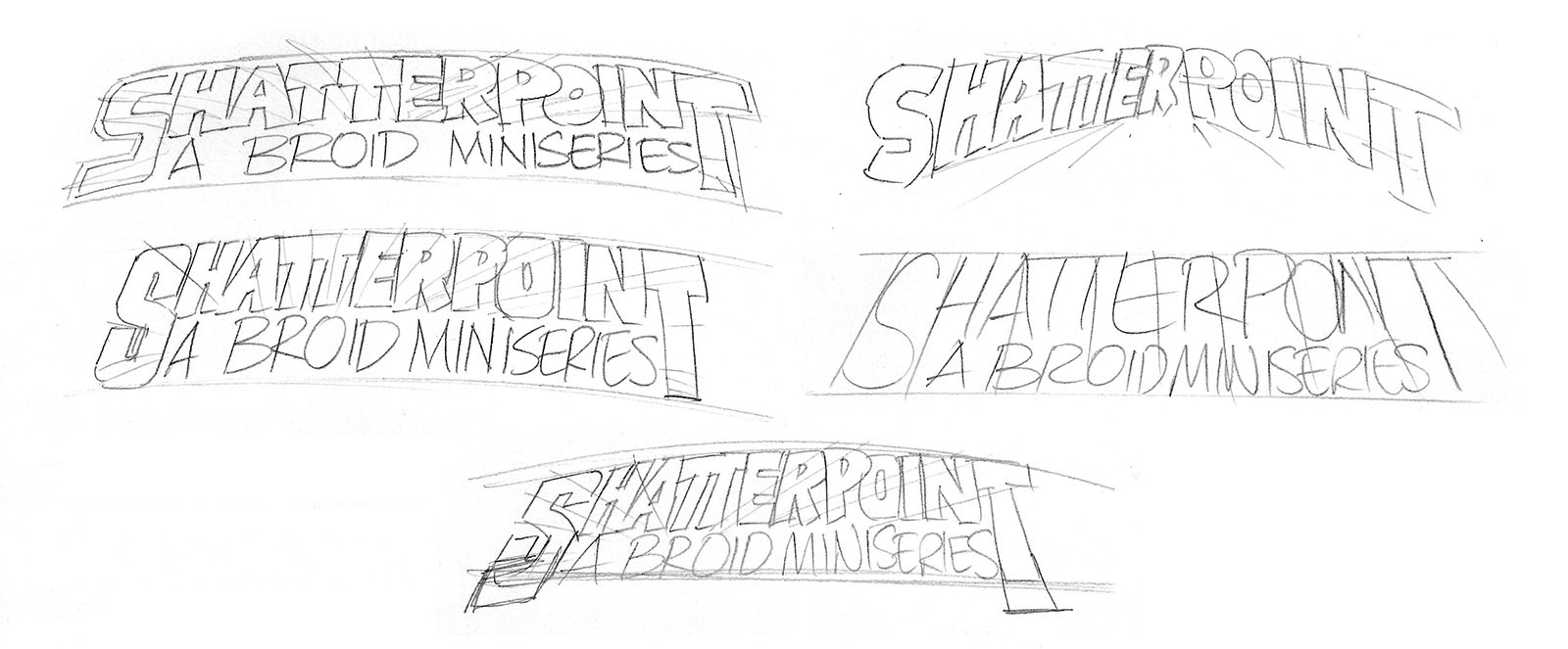
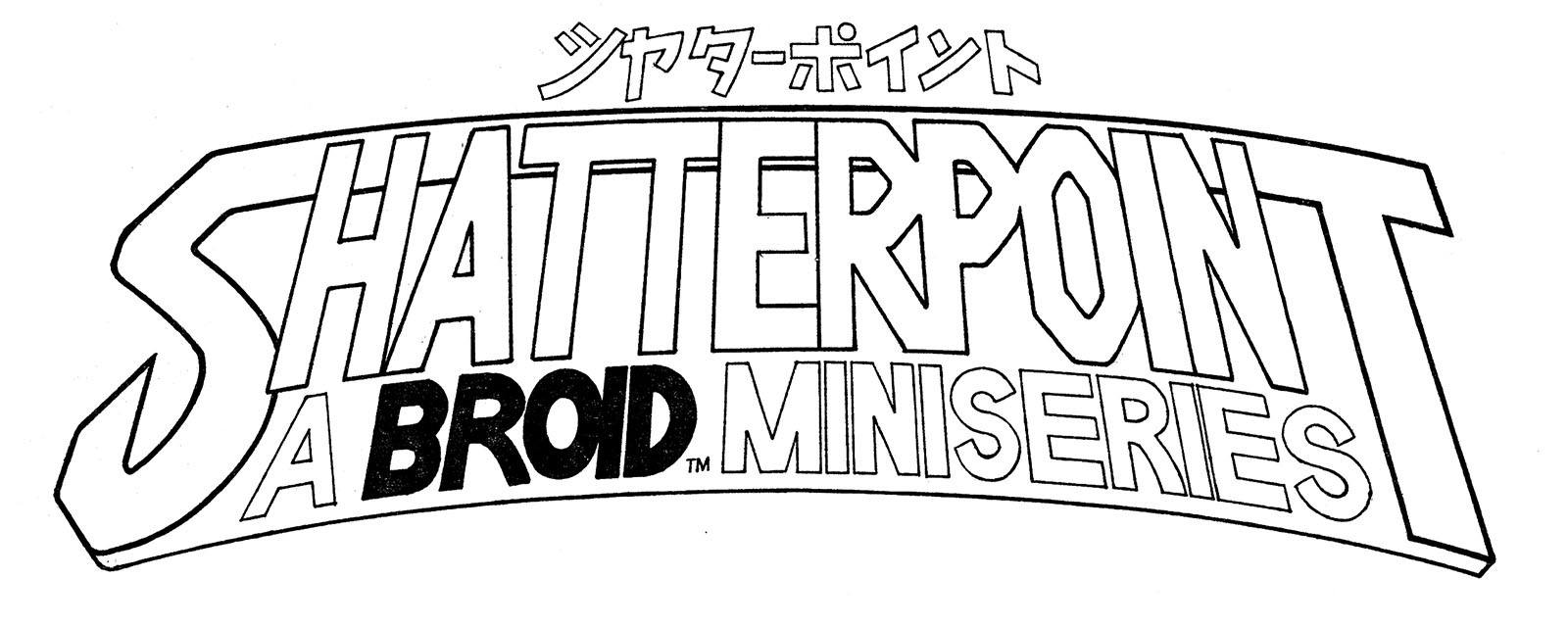
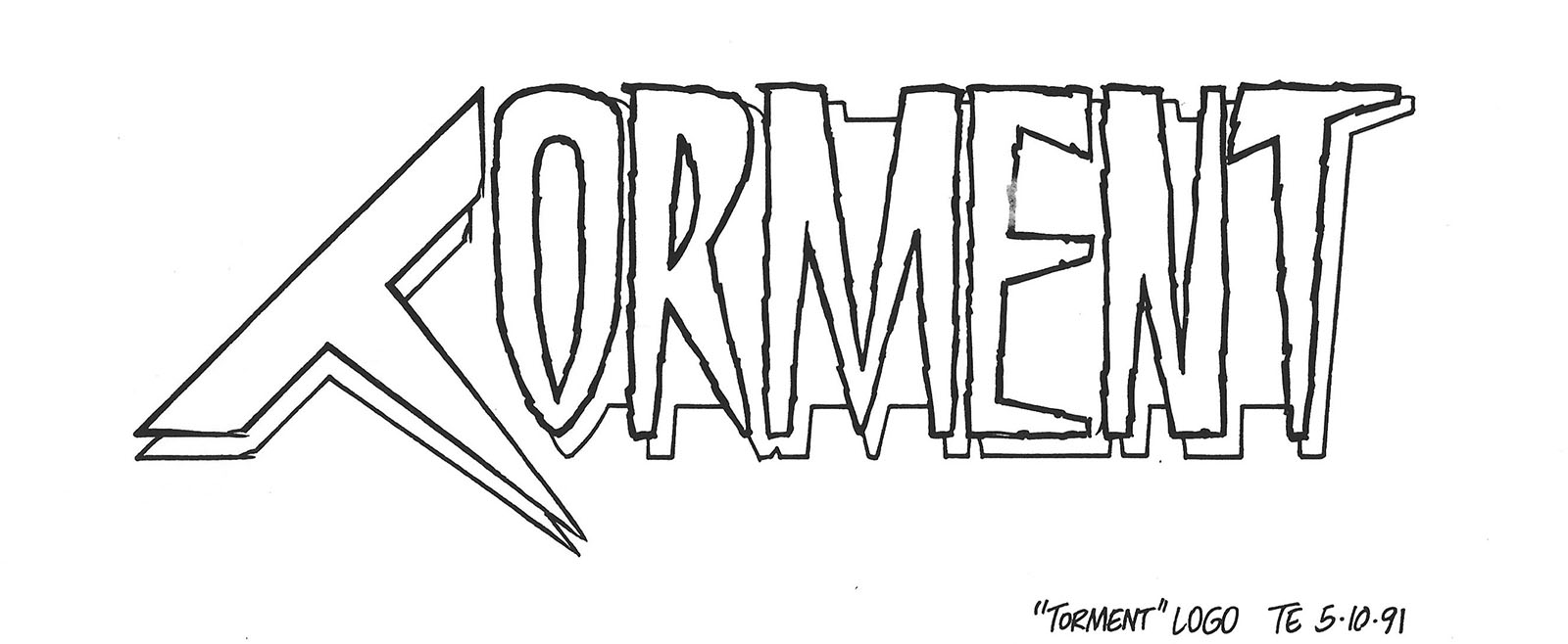
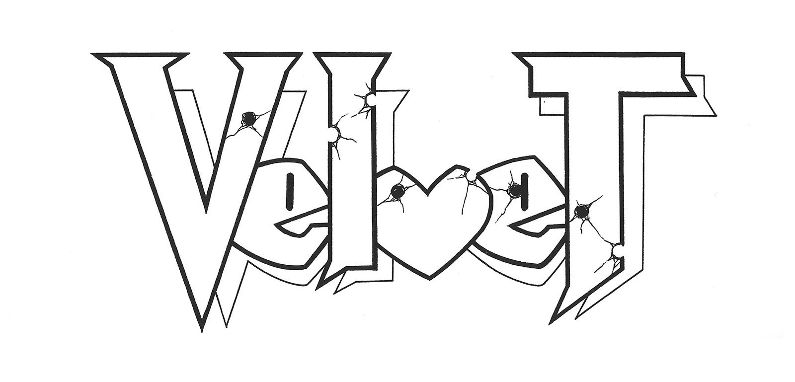
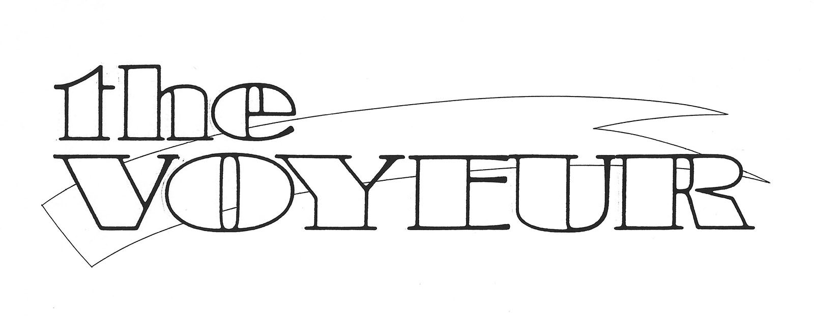
When it came time to re-brand the second BROID series for Eternity Comics, I had to come up with another name to freshen up the sales opportunities. The name I chose was derived from a significant moment in the story, a point where everything “shatters.” Thus, Shatterpoint. I whipped up a logo for it, and my editor was unexpectedly impressed by my design approach. This led him to offer me additional work: the creation of more logos for other comics.
Some were sketched in advance and sent to me for fine-tuning. Others were just words on paper to be logotyped from scratch. In each case, I knew nothing about the content of the comics. They were still in early production, so there wouldn’t have been much to go on anyway. Without context, I would simply react to the title and rough out an idea for consideration. I’d get approval and start drafting.
These days, logos are almost entirely digital products made by manipulating fonts in one way or another. Even back then, I would occasionally print out a font-version of a title and redraw it with variations. It was also important to add a buffer of some kind between the lettering and the cover art, otherwise the two could merge together and lose clarity. The number one job of a logo is to catch the attention of someone standing a few feet away, and you can’t do that if it’s fighting the artwork it’s supposed to be selling.
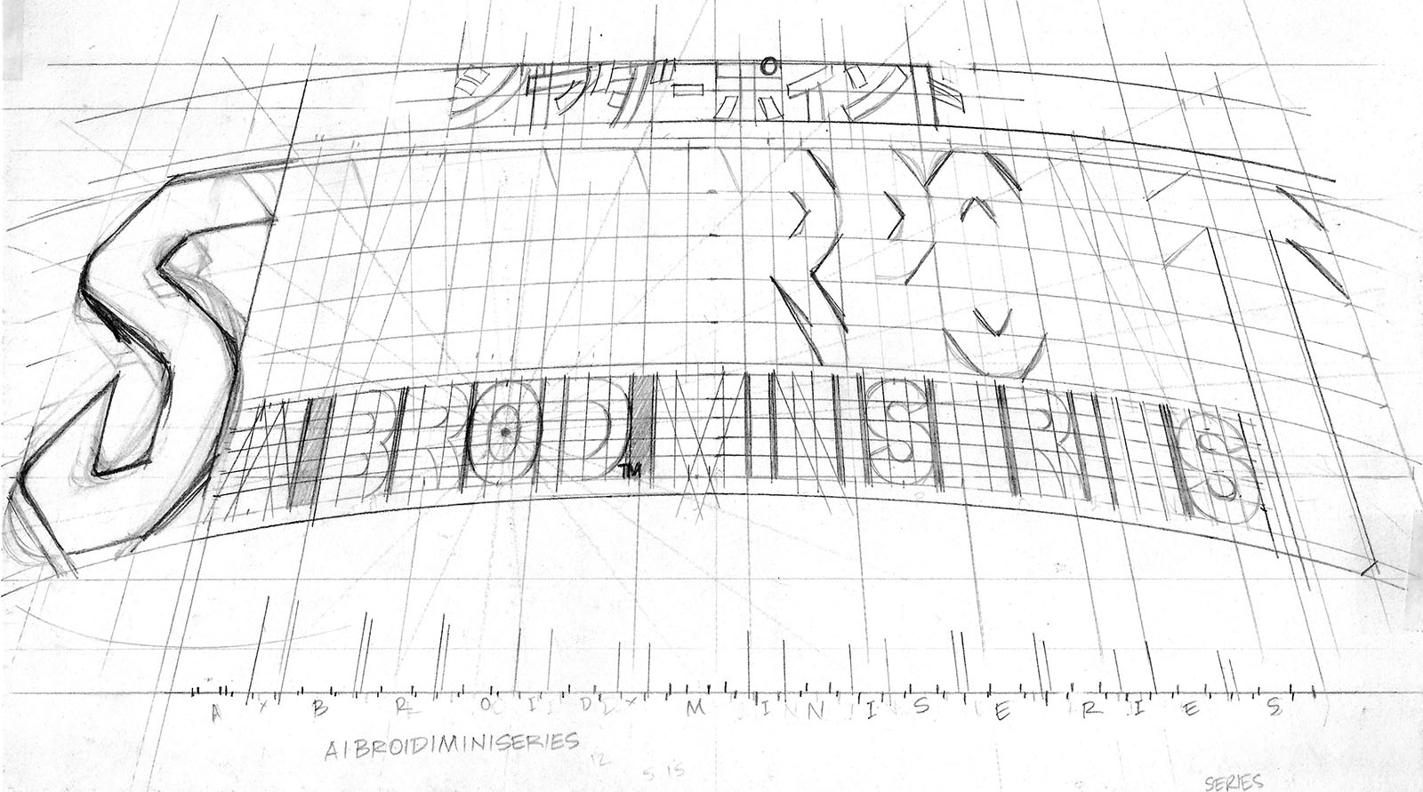
Developing logo skills isn’t too different from drawing itself; you find the foundational shapes that make up an object, in this case a letter, and render them at a precise angle. You can fall back on math, since most letterforms fit into a basic 3×5 grid with some reliable ground rules. But then there are the “cute” letters that bend those rules; I’s, O’s, M’s, and the too-cool-for-school V’s and W’s. As you experiment, you learn the importance of kerning – the spaces between letterforms – to graphic cohesion. Think of them as invisible letters that play just as big a role in readability. It was a huge help for me to have spent a few years as a typesetter before diving into this as a craft.
Anyway, I could go on and on about all the quirks and personalities of individual letters, but typography is a lifetime discipline. Check out a book (available on Audible) called Just My Type by Simon Garfield if you want to explore the topic further.
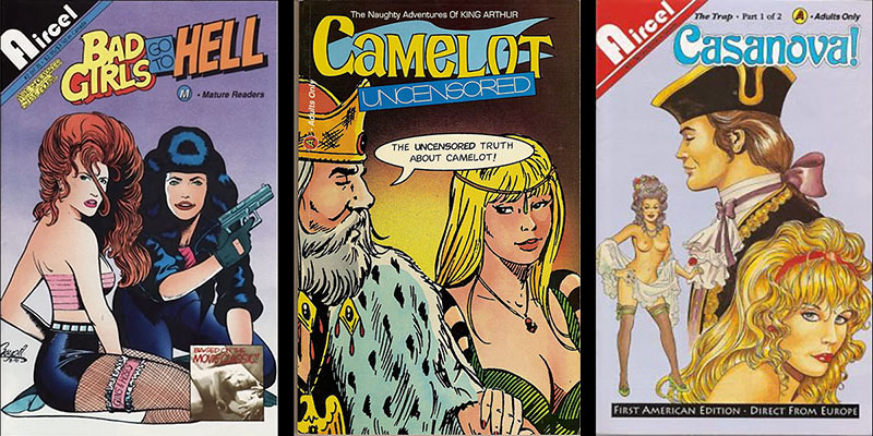
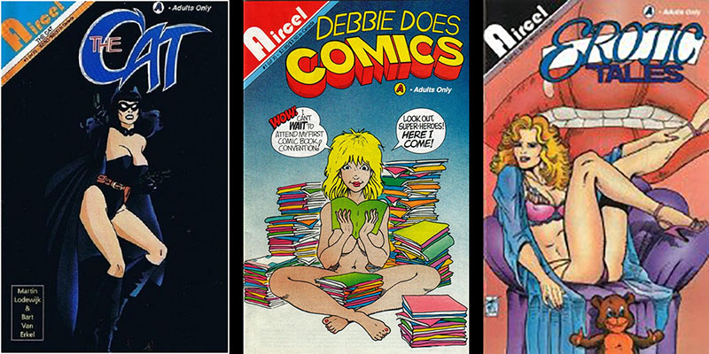
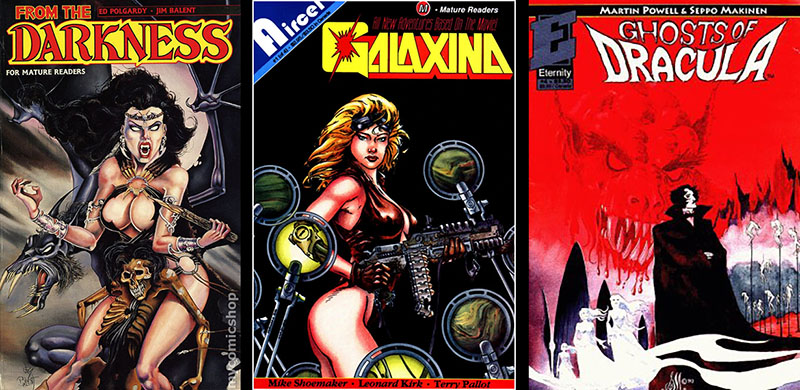
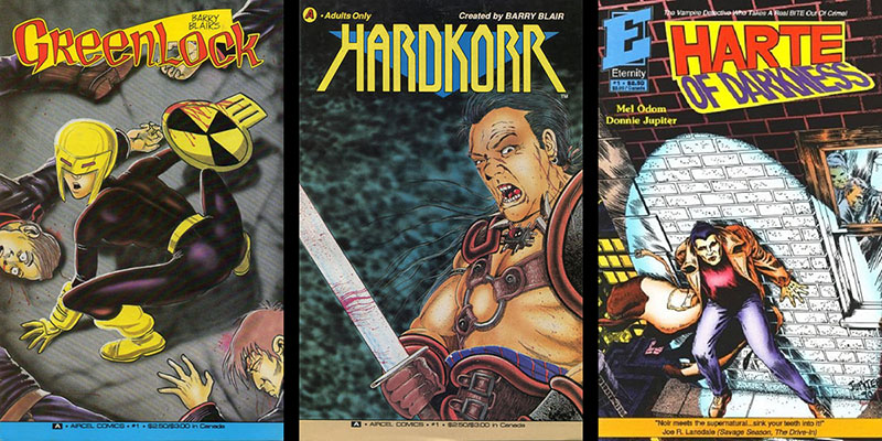
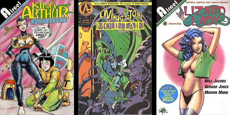
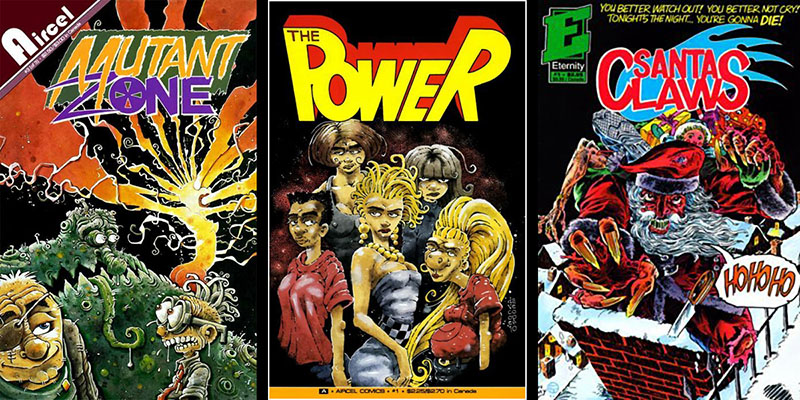
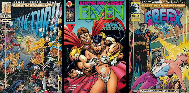
The punchline to this story is that for all the precision labor that went into these logos, they pretty much ended up as lipstick on pigs. Malibu had an imprint called Aircel that was the comic book equivalent of grindhouse cinema, pouring lurid material into the market with no apparent concern about its merit. By pure luck, it became the launch pad for the original Men in Black comics that led to the feature film franchise (and a TV cartoon that I briefly worked on). This was certainly not by design.
I’m not going to sugar coat this; it was pretty galling to crank out one logo after another for junk food while I was simultaneously struggling to make my own comics into full-course meals. But like I said, I’m not personally invested in everything I’ve drawn.
I didn’t think about these logos at all after they were done and I got paid for them. I basically rediscovered them when I dug into my files for ArtValt content. When I went searching for images of the comics they appeared on, it reminded me what a sketchy, schizophrenic company Malibu was. There were certainly good things about working there, but I’m sure all my fellow alumni would be happier about it now if there had been fewer weeds in that garden.
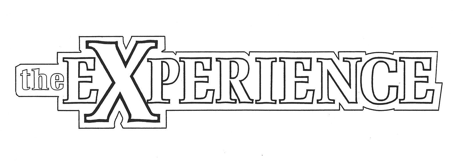
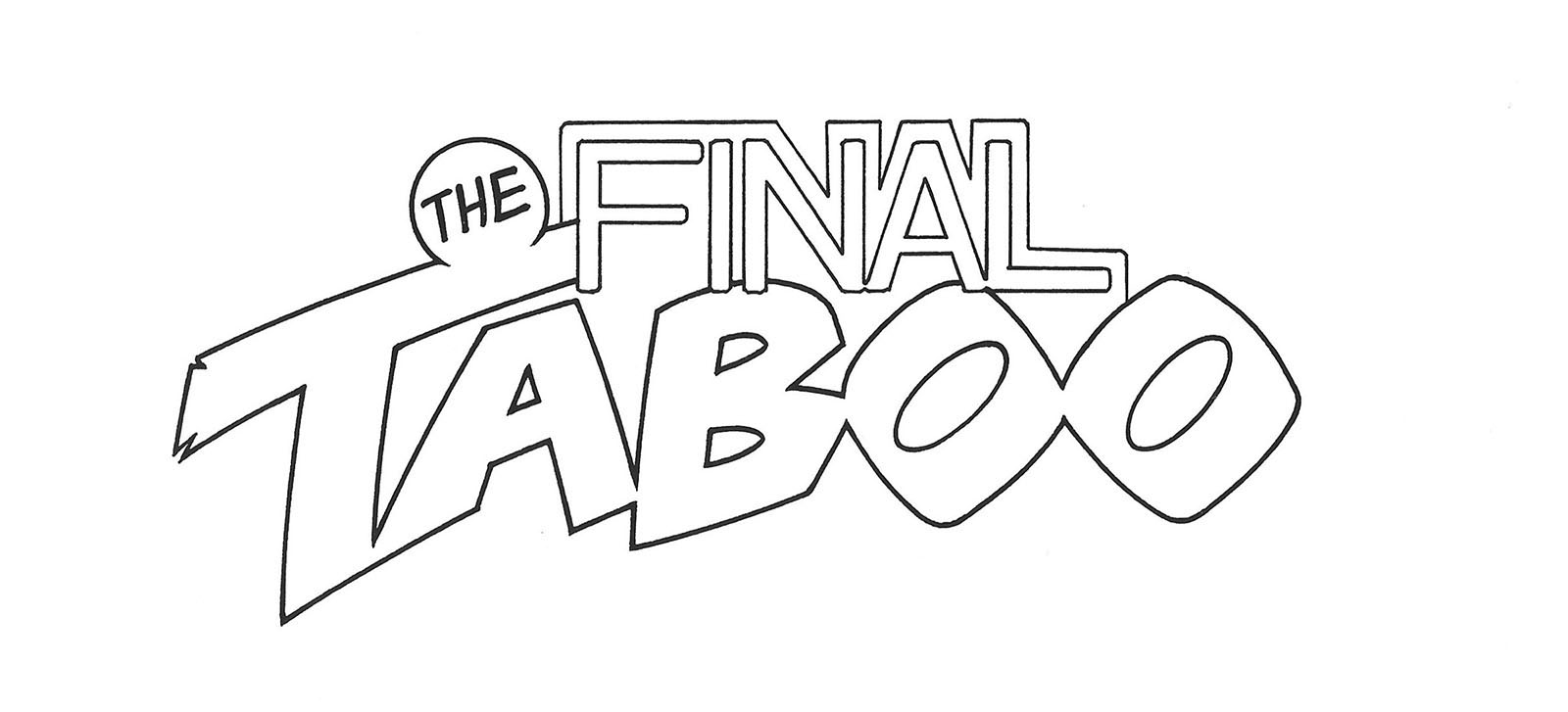

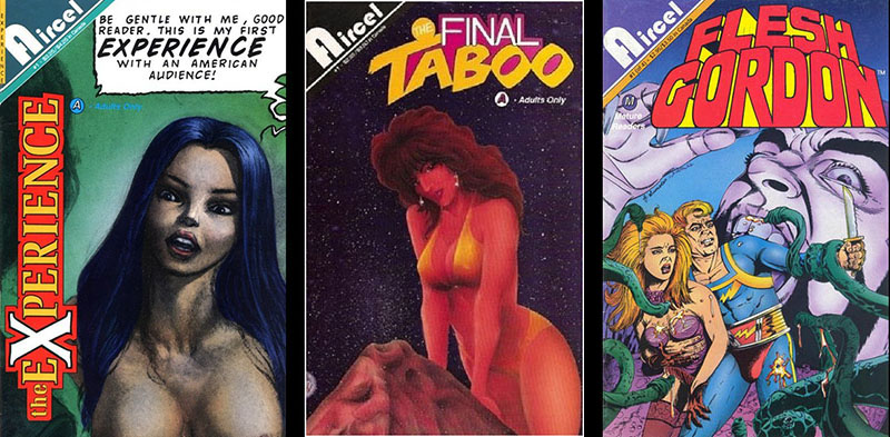
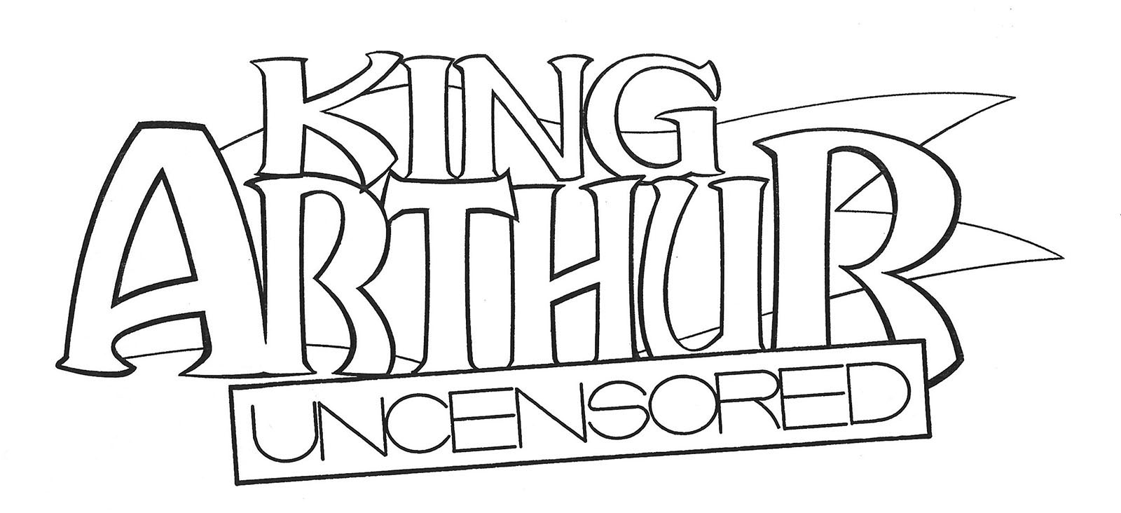
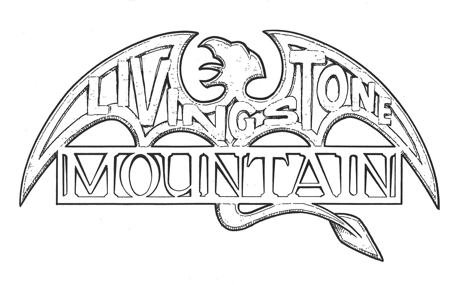
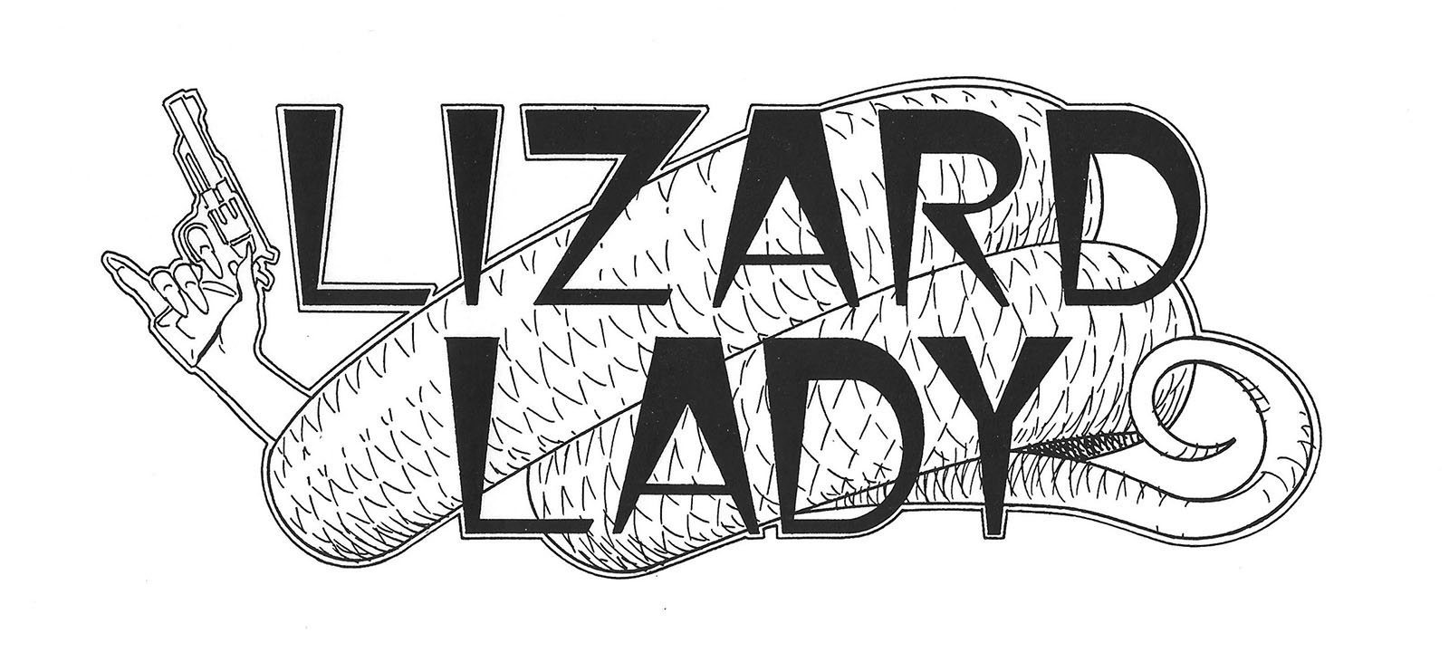
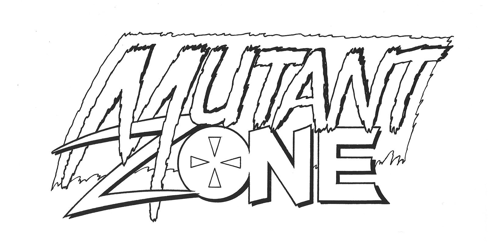
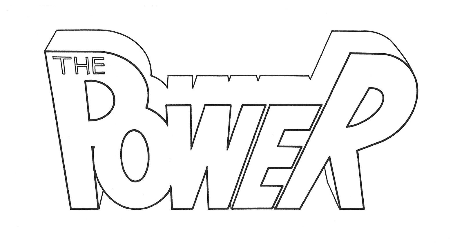

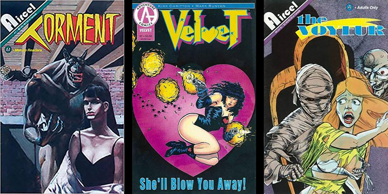
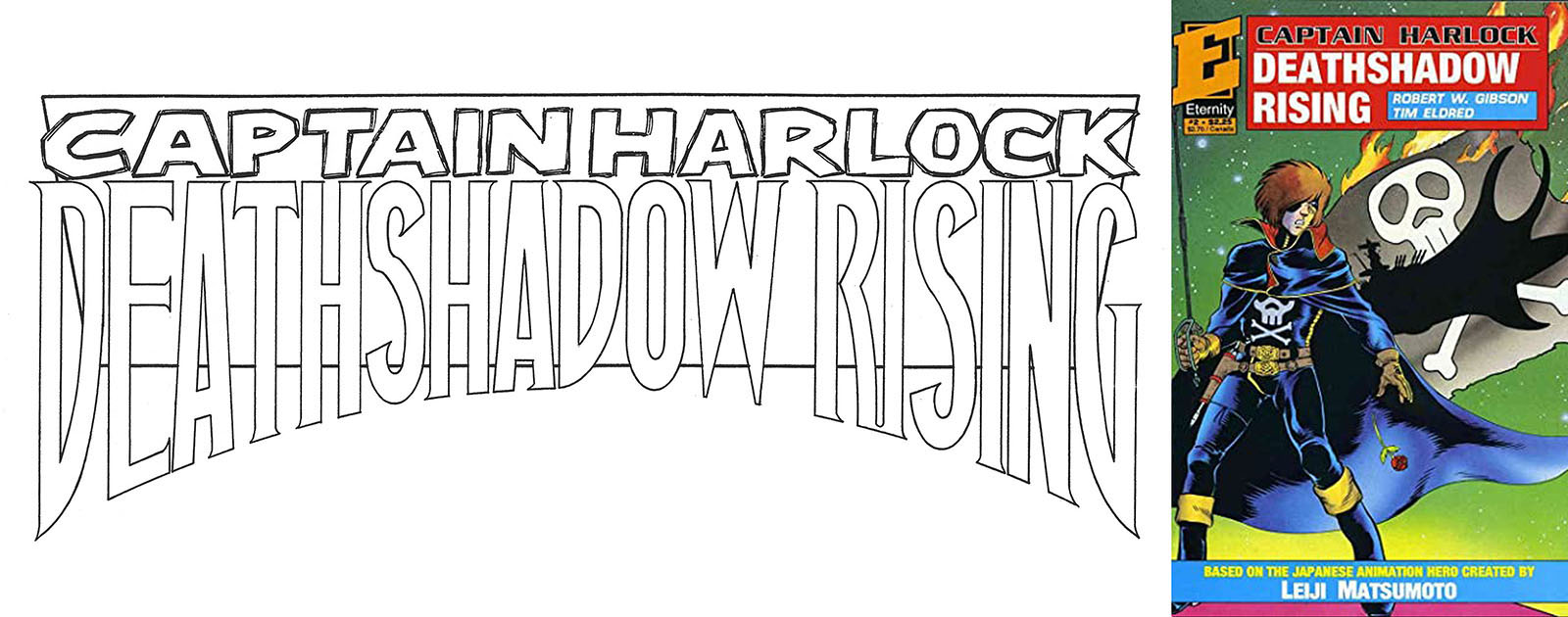
I couldn’t find images of finished comics for these three. They may not have seen publication…
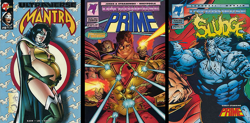
When Malibu decided to level up in 1993 with a new lineup of mainstream superhero titles, I got to design some of their logos. Here are a few…
Of course, I also created logos for the comics I was personally invested in, since I drew them. This did not guarantee that they got used. This one, for example, was dropped in favor of a font treatment. I don’t remember why.
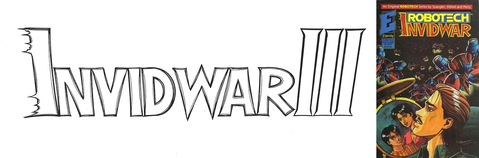
This one was partially used. I suggested that we do three separate series for this Robotech title, calling them Invid War I, Invid War II, and Invid War III. We could just add a numeral to each one. But it was decided to do it all as a single unbroken series, so all three numerals were lopped off.