Lensman: Secret of the Lens, 1990
Dark Horse’s MECHA series was my first professional comic book assignment, but in every sense that matters, Lensman: Secret of the Lens #1 was my launch pad as a professional comic book artist. Like most pivotal things in life, it was a right time/right place situation.
As reported elsewhere on ArtValt, I first conceived of BROID back in 1987. Rather than waiting to find a publisher, I just dove in and wrote/drew it one issue at a time all the way to the end. I knew what I wanted it to be and didn’t need anyone’s permission to make it. That decision made all the difference, because when I approached Eternity editor Chris Ulm at the 1989 Chicago Comic Con with a STACK of finished roughs for 13 issues, he knew I meant business.
Naturally, he wasn’t in a position to say yes to it on the spot. We’d have to communicate after the event. But during our conversation, another door opened that I had no way to anticipate.
“We just landed adaptation rights for an anime series called Lensman. Would you be interested in that?”
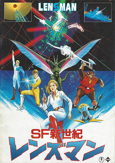
If this was a TV show, that’s the moment where the picture would spin into a flashback. Summer 1984. Anime was exploding in Japan. Out of nowhere came a movie called Lensman with cutting edge (for the time) CG graphics, slick designs, a fresh pop soundtrack, and some impressive big-screen animation. I got to see it on VHS the following year and liked it quite a lot. It took way more inspiration from Star Wars than from the 1930s pulp novels it was sort of based on, but that was fine by me. I hadn’t read those novels yet, so I just took it on its own merits.
I bought some of the merch, had fun rewatching the movie, collected episodes of the followup TV series, and then moved on to other anime. Those who had read the original novels (written by E.E. “Doc” Smith) pretty much wrote off the Japanese version, but did enlighten me on how important Lensman was to the history of science-fiction.
The Lensmen in the stories were guardians of peace and justice in space, precursors of the Green Lanterns and the Jedi Knights. “Doc” Smith essentially created the genre of space opera as we know it today. So as it turned out, I had him to thank not only for this job opportunity, but for creating the playground I’d been romping around in since I started drawing in the first place. (Read more at the Wiki page here.)
By 1989, there were plenty of anime properties I would have rather drawn than Lensman, but I was uniquely positioned to take it on. I knew a lot about it, I had reference material at my fingertips, and I was 100% ready to draw comic books for a living. Plus, hooking up with a company that published anime-based comics might open a path to some of those other properties.
Short version: I said yes.
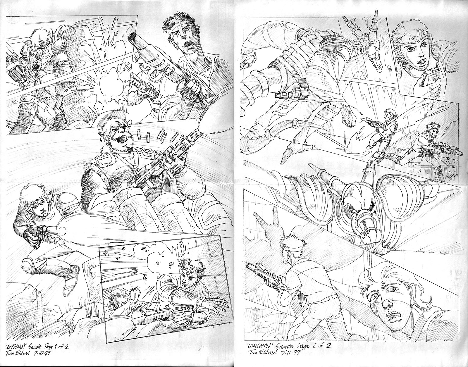
That meeting in Chicago happened the first weekend of July. Work would begin by the end of the month. Two things needed to happen in the meantime: I bought and devoured the original novels and drew a penciling sample for Eternity as a tryout. It was a hole in one, and the race was on. Like I said, right time/right place.
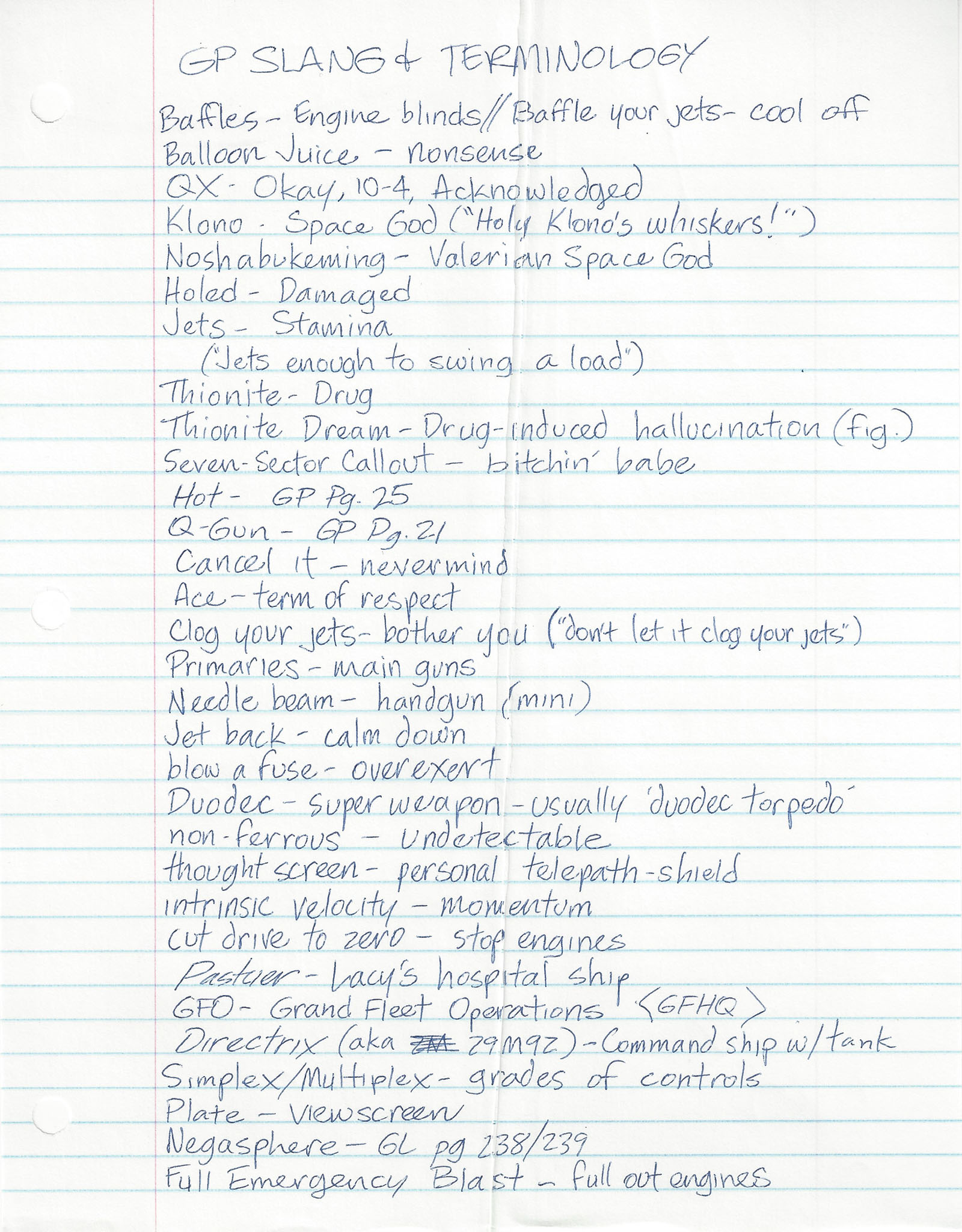
I definitely saw what everyone meant about the anime being nothing like the original. The novels leaned heavily into science and physics as a counterpoint to the huge scale of the space fantasy. It was known that E.E. “Doc” Smith’s estate was not happy about the anime, and were basically disowning it. They had no connection to our project, since the licensor was Harmony Gold, who obtained publishing rights from the Japanese production company. So no part of the novels was available for our use. I found this out when I suggested we adopt some of the cooler Smith jargon into the dialogue and was told that even this was off-limits.
Regardless, here’s the Galactic Patrol lexicon I recorded as I read the novels. Fun, but useless.
A writer named Paul O’Connor had been assigned to the comic and was already underway. The plan was to split up the two-hour movie into six issues, following a standard that (I think) was set by Marvel’s Star Wars adaptation in ’77. Any more and it would move too slowly. Any less and we’d be cutting stuff out (though Marvel managed to get Return of the Jedi into four issues). Six was comfortable enough to get everything in without compromise.
I did come up with an extra story layer early on, though; the one thing Lensman readers REALLY hated was that the hero gets his lens as a “gift” rather than earning it through hard training. So, I thought, what if it’s not a “real” lens? What if it’s a phantom that appears and disappears, as if testing him? Maybe that would mollify some haters. Fortunately, Paul liked the idea and wove it into his adaptation.
As he was writing, I was sketching. I gathered up all my references (including model kits, which would make my job WAY easier) and made some drawings for myself. I also worked up ideas for covers and ads, which were going to be necessary if we wanted people to actually know about what we were doing.
There would be standard and “collector’s edition” versions of the first issue. The collector’s version would have a foil-stamped cover logo and extra pages with production material from the anime. (Provided for by Harmony Gold’s rights, I assumed.) For the first time, my responsibility would be to transform someone else’s words in a script into pictures on a page. As it turned out, after making my own comics for about twelve years, I was qualified. And if I could prove that with consistent productivity, a publishing agreement for BROID would follow.
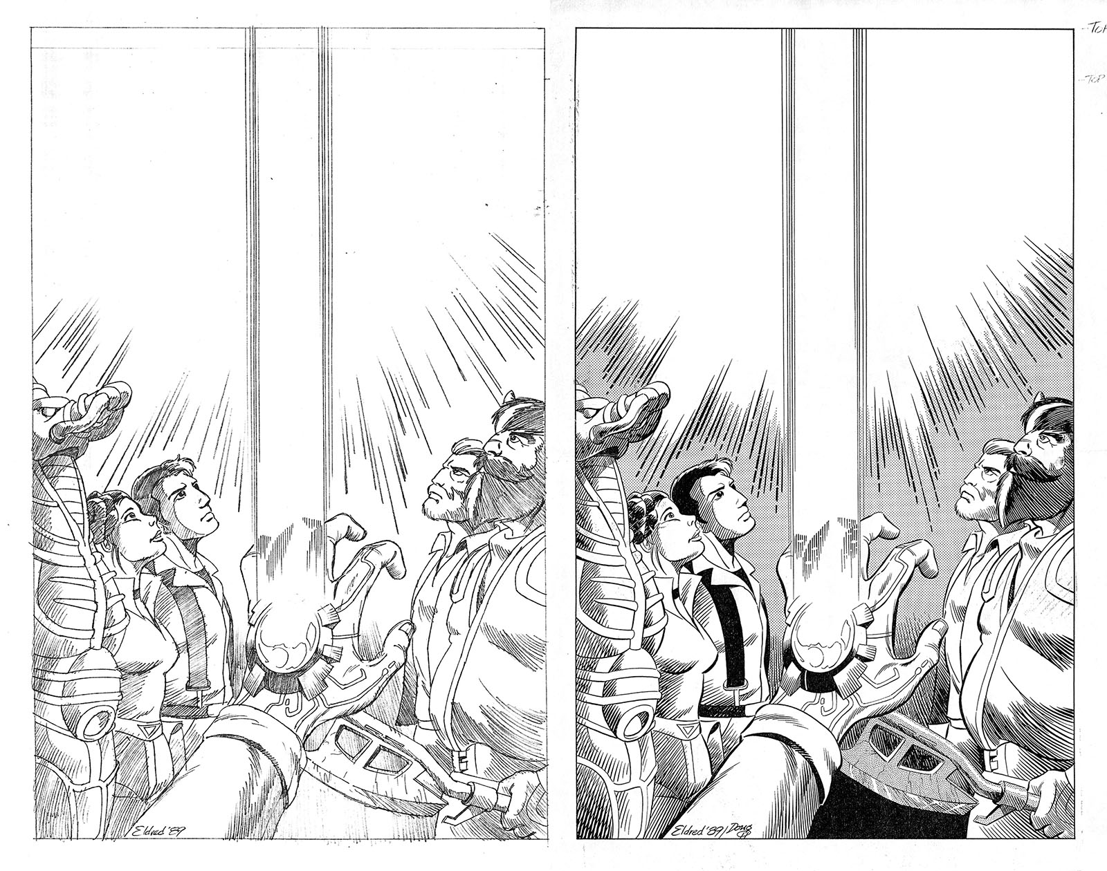
My first art after being officially hired, an ad concept inspired by the “Lightsaber” poster from Return of the Jedi.
Inked version by Doug Hazlewood. Every time I see this again, I wish Doug had been the inker for the whole series.
Perhaps that way we could have avoided some drama. See more ad art from the startup phase here.
Then there’s the OTHER thing that was happening in July 1989: I was in my final countdown to fatherhood. My daughter was within a month of arrival, due sometime in the first half of August. My wife and I started Lamaze classes around mid-month and took one trip to the hospital on a false alarm. During this time I started thumbnailing pages from Paul’s first script. We went into the hospital a second time on Sunday, July 30 for what we thought was another false alarm, because the baby wasn’t due for another two weeks. I knew it would take a while, so I brought work with me and designed Lensman pages while we waited to be released.
Imagine my surprise when the obstetrician came in and said, “We’re having a baby tonight.” And within a couple hours, we did. I became a professional comic book artist and a father on practically the same day.
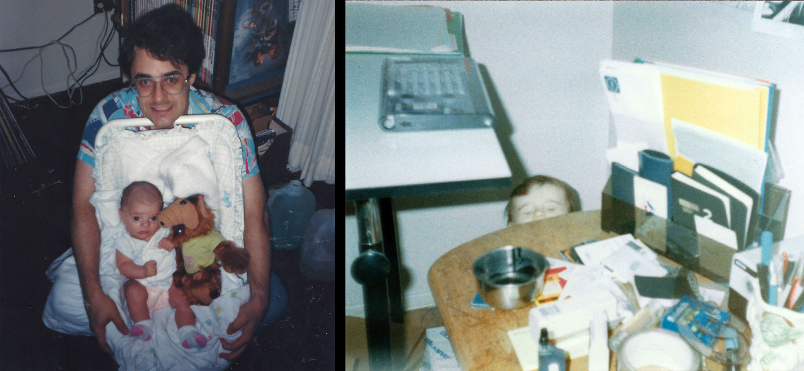
Left: my daughter Genevieve in her first month on Earth (with her first friend ALF).
Right: About a year old, taking her first steps in my studio (which was also her bedroom). Her son is now older than that.
Another thing that had to fall into place was an inker for the series. I’d met about a dozen or so other artist-hopefuls in an APA group (read more about that here), and the one that seemed most ready to make the jump into the pro world was a guy named Paul Young. His ink lines were very precise and controlled, important qualities for a series like this. I recommended him for the job and my editor agreed.
Malibu didn’t pay a lot for inking, balancing a very low page rate with the promise of royalties down the road. Because of that, they couldn’t be picky. Basically, anyone who was willing to work for peanuts was worth considering, so Paul Young was accepted without much fuss. They also had letterers who regularly handled their other titles, so lining one up was easy. And with that, all the roles were filled.
The demands of inking – and the vital importance of finding the right inker – just might have been the most important lesson I learned in my inaugural year. I’ll share that lesson in the liner notes below.
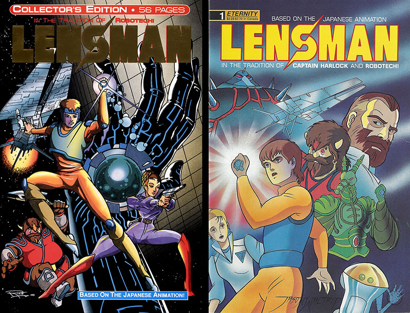
Cover art by Doug Rice (left) and Jason Waltrip (right)
Issue 1: Arrival
February 1990
Penciled early August 1989
Inked by Paul Young
Click here for roughs | Click here for pencils | Click here for inks | Click here for Collector’s Edition bonus pages
As I write these words, it’s been 32 years since I drew this comic, and looking back on it is just like looking back on my first year as a father; some parts are embarrassing, but others came out better than expected. The most embarrassing part is the figure drawing, which is just barely holding together in some panels. At the time, visual storytelling was a much higher priority for me. Finding the right images to land on and connecting them to each other is the real craft of drawing comic books, and the part that I always find the most interesting. Back then I thought of everything in those panels – including the characters – as props in my film shoot. As long as I transmitted what the script conveyed, I figured I was hitting the most important target.
Today, to my relief, I can say there isn’t much I would do differently in terms of presentation. Graphically, they still hold up. But since then I’ve learned a lot more about acting and psychology, so I’d work harder to make the characters more than props.
Reviewing old work has never been painful to me, because it’s another kind of learning experience. Inevitably, I spot a problem that got solved over time. Example: in issue 1, I hadn’t yet figured out how to draw ears properly. All those twists and curves were hard to reconcile. The remedy for it was having a baby sleeping next to me at the drawing table. She’d lie there with her head turned just right to be my live model. That’s how I eventually got it.
So that’s my advice to you beginners. Can’t figure out how to draw ears? Have a baby.
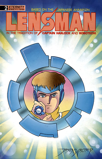
Issue 2: Legacy
March 1990
Penciled late August 1989
Inked by Paul Young
Click here for pencils | Click here for inks
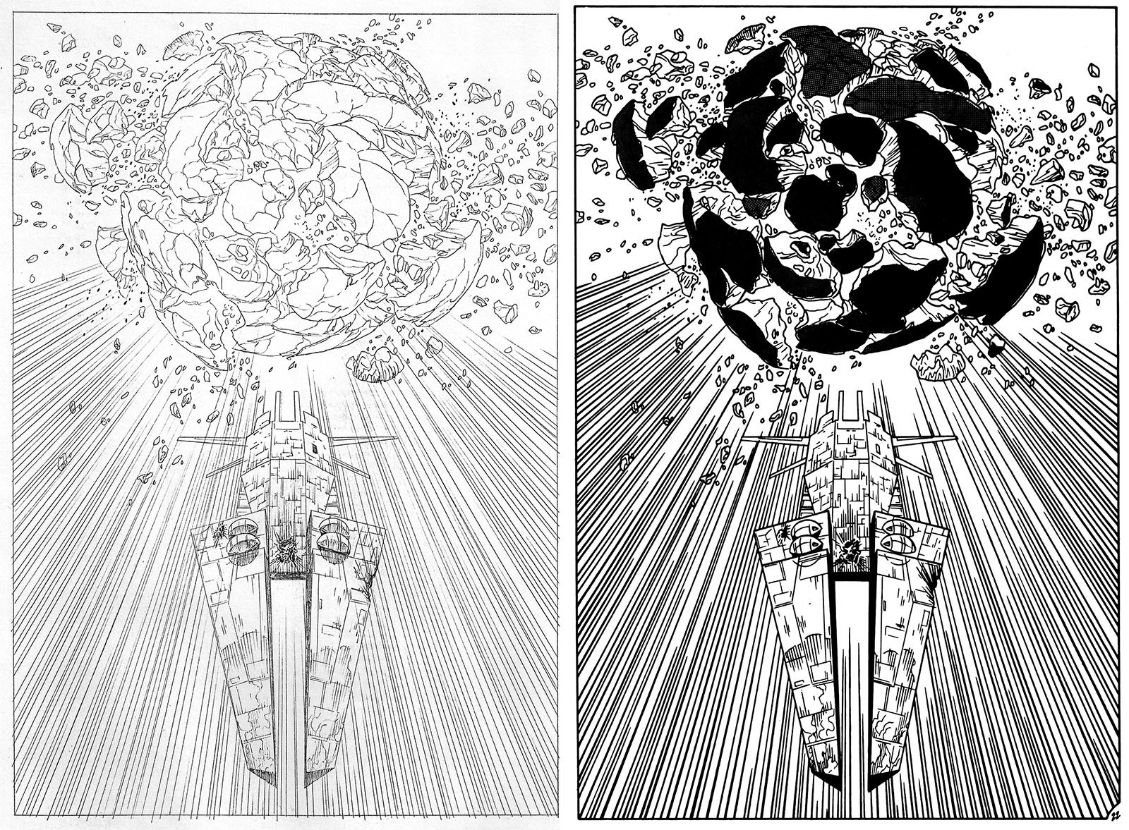
Now it’s time to talk about inking. Before this, I’d only had a little experience drawing in pencil for someone else to ink over. This was much more demanding than penciling just for myself; I could leave out a lot of detail because I would just draw it later in ink. But turning penciled pages over to another artist means you can’t leave out ANYTHING. In effect, you’re drawing the finished comic the way you want it to look and hoping they interpret your drawings as you intended. On Lensman, Paul Young did not accomplish that task.
Paul’s approach was quite heavy-handed, which shouldn’t have surprised me based on his track record as a cartoonist, but seeing his style applied to my pencil lines was kind of shocking. Where comic book artists traditionally used brushes to add variation to their linework (commonly referred to as “thick and thin”), Paul went in with pens that took all the nuance out. Every line was about the same thickness as every other line, which drained all sense of depth out of the art. This approach can work if you get color in there to restore definition, but this was a black and white comic, so we didn’t have that to fall back on.
In issue 2, the one moment that brought this lesson down hard was the page below. It was my favorite single image in the issue, and it was heartbreaking to see so much of the delicacy get lost. Penciled version on the left, inked on the right. It was only going to get worse from here.
Issue 3: Helmuth
April 1990
Penciled late Sept/early Oct 1989
Inked by Paul Young
Click here for pencils | Click here for inks
Something happened when I started on this issue, which I didn’t expect: I was suddenly a better penciler. I’d drawn the first two issues back to back, during which time I finally got the long-awaited green light to start on BROID. The first issue was double-length, so I took four weeks off from Lensman to draw it, then came back for this one. As soon as my pencil hit the drawing board on page 1, I felt like a whole new artist.
I’d scheduled myself to draw three pages a day, and when I stepped back at the end of the first day I couldn’t believe what I was seeing; far more detail and intricacy than anything in the first two issues. I’d improved organically just by putting in the work, and it was invigorating. I can truthfully say I wouldn’t change a line of it today. It didn’t even matter that Paul’s inks would brute-force all the nuance out of it later, because I now had a new sense of what I was capable of.
The other milestone for issue 3 was the start of a whole second Lensman spinoff comic. Looking ahead at the calendar, I recognized that I was far ahead of schedule; I would finish penciling the first BROID series several months before we knew if sales would support the second series, which meant I’d have a gap in my income. What could possibly fill that gap?
Lensman #3 gave me a ready answer. Since some new characters step into this issue and then vanish again, I thought it could be cool to follow them into their own adventure. I suggested this in a phone call to my editor, and he couldn’t say “yes” fast enough.
I hope you can appreciate how unusual that was. The print order for Lensman #1 was still a couple months away and I had nothing else published yet. But Malibu already had a successful track record of Robotech spinoffs, and they considered Lensman to be in the same ballpark. Besides, they could recover the licensing fee faster with two comics than with one. Using Lensman #3 as a starting point, I wrote up a proposal for a 5-issue miniseries called Galactic Patrol, which I would create myself. Within a month, I started drawing it.
Sausage-making Footnote: I submitted a cover drawing for this issue that was not used, because it only had spaceships in it. The editor offered this explanation for rejecting it, which I will quote word for word: “There are two kinds of covers that always sell: a naked woman, or something blowing up.”
I have yet to see a cover of a naked woman blowing up, but by that logic it should break all the records.
Issue 4: Dragon Warrior
May 1990
Penciled late Nov 1989
Inked by Paul Young
Click here for pencils | Click here for inks
After taking six weeks off to pencil two issues of BROID and the first issue of Galactic Patrol, it was back to Lensman again. For my money, this was the best single issue of the six; I came in with three more comics under my belt (more time to improve), Paul’s inks were a little more in tune (still not perfect, but more complimentary), and I finally got to draw Worsel, the coolest character in the movie. He was the first actual lensman we’d seen since issue 1, and it gave us a chance to exercise more of our subplot with Kim’s lens not being quite what it appears.
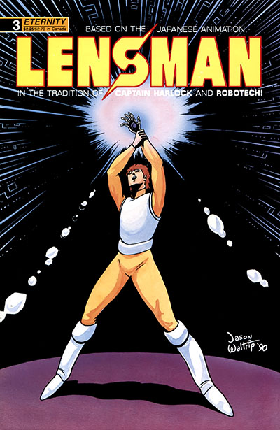
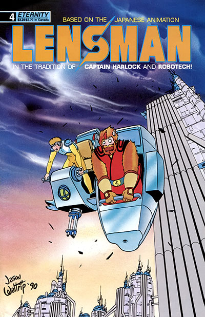
This might be a good moment to mention the covers. I had no involvement with them until #6, since the editor had assigned them to Jason Waltrip from the start. Jason was one half of the “Waltrip Brothers” who had been drawing Robotech Sentinels for what seemed like forever. I wasn’t a fan. Robotech had lost its shine for me by then, and I always found their art to be…immature. Sentinels just went on from one month to the next, never growing or improving. Plenty of readers bought it, but I’d be surprised if that was due to the art.
I understood the strategy behind hiring Jason, since Malibu wanted the Robotech audience to become the Lensman audience, I just didn’t think a Waltrip cover was the best way to do it. They were pretty bland and probably wouldn’t attract anyone outside the Robotech bubble. And to me that huge signature sort of implied Jason did the whole book, which was bad form.
I bring it up now because the cover scene for Lensman #4 doesn’t take place until #5, which seemed like a bonehead move. A Worsel cover would have been a slamdunk, but nobody asked me for a vote.
Issue 5: Healthy Anarchy
June 1990
Penciled late Jan 1990
Inked by Paul Young and Jimmy Palmiotti
Click here for pencils | Click here for inks
I took another six-week break to pencil the 4th issue of BROID and two issues of Galactic Patrol, then dove into this one with gusto. I’d looked forward to it since the beginning, since it adapts my favorite part of the movie, a rip-roaring chase sequence through an industrial environment. The animation is still amazing today, and I wanted to do it justice.
Chase scenes are generally avoided in American comics because they take up a lot of pages and don’t leave much room for story, but this was a rare instance when it would work (and it ended up taking about half the issue). This part is also chock-full of aliens, which gave me plenty of chances to plant Easter Eggs. Look closely for them.
On the other hand, this issue was the breaking point for Paul Young.
Out of the blue one day, I got word from the editor that Paul turned the issue in half-finished, claiming it was impossible to ink. He simply gave up without telling anyone in advance or asking for help. This forced the editor to find another inker to fill in, which brought Jimmy Palmiotti on board. It’s kind of amazing to me that this happened. I didn’t know who he was then, but he later became a big-time Marvel artist. He took it as a rush job and had to do a lot in a short time, but he used a pen/brush combo that finally captured the kind of linework the penciling begged for, so I was relieved to see it.
Paul was also relieved, but in a different way. By the time he sent back #5 unfinished, he’d gotten the art for #6 and inked three pages of it. He said #6 was much simpler, and he was good to keep going. Scoffing at this presumption, the editor instructed him to send back ALL of #6 without inking any more of it. In other words, Paul was relieved of duty. And that drama was over.
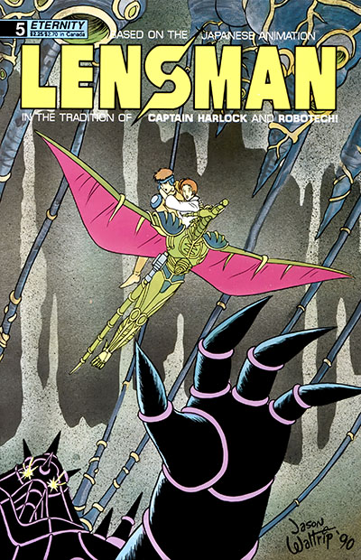
Meanwhile, Jason Waltrip’s last cover for the series represented a scene that (A) wasn’t in this issue and (B) did not appear in our adaptation of the movie. So that was weird.
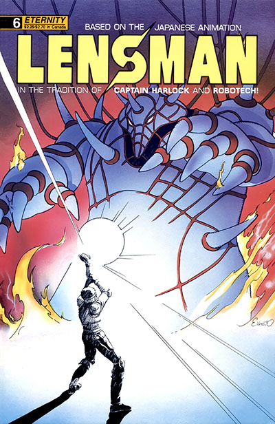
Issue 6: Showdown
July 1990
Penciled early March 1990
Inked by Paul Young and Jimmy Palmiotti
Click here for pencils | Click here for inks
I took a month between #5 and #6 to finish off the last two issues of Galactic Patrol, which synced up perfectly. GP #5 and Lensman #6 cross over with each other and lead to the same finale, which was a great way to conclude both projects.
The real challenge this time was to capture the climax of the movie, a videogame-style mind battle that was rendered in CG with lots of TRON-style faux-airbrushing and abstract shapes. It was cutting edge in 1984, but got quickly outdated as technology rocketed forward. Either way, we couldn’t capture anything like it in a black & white comic book, so Paul O’Connor went another way, turning it into an internal emotional battle. This nudged me away from panel continuity into a montage approach, which was a nice break from the norm.
Jimmy Palmiotti finished it off as the inker of record. It still didn’t match the finished product I had in my head, but I was the only one who knew that. It was my first experience with a lesson learned years later on TV cartoons: the audience only knows what’s on their screen, not in your mind. Anyway, I finally got to do a cover, and it EXACTLY MATCHED a scene in the book. For a change.
The one weird thing I can’t explain is that page 4 was MISSING from the finished issue. It was scripted and I penciled it, but the finished comic skips right from 3 to 5. Nobody caught it at the time, and it was also missing from the graphic novel reprint. In fact, I myself didn’t even see the gap until I put all the materials together for this retrospective. So I bear some responsibility too, I guess.
By the way, Lensman #1 was published just before I started on #6. When I saw it in print, it was like some other person drew it. I’d come a long way in that time, drawing a total of 15 comic books in seven months, finishing one every two weeks on the dot. I learned some really valuable lessons along the way and proved to myself that this was a viable career choice. And I even managed to take care of a human child as a work-at-home dad. But a whole new phase of my education was just beginning.
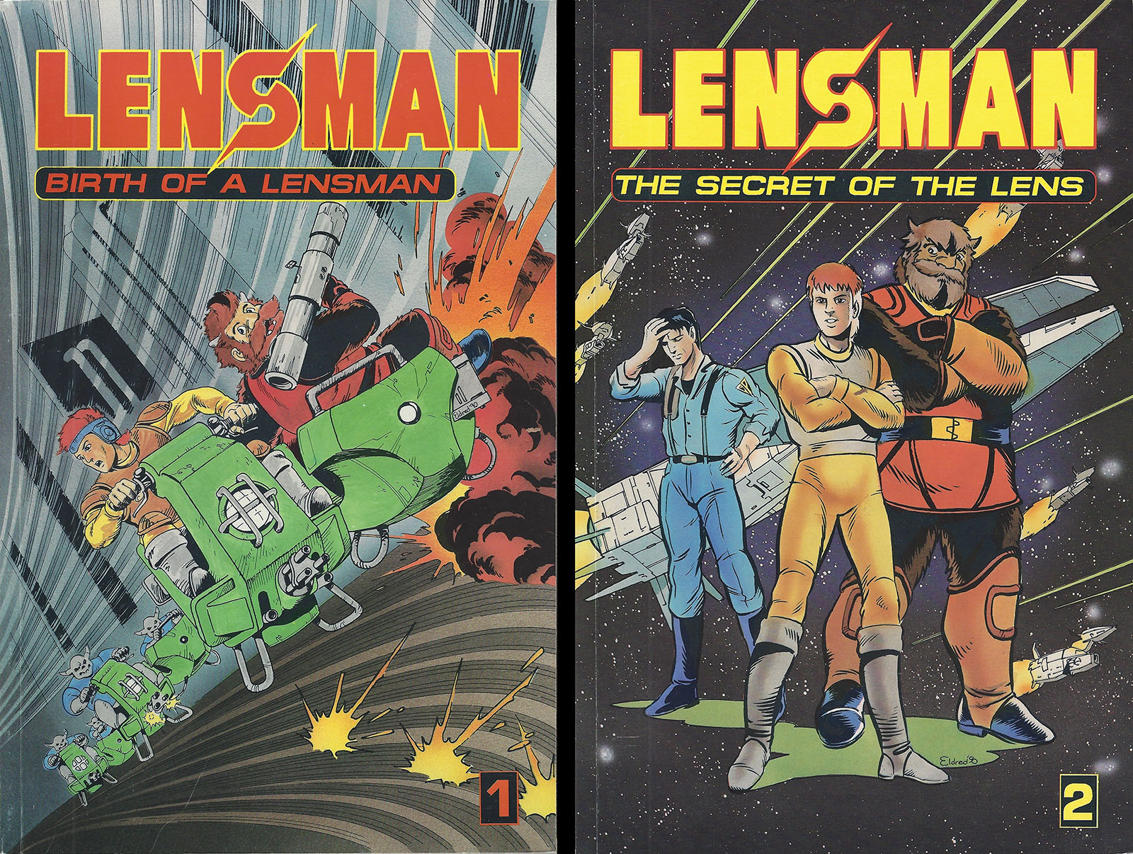
Graphic novel collections, 1991
The last word on this Lensman series came the following year when it was reprinted in two volumes of three issues apiece. The bonus material in the issue 1 Collector’s Edition was not included, so that remains a rarity. I drew the art for both covers, intending them to go the other way around (the cover for 1 was designed for 2 and vice-versa). I also didn’t like the color on the Vol. 1 cover, because it stopped the action dead in its tracks. Between all that and the missing page, you might think Malibu was a bit sloppy. And you’d be right.
I actually came up with a LOT of cover ideas that were more designy and minimalist, but none were accepted. Click here to see my concept sketches.
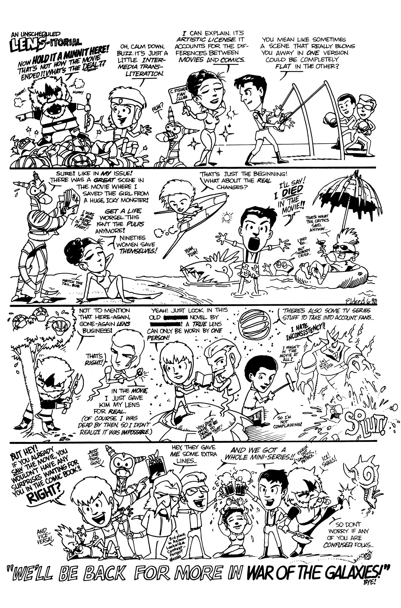
And finally, there is this extra page of silliness I did for the end of issue 6. Because I always appreciate when someone puts a little extra effort into a signoff.